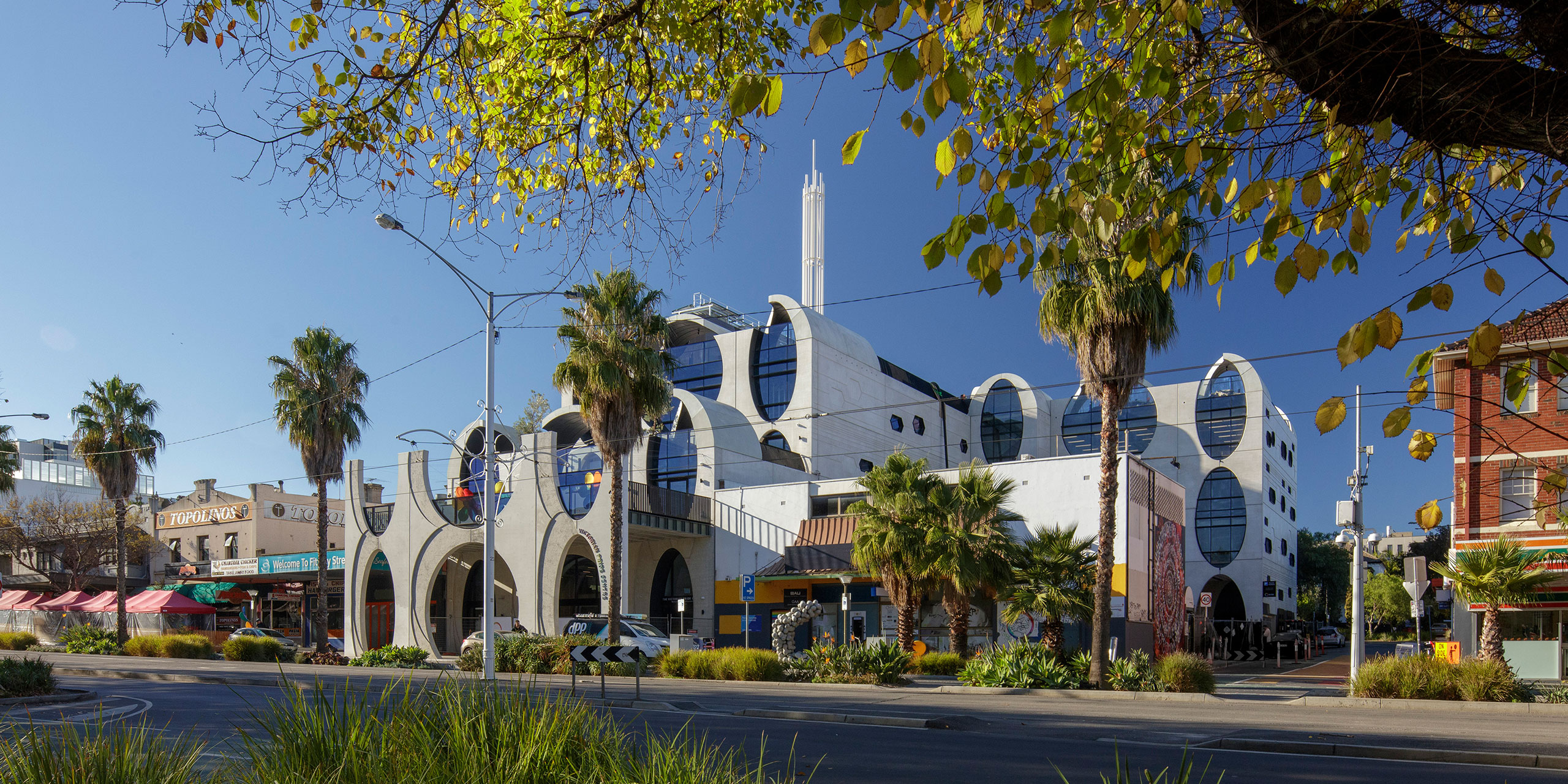
Victorian Pride Centre. Photo by John Gollings
What does the 140-year-old Victorian Trades Hall have in common with the new Victorian Pride Centre? Actually, more than you’d imagine. Firstly, they are both legacy public buildings that will stand the test of time. And more importantly they are both physical embodiments of a cultural shift – a celebration of human rights and social justice. Titled ‘The Unfinished,’ the Victorian Pride Centre is a work in progress, one conceptualised to continually evolve and transform, just like the community it’s home to.
Brearley Architects and Urbanists (BAU), together with Grant Amon Architects (GAA) knew immediately that the chance to design a building that represents Australian cultural progress was one they were keen to pursue. According to James Brearley, Principal at BAU, the Victorian Pride Centre is one of the most important representational buildings that has been constructed in Australia for decades.
0
Presentation of the Award of the Year. Credit Kit Heselden.
Making a social impact through design is a privilege that he doesn’t take lightly. ‘A chance to work on a building of this significance is rare and fantastic. As a symbol of the LGBTQI+ community, it drives the campaign of equality further,’ said James.
Another element that attracted him and the team of 18 design professionals who worked collaboratively on the project – including Grant Amon, Steve Whitford and Jens Eberhadt – was the fact that it’s located in St Kilda, where James and other members of the group both live and work.
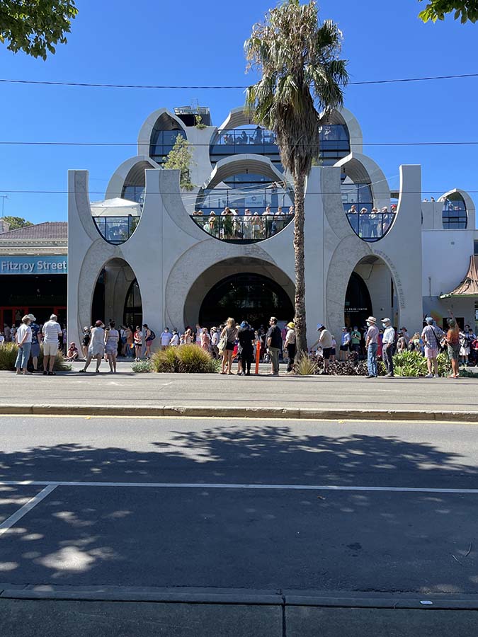
‘I’m a St Kilda guy and this is in the heart of Fitzroy Street. It’s important to me and I feel a strong personal connection. It’s momentous for the LGBTQI+ community but also for the St Kilda community. I believe the reason it is situated here is because St Kilda has a long and colourful history of inclusiveness so there’s a strong sense of place and the two play hand in hand,’ James commented.
Taking inspiration from the design brief and traditional St Kilda motifs
The design philosophy behind creating a cultural icon took a huge amount of thought and consideration. The team was fortunate to have had a very detailed and intricate brief that involved community consultation and specific goals and outcomes.
What drove the design was a combination of the brief and the idea of building something experimental – finding new ways to create architecture within in an intense competition environment and just ‘going for it.’
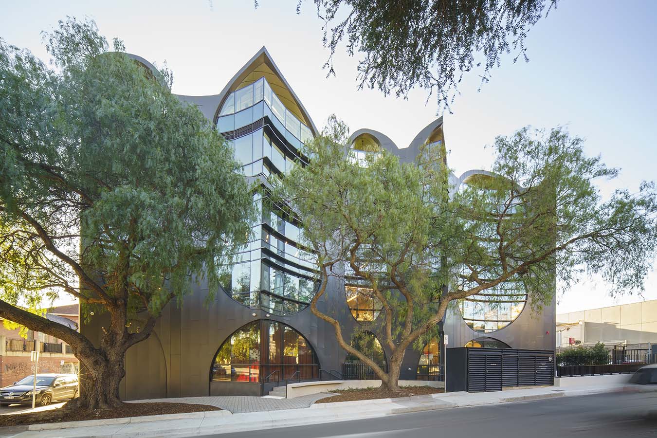
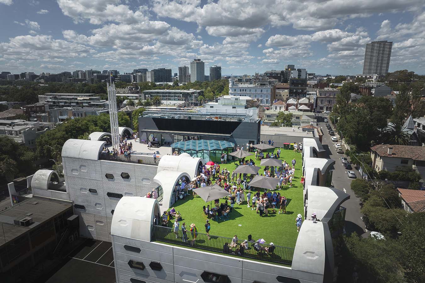
The building needed to be appropriate to the land-locked site, to look like it was going to last or like it had already been here. As such, the design’s distinctive curves are inspired by St Kilda’s memorable architecture – dance halls, Luna Park, domes, cupolas and vaults. This idea of curvature is a hallmark of the design, both on the monolithic exterior and voluminous interior spaces.

