Finalist 2025

Right Care, Right Time: Making it Easier to Navigate Our Health System

Studio Binocular / VML Melbourne / Victorian Department of Health

A user-centred framework simplifying Victorias health system, improving access and reducing emergency department pressure with proven campaign results.

A comprehensive design framework that transforms how Victorians navigate their health system.

Through extensive research and user-centred design, we developed a three-category system (Everyday Care, Urgent Care, Emergency Care) that simplifies complex health services into an intuitive traffic light model. The framework addresses widespread public confusion about health services whilst reducing emergency department pressure.

Successfully launched through a major public campaign in January 2025, the strategic design solution includes visual identity, messaging principles, and practical communication tools that empower both health communicators and everyday Victorians to access the right care at the right time.

Design Brief:

Following extensive consumer research revealing that Victorians struggled to access appropriate health services; felt confused by service names; and were overwhelmed by available options; the Victorian Department of Health commissioned Studio Binocular to address critical challenges in public health service navigation.

The strategic design brief called for a framework that would organise government health services around user needs, create clearer pathways to appropriate care, and reduce pressure on emergency departments.

The solution needed to break through language and literacy barriers whilst being culturally inclusive and accessible to diverse communities, including CALD populations, First Nations communities and LGBTIQA+ Victorians.

The framework required development of practical tools for both public communication and internal departmental use, supporting consistent messaging across all health services.

Implementation needed to accommodate future service expansion while enabling immediate deployment through a comprehensive public awareness campaign targeting parents, carers, and young adults across Victoria.


This project was developed by:

Design Process

Our strategic design process began with comprehensive market review and analysis of best practice models from other jurisdictions, establishing evidence-based approaches to health service navigation.

Right Care Right Time was underpinned by an extensive body of consumer research that the Department had undertaken with over 2000 Victorians who represented the diversity of our state. It highlighted key challenges and issues the public had with identifying health services and connecting with service names in a way which made sense to them.

Additionally, peoples perception of health care as either my GP or emergency prevented understanding of the full spectrum of available services. The research identified the opportunity to introduce urgent care as a distinct category between GPs and emergency.

Studio Binocular interrogated this through in-depth interviews with departmental program leads, Primary Health Network representatives, and Victorian Virtual Emergency Department stakeholders, ensuring perspectives were captured from throughout the health system.

We then ran two intensive brand workshops focused on categorising care types, reviewing where do I go models, prioritising services and establishing naming conventions. These sessions ensured internal stakeholder alignment and informed our strategic design process.

We developed multiple framework options, exploring different approaches to colour, iconography, language and messaging. Personas representing key user groups allowed us to map user journeys and understand potential pain points.

But the real value came through the second phase of consumer research, which involved community members testing the prototypes, sense-checking the strategy and providing feedback for further refinement.

The resulting framework balances simplicity with comprehensiveness, ensuring the three-category system accommodates existing services whilst providing flexibility for expansion. It is supported by visual principles, messaging guidelines, and practical application examples to guide implementation.

The Right Care Right Time campaign launched in January 2025, with materials translated into eight languages and distributed through a range of media.

Design Excellence

When it comes to healthcare, design excellence means effectiveness. In times of poor health or injury, every minute matters – and the ability to access appropriate care is crucial.

Right Care, Right Time exemplifies design excellence through its user-centred approach that transforms complex health information into an intuitive, accessible framework with proven real-world impact.

Structurally, Studio Binocular shifted service communication away from bureaucratic divisions toward public needs, using relatable terms. Rather than listing health services with no public meaning, the framework lists relatable symptoms like treatment for common colds, broken bones, or life-threatening events. This user-centred communication approach was validated through the successful January 2025 campaign launch, reaching parents, carers, and young adults across diverse Victorian communities.

Visually, the framework’s traffic light colour system creates immediate understanding across cultural and linguistic barriers: green represents everyday care, orange indicates urgency, and red signals emergency situations. This existing colour psychology reduces cognitive load during stressful health situations, with meaning instantly conveyed. Combined with simple iconography and typography, the framework ensures professional credibility alongside accessibility.

This visual clarity was reinforced across television commercials, social media content, and translated materials for eight CALD communities. The framework includes clear messaging principles and naming conventions ensuring consistent implementation across Victoria’s extensive health network.

The project also included the renaming of significant services to provide more logical and memorable service names – including “Priority Primary Care Centres” to “Urgent Care Clinics”.

Journey mapping across eight distinct personas, from CALD community influencers to rural residents with complex health needs, ensured user needs remained central; and ensured the framework could be adapted for specific user circumstances and service areas.

The framework accommodates existing services whilst providing clear pathways for future expansion, demonstrating forward-thinking design that anticipates system evolution, and establishing a new benchmark for strategic public health communication design in Australia.

Design Innovation

Right Care, Right Time introduces groundbreaking innovation in public health communication through its systems approach to service navigation, validated through research and real-world implementation.

The framework represents a user-centred redesign of health service categorisation in Victoria, moving beyond traditional medical hierarchies to intuitive public understanding.

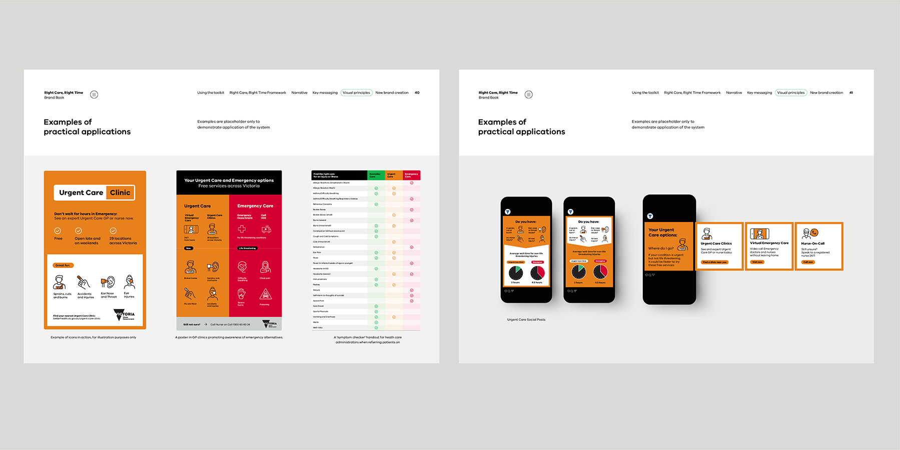
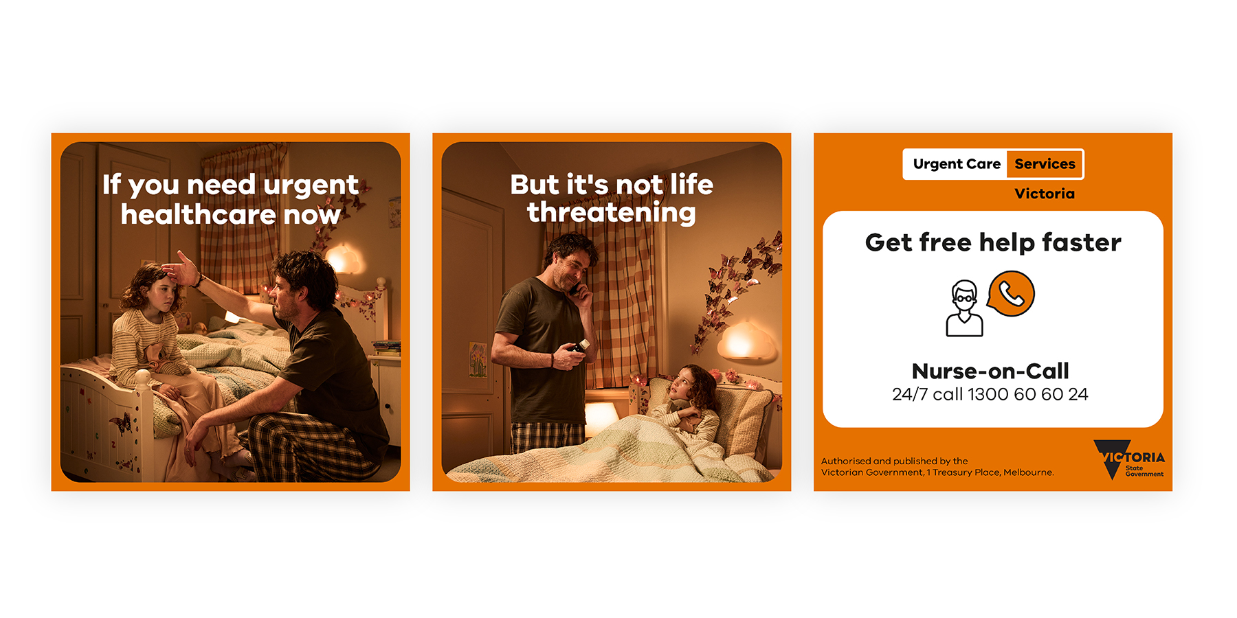
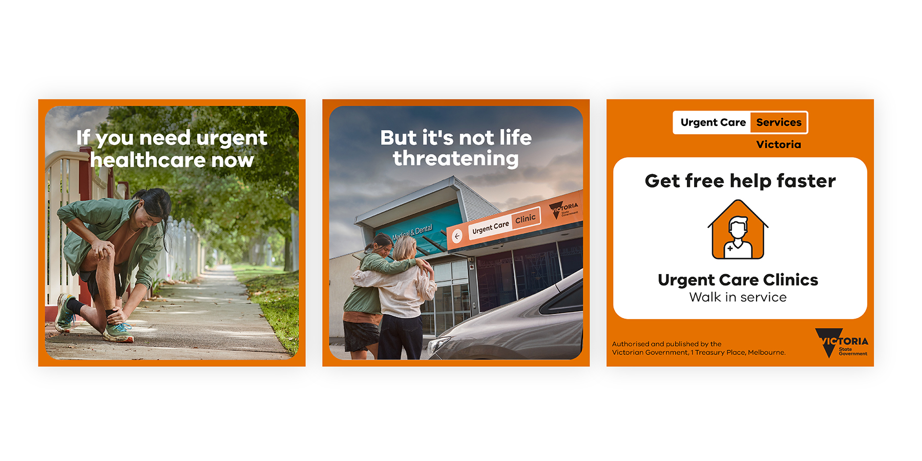
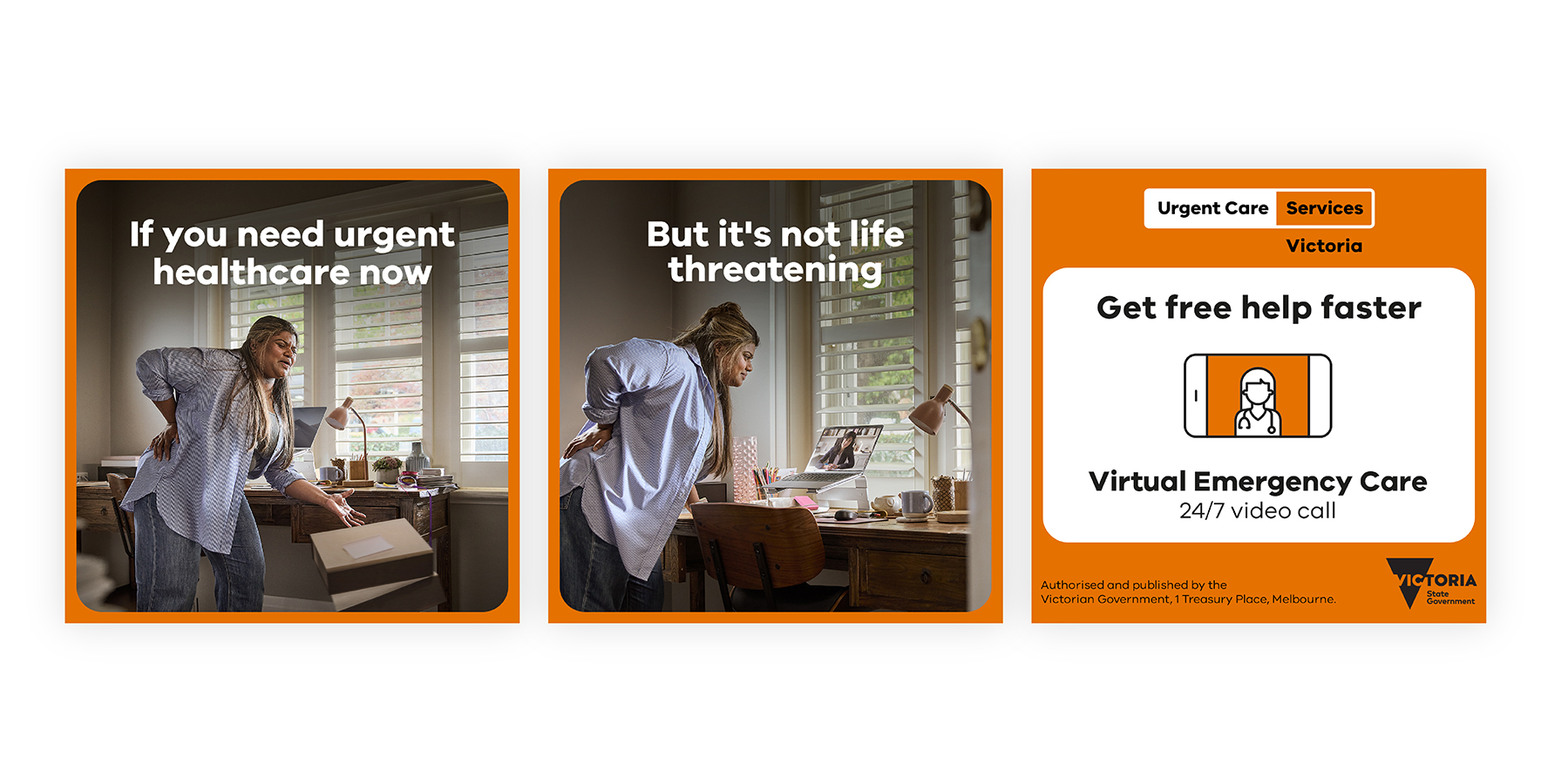
Key innovations include creating Urgent Care as a distinct category bridging everyday and emergency care – addressing a critical gap in public understanding identified through extensive consumer research. This category innovation provides clear alternatives to emergency department attendance, potentially reducing system pressure whilst improving consumer outcomes.

The January 2025 campaign launch demonstrated this innovation’s effectiveness, specifically promoting three urgent care services: Nurse-on-Call, Virtual Emergency Care, and Urgent Care Clinics across 29 Victorian locations.

The ‘traffic light’ metaphor application to health services represents unique problem-solving, leveraging universal colour understanding to transcend language and literacy barriers. Campaign implementation across eight languages – including Simplified Chinese, Vietnamese, Greek, and Arabic – proved this visual innovation’s cross-cultural effectiveness.

Innovation extends to comprehensive demographic adaptation, creating tailored campaign messaging for parents of young children, parents of teenagers, and young adults aged 20–39, whilst maintaining overall framework coherence.

The easy-to-understand visual hierarchy supports information delivery across multiple channels, from 30-second ads to detailed web resources at urgentcare.vic.gov.au.

Implementation methodology innovation provides government departments with systematic approaches for consistent service communication whilst maintaining local adaptation flexibility.

The framework’s integration of physical and digital touchpoints creates seamless user experiences across channels, demonstrated through the campaign’s multi-platform approach spanning television, radio, social media, search, and print.

The user-centred approach represents a paradigm shift from provider-focused to public-focused health communication, creating genuine innovation in government service design.

Campaign results demonstrate how strategic design thinking solves complex public policy challenges whilst improving measurable human outcomes – positioning Victoria as a leader in strategic health communication design globally.

Design Impact

Right Care, Right Time delivers transformative social and commercial impact, fundamentally improving how Victorians access healthcare with campaign outcomes demonstrating real-world effectiveness.

Social impact centres on health equity, as the framework successfully reduces barriers for vulnerable populations including CALD communities, rural residents, and those with limited health literacy. The January 2025 campaign specifically targeted these groups through translated materials in eight languages and geographic targeting around urgent care clinic locations.

By simplifying navigation and providing clear pathways, Right Care Right Time prevents delayed care that could result in serious health deterioration, particularly benefiting families with young children and elderly Victorians managing chronic conditions.

Commercial impact anticipates significant cost savings through reducing emergency department pressure, as every inappropriate emergency presentation costs substantially more than appropriate service utilisation. The campaign’s promotion of three specific urgent care alternatives – Nurse-on-Call, Virtual Emergency Care, and walk-in Urgent Care Clinics – provides concrete options that directly address this.

The framework enables strategic health service planning and supports evidence-based investment decisions about resource allocation, maximising public health outcomes per dollar invested. Campaign implementation – driving 414,627 website visits – demonstrates the framework’s effectiveness.

Initial audiences of Melbourne metro and Geelong showed potential for expansion across Victoria – proving the design’s adaptability to different geographic and demographic contexts. Social media engagement through @VicGovDH channels and #UrgentCareServices hashtag creates ongoing community dialogue and awareness.

Long-term impacts continue through cumulative effects on Victorian health and wellbeing, and health system efficiency. The campaign’s comprehensive asset library ensures sustained messaging consistency.

Right Care Right Time’s influence extends beyond health, providing a proven model for other government departments seeking to improve public experiences through strategic design intervention.

The campaign amplifies the project’s impact across Victoria’s public sector, demonstrating how thoughtful design solutions address complex public policy challenges while delivering tangible improvements to public outcomes and system performance.

Communication Design 2025 Finalists

Flow Power

Flow Power

Self-titled / Flow Power

Lifeblood

Lifeblood

Principals / Australian Red Cross Lifeblood

World Cancer Day

World Cancer Day

Motherbird / Richie Meldrum / UICC

Melbourne Recital Centre

Melbourne Recital Centre

Melbourne Recital Centre / Tim Kotsiakos / Ash Leech / Ben Beagley / Nicki Wright / Ben Beagley / Cinzia Kotsiakos

NCM — Signal to Noise

NCM — Signal to Noise

Commissioned by National Communication Museum / Creative Direction — Tim Kotsiakos / Design — Ben Beagley / Design — Nicki Wright / Creative Coding — Ben Beagley

Australian Gender Equality Council (AGEC) — Strategic Branding

Australian Gender Equality Council (AGEC) — Strategic Branding

Merren Spink / Anita McArthur / Cassie Brock / Elise Lampe / Letterform / Alexandrena Parker

Free Pads and Tampons. Period.

Free Pads and Tampons. Period.

Department of Families / Fairness and Housing

pitt&sherry – To Build Big, We Start Small

pitt&sherry – To Build Big, We Start Small

Mo Works / Mo Hamdouna / Andres Herrera / Clemence Vandame / Jason Posada / Lidya Hartanto / David Atchison / Tahlia Petyanszki / Lauren Toulet / pitt&sherry / David Atchison / Tahlia Petyanszki / Lauren Toulet

FLIP THE VAPE – A Community-Led Anti-Vaping Campaign

FLIP THE VAPE – A Community-Led Anti-Vaping Campaign

Mo Works / Mo Hamdouna / Tim van Irsel / Andres Herrera / Daniela AbrilJason Posada / Lidya Hartanto / Danish Khan / Victorian Aboriginal Health Service (VAHS) /Salomae Haselgrove / Lionel Austin