


Our design process began with stakeholder interviews and brand workshops to gain a thorough understanding of the organisation’s culture, values, and aspirations.
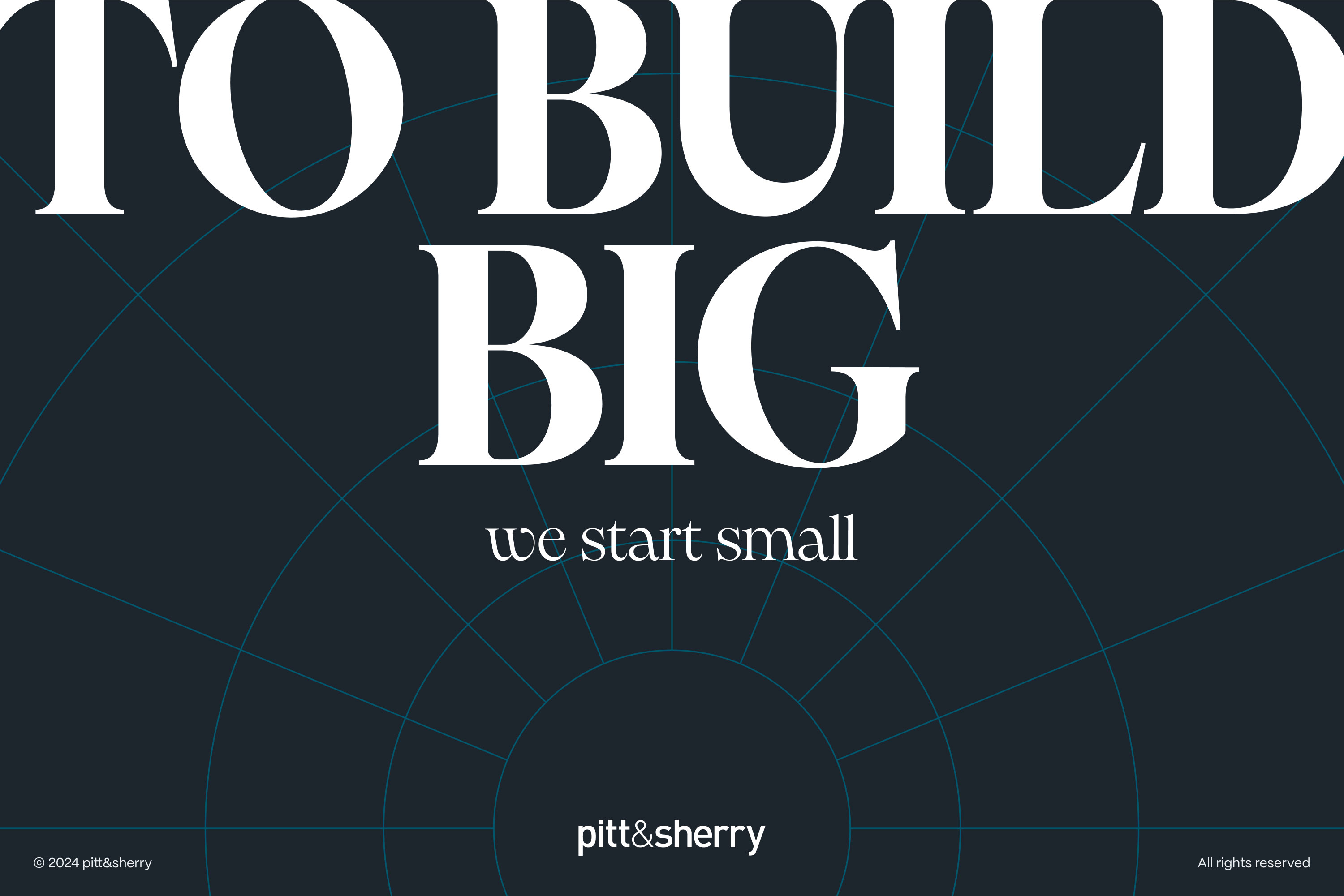
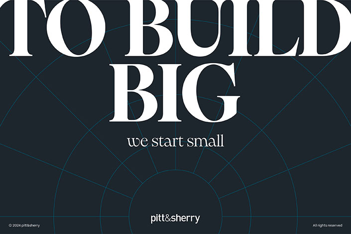
A key insight was the strong emotional attachment to the lowercase logo, which stakeholders wanted to retain. Rather than redesigning the logo, we built a new identity system around it. This allowed us to modernise the brand without breaking continuity or trust.
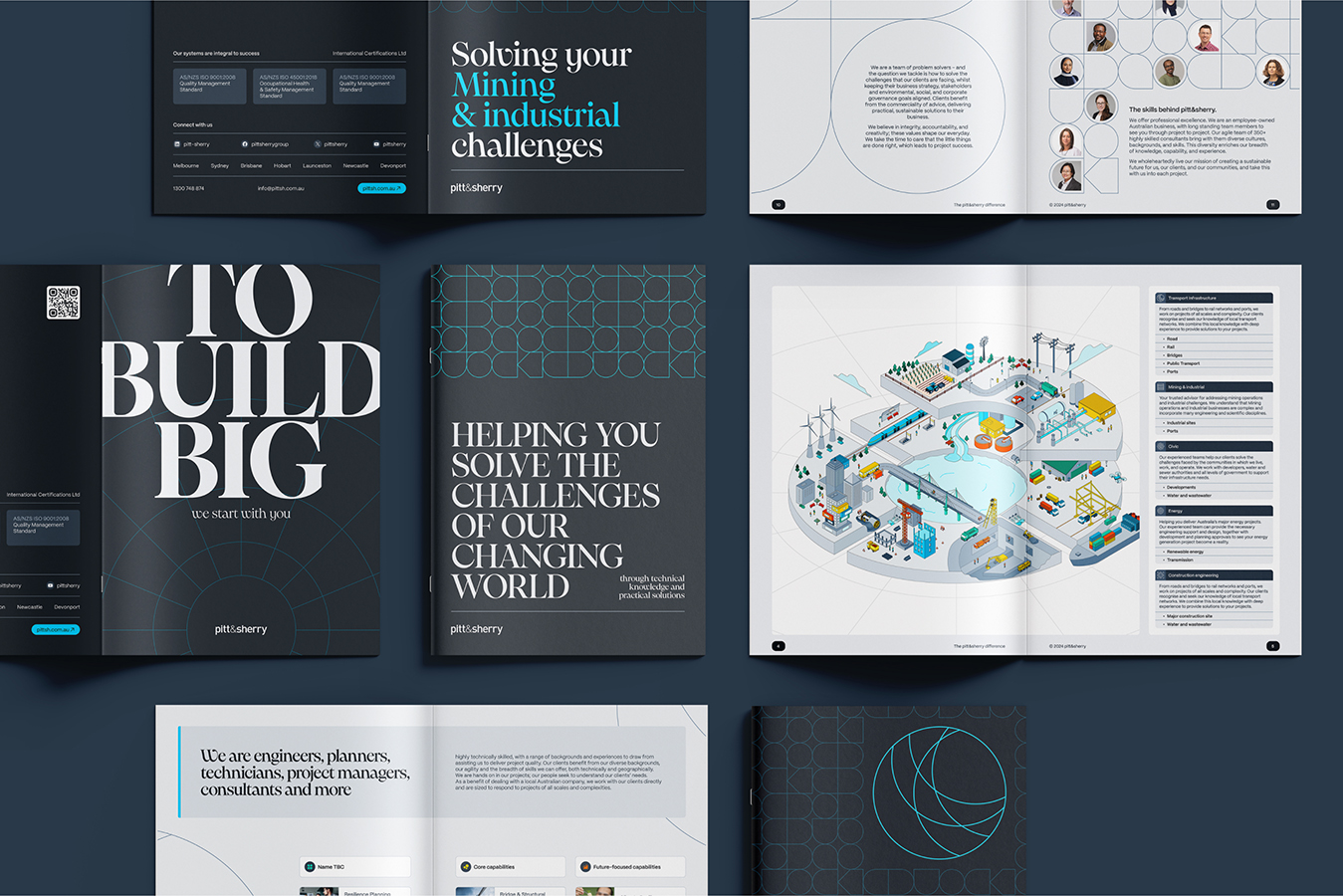
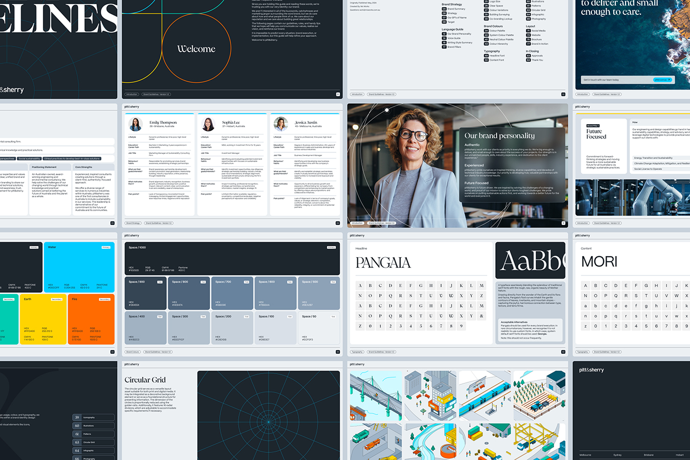
We conducted a brand audit to assess existing materials and map inconsistencies. Using this insight, we developed a modular design framework built on elemental colour theory, accessible type scales, and a strong grid system to ensure clarity and cohesion across all outputs.
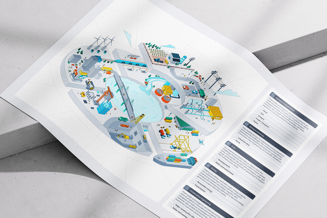
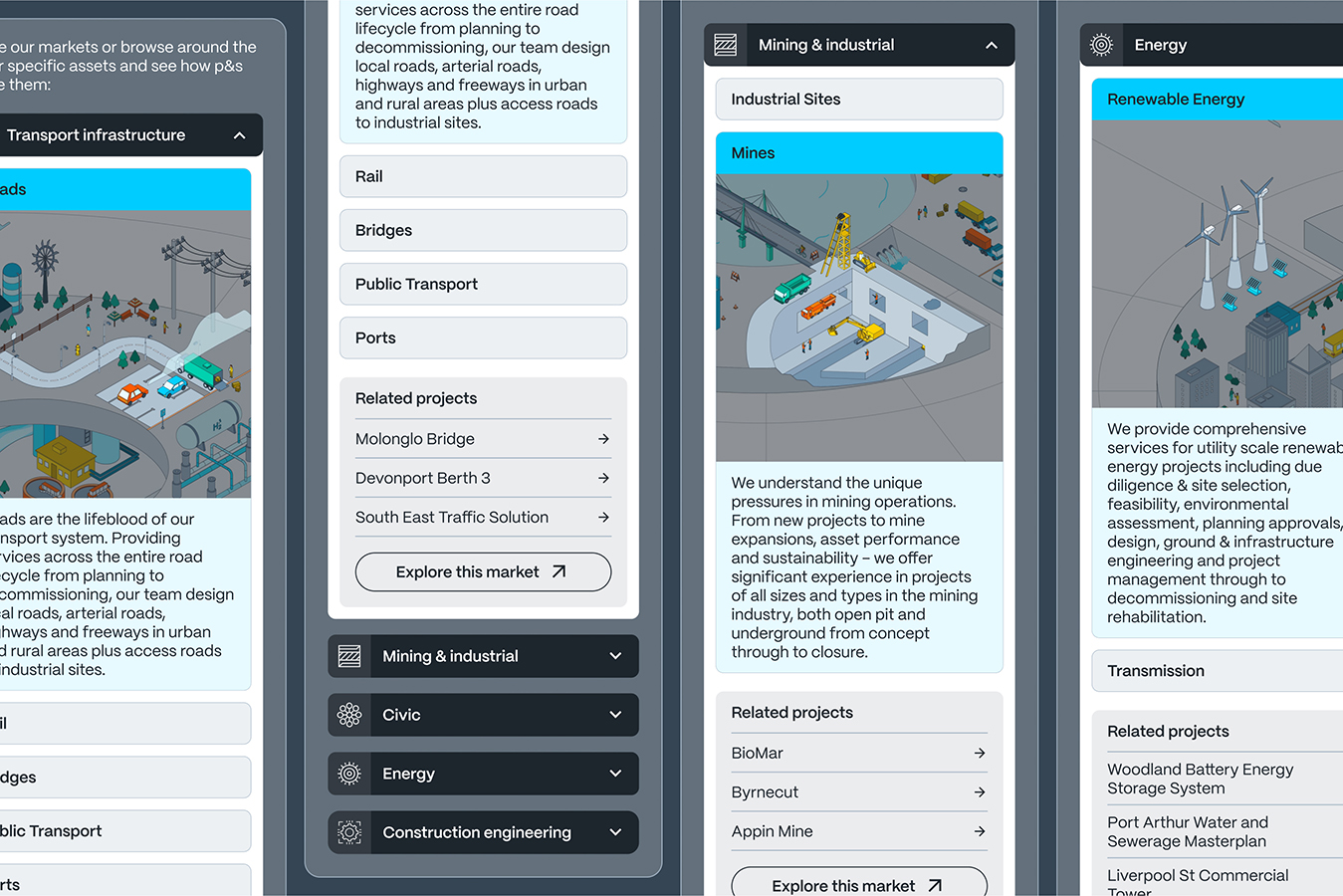
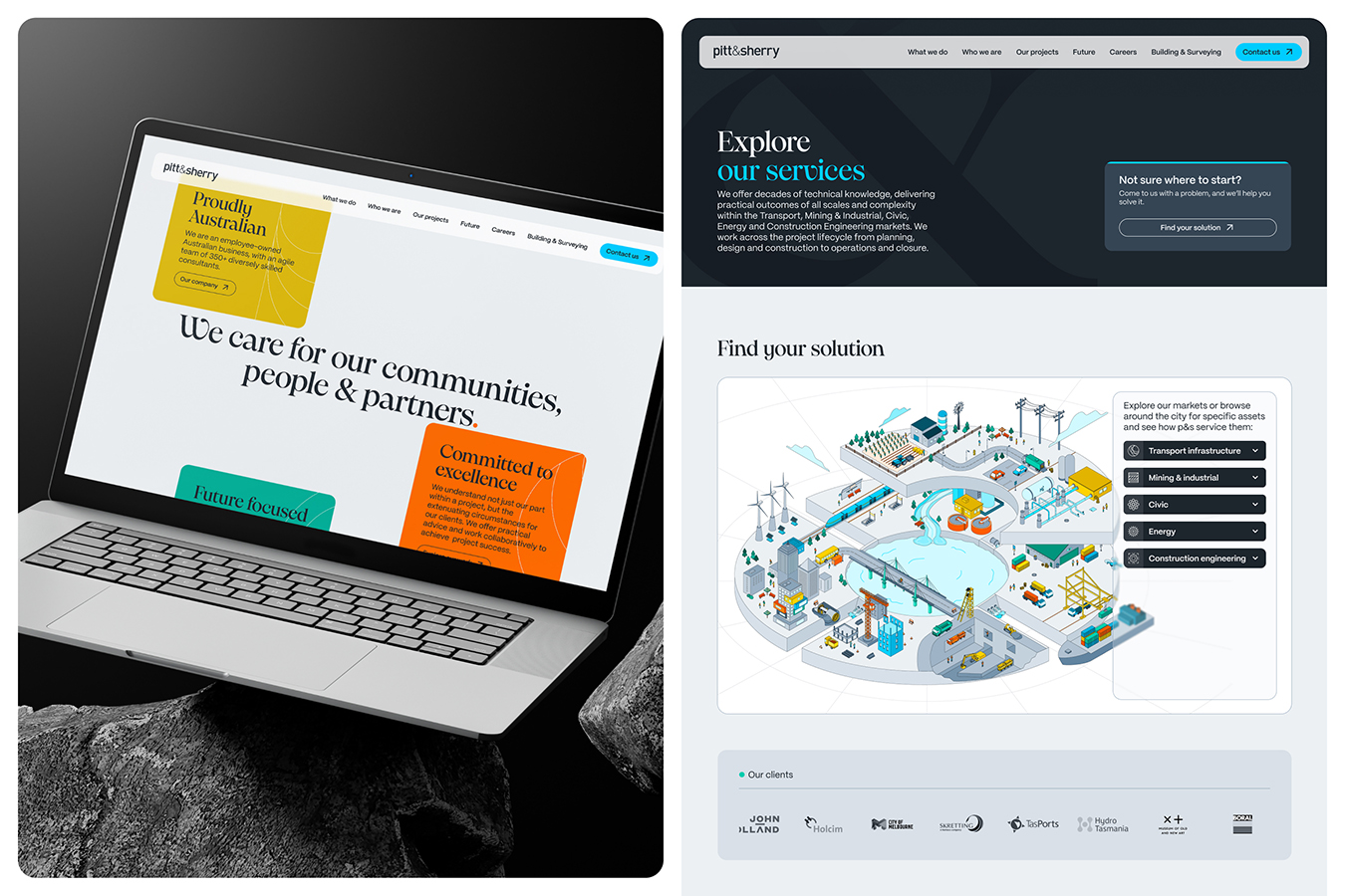
Prototypes were developed for real use cases, including social content, internal documents and corporate communications. We also created an interactive infographic that explained pitt&sherry’s market sectors in a clear, engaging format. Designed for use across web and print, it became a key storytelling asset.
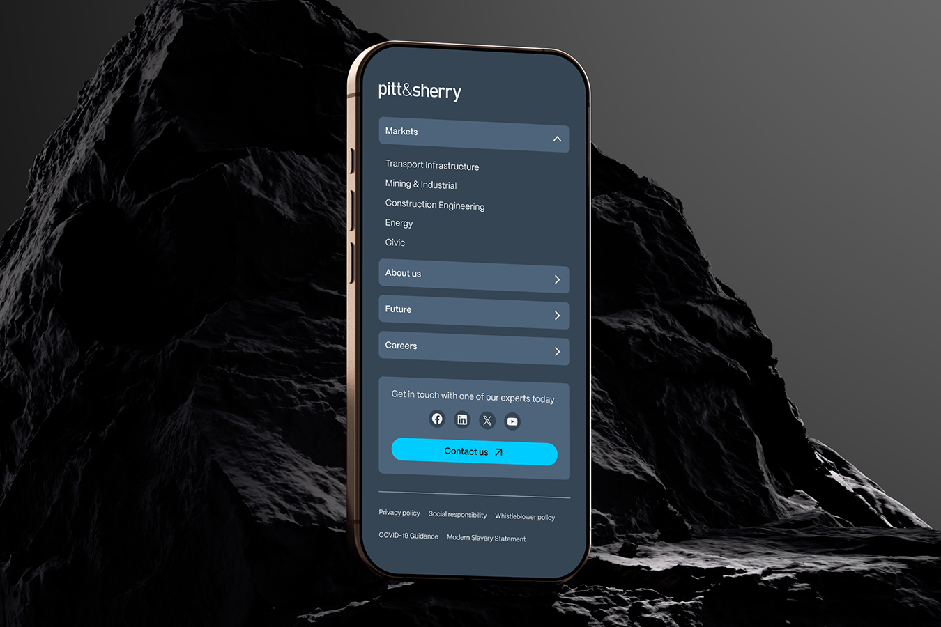
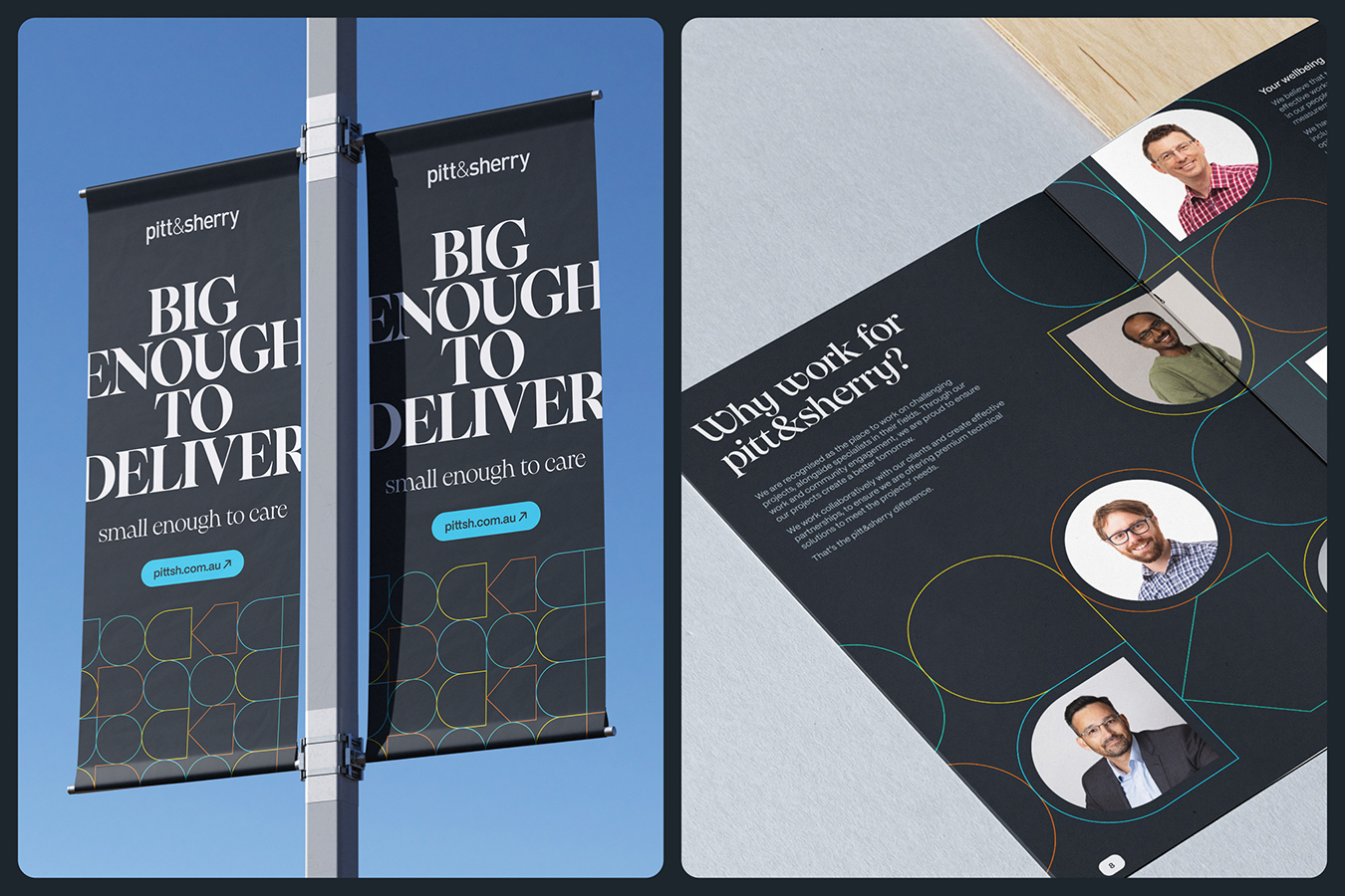
To support implementation, we produced a comprehensive brand guide, templated toolkits, and motion assets. We rolled out the identity in phases, starting with high-impact touchpoints, such as the website, followed by internal materials and social channels. This approach reduced risk and encouraged feedback at each stage, building internal support and adoption.
The final system exceeded the brief by improving consistency, usability and internal engagement. The new design is being applied across the business, including a new sub-brand launch. Every element was carefully tested and professionally executed to ensure a high-quality result that will support pitt&sherry’s growth for years to come.