


This project offers an excellent case-study in melding design research with design outcome. The design process required intense and sustained observation and research, the distillation of these observations into concise and engaging stories as well as a deep awareness of place.
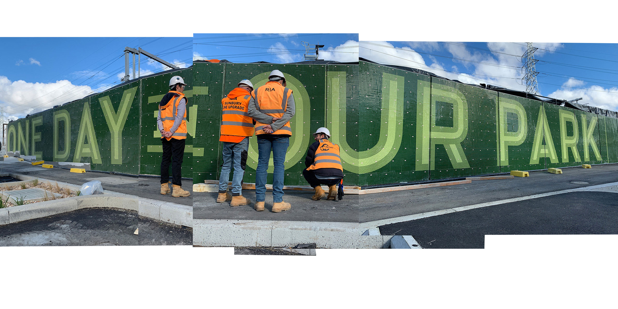
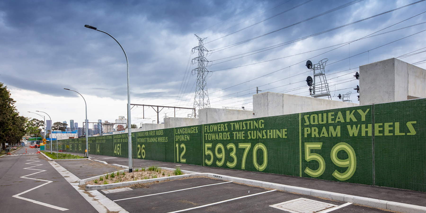
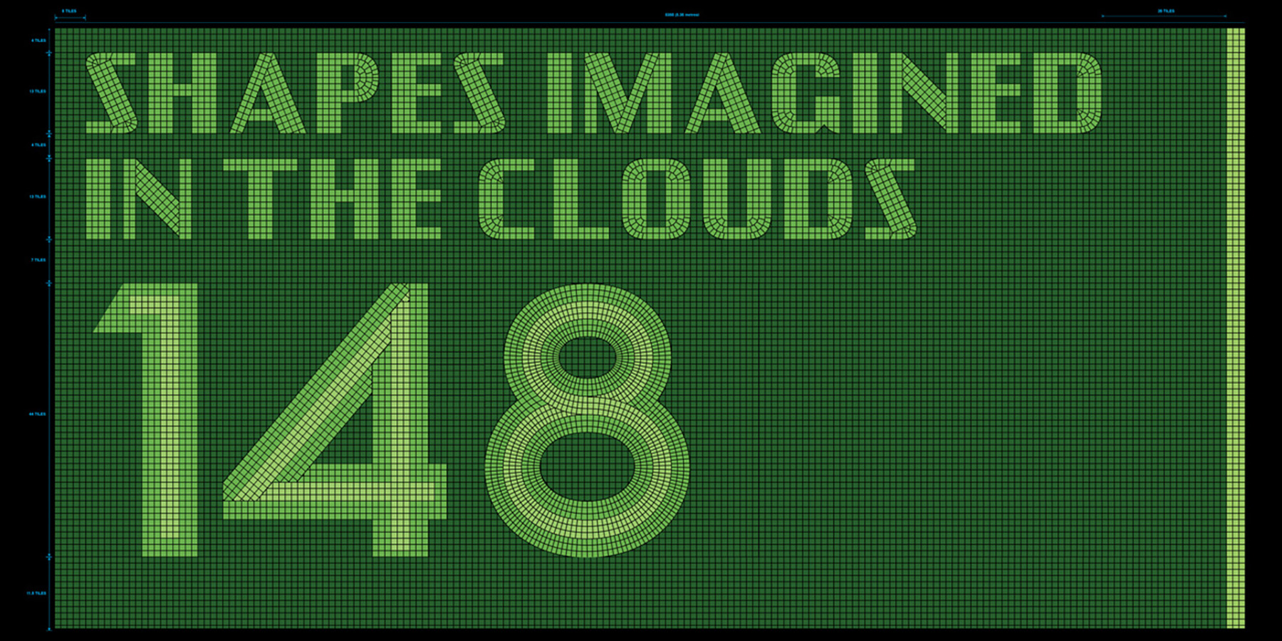
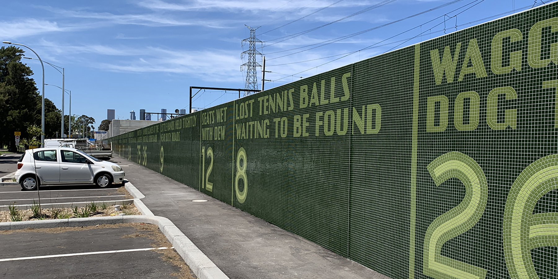
This documented research then became the basis for the exploration of materials and an appropriate typographic language. A knowledge of how people use and move through the 360 metre length of the space was integral in breaking the research into 45 smaller ‘vignettes’ — Books read silently under trees 45; Shapes Imagined in the Clouds 148; Squeaky Pram Wheels 59; Lost Water Bottles 21, etc. This user-centred approach allowed both spectacle and intimacy in the same design.
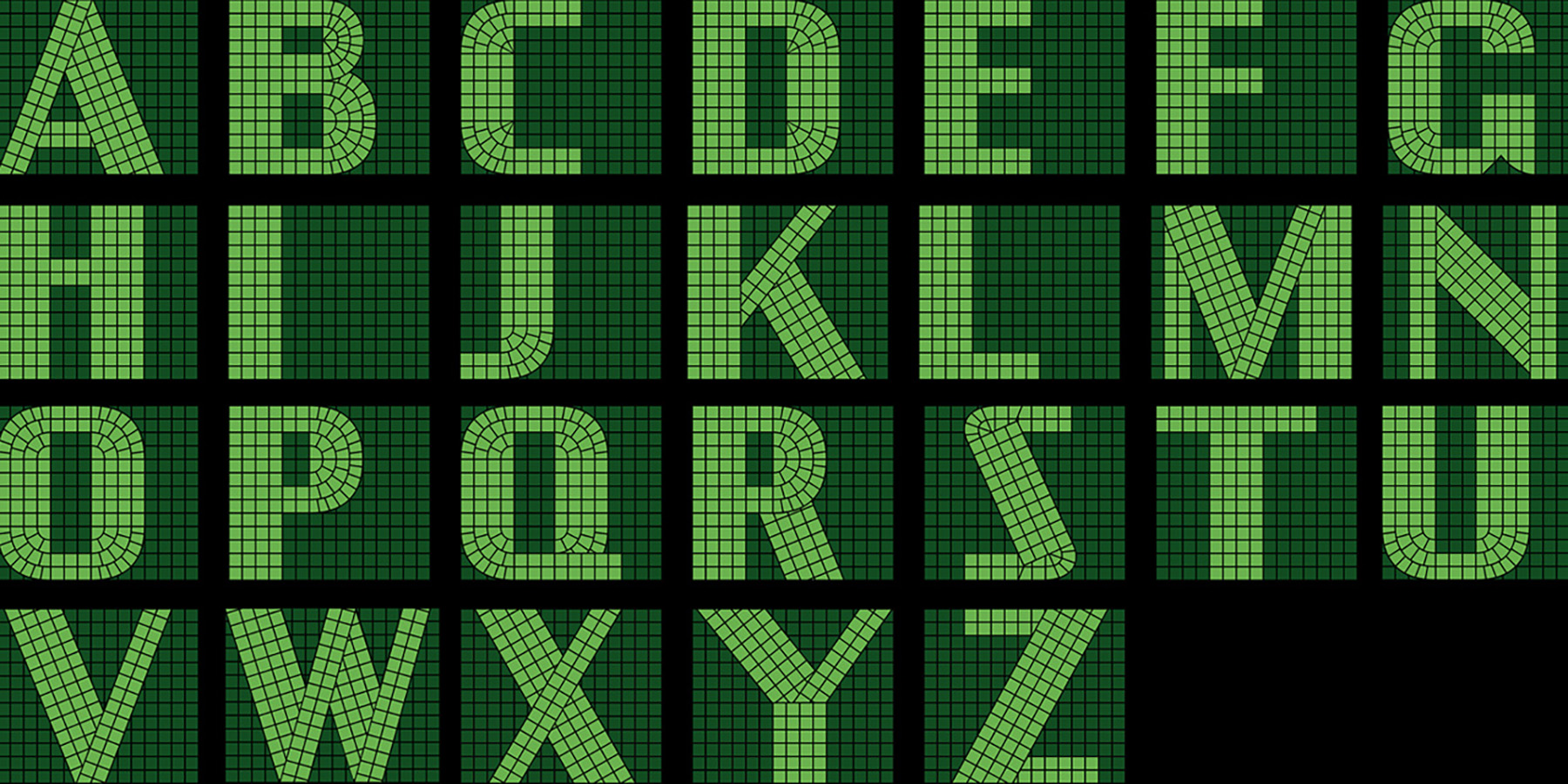
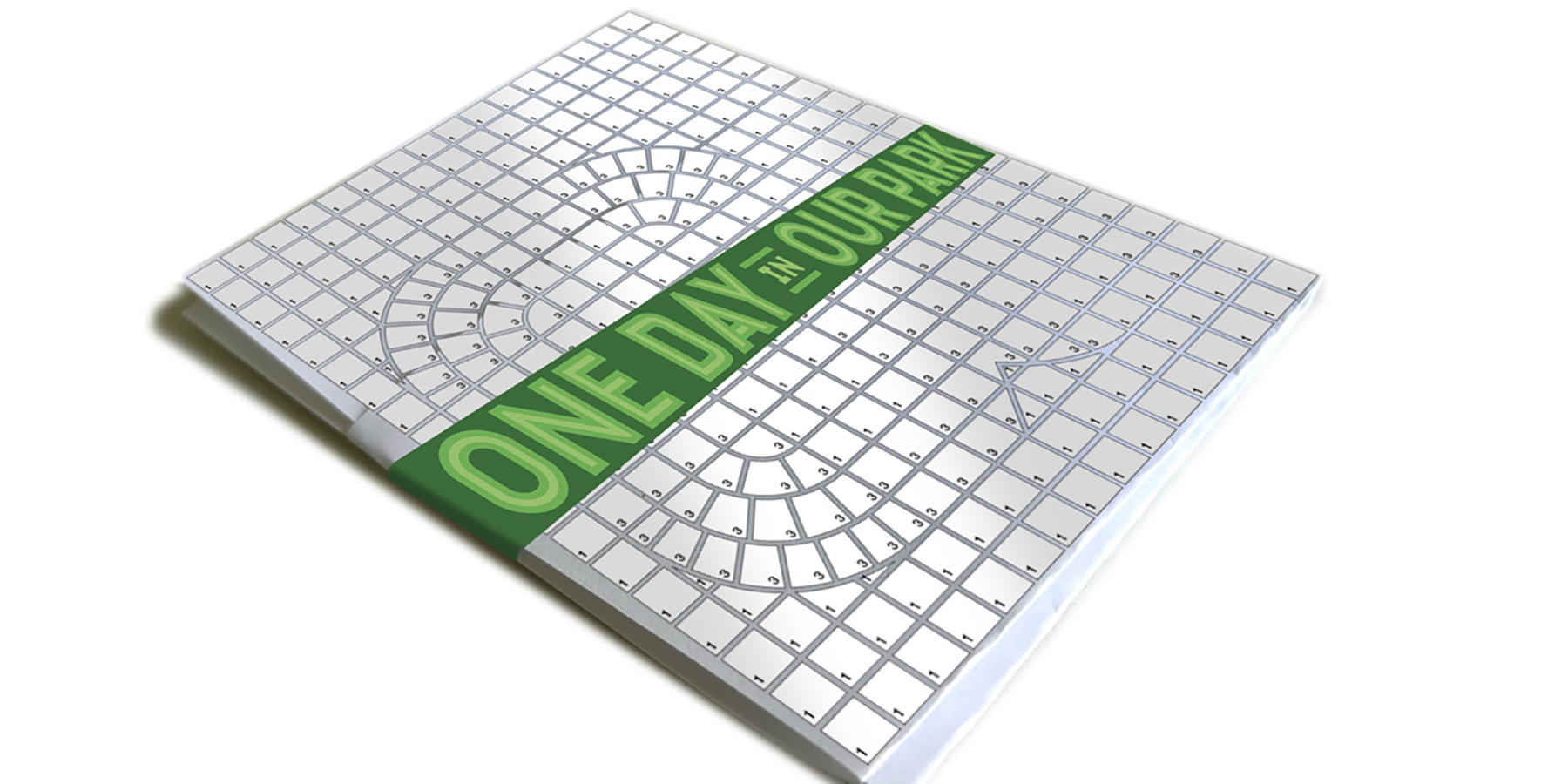
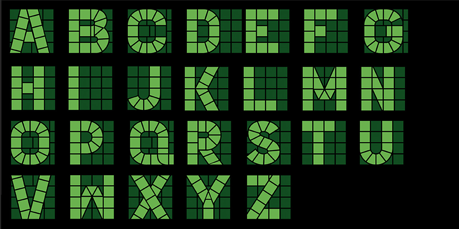
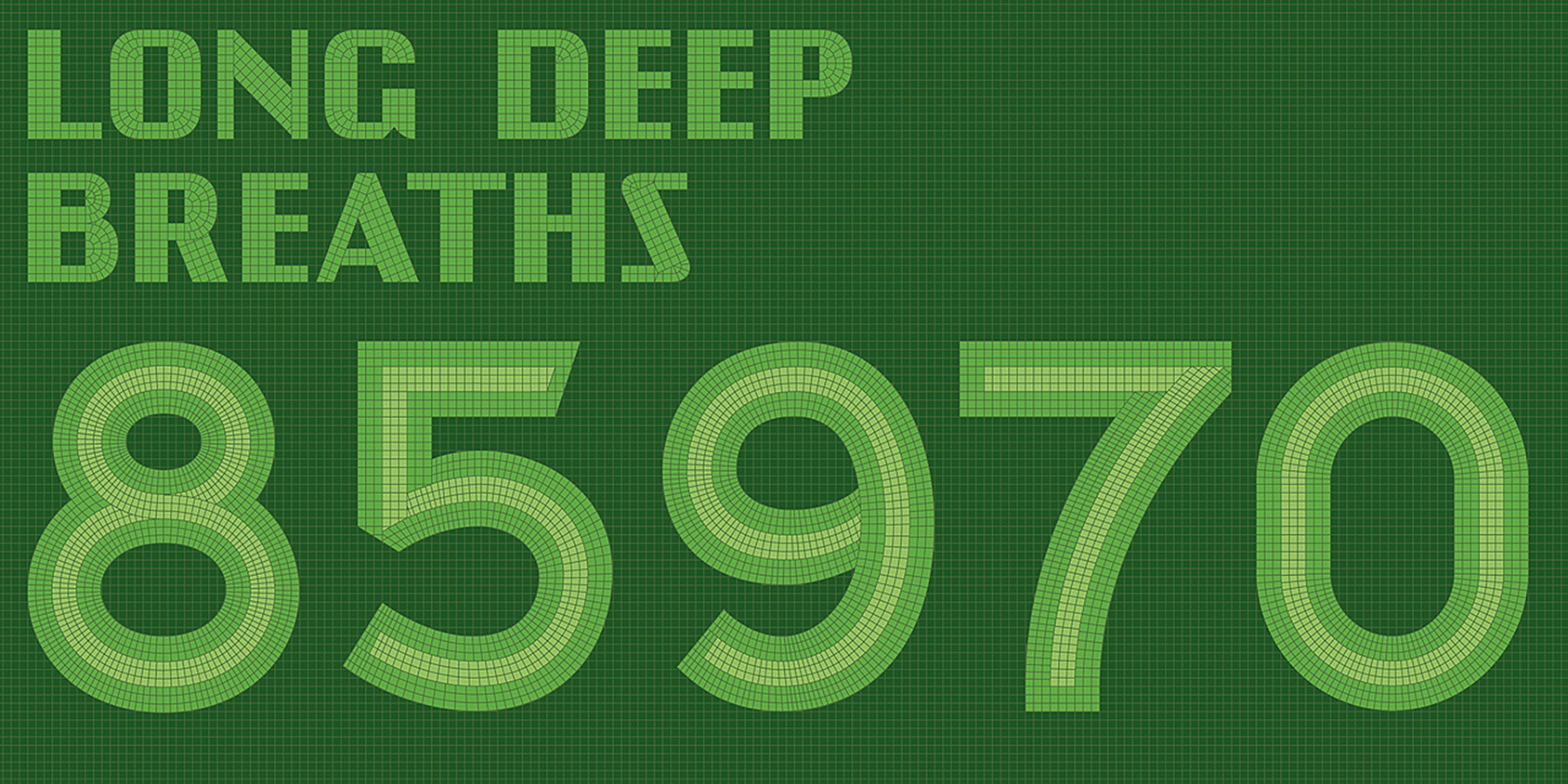
The typographic execution is extraordinarily complex – involving over 1.6 million tiles across a length of 360 metres. It required the design of four custom typefaces, meticulously crafted for the specific tile and grout dimensions. These typefaces were named to indicate their tile height – Holland 4, 14, 44 and 84. The design had to be typographically elegant, yet able to work within a modular production system. The tiling was mosaiced off-site then brought back on-site in square sheets for easier installation.
The design team exceeded the expectations of the brief in two ways – firstly, in authoring the content of the communication design through research, and secondly, through the specialist typographic skills of the studio. It not only answered the creative and technical aspects but created a dramatic and meaningful design work destined to become a landmark.