Finalist 2025

NCM — Signal to Noise

Commissioned by National Communication Museum / Creative Direction — Tim Kotsiakos / Design — Ben Beagley / Design — Nicki Wright / Creative Coding — Ben Beagley

A dynamic, generative identity that transforms disruption into creativity, amplifying Signal to Noise’s immersive exploration of communication.

Signal to Noise is an exhibition that explores how artists turn glitches, static, and disruptions in communication into creative expression. Rather than seeing noise as a problem, the show celebrates it as a source of innovation and new ideas.

Our visual identity reflects this by using a dynamic, ever-changing logo made from thousands of moving points that shift between order and chaos. This generative design brings the exhibition’s theme to life across digital and physical spaces, creating an immersive experience that invites visitors to rethink how we communicate in a world full of noise.

Design Brief:

The brief was to create a visual identity for Signal to Noise, an exhibition exploring how noise and disruption can be reframed as creative forces.

The challenge was to develop a design system that reflected the exhibition’s core theme—the fluid boundary between clarity and chaos—without overpowering the diverse artworks on display.

The identity needed to be flexible, adaptable, and work seamlessly across multiple platforms, including physical exhibition spaces, digital signage, print, and online channels.

Additionally, the design had to incorporate motion and interactivity to engage visitors and reinforce the exhibition’s concept of noise as dynamic and generative.

The intended outcome was a cohesive, immersive brand experience that supported the curatorial vision, invited audience engagement, and pushed the boundaries of traditional exhibition branding through innovative use of technology.


This project was developed by:

  • National Communication Museum
  • Creative Direction — Tim Kotsiakos
  • Design — Ben Beagley
  • Design — Nicki Wright

Design Process

The design process began with an in-depth collaboration between our team, the National Communication Museum curators, and participating artists to fully understand the exhibition’s complex themes around noise, disruption, and communication. We conducted workshops and research sessions to explore how these concepts could translate visually without overshadowing the artworks themselves.

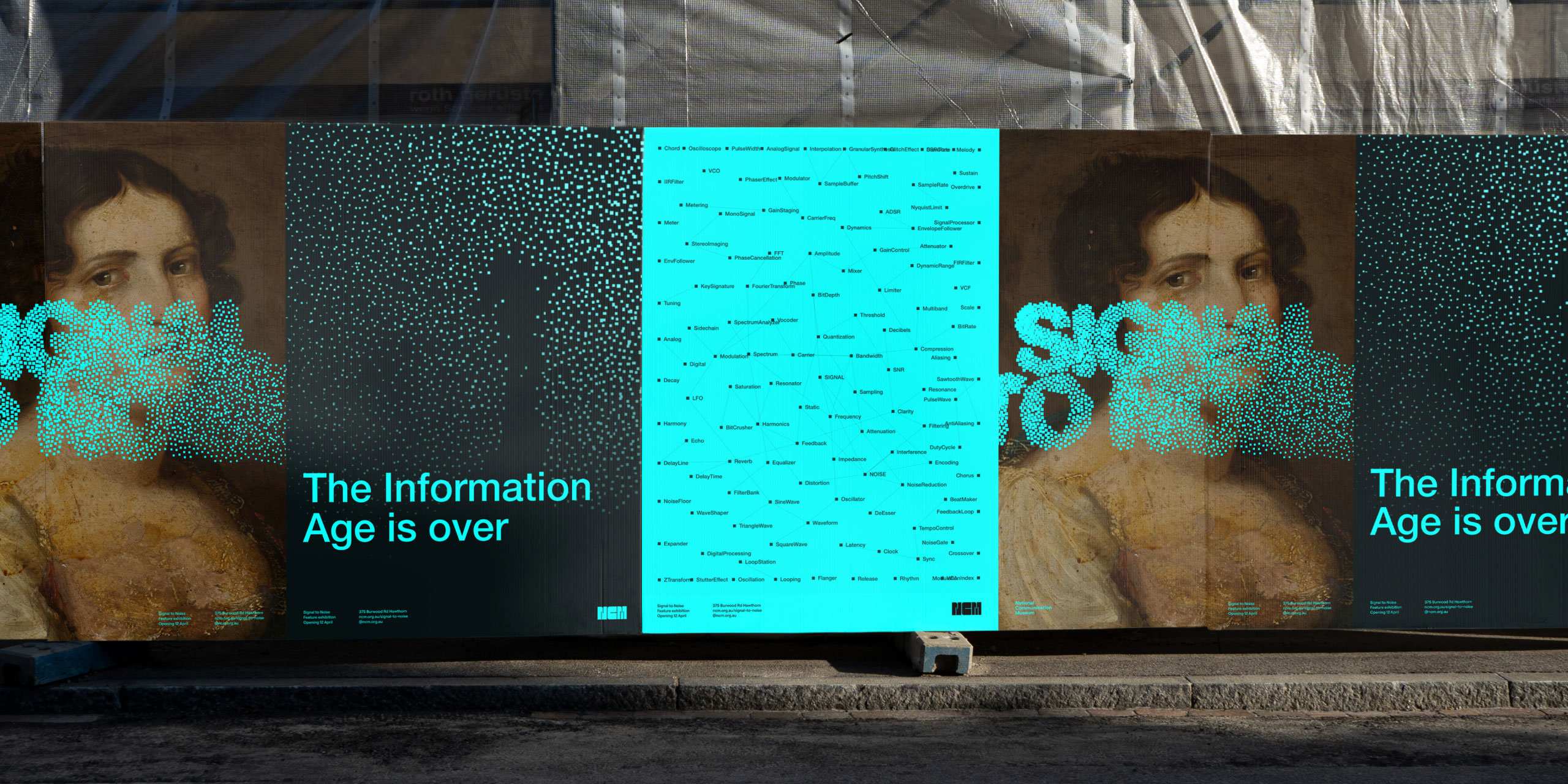
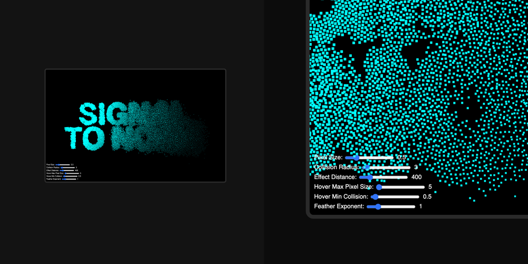
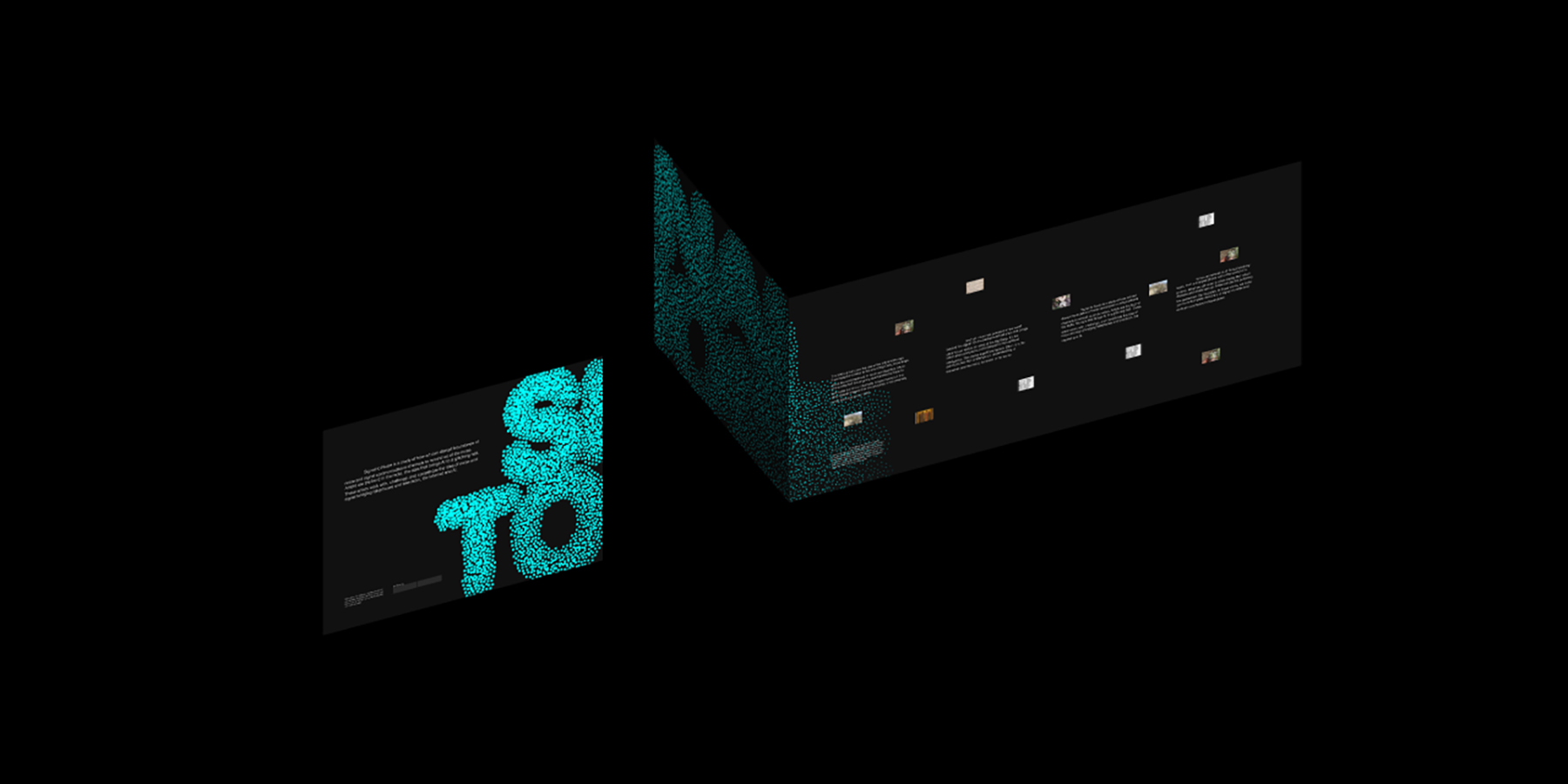
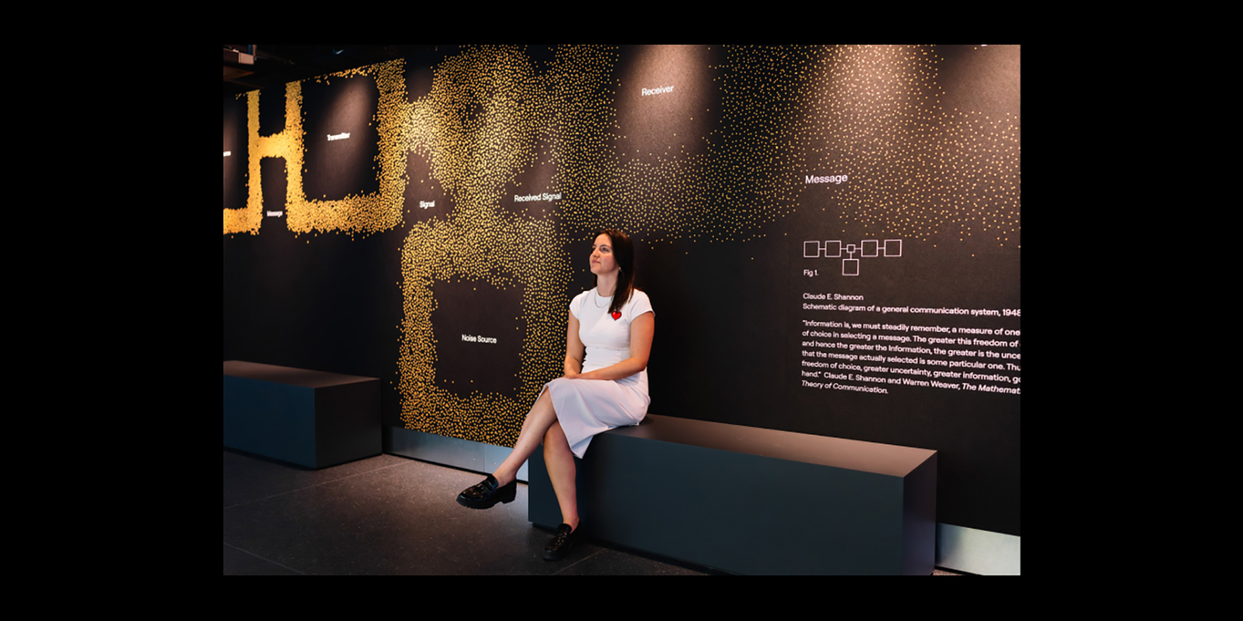
From these insights, we developed the core idea of a generative, ever-evolving identity that mirrored the exhibition’s fluid relationship between clarity and chaos. Using d3.js—a data visualisation tool—we created a system of 10,000 nodes that interact dynamically, allowing the logo and graphic elements to shift between readable forms and abstract configurations. This approach ensured the brand was not static but alive, echoing the exhibition’s message.

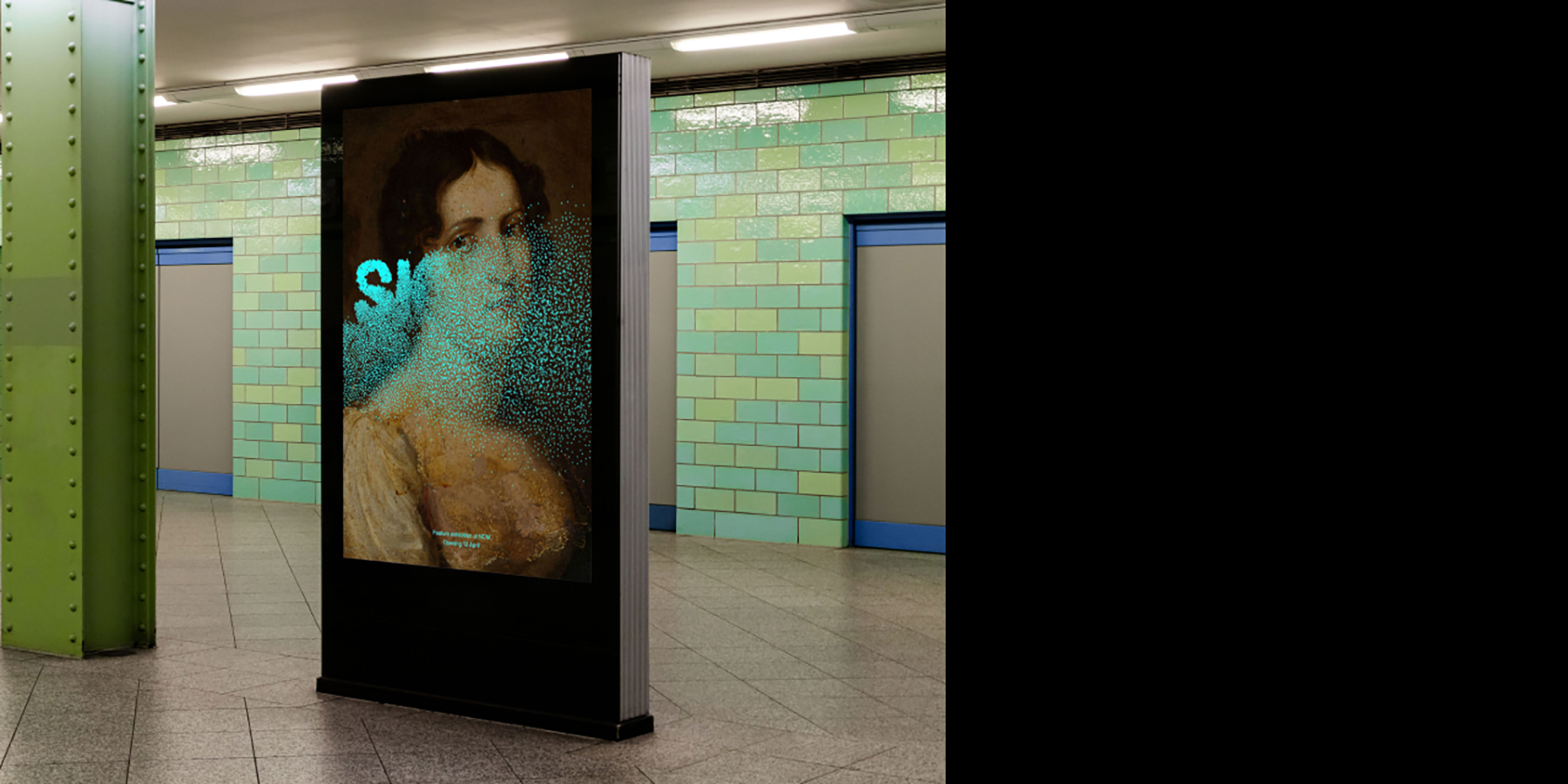
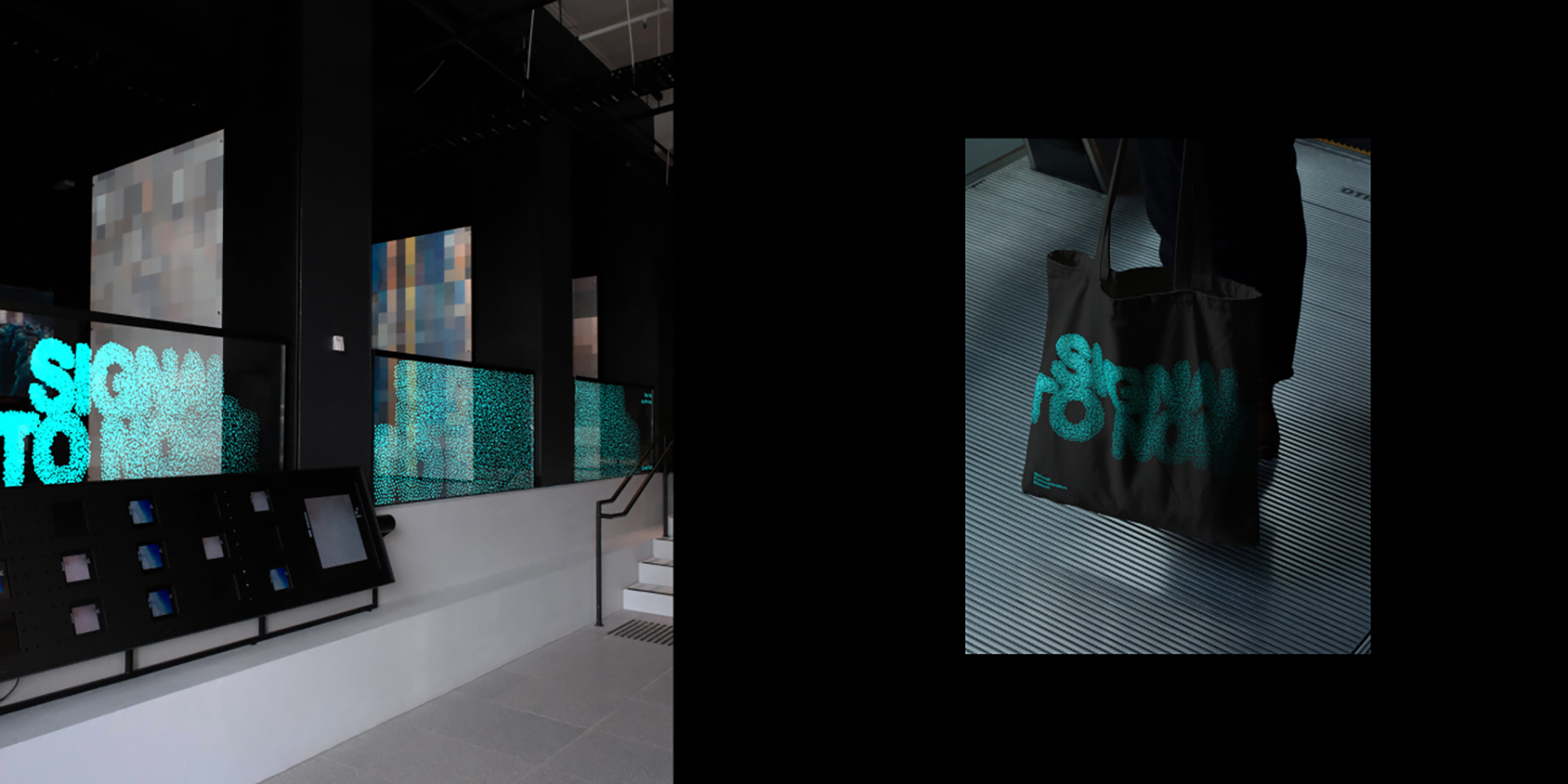
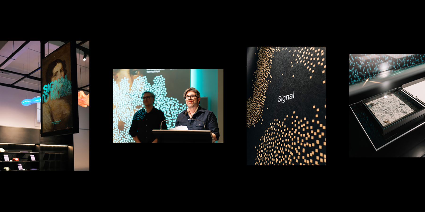
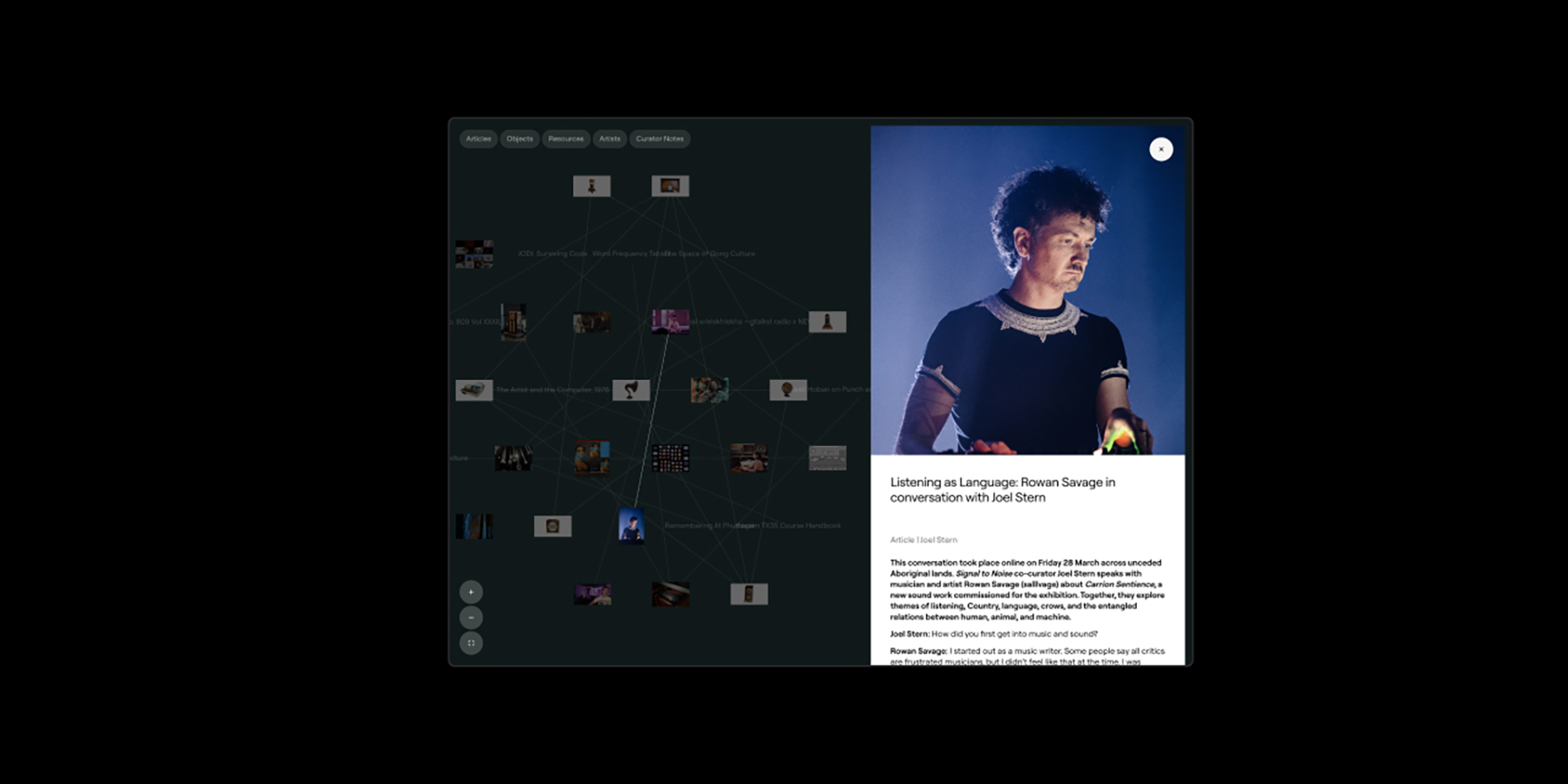
To address the need for flexibility and scalability, we built a custom browser-based tool enabling the team to generate multiple logo variations across resolutions, formats, and applications. This streamlined production workflows and allowed for seamless adaptation across digital signage, print materials, outdoor advertising, and in-gallery installations, including unique surfaces like acoustic panels and glass.

Motion design was integrated thoughtfully, enhancing the visual language without distracting from the art. Subtle animations reflected the concept of noise as movement and disruption, further engaging visitors. Throughout, close collaboration with production experts ensured high-quality execution across diverse media, overcoming challenges related to materiality and budget constraints.

The result is a professionally crafted, innovative identity system that not only met but exceeded the brief—supporting a cohesive, immersive visitor experience while pushing the boundaries of exhibition branding through generative technology and interactive design.

Design Excellence

The Signal to Noise project exemplifies design excellence by seamlessly combining innovation, functionality, and user experience into a cohesive identity system. At its core, the design addresses the fundamental criteria of good design: it is visually compelling, highly adaptable, accessible, and sustainably executed across multiple platforms and materials.

Functionality was paramount—the generative identity adapts fluidly to various formats, from large-scale outdoor signage to delicate in-gallery applications. The custom browser-based tool empowers internal teams to maintain brand consistency and flexibility, reducing production time and costs while ensuring quality. Accessibility was carefully considered through colour contrast and legibility, ensuring the identity communicates effectively to diverse audiences.

Aesthetically, the identity’s dynamic nature reflects the exhibition’s theme of disruption and fluidity without overwhelming the artworks. Motion and interactivity are employed judiciously to enhance engagement and deepen visitors’ connection to the content. Material choices and production methods were selected to minimise waste and maximise longevity, supporting sustainability principles.

The user experience was a guiding focus throughout—from the intuitive tools provided to staff, to the immersive spatial applications that invite visitors to engage directly with the concepts of noise and signal. This holistic approach ensures the brand not only looks exceptional but feels alive and relevant across every touchpoint.

By pushing the boundaries of generative design within a cultural institution, Signal to Noise sets a new benchmark for exhibition branding in Victoria, Australia, and beyond. It demonstrates the power of investing in professional, innovative design to create meaningful, adaptable, and forward-thinking experiences that resonate widely and stand the test of time.

Design Innovation

The Signal to Noise project addresses the challenge of creating a visual identity that embodies the exhibition’s exploration of noise as both disruption and creative force in an innovative, groundbreaking way. Rather than relying on a traditional static logo or fixed brand assets, we developed a generative identity built entirely with code—an approach that is rare within exhibition branding and represents a significant advancement in design practice.

Using d3.js, a data visualisation framework, we constructed a system of 10,000 interactive nodes that simulate forces of attraction and repulsion, allowing the identity to continuously morph between states of order and chaos. This dynamic behaviour directly reflects the exhibition’s core theme, making the brand itself a living, evolving expression of noise and signal.

This fluidity creates new opportunities for engagement, enabling applications across multiple media formats, including static, animated, and interactive experiences—all generated from one flexible system. This user-centred design empowers museum staff through a custom browser-based tool that generates tailored identity variations on demand. This not only streamlines production and ensures brand consistency but also allows the team to adapt the identity to different formats and contexts easily, responding directly to their workflow needs and resource constraints.

By embedding generative code as the foundation of the brand, the project breaks new ground in how exhibition identities can function and interact. It pushes the boundaries of what is possible in cultural branding, marrying technology and design to create a responsive, immersive, and meaningful experience.

This innovation sets a precedent for future exhibitions worldwide, illustrating how dynamic design can deepen audience connection and enhance storytelling.

Design Impact

The Signal to Noise project delivers lasting impact across social, commercial, and environmental dimensions, showcasing the transformative power of professional design.

Socially, it challenges conventional perceptions of noise and disruption, encouraging visitors to engage with technology and communication in new, thoughtful ways. By fostering curiosity and dialogue, the exhibition deepens public understanding of complex contemporary issues—from data privacy to AI—making the arts a catalyst for societal reflection and connection.

Commercially, the generative identity and custom browser-based tool enhance operational efficiency for the National Communication Museum. This reduces reliance on costly, time-intensive manual design processes, enabling the museum to adapt branding swiftly across diverse platforms and media. The scalability and flexibility of the system help future-proof the institution’s visual language, supporting ongoing engagement and outreach.

From an environmental standpoint, the project embraces circular design principles by minimising waste and material use. The digital-first approach reduces dependence on printed collateral and one-off production runs. Templates and generative assets promote reuse and adaptation, lowering resource consumption and environmental impact over time.

This project reinforces Victoria’s reputation as a global leader in innovative, culturally rich design. By pioneering generative branding within the museum sector, Signal to Noise sets a new standard for exhibition identity and experiential design, demonstrating how design can be both cutting-edge and meaningful.

Ultimately, this work exemplifies the value of investing in professional, forward-thinking design to create culturally resonant experiences that inspire audiences, empower institutions, and contribute positively to society, the economy, and the environment—locally, nationally, and internationally.

Communication Design 2025 Finalists

Flow Power

Flow Power

Self-titled / Flow Power

Lifeblood

Lifeblood

Principals / Australian Red Cross Lifeblood

World Cancer Day

World Cancer Day

Motherbird / Richie Meldrum / UICC

Melbourne Recital Centre

Melbourne Recital Centre

Melbourne Recital Centre / Tim Kotsiakos / Ash Leech / Ben Beagley / Nicki Wright / Ben Beagley / Cinzia Kotsiakos

NCM — Signal to Noise

NCM — Signal to Noise

Commissioned by National Communication Museum / Creative Direction — Tim Kotsiakos / Design — Ben Beagley / Design — Nicki Wright / Creative Coding — Ben Beagley

Australian Gender Equality Council (AGEC) — Strategic Branding

Australian Gender Equality Council (AGEC) — Strategic Branding

Merren Spink / Anita McArthur / Cassie Brock / Elise Lampe / Letterform / Alexandrena Parker

Free Pads and Tampons. Period.

Free Pads and Tampons. Period.

Department of Families / Fairness and Housing

pitt&sherry – To Build Big, We Start Small

pitt&sherry – To Build Big, We Start Small

Mo Works / Mo Hamdouna / Andres Herrera / Clemence Vandame / Jason Posada / Lidya Hartanto / David Atchison / Tahlia Petyanszki / Lauren Toulet / pitt&sherry / David Atchison / Tahlia Petyanszki / Lauren Toulet

FLIP THE VAPE – A Community-Led Anti-Vaping Campaign

FLIP THE VAPE – A Community-Led Anti-Vaping Campaign

Mo Works / Mo Hamdouna / Tim van Irsel / Andres Herrera / Daniela AbrilJason Posada / Lidya Hartanto / Danish Khan / Victorian Aboriginal Health Service (VAHS) /Salomae Haselgrove / Lionel Austin