Finalist 2025

Melbourne Recital Centre

Melbourne Recital Centre / Tim Kotsiakos / Ash Leech / Ben Beagley / Nicki Wright / Ben Beagley / Cinzia Kotsiakos

A bold rebrand inviting all music lovers in, uniting legacy and innovation through design, motion, and digital-first tools.

Melbourne Recital Centre (MRC) is famed for world-class performances and exceptional acoustics, but was seen as exclusive by younger audiences.

We created a bold new brand inspired by its unique hexagonal architecture, combining dynamic visuals, motion, and the strategic narrative Music for the daring to welcome all music lovers.

A custom digital tool streamlines on-brand design, ensuring consistency and inclusivity.

The result is a confident, modern identity that honours MRC’s legacy while inviting a broader, more curious audience to engage with live music.

Design Brief:

MRC is renowned for its acoustics and classical programming, but was perceived by many as exclusive or uninviting, particularly to younger, more diverse audiences.

With major redevelopment underway in the surrounding precinct, MRC saw an opportunity to evolve its identity and reposition itself for the future.

The brief was to create a new brand that honoured MRC’s legacy while making it feel more open, dynamic, and relevant. The goal was to attract new audiences, strengthen engagement, and support internal teams with a flexible, future-ready design system.

The solution needed to work across physical and digital environments, reflect the venue’s architectural uniqueness, and enable more adventurous programming, without alienating loyal patrons.


This project was developed by:

  • Melbourne Recital Centre
  • Creative Direction & Brand Strategy — Tim Kotsiakos
  • Research & Insight — Ash Leech
  • Design — Ben Beagley, Nicki Wright
  • Creative Coding — Ben Beagley
  • Copywriting — Cinzia Kotsiakos

Design Process

We began with a deep discovery phase, conducting interviews with internal stakeholders, audience groups, and local artists to uncover perceptions of MRC. The insights were clear: while respected, MRC was seen as formal and exclusive, limiting its appeal to new and younger audiences.

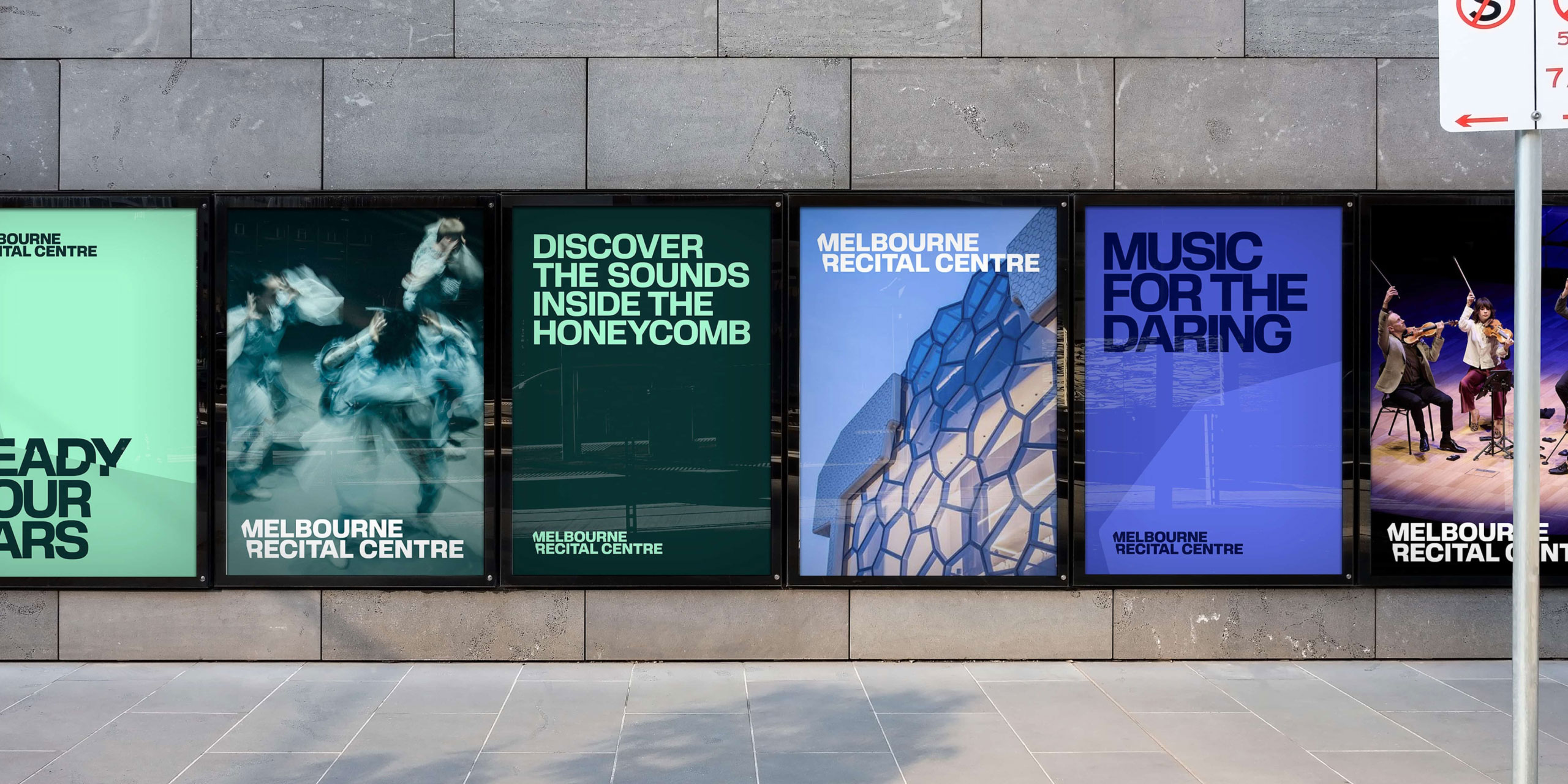
We also learned that what united all music lovers—regardless of genre—was a shared sense of curiosity and passion. From this, we developed the strategic narrative Music for the daring—a bold invitation to explore sound, challenge expectations, and embrace new experiences. This idea guided every aspect of the design process.

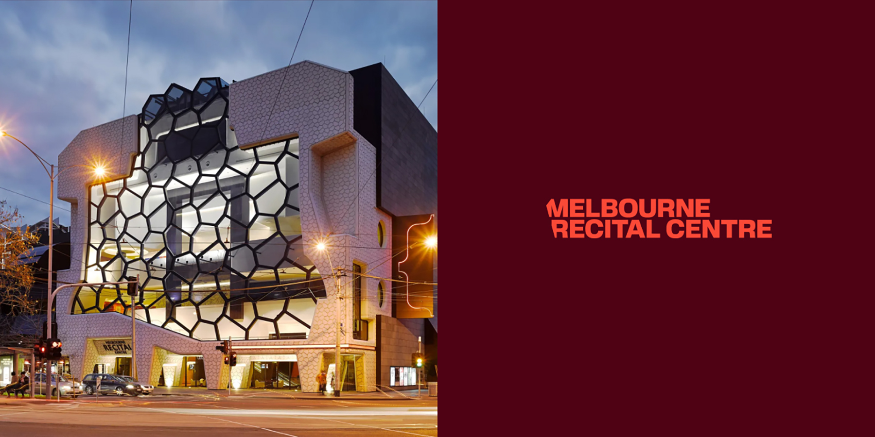
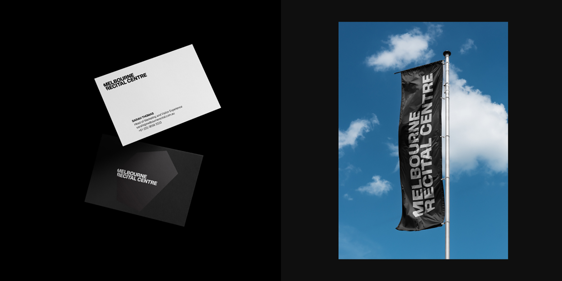
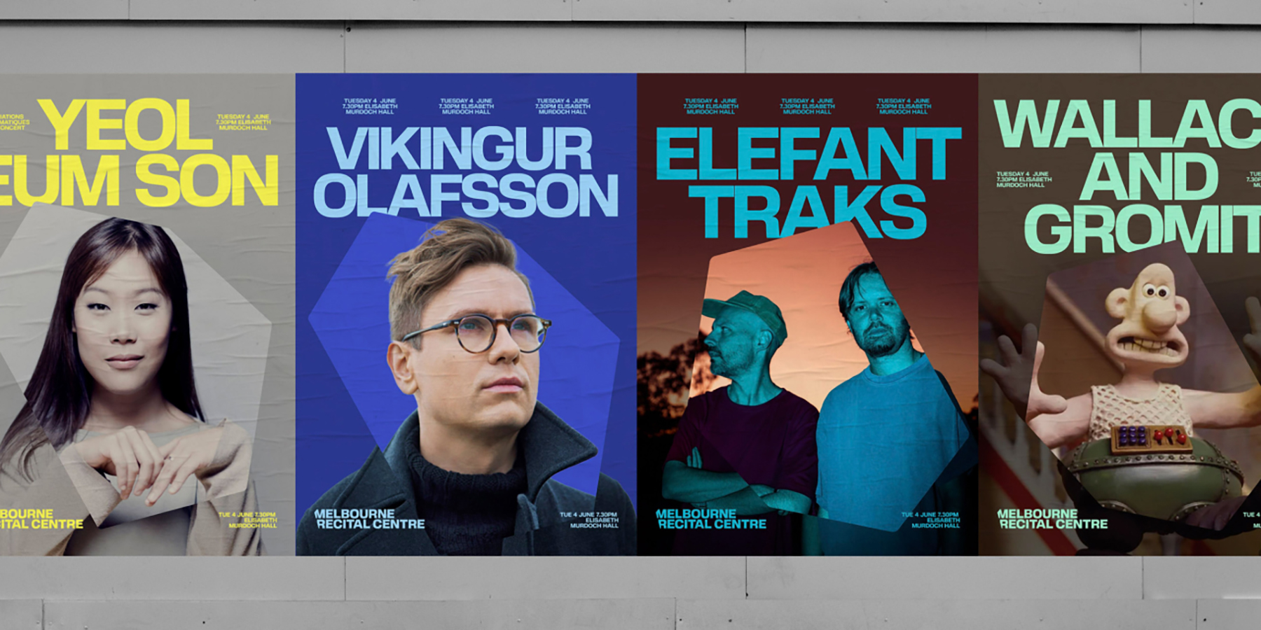
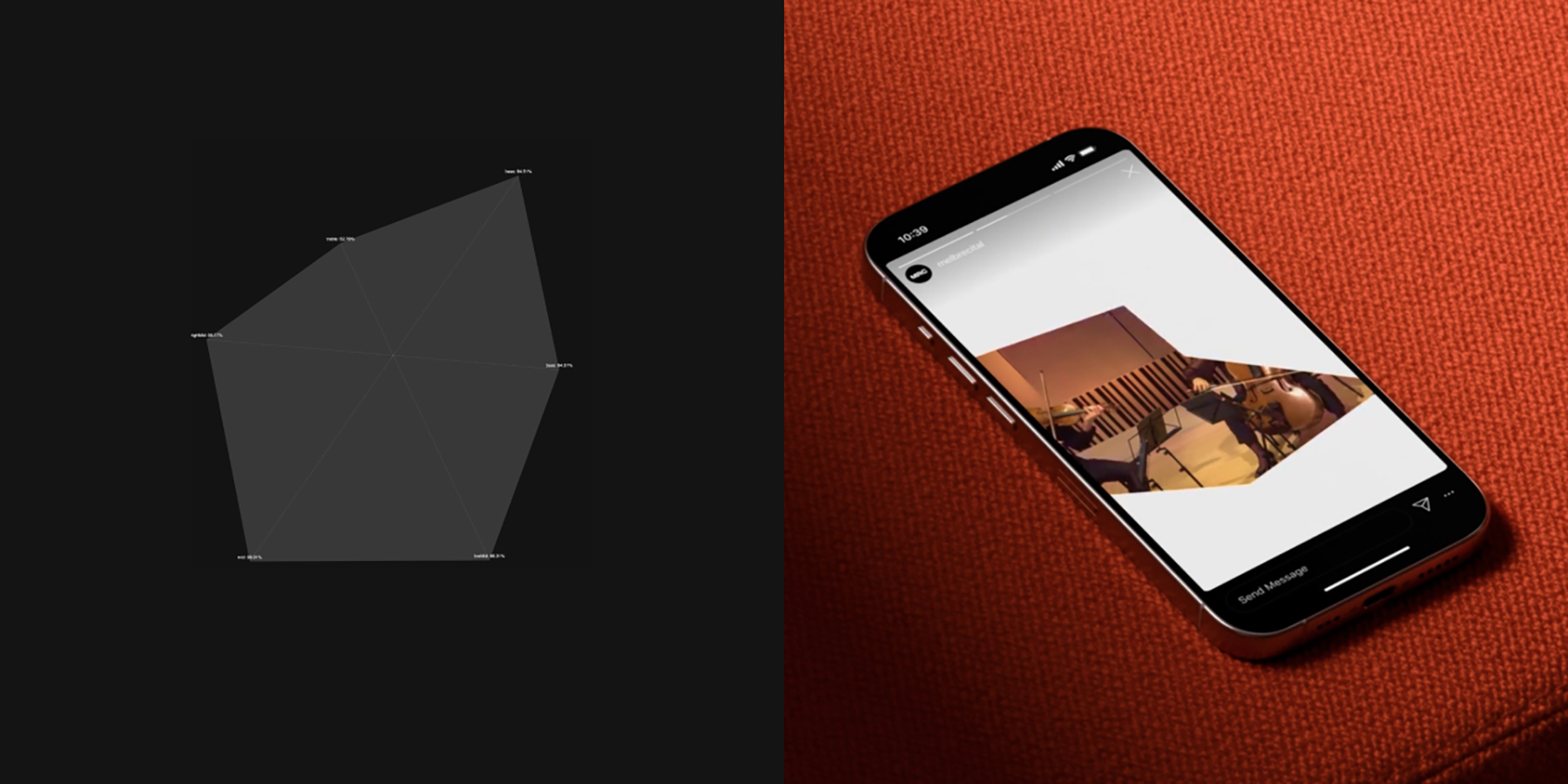
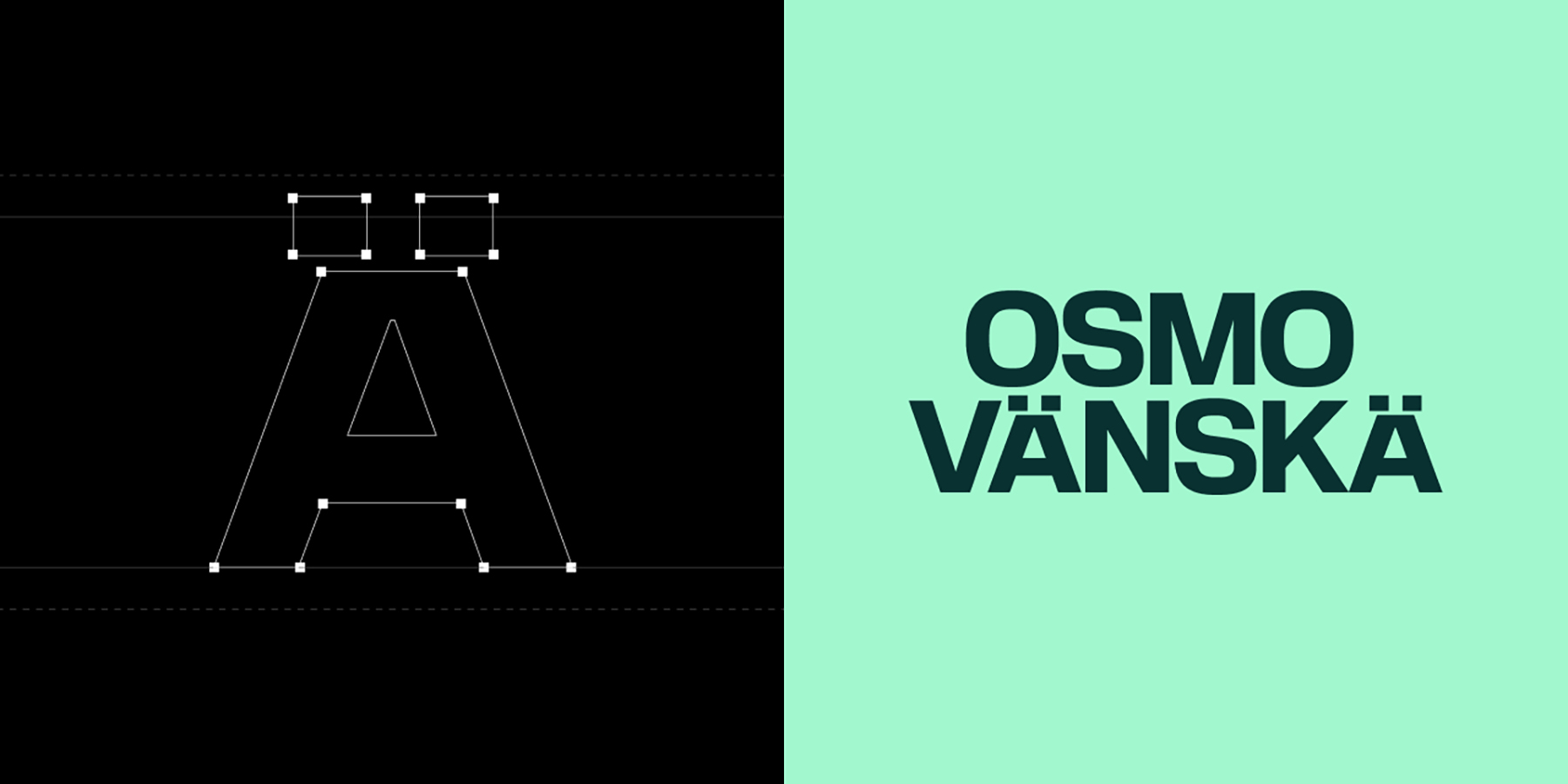
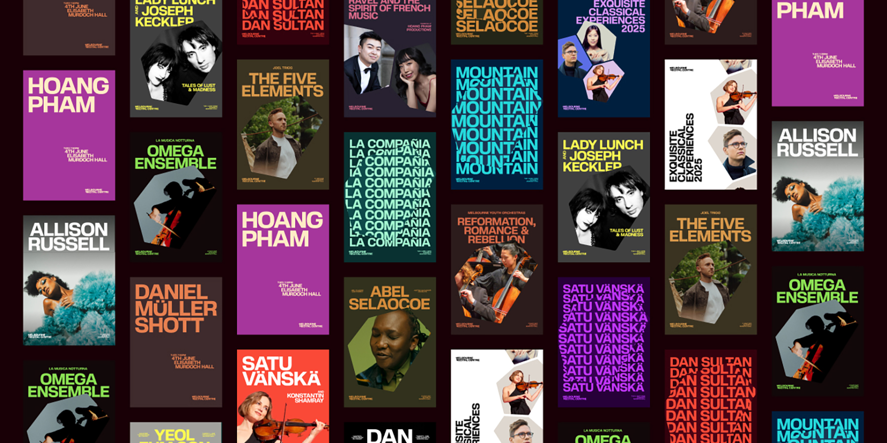
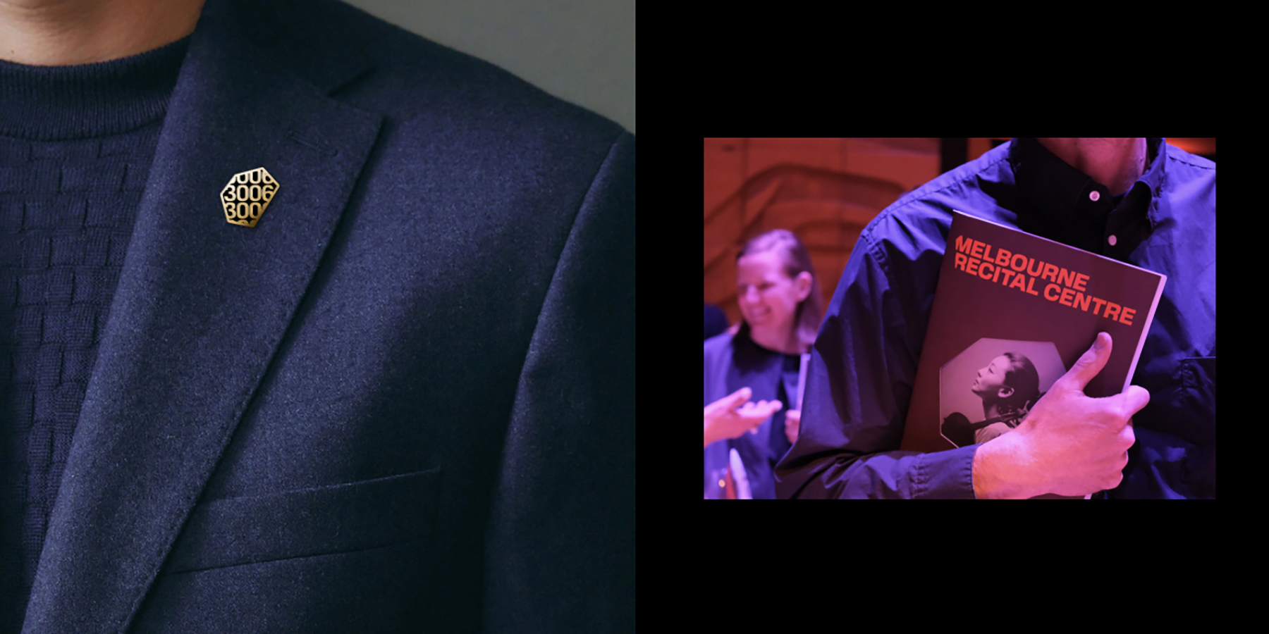
Visually, we drew inspiration from MRC’s iconic hexagonal architecture, translating it into a flexible graphic system, cropped logomark, and dynamic motion principles. A confident type system, bold colour palettes, and expressive animations give the brand energy and modernity.

To support implementation, we built a custom digital guidelines platform and a bespoke tool that generates on-brand, accessible colour combinations from performance images. This tool empowered MRC’s internal team, ensuring consistency while reducing subjectivity and production time.

The final design was applied across digital and physical touchpoints—from signage and social media to programs and posters. Motion gestures (“Focus,” “Discover,” “Immersion”) were used across campaigns to reflect sound and enhance engagement.

Through strategy, design, and innovation, the project exceeded the brief, reshaping perception, increasing audience engagement, and giving MRC a bold, future-ready identity grounded in purpose and place.

Design Excellence

The MRC rebrand sets a new benchmark for design excellence by seamlessly integrating strategic clarity, aesthetic impact, and cutting-edge technology. From the outset, technology was embedded as a core part of the design process to ensure flexibility, consistency, and creative freedom across a wide range of applications.

A standout innovation is the bespoke digital tool that generates accessible colour pairings from artist images, allowing internal teams to effortlessly produce unique, on-brand assets for each event. This approach empowers the creation of distinct posters and collateral that feel fresh and tailored, while remaining unmistakably part of the MRC family.

By automating colour selection and ensuring accessibility standards, the tool reduces production time and removes subjective guesswork, making the brand system highly usable and scalable.

Visually, the identity draws inspiration from MRC’s iconic hexagonal architecture, reinterpreted through dynamic motion design that responds to sound. This living graphic language adds depth and engagement across digital and physical channels, reinforcing MRC’s world-class acoustics and vibrant programming.

More than a refresh, this rebrand repositions MRC as a forward-thinking cultural institution, demonstrating how technology-driven, flexible design can future-proof arts branding and foster deeper, more inclusive audience engagement locally and internationally.

Design Innovation

The MRC rebrand addressed the challenge of bridging traditional and contemporary audiences with an innovative, user-centred design approach that redefined cultural branding. Central to this was the strategic narrative Music for the daring, which reframed the Centre’s identity as bold, inclusive, and adventurous, breaking away from perceptions of being “stuffy” and exclusive.

A world-first innovation was a bespoke digital tool that automatically generates cohesive, accessible colour pairings from performer images. Designed for MRC’s internal team, this tool removed guesswork from the design process, streamlining production while ensuring consistent, accessible brand application across diverse media. It empowered staff with intuitive technology tailored to their workflows, reducing time and costs without compromising quality.

Visually, the identity draws on MRC’s hexagonal architecture through a flexible graphic system combined with dynamic motion gestures—“Focus,” “Discover,” and “Immersion”—that respond in real time to music. Advanced motion design and real-time audio analysis transformed the static hexagon into an animated shape that visually reacts to sound’s rhythm, pitch, and intensity. This living graphic embodies MRC’s acoustics and programming, immersing audiences in a visual experience of sound.

The user-centred approach extended beyond audiences to internal teams, embedding accessibility and digital-first thinking to create a sustainable, scalable brand system that supports long-term growth.

In summary, this project uniquely combines strategic narrative, digital innovation, and architectural inspiration to create a living brand system. It sets a new global standard for cultural institutions, redefining how arts organisations engage audiences through design.

Design Impact

The MRC rebrand has delivered a lasting, positive impact—socially, commercially, and environmentally. By repositioning the Centre as inclusive and adventurous, the brand has helped attract broader audiences, particularly younger and first-time visitors. The strategic narrative, Music for the daring, has shaped programming, communications, and culture, making the arts more accessible and engaging for all.

Commercially, the design system and bespoke digital tool have improved internal workflows, reduced production time and cost, and ensured long-term brand consistency. Built with accessibility in mind, the tool also supports inclusive design across all communications.

Environmentally, the project reflects circular design thinking. Templates and digital assets reduce the need for printed collateral and external production, minimising waste and resource use.

The project exemplifies how purposeful, professional design can drive transformation. It elevates the role of design in cultural institutions and showcases the power of creative thinking in shaping public perception, community engagement, and organisational sustainability.

As a proudly Victorian project, it contributes to the state’s global reputation for design excellence, demonstrating how thoughtful design can strengthen institutions and enrich society for the long term.

Communication Design 2025 Finalists

Flow Power

Flow Power

Self-titled / Flow Power

Lifeblood

Lifeblood

Principals / Australian Red Cross Lifeblood

World Cancer Day

World Cancer Day

Motherbird / Richie Meldrum / UICC

Melbourne Recital Centre

Melbourne Recital Centre

Melbourne Recital Centre / Tim Kotsiakos / Ash Leech / Ben Beagley / Nicki Wright / Ben Beagley / Cinzia Kotsiakos

NCM — Signal to Noise

NCM — Signal to Noise

Commissioned by National Communication Museum / Creative Direction — Tim Kotsiakos / Design — Ben Beagley / Design — Nicki Wright / Creative Coding — Ben Beagley

Australian Gender Equality Council (AGEC) — Strategic Branding

Australian Gender Equality Council (AGEC) — Strategic Branding

Merren Spink / Anita McArthur / Cassie Brock / Elise Lampe / Letterform / Alexandrena Parker

Free Pads and Tampons. Period.

Free Pads and Tampons. Period.

Department of Families / Fairness and Housing

pitt&sherry – To Build Big, We Start Small

pitt&sherry – To Build Big, We Start Small

Mo Works / Mo Hamdouna / Andres Herrera / Clemence Vandame / Jason Posada / Lidya Hartanto / David Atchison / Tahlia Petyanszki / Lauren Toulet / pitt&sherry / David Atchison / Tahlia Petyanszki / Lauren Toulet

FLIP THE VAPE – A Community-Led Anti-Vaping Campaign

FLIP THE VAPE – A Community-Led Anti-Vaping Campaign

Mo Works / Mo Hamdouna / Tim van Irsel / Andres Herrera / Daniela AbrilJason Posada / Lidya Hartanto / Danish Khan / Victorian Aboriginal Health Service (VAHS) /Salomae Haselgrove / Lionel Austin