Finalist 2025

Lifeblood

Principals / Australian Red Cross Lifeblood

Making Lifeblood impossible to ignore: A brand strategy and a visual, voice and sonic identity refresh.

When demand for blood hit a 12-year high, Australian Red Cross Lifeblood needed more than a brand refresh. They needed a rallying cry.

We evolved their identity into something bold, human, and impossible to ignore. From strategy and storytelling to visuals and voice, we built a brand fit for a national movement — one that could flex from joyful moments to clinical ones, from first-time donors to government stakeholders.

With new brand codes, a custom sonic identity, and a voice that moves people, Lifeblood now feels as vital as its mission.

Design Brief:

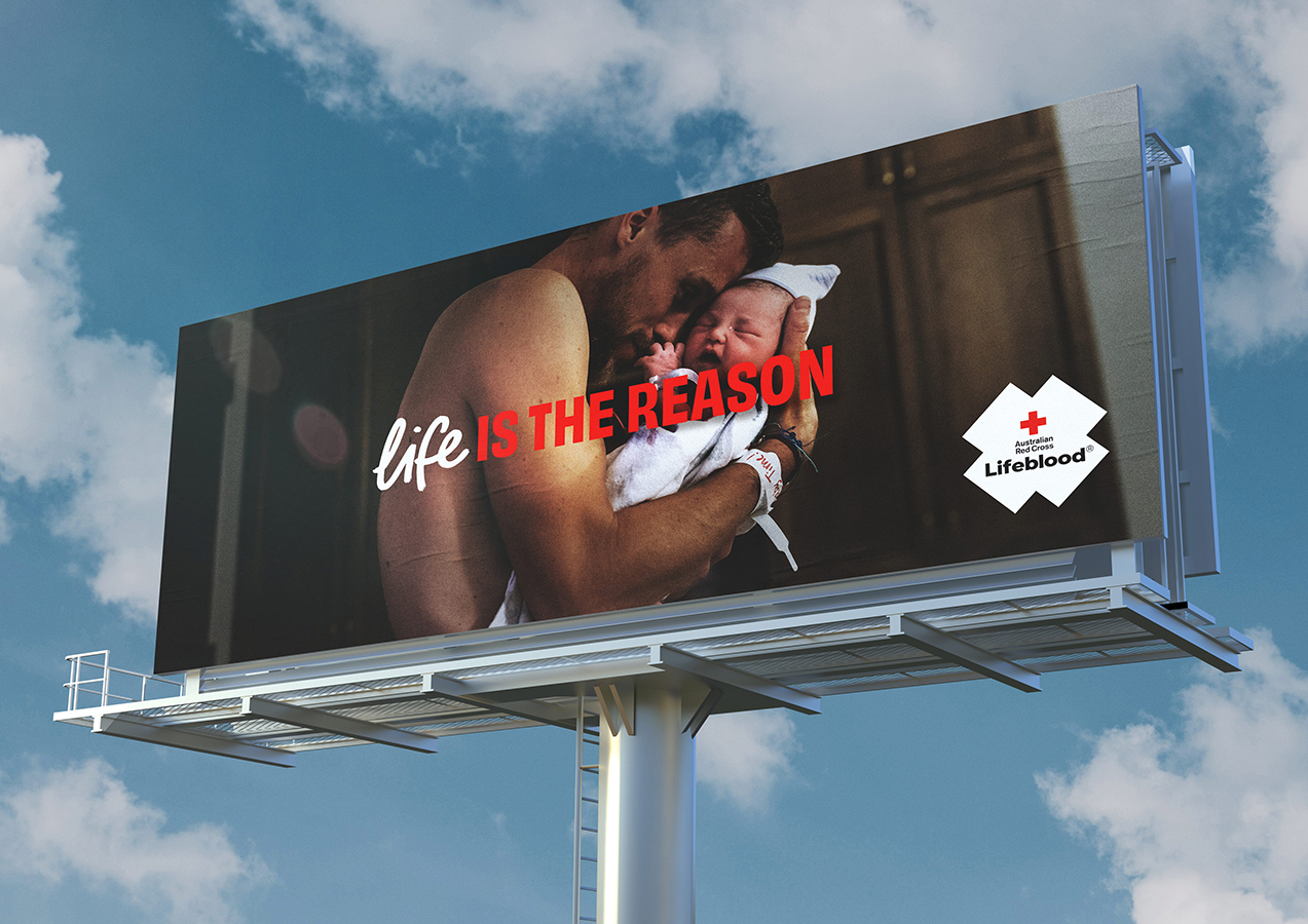
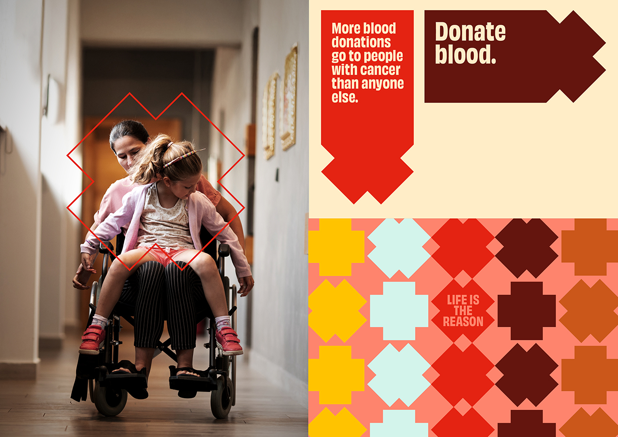
Lifeblood provides life-saving blood, plasma, transplantation, and biological products that power world-class health outcomes. But with demand at record highs and donors in short supply, the brand needed to inspire a movement.

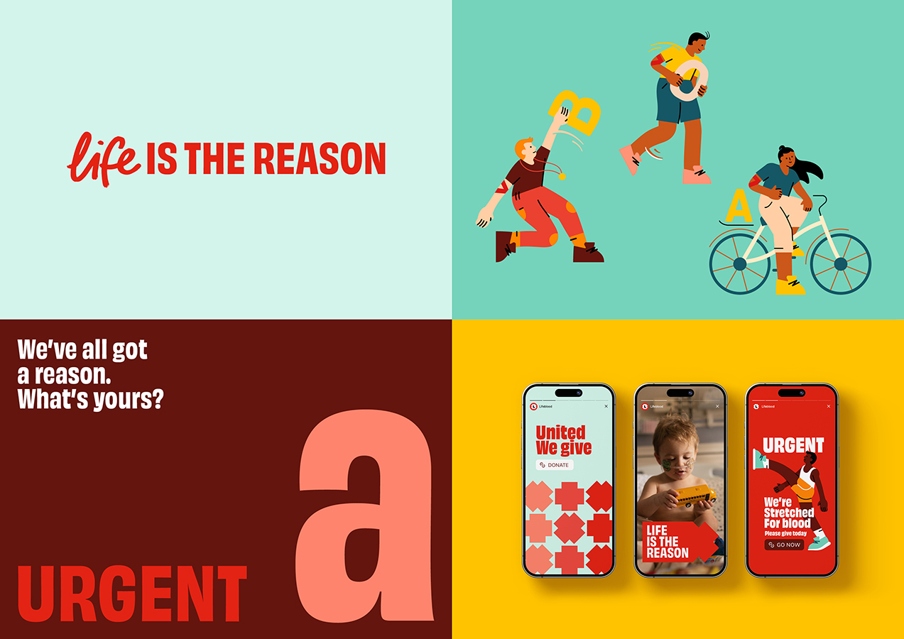
Our task was to refresh Lifeblood’s brand strategy, visual identity, voice, and sonic system in line with their 2027 goal: to spark a movement of donors. The new brand had to resonate deeply with younger and multicultural audiences, while also reinforcing Lifeblood’s position as a trusted leader in health, research, and innovation.

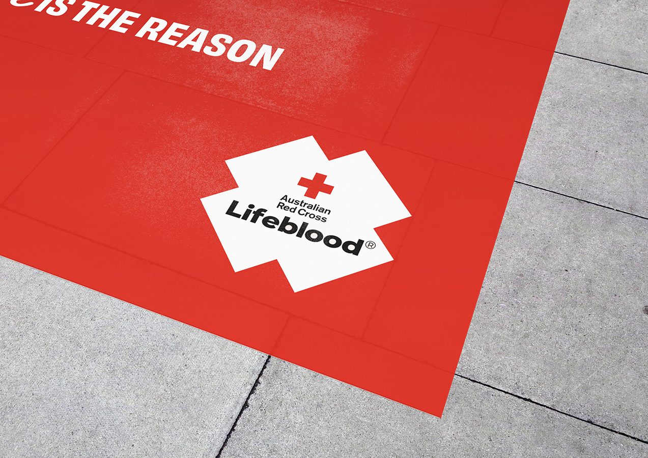
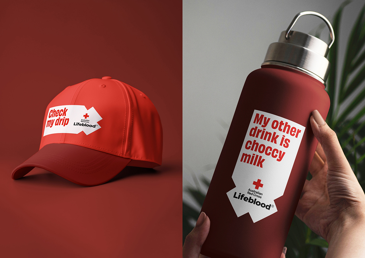
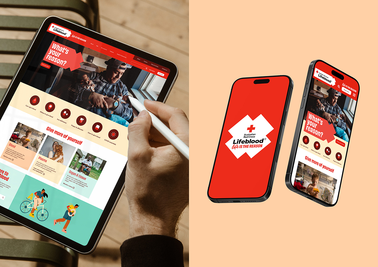
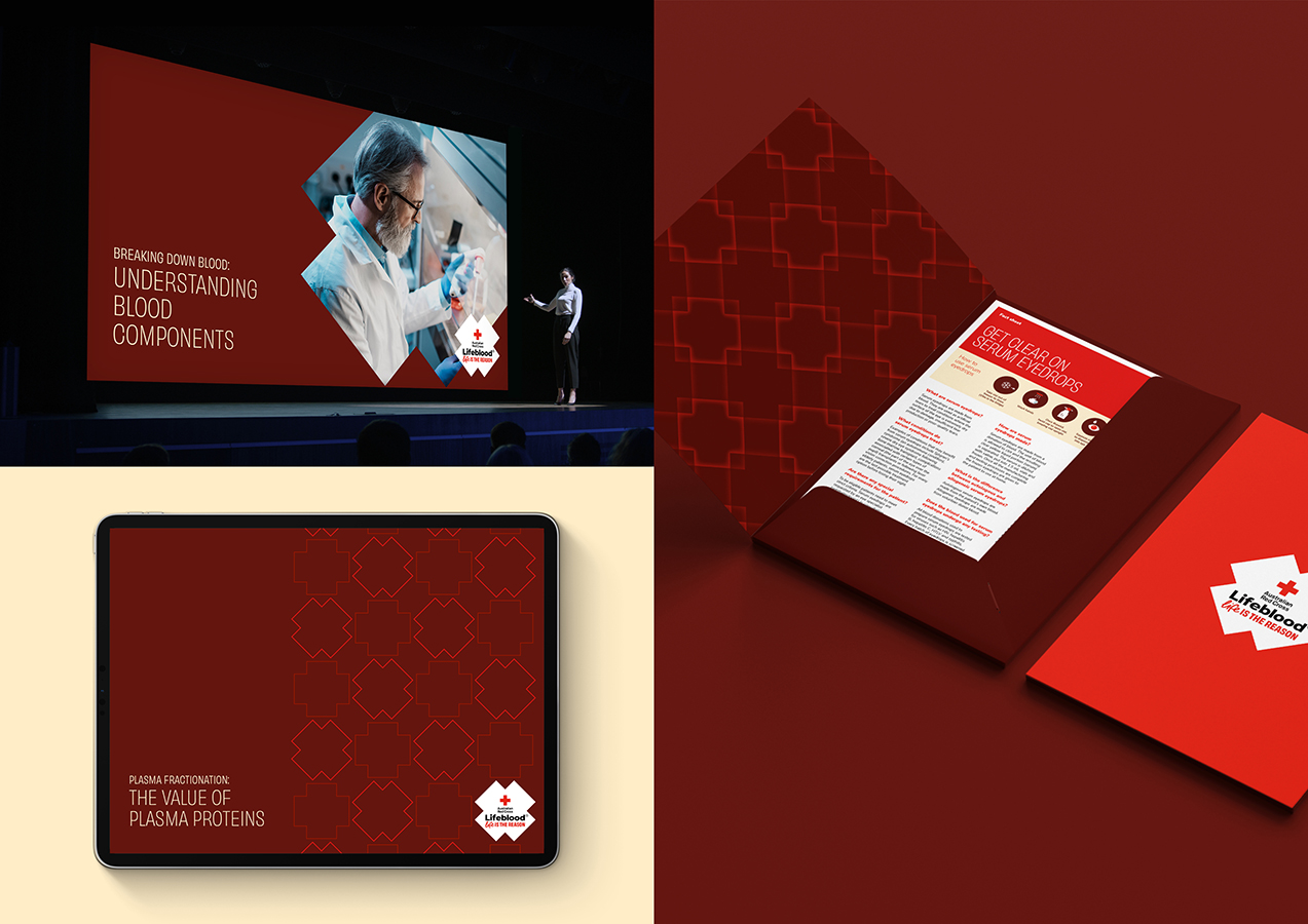
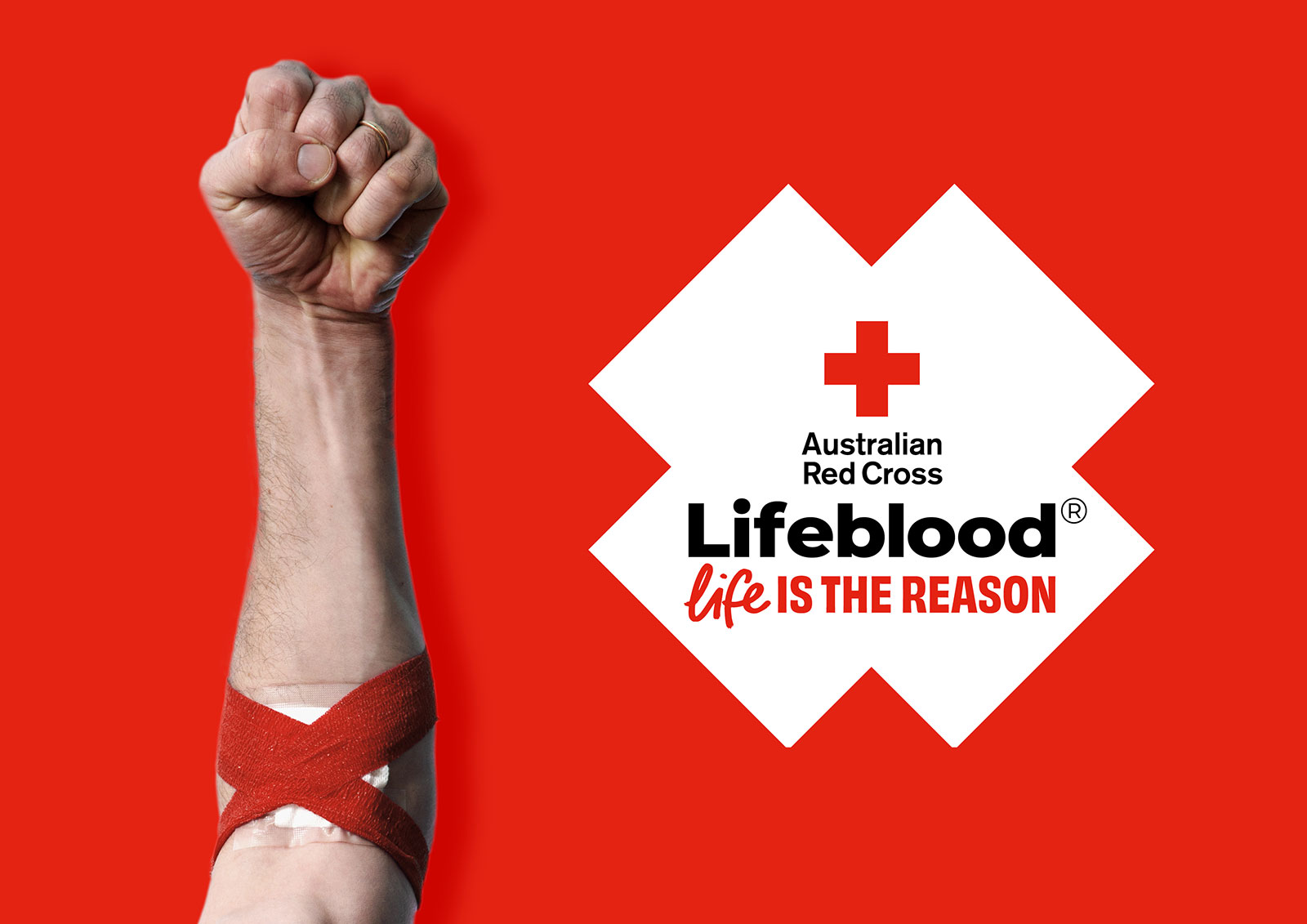
It needed to flex across everything — from playful campaigns to clinical communications, social posts to government reports — all while respecting international conventions of the Red Cross emblem and ensuring it was easy to use for internal teams.

The ask was big: build a brand full of life and make it impossible to ignore.


This project was developed by:

Design Process

We began with multi-day online community research to uncover what drives social movements and inspires action. These insights shaped a new brand positioning ‘Full of Life’ and built the brand personality traits: ‘Full of emotion’, ’Clear as’ and ‘Purpose with punch’.

With a tight budget, we took a modular approach. Rather than represent complete concepts, we developed standalone identity elements. This kept momentum high and allowed Lifeblood to shape the brand with us, reducing risk of derailment later.

At the heart of the new identity is the ‘Donation Device’. A powerful, flexible brand code drawn from the familiar shapes of bandages and the Red Cross emblem. It creates instant recognition, provides a compliant space for the emblem to appear, and can be applied easily across every channel.

To give the movement rhythm, we collaborated with sound studio Samplify to create a sonic identity. Anchored by a signature click, it’s filled with energy urgency and humanity, bringing the brand to life in a single beat.

A vibrant colour palette, inclusive illustration style and a typeface with just the right amount of quirk add warmth and character. From donor comms to stakeholder briefings, the identity flexes from playful to professional while staying unmistakably Lifeblood.

We refined the brand voice to match. Whether gut-wrenching or heart-warming, clear or convincing, it’s now a voice that moves people and drives action.

Every detail of the brand is built to connect, with the public, partners and with purpose. Lifeblood asked for a brand that would spark a movement. This one makes them impossible to ignore.

Design Excellence

The refreshed Lifeblood identity is designed to connect. Emotionally, practically and universally. It captures the full spectrum of human feeling, from urgency to optimism and reflects it back through a system that’s warm, inclusive and unmistakably full of life.

A bespoke illustration suite brings local communities to the front, with characters and scenarios that reflect real Australian diversity. An accessible colour system was developed using best-practice principles, including trios of compliant colour combinations that offer flexibility without compromising clarity.

Every element of the identity has been shaped with users in mind. The donation device provides a seamless way to house the Red Cross emblem, meeting international safety and compliance requirements. The type system is friendly and readable. And the sonic identity adds another sensory layer, creating memorable interactions across digital, physical and broadcast environments.

The process was deeply collaborative. From co-creating with Lifeblood’s in-house team to engaging local illustrators and music producers. This close partnership ensured the identity was not only powerful, but practical.

“Principals’ collaboration with our internal team, from workshopping initial inputs to crafting the finer points of the system, ensured the final identity was fit for purpose and easy to implement. It has been a game changer and an absolute pleasure working with their team”.
Alice Buda, Design Lead, Australian Red Cross Lifeblood

This is a benchmark project. Strategically driven, creatively fearless, and rooted in usability. It demonstrates the real-world value of investing in professional design, raising the bar not just for healthcare branding in Victoria, but for public sector design across Australia and beyond.

Design Innovation

The design wasn’t about invention for invention’s sake. It was about finding fresh, emotionally intelligent ways to connect, and building a brand system that moves people to act.

The sonic identity leads with quiet confidence. It begins with the sound of drips, a nod to the clinical, overlaid with finger clicks. It’s distinctive, upbeat, and universally understood as a call to action. Designed without musicality, the sound flexes across channels, with or without backing tracks. It’s instantly recognisable and deeply human. A sonic shortcut to the brand’s energy and urgency.

Photography also took a fresh approach. Lifeblood needed to strike a rare balance, capturing imagery that’s real, not raw. We introduced a photojournalistic style that captures the lived experiences of donors and recipients, exploring the full spectrum of emotion, from joy to vulnerability, without tipping into discomfort.

We built a framework around four key themes: life, blood, birth, and cancer. This became a practical lens for co-creating content and emotional guardrails with Lifeblood, to ensure the images always feel truthful, grounded and in tune with the brand’s optimism.

These design innovations put people at the centre. The details may seem subtle, but together they create a brand that feels original, emotionally attuned and impossible to ignore. Designed with empathy, built to inspire action and crafted for real world use, Lifeblood’s identity redefines how movement brands show up in public life.

Design Impact

Lifeblood’s refreshed identity is bold, human, and purpose-built, helping to shift the brand from service provider to movement leader.

Since launch in September 2024, its impact has been felt across the system. During the Life is the Reason campaign period, brand tracking showed a measurable lift in motivation to donate, increased trust in Lifeblood, and stronger belief in the importance of blood donation. Positive sentiment towards the brand has continued to grow throughout the campaign.

The brand system’s flexibility means it connects across society, speaking with warmth and urgency to attract new donors, while also commanding credibility in health, research and government. The Donation Device, brought to life in M&C Saatchi’s national campaign, is already a distinctive marker of the movement. Building recognition and emotional connection wherever it appears.

This is design that proves its value, driving behavioural change, strengthening public health outcomes, and helping Lifeblood plan for long-term supply and future challenges.

Lifeblood has set a new standard for how public sector brands can show up – engaging communities, inspiring action, and communicating purpose with confidence.

Strategically sharp and creatively fearless, this project reflects the best of Victoria’s design culture and shows the global potential of people-first branding, built with craft, collaboration and care.

Circular / Sustainability Criteria

The Lifeblood brand is inherently circular. A flexible, digital-first system that enables in-house teams to produce campaign and content materials without ongoing external resourcing.

The Donation Device is a consistent, low-impact design asset. It cuts down on complex applications and streamlines production across formats. The sonic identity reduces reliance on costly bespoke compositions, offering a recognisable, repeatable sound asset that can be applied anywhere, anytime.

This is sustainable design in action. Built to last, easy to apply, and powerful across all channels.

And by investing in human-centred design, Lifeblood has created a brand that will deliver long-term value to society, our health system, and the economy.

It sets a new benchmark and contributes meaningfully to Victoria’s global reputation for strategic, sustainable and emotionally intelligent design.

Communication Design 2025 Finalists

Flow Power

Flow Power

Self-titled / Flow Power

Lifeblood

Lifeblood

Principals / Australian Red Cross Lifeblood

World Cancer Day

World Cancer Day

Motherbird / Richie Meldrum / UICC

Melbourne Recital Centre

Melbourne Recital Centre

Melbourne Recital Centre / Tim Kotsiakos / Ash Leech / Ben Beagley / Nicki Wright / Ben Beagley / Cinzia Kotsiakos

NCM — Signal to Noise

NCM — Signal to Noise

Commissioned by National Communication Museum / Creative Direction — Tim Kotsiakos / Design — Ben Beagley / Design — Nicki Wright / Creative Coding — Ben Beagley

Australian Gender Equality Council (AGEC) — Strategic Branding

Australian Gender Equality Council (AGEC) — Strategic Branding

Merren Spink / Anita McArthur / Cassie Brock / Elise Lampe / Letterform / Alexandrena Parker

Free Pads and Tampons. Period.

Free Pads and Tampons. Period.

Department of Families / Fairness and Housing

pitt&sherry – To Build Big, We Start Small

pitt&sherry – To Build Big, We Start Small

Mo Works / Mo Hamdouna / Andres Herrera / Clemence Vandame / Jason Posada / Lidya Hartanto / David Atchison / Tahlia Petyanszki / Lauren Toulet / pitt&sherry / David Atchison / Tahlia Petyanszki / Lauren Toulet

FLIP THE VAPE – A Community-Led Anti-Vaping Campaign

FLIP THE VAPE – A Community-Led Anti-Vaping Campaign

Mo Works / Mo Hamdouna / Tim van Irsel / Andres Herrera / Daniela AbrilJason Posada / Lidya Hartanto / Danish Khan / Victorian Aboriginal Health Service (VAHS) /Salomae Haselgrove / Lionel Austin