Finalist 2025

Free Pads and Tampons. Period.

Department of Families / Fairness and Housing

One in five Victorians report being unable to afford the period products they need every month.

Free Pads and Tampons. Period. is a communication campaign to promote the Victorian Government’s initiative to bring free menstrual products to all Victorians who need them.

This was a design campaign that involved product packaging, outdoor advertising, vending machines, social media, websites, and more.

It was about delivering a bold initiative in the most confident, accessible, and eye-catching way, stripping away the shame of menstruation and period poverty.

Design Brief:

We designed a campaign around a powerful concept: Pads and tampons aren’t a luxury. Period.

Since launching the campaign in November 2024, Victorians have accessed more than 60,000 free packs of pads and tampons. This campaign offers free period products across 700 sites in Victoria in 1,500 vending machines — from the MCG to community centres and hospitals.

The design of the campaign had to be captivating and bold — like the concept of free period products — and it had to be accessible for people from all parts of the Victorian community, but especially marginalised groups who experience ‘period poverty’.

It had to be direct, loud, confident, and unequivocal. This aimed to remove shame and stigma around menstruation and period poverty.

The design was to be applied across outdoor advertising like billboards to tampon box packaging. The campaign was developed entirely in-house, creating new opportunities and making the process efficient, collaborative, and cost-effective.


This project was developed by:

  • Department of Families, Fairness and Housing

Design Process

Our design process took several months, from the research phase to working with international product suppliers and vending machine companies. We reviewed similar campaigns from around the world. We involved stakeholders and community members, incorporating their feedback to ensure we agreed on the best direction.

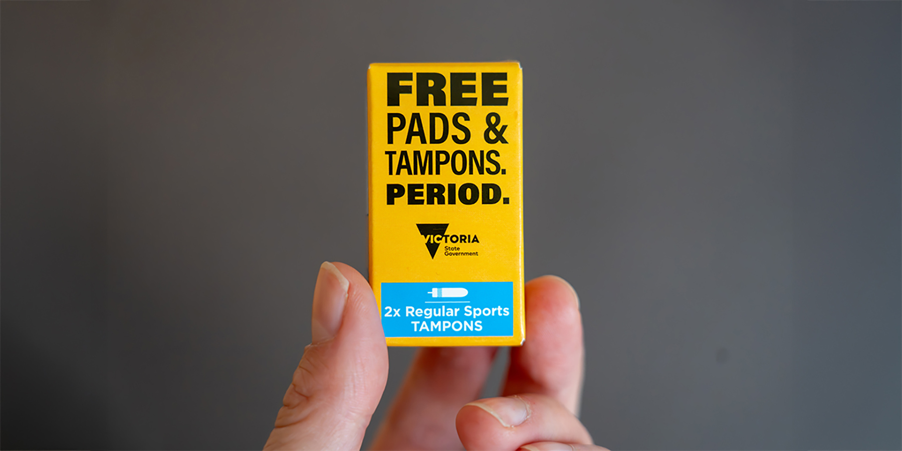
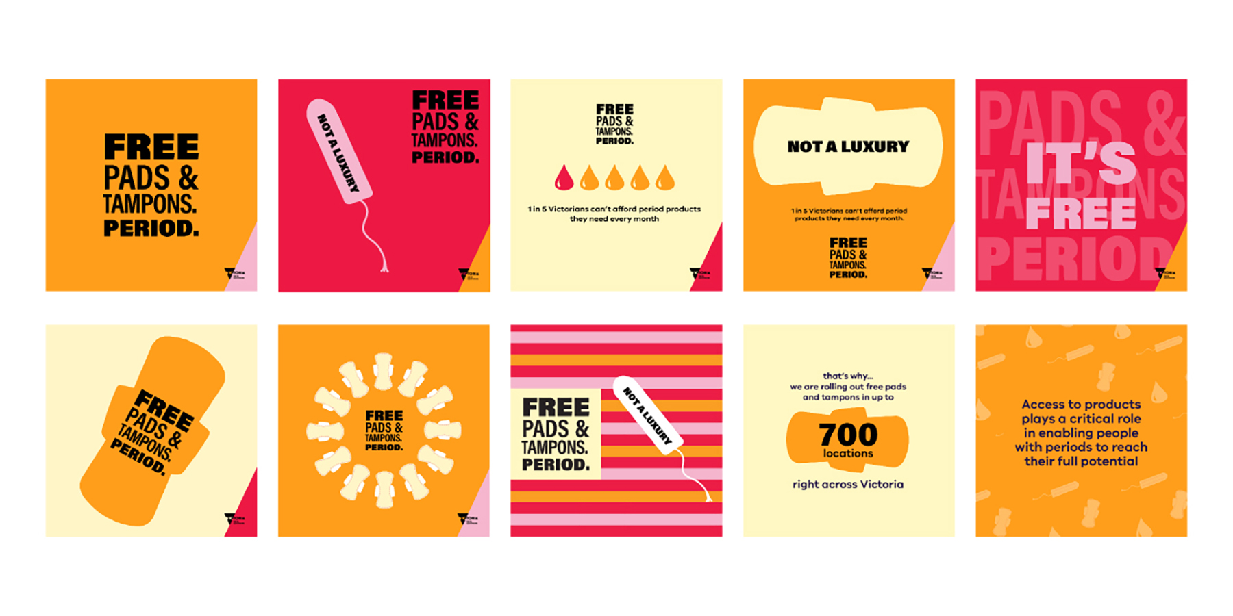
Concept development was next. To meet the brief, the designs were bold, using bright high-contrast colours and large fonts to make the message pop. We built our campaign around the tagline ‘Free Pads and Tampons. Period.’ This wordmark needed to be scalable, and we designed mock-ups on miniature tampon boxes and billboards. Then, we showed stakeholders, who provided constructive feedback, such as ensuring our colour palette was rooted in real colours of menstruation – reds, pinks, and oranges. We didn’t want to shy away from this and felt it was a strong message to convey.

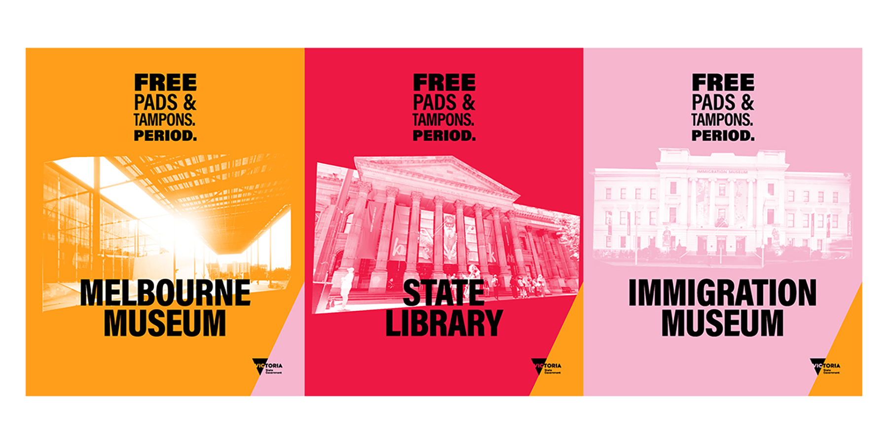
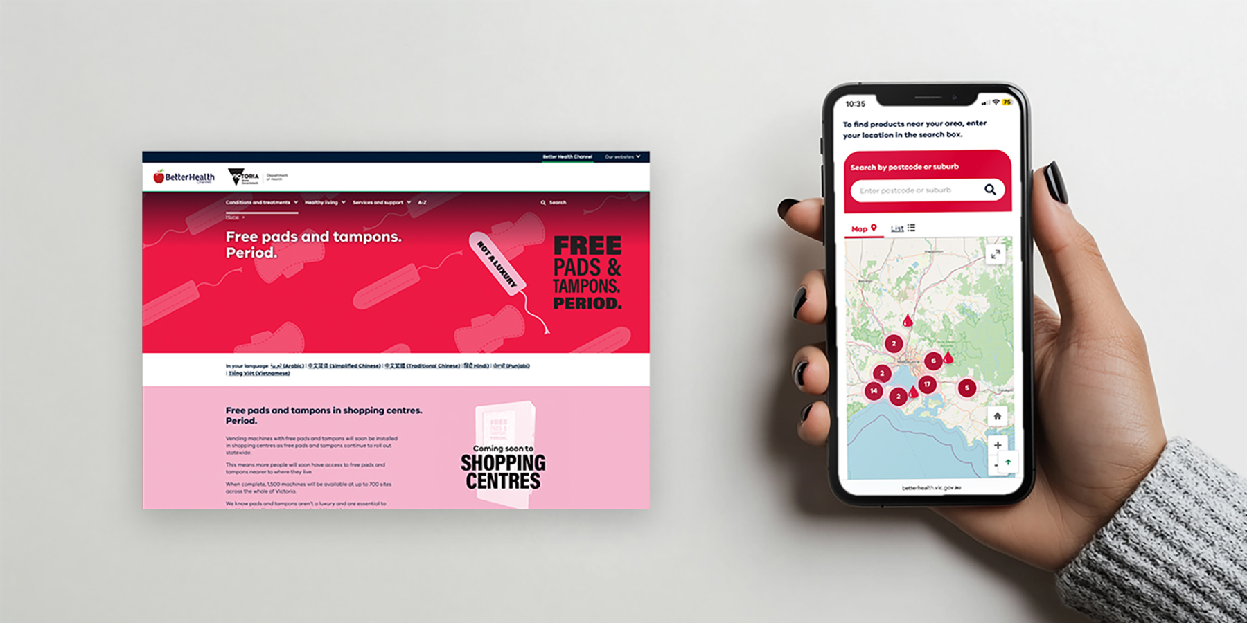
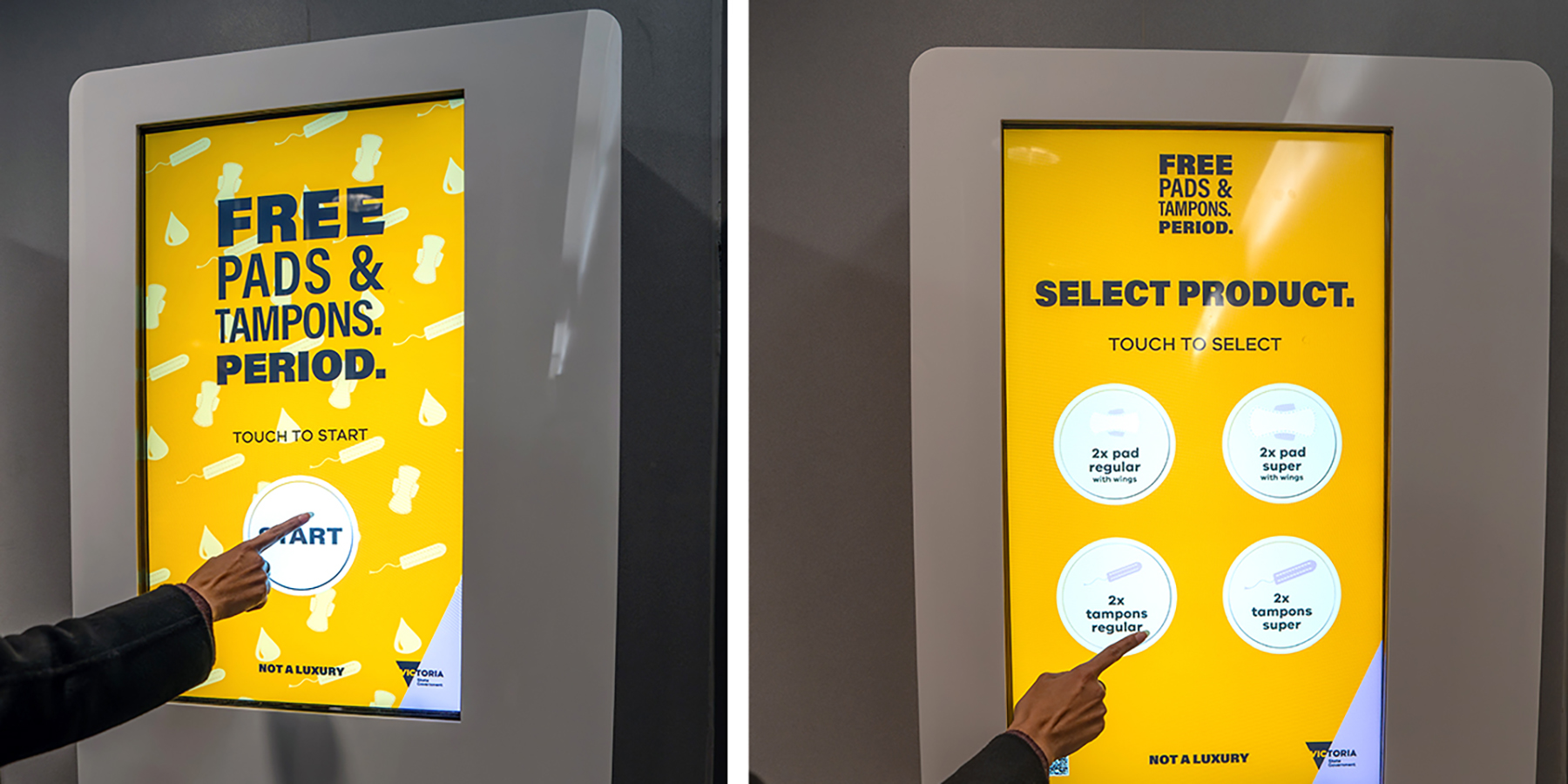
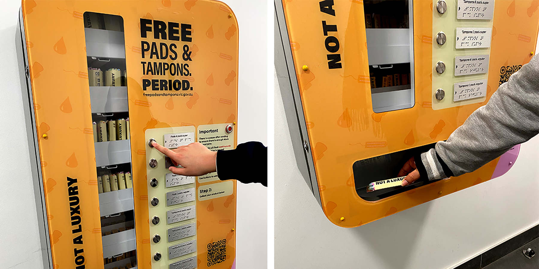
Once the concept was approved, we rolled it out across a wide range of materials: vending machines, packaging, posters, social media, website banners, and more. We worked with suppliers to send packaging designs overseas, where 100,000 units were printed. We also created touchscreen vending machine animations and a different accessibility machine that has braille instead of a touchscreen, with at least one accessible machine per site.

The campaign was launched in phases: first, a test phase of 50 machines was launched at the State Library with the Minister for Women. This allowed for user testing of the vending machines and further tweaks, followed by a broader public rollout at sites across Victoria.

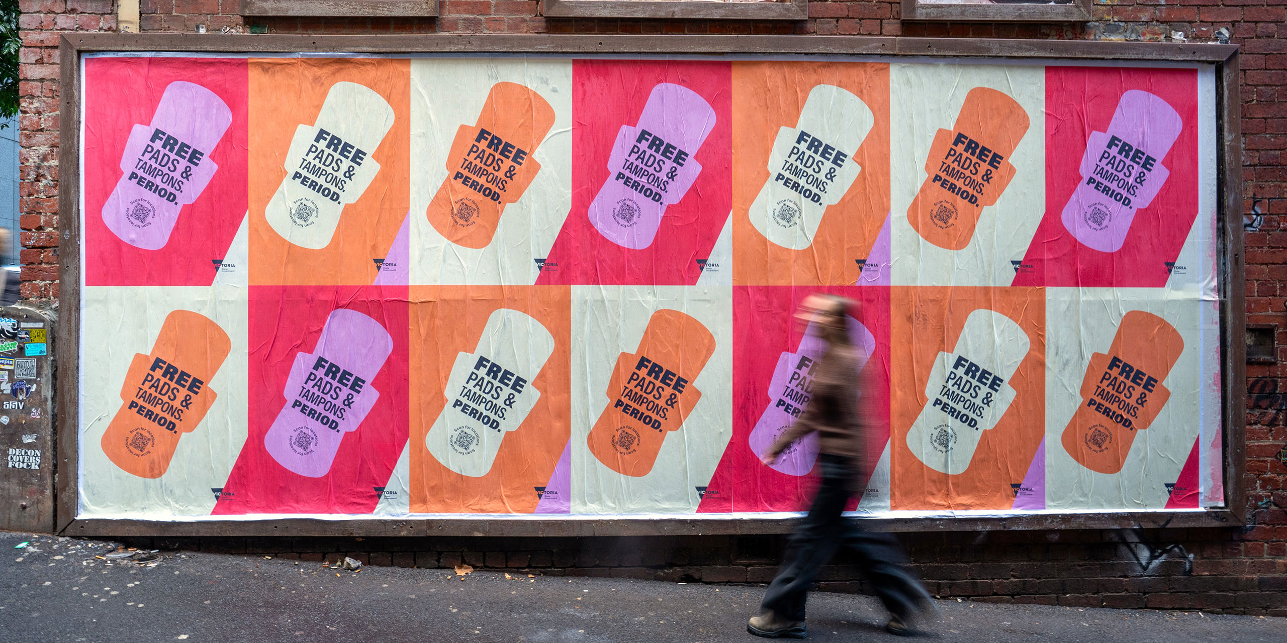
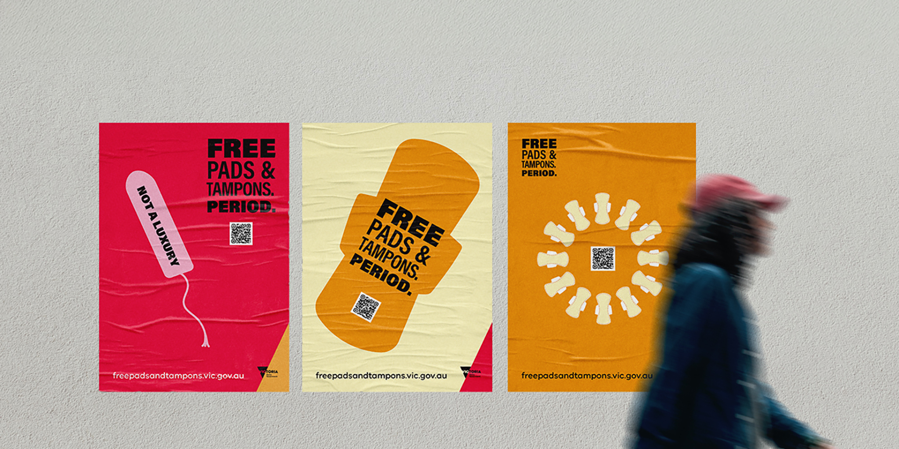
When the campaign went public, we developed street posters that plastered pads and tampons across Victorian walls, hitting another campaign objective of normalising periods. These posters used striking repetition and were designed to be rolled out in grids. We also produced animated reels for social media to improve awareness and engagement.

Design Excellence

This project sets a new benchmark for public health design in Victoria. It showed how bold, inclusive, and professional design can help break down stigma and promote health equity in spaces across the entire state.

This campaign has the user experience at its heart, as we were delivering awareness and a product people could access across Victoria. We made sure we considered the full user journey — from using the interactive online maps to find the nearest vending machines, to obtaining products using the touchscreen, or reporting technical issues with QR codes.

The entire design process was created with accessibility at the forefront. We designed for machines with braille, translated our websites into multiple languages, and made sure the designs were impactful at both small and large scales. Sustainability was considered, and the outer packaging of the products uses cardboard instead of plastic.

Our target audience was broad and included people of all ages, backgrounds, and gender identities who menstruate, so it was essential the design didn’t exclude anyone. We chose gender-neutral colours and avoided stereotypical imagery often seen in menstrual product marketing. Instead, we focused on clear, confident design that spoke to everyone with respect and without embarrassment.

We used key design principles like hierarchy, contrast, alignment, and consistency to make sure each asset felt cohesive and polished across all formats. We created an online stakeholder pack for venues stocking the products, with downloadable tools like posters and social media posts so they could direct users and promote the campaign in their own spaces.

This campaign was made possible by cross-government collaboration. While hard to quantify, we estimate that we saved up to $250k through our professional in-house design team who delivered all of our branding, assets, packaging, and a purpose-built website.

Design Innovation

This project tackled a real problem: addressing period poverty by providing free menstrual products in public places and challenging the stigma that still surrounds periods. Our goal was to flip that — to create a bold, visible campaign that made period products feel normal, accessible, and easy to find.

We used a specific colour palette (reds, oranges, pinks) that draws on the menstruation process and evokes bodily functions, without being too explicit or gendered. It was important to be inclusive of all Victorians who bleed.

The design uses bold, direct silhouettes of menstrual products rather than hiding behind outdated, overly feminine imagery often seen in traditional period product branding. This was a deliberate and innovative choice to challenge the stigma around periods and make the products feel normal, visible, and unashamed.

We also went bold and public with a major outdoor advertising campaign using a grid-like repetitive structure with multiple posters to draw attention to the campaign.

The campaign helped users through the entire process of accessing these products. We developed a mobile-friendly interactive map to help users easily find locations, particularly those without a computer. This practical tool addressed access needs of vulnerable communities. This includes public housing residents, a target cohort of which 25 per cent have access to only a mobile phone.

Most major government campaigns of this size are outsourced to external design agencies, so keeping it in-house with our small but professional design team created new opportunities to work collaboratively with the program areas and allowed for faster feedback and better alignment with project goals.

Design Impact

We translated all campaign materials into six key languages — Arabic, Simplified and Traditional Chinese, Hindi, Punjabi, and Vietnamese.

We also proudly partnered with Affinity Outdoor — a female-led company with a 90% women workforce — to design and build the pad and tampon machines, and worked with disability support organisation Cape Solutions to help us repackage the free pad packs. These strategic, values-driven partnerships amplified reach, removed barriers, and embedded equity into every layer of delivery — building real public value and deep community impact.

At the regional launch of the Free Pads and Tampons initiative in May this year, we heard from the Manager of Student Support Services at TAFE Gippsland. She shared the importance of the initiative in removing real barriers to education that her students experience.

By making pads and tampons more visible and discussed in the community, people who menstruate are not limited in their participation in social and civil aspects of their lives due to lack of period products. Now, with over 60,000 period packs accessed since our test campaign launched in November, we have removed barriers to these essential products and made vital steps towards gender equity.

We’ve changed the conversation around periods on our social media and with our public campaign, removed shame and stigma by leaning into bold design and colours, and improved access to a basic health necessity.

The program aims to create a social impact where barriers to accessing pads and tampons are removed and menstruation and period products are normalised. In achieving this, there is potential for it to contribute to a broader social impact where:

  • People who menstruate have improved psychosocial wellbeing, physical, and sexual health.
  • Menstruation is no longer a barrier to social and civil life (employment and sport).
  • Period products are consistently provided as an essential product in washrooms.

Communication Design 2025 Finalists

Flow Power

Flow Power

Self-titled / Flow Power

Lifeblood

Lifeblood

Principals / Australian Red Cross Lifeblood

World Cancer Day

World Cancer Day

Motherbird / Richie Meldrum / UICC

Melbourne Recital Centre

Melbourne Recital Centre

Melbourne Recital Centre / Tim Kotsiakos / Ash Leech / Ben Beagley / Nicki Wright / Ben Beagley / Cinzia Kotsiakos

NCM — Signal to Noise

NCM — Signal to Noise

Commissioned by National Communication Museum / Creative Direction — Tim Kotsiakos / Design — Ben Beagley / Design — Nicki Wright / Creative Coding — Ben Beagley

Australian Gender Equality Council (AGEC) — Strategic Branding

Australian Gender Equality Council (AGEC) — Strategic Branding

Merren Spink / Anita McArthur / Cassie Brock / Elise Lampe / Letterform / Alexandrena Parker

Free Pads and Tampons. Period.

Free Pads and Tampons. Period.

Department of Families / Fairness and Housing

pitt&sherry – To Build Big, We Start Small

pitt&sherry – To Build Big, We Start Small

Mo Works / Mo Hamdouna / Andres Herrera / Clemence Vandame / Jason Posada / Lidya Hartanto / David Atchison / Tahlia Petyanszki / Lauren Toulet / pitt&sherry / David Atchison / Tahlia Petyanszki / Lauren Toulet

FLIP THE VAPE – A Community-Led Anti-Vaping Campaign

FLIP THE VAPE – A Community-Led Anti-Vaping Campaign

Mo Works / Mo Hamdouna / Tim van Irsel / Andres Herrera / Daniela AbrilJason Posada / Lidya Hartanto / Danish Khan / Victorian Aboriginal Health Service (VAHS) /Salomae Haselgrove / Lionel Austin