Finalist 2025

Flow Power

Self-titled / Flow Power

Brand strategy and visual identity for the residential arm of Flow Power, a renewable energy generator, advisor and retailer.

Flow Power is an Australian renewable energy generator, advisor and retailer. With over 30 years of experience in the commercial and industrial sector, it provides power to clients like the City of Sydney and the Sydney Opera House.

Self-titled worked collaboratively with Flow Power to create a visual identity for their residential brand and to launch a new offer — one that gives discounts to customers who use energy when prices are lower and renewables plentiful in the grid.

The brand cuts through a sea of greenwashing and jargon, to resonate with an audience that has historically been price-driven.

Design Brief:

Although Australia must transition to 100% renewable energy, electricity production remains one of the largest contributors to carbon emissions. Limited solutions and poor understanding of the energy market leave Australians unable to make energy choices that reduce cost and carbon.

Flow Power has entered the residential energy market with an innovative new offer — one that gives discounts to customers who use energy when prices are lower and renewables plentiful in the grid.

The problem we were asked to solve was how to create a brand which had a strong link to the existing commercial brand and explained the myriad benefits of a complex offer in a way that was relevant and compelling to an audience that is time-poor and price-sensitive.

The intended outcome was expected to grow the customer base in the pilot state of Victoria.


This project was developed by:

Design Process

The design process for Flow Power’s new residential brand began with an audit of the existing commercial and industrial brand and communications. This was supported by research examining the industry as a whole, including Flow Power’s competitors, and by workshops with members of the leadership team and various stakeholders across the company.

Through these workshops, we collectively defined Flow Power’s key points of difference, value proposition, and Self-truth® (brand idea) – ‘Empower’. This speaks to the way that Flow Power ‘empowers’ their customers to make better energy choices through energy education, innovative technology, renewable energy generation, and habit-based incentives.

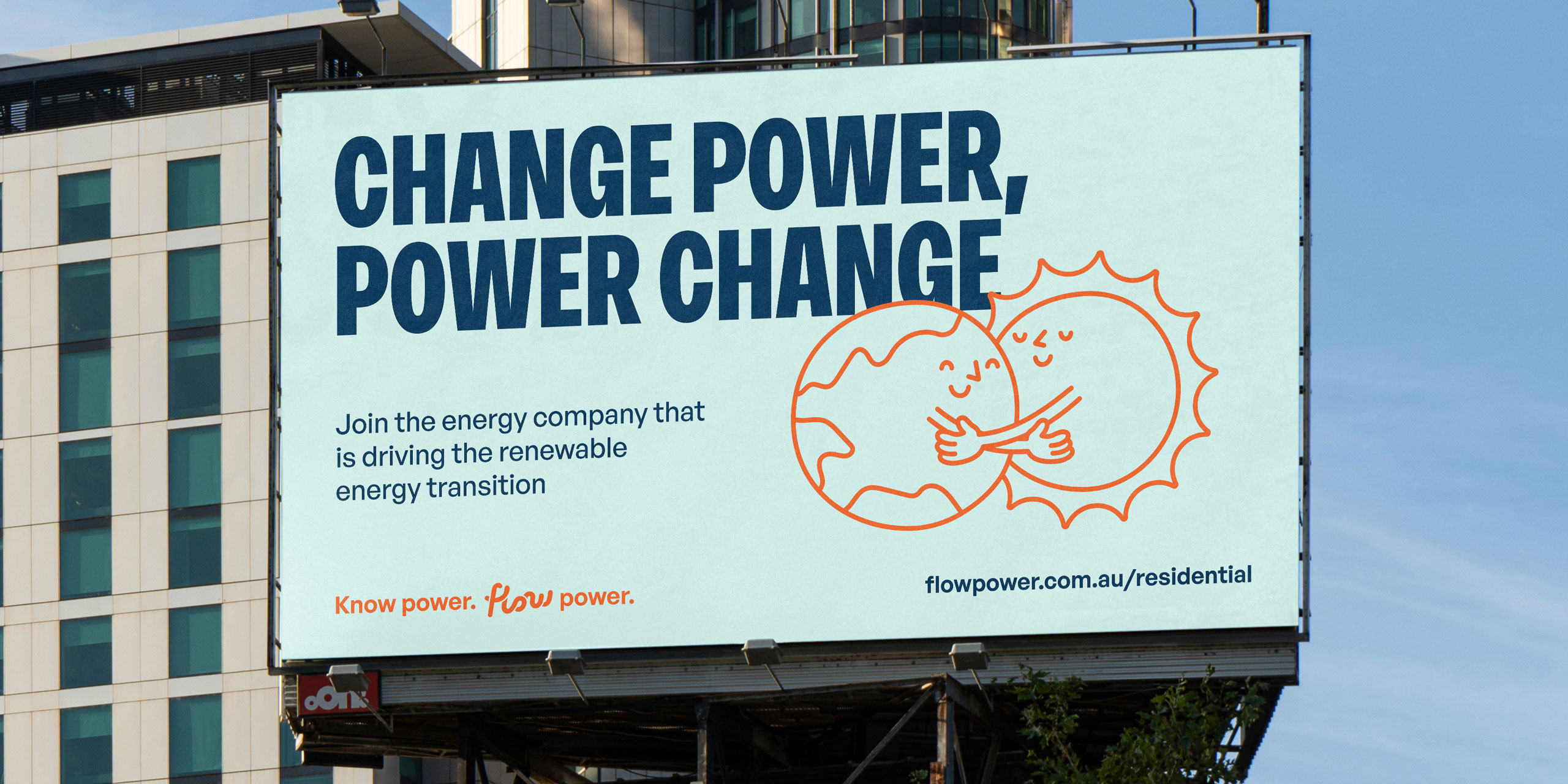
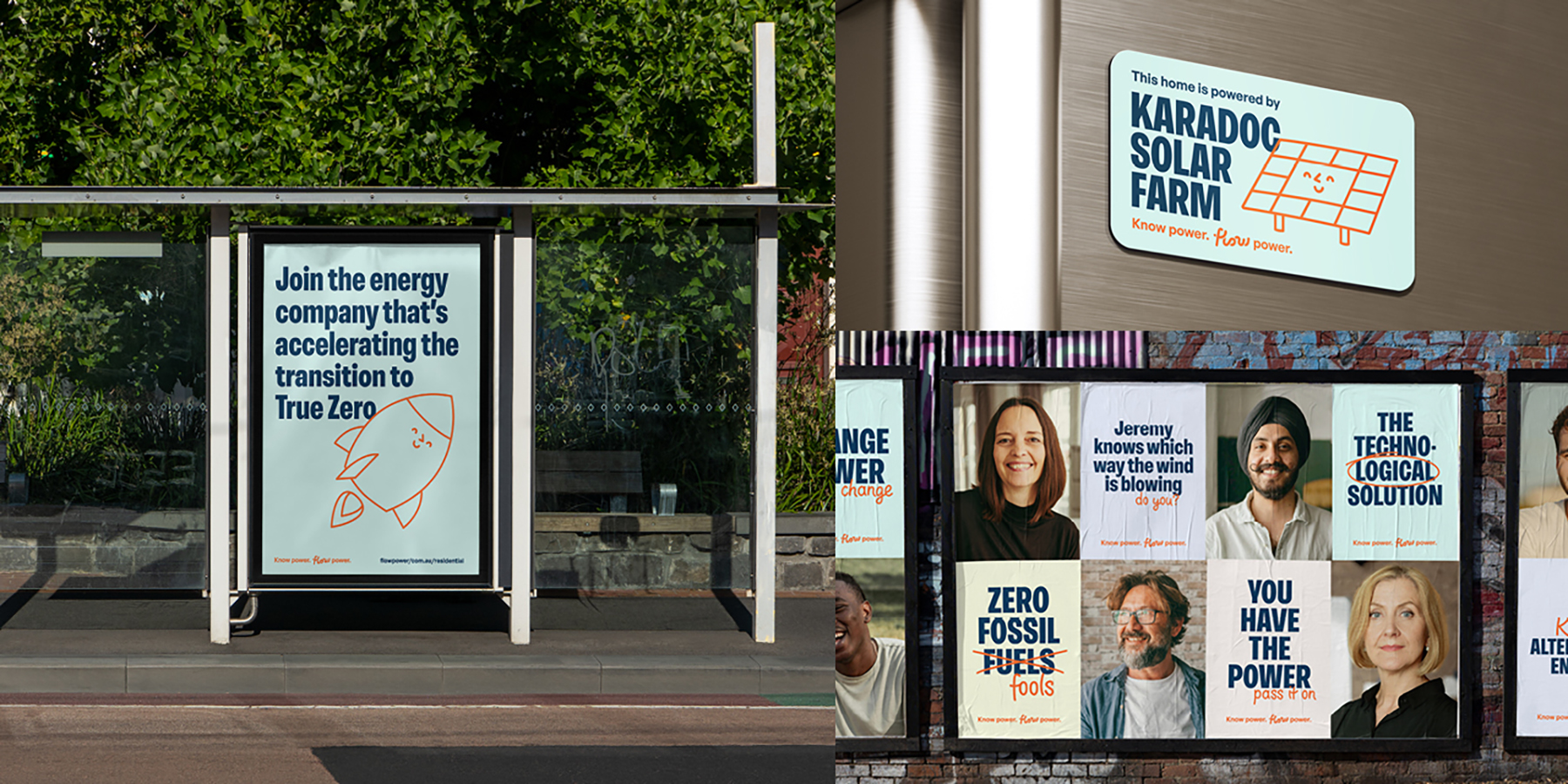
On this strategic base, we created a brand system that could speak to everyday Australians in language they could understand. The brand communicates Flow Power’s deep expertise and initiatives, while also letting customers know how these benefit them.

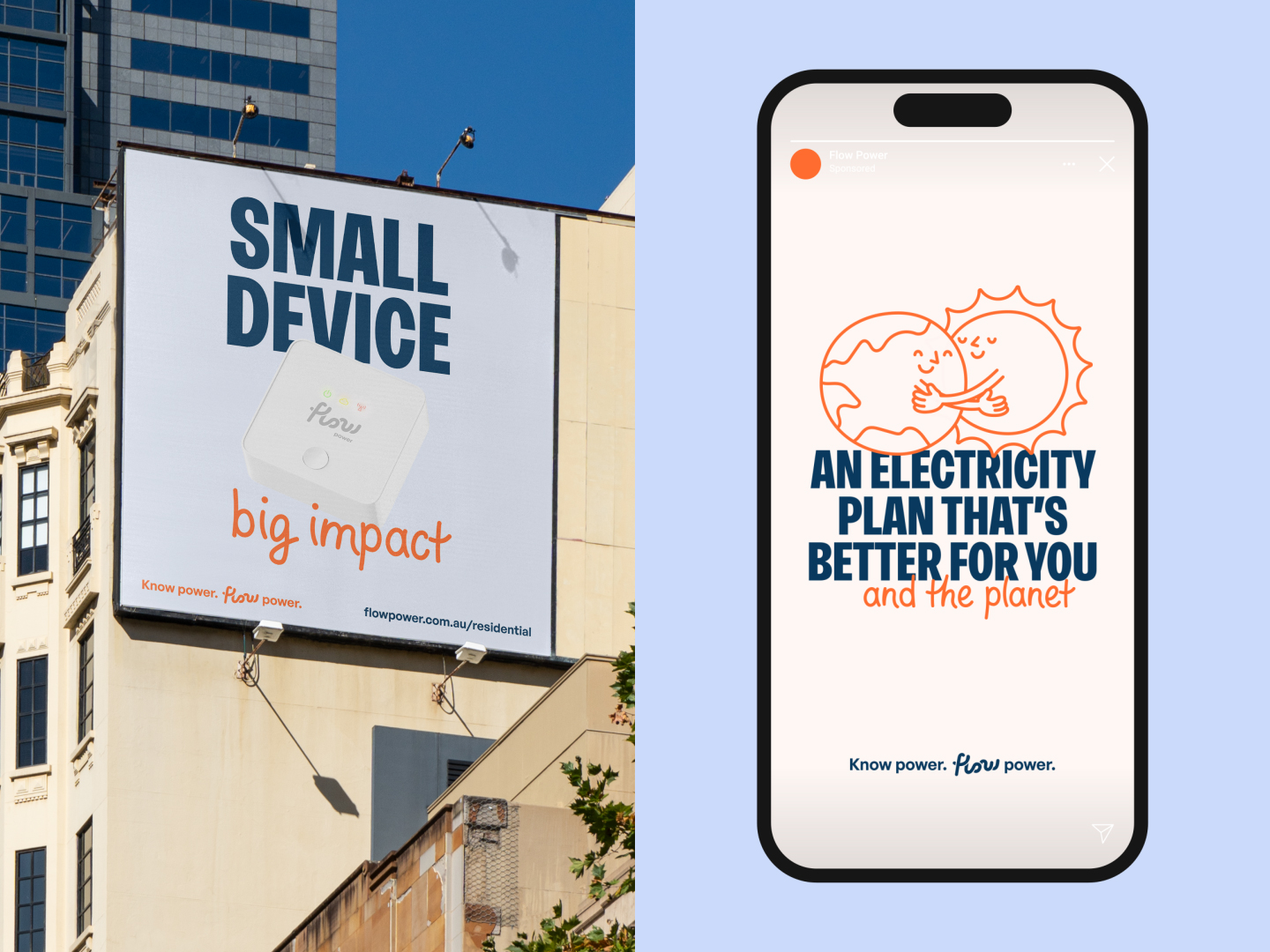
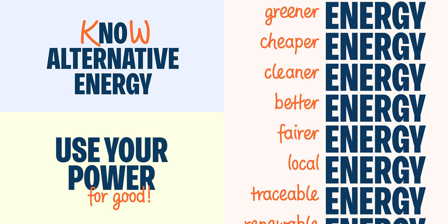
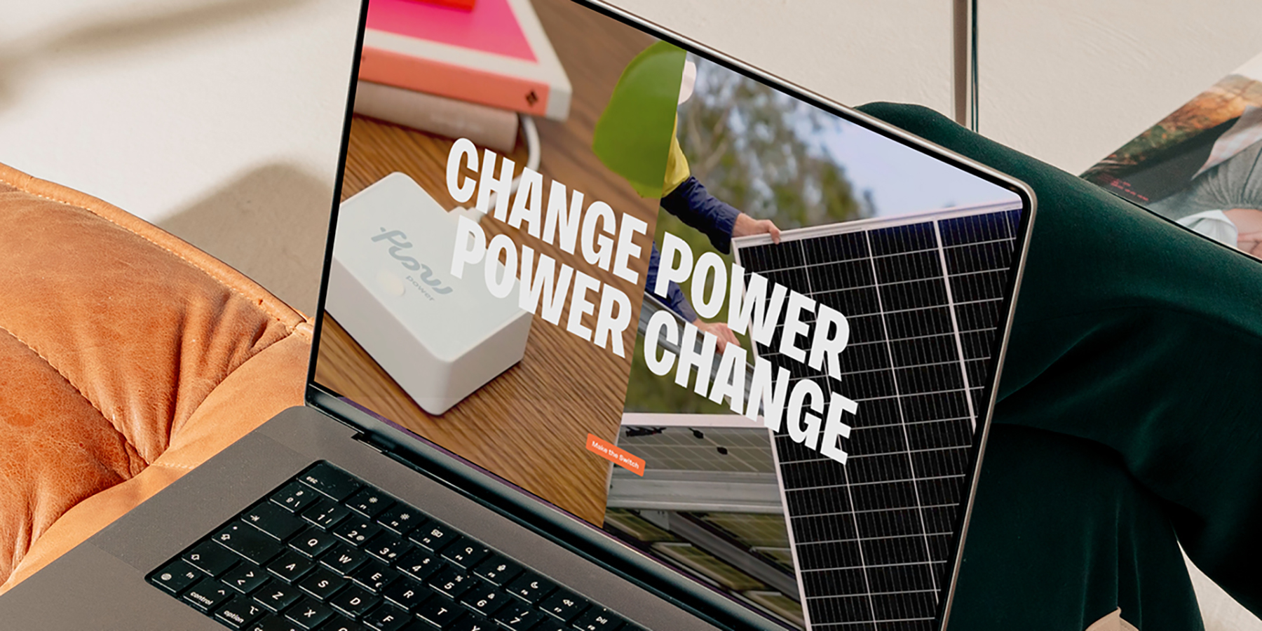
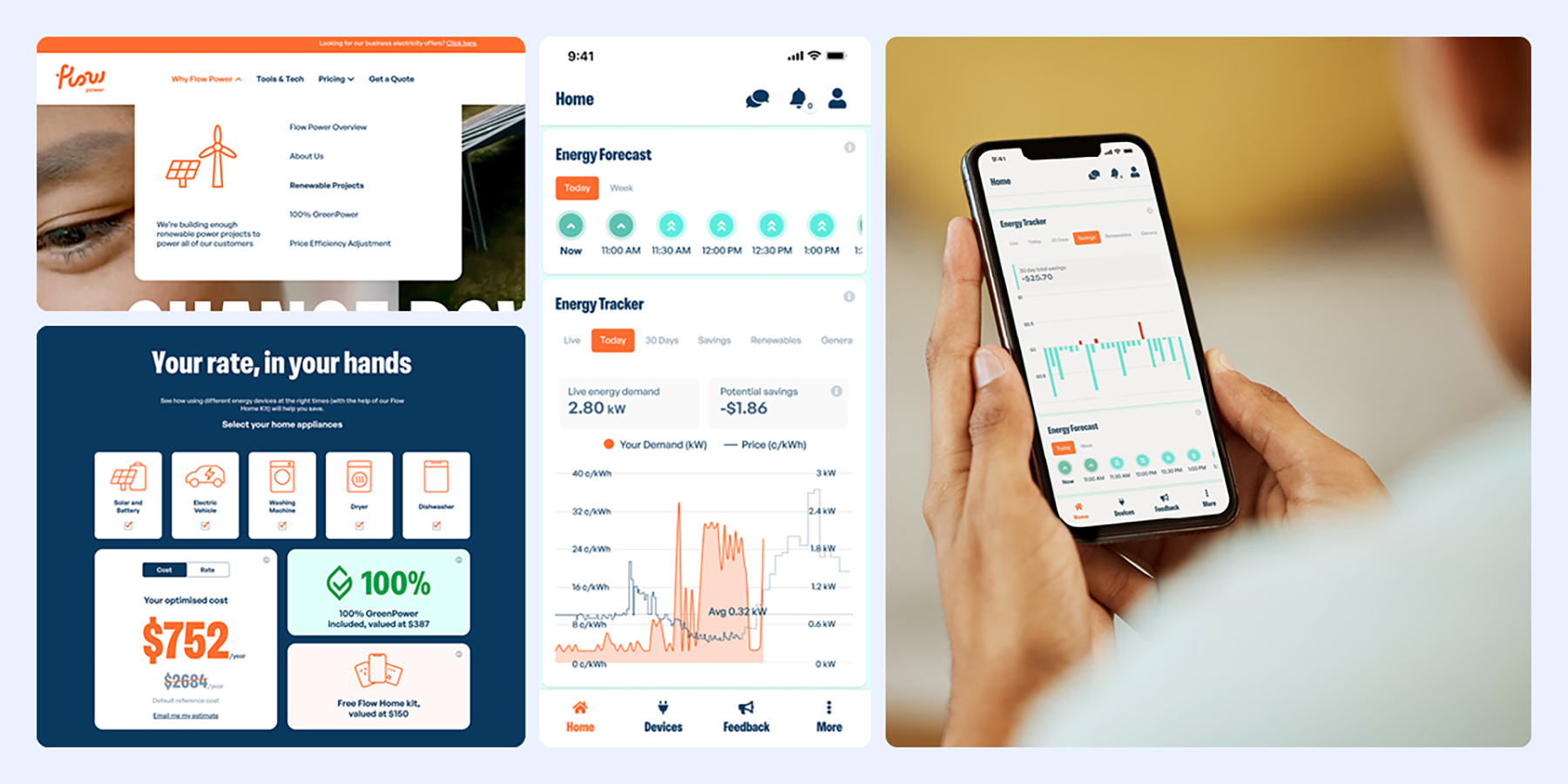
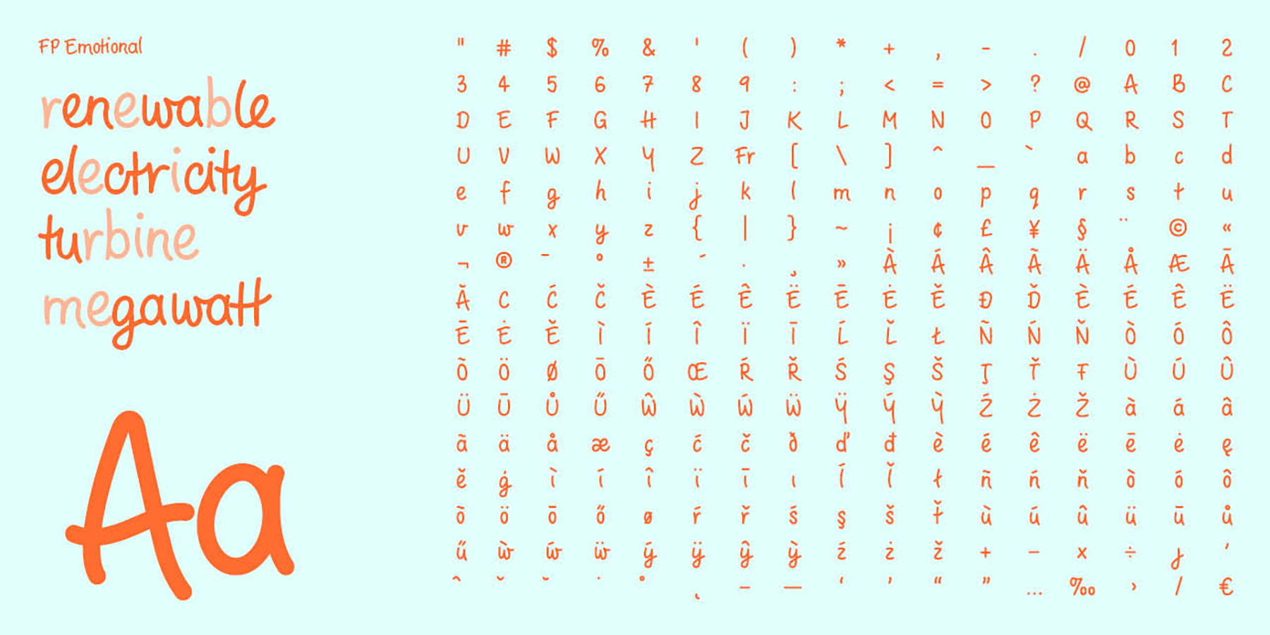
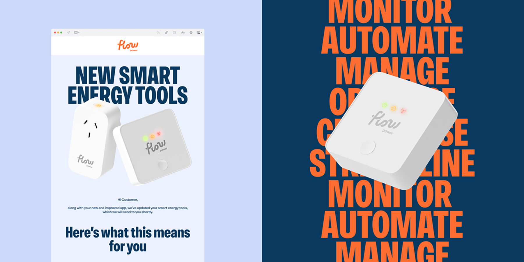
The brand system incorporates a visual identity comprising a custom typeface, icons, and illustrations, as well as an animation toolkit, photography, and user interface system. Using the brand system, we then designed and developed a website, which is where much of the brand underwent user acceptance testing and refinement of key messages.

Following the website, we applied the system to digital marketing campaigns, advertising campaigns, product packaging, digital and physical customer communications, and an updated app interface.

Design Excellence

The design builds a new visual language, based in large part on the existing cursive logo and signature orange used in the commercial and industrial brand.

Our audience are climate-aware but uneducated about the energy market, and are often time-poor and price-sensitive. So the brand communicates Flow Power’s deep expertise and initiatives, while also letting everyday Australians know how these benefit them.

This was achieved through the use of a hand-drawn custom typeface which brings a friendly, human touch and allows us to balance rational benefits with emotional drivers. The highly functional app UI helps customers view market prices and renewable generation, and to monitor, plan, optimise and automate their energy use with ease.

Flow Power’s website is the primary touchpoint for all new customers and clearly explains Flow Power’s comprehensive and complex offer quickly and efficiently. Video content, interactive graphs, maps and 3D renders help to break down the different aspects of the residential product in an engaging and succinct way, educating the user along the journey.

While successful as a stand-alone brand, given the link to the commercial and industrial brand, this also raises the profile of Flow Power more broadly. The success of the residential brand project led to the client engaging Self-titled to redevelop the entire Flow Power master-brand across all products, services, and audiences. This work is currently in progress.

Design Innovation

The main human insights which drove our solution were that audiences need both rational and emotional drivers to inspire action. Utilities such as electricity are often seen as boring necessities, with little difference between suppliers and choice driven largely by price.

This new offer combines both rational price incentives and emotional sustainable incentives — and we’ve been single-minded about elevating both.

The design solution breaks category norms in several ways. Firstly, it cuts through ubiquitous greenwashing with straightforward, honest language. Secondly, climate change is surrounded by negativity and guilt, but we know it’s not driving behaviour change. We brought some optimism and fun through illustrated characters that celebrate making a difference.

Because Flow Power’s price varies depending on time of use, we created an innovative optimised rate calculator which allows would-be customers to see potential savings as well as environmental benefits.

Design Impact

The project has been hugely successful for Flow Power, helping them launch a differentiated offer into the residential market and gain exposure to a large, new audience.

Some key metrics include:
– 95% increase in visitor growth since the website launch
– New customer sign-ups have increased 300% in the last 6 months
– Average 1.5 million impressions on social media ads per month

By successfully communicating a usage-based pricing structure and offering only 100% GreenPower accredited energy, the brand puts pressure on other retailers to improve their pricing models and environmental credentials.

The brand also increases awareness of the Australian energy market, and the price and renewable mix fluctuations throughout the day, allowing customers to make better informed decisions.

Beyond generating enough electricity for all customers from their own renewable projects, Flow Power is inspiring Australians to change their energy behaviour. By shifting some of their electricity usage to the middle of the day when renewables are plentiful in the grid, they are reducing carbon and accelerating the transition to the true zero future.

Circular / Sustainability Criteria

By successfully communicating a usage-based pricing structure and offering only 100% GreenPower accredited energy, the brand puts pressure on other retailers to improve their pricing models and environmental credentials.

The brand also increases awareness of the Australian energy market, and the price and renewable mix fluctuations throughout the day, allowing customers to make better informed decisions.

Beyond generating enough electricity for all customers from their own renewable projects, Flow Power is inspiring Australians to change their energy behaviour.

By shifting some of their electricity usage to the middle of the day when renewables are plentiful in the grid, they are reducing carbon and accelerating the transition to the true zero future.

Communication Design 2025 Finalists

Flow Power

Flow Power

Self-titled / Flow Power

Lifeblood

Lifeblood

Principals / Australian Red Cross Lifeblood

World Cancer Day

World Cancer Day

Motherbird / Richie Meldrum / UICC

Melbourne Recital Centre

Melbourne Recital Centre

Melbourne Recital Centre / Tim Kotsiakos / Ash Leech / Ben Beagley / Nicki Wright / Ben Beagley / Cinzia Kotsiakos

NCM — Signal to Noise

NCM — Signal to Noise

Commissioned by National Communication Museum / Creative Direction — Tim Kotsiakos / Design — Ben Beagley / Design — Nicki Wright / Creative Coding — Ben Beagley

Australian Gender Equality Council (AGEC) — Strategic Branding

Australian Gender Equality Council (AGEC) — Strategic Branding

Merren Spink / Anita McArthur / Cassie Brock / Elise Lampe / Letterform / Alexandrena Parker

Free Pads and Tampons. Period.

Free Pads and Tampons. Period.

Department of Families / Fairness and Housing

pitt&sherry – To Build Big, We Start Small

pitt&sherry – To Build Big, We Start Small

Mo Works / Mo Hamdouna / Andres Herrera / Clemence Vandame / Jason Posada / Lidya Hartanto / David Atchison / Tahlia Petyanszki / Lauren Toulet / pitt&sherry / David Atchison / Tahlia Petyanszki / Lauren Toulet

FLIP THE VAPE – A Community-Led Anti-Vaping Campaign

FLIP THE VAPE – A Community-Led Anti-Vaping Campaign

Mo Works / Mo Hamdouna / Tim van Irsel / Andres Herrera / Daniela AbrilJason Posada / Lidya Hartanto / Danish Khan / Victorian Aboriginal Health Service (VAHS) /Salomae Haselgrove / Lionel Austin