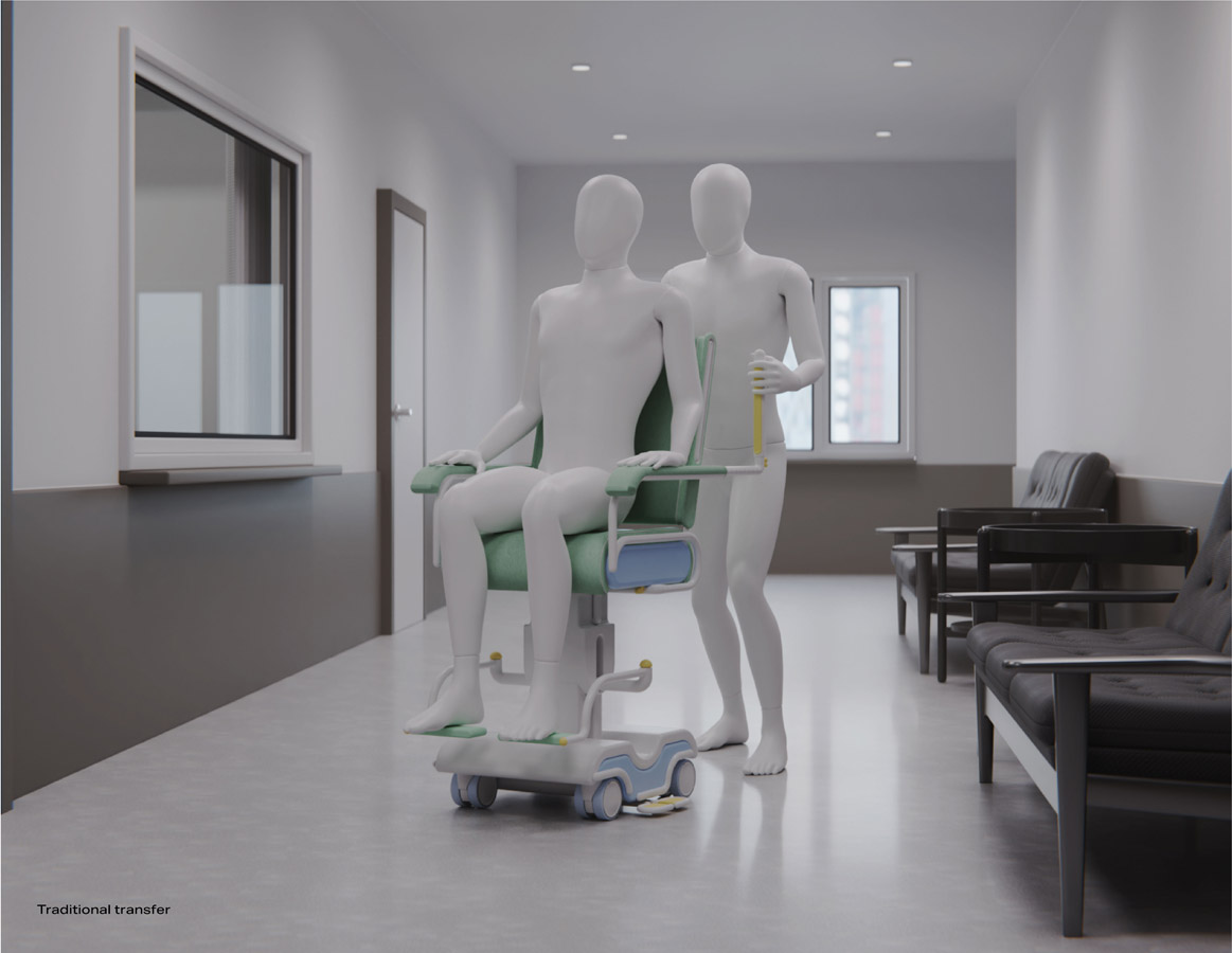
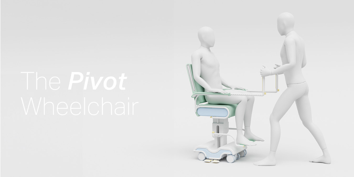
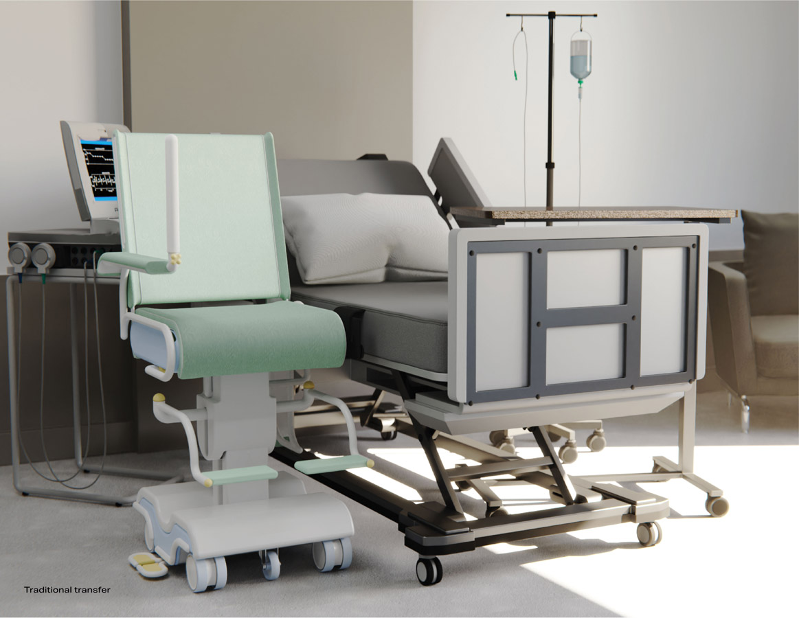
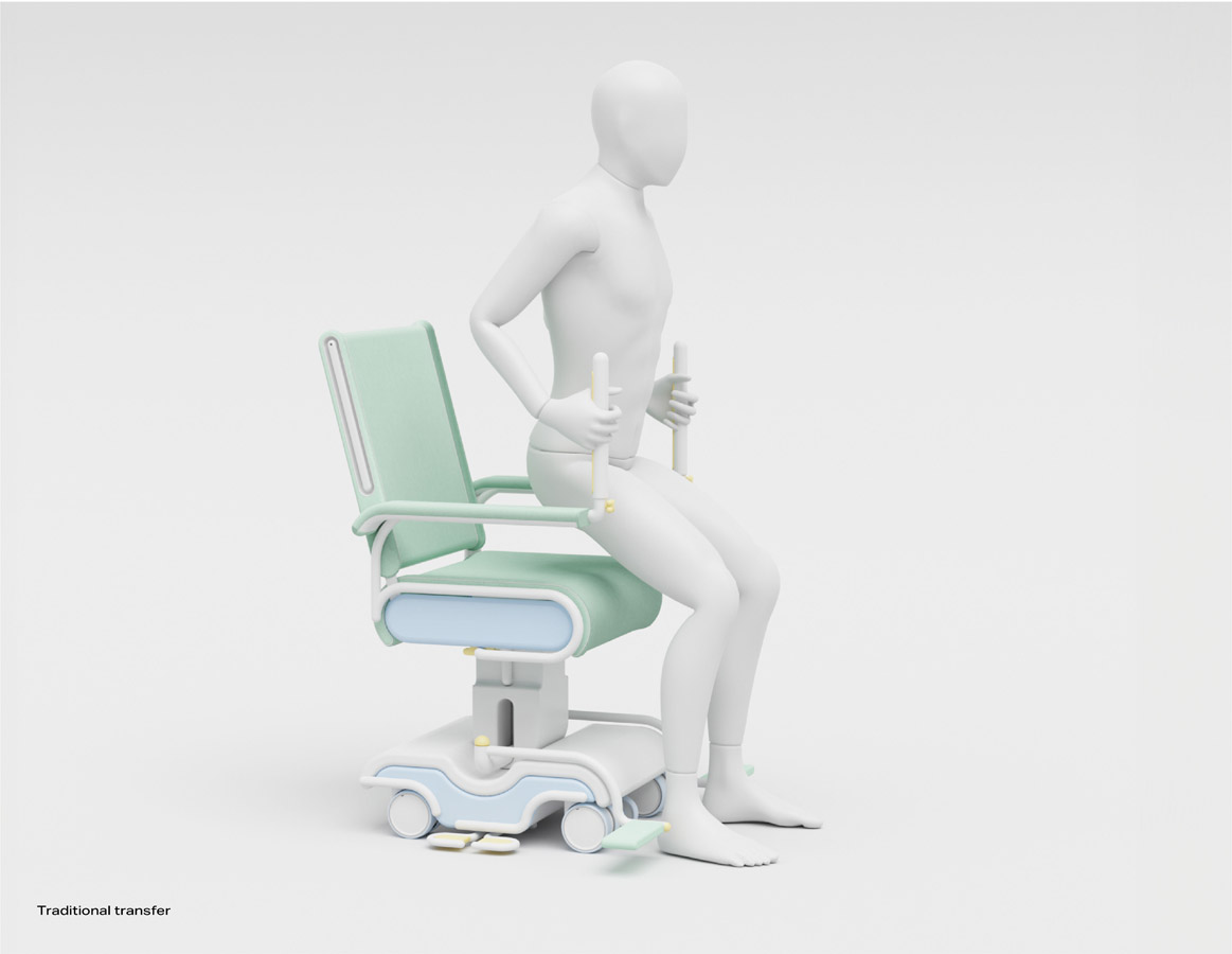
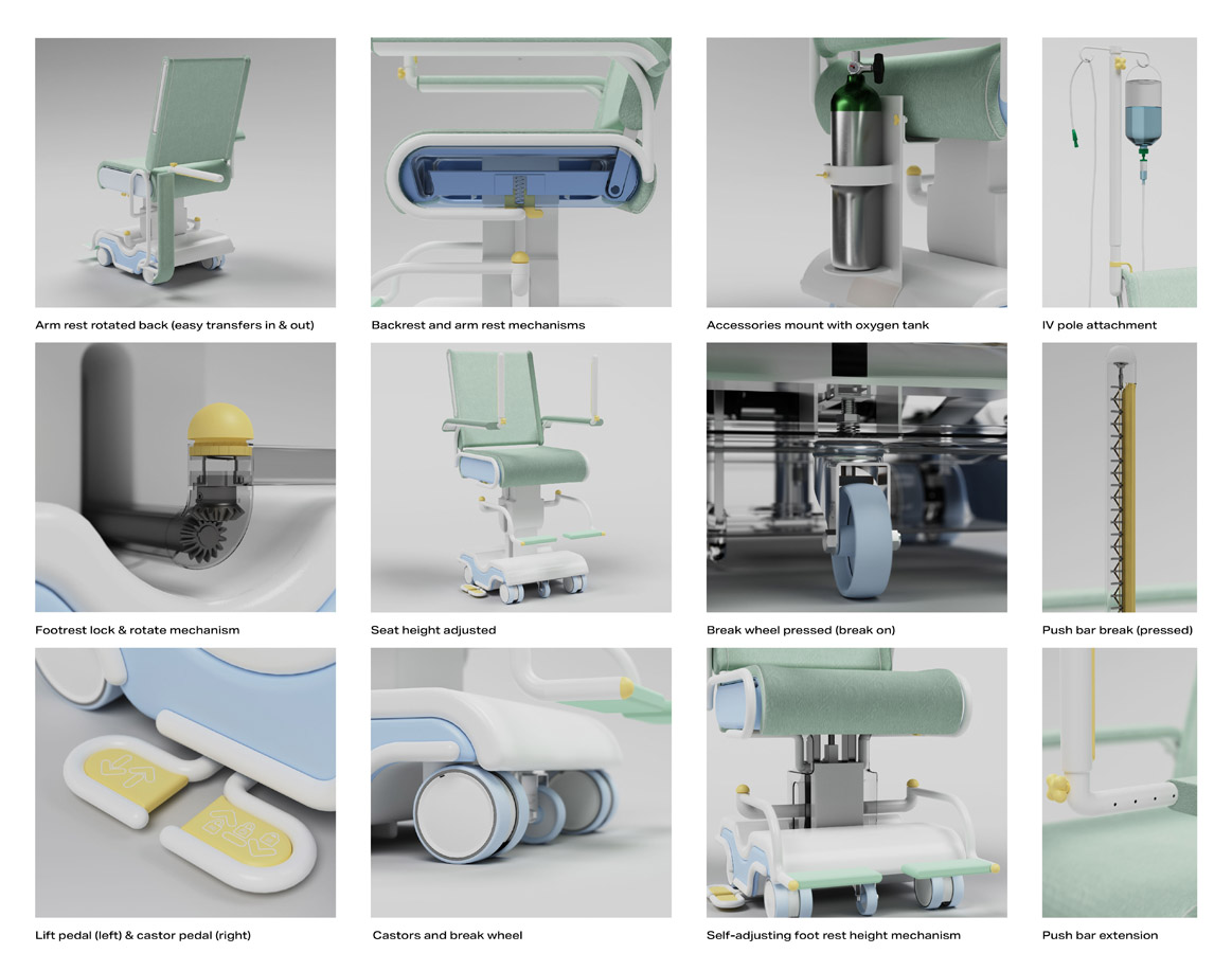
The design journey began during the observation of my grandfather’s wheelchair transfer experience while he suffered from dementia. When the wheelchair was pushed from behind, his paranoia and anxiety increased due to the inability to see who was pushing him or know where he was going. Conversely, when someone walked alongside him while another pushed the wheelchair, he appeared visibly more comfortable and remained seated. Having visited the Monash Children’s Hospital, I met with nurses who reported frequently pulling wheelchairs backward for patients who were flight risks and noted the difficulty in communicating and bonding with their patients while pushing from behind. These parallels in experiences led to an exploration of how human connection can enhance the user experience and improve the transfer system.
To establish features, the requirements and limitations of current wheelchairs, the hospital setting, the transfer system, staff, and patients were clearly outlined. Methods such as system, process, and user journey mapping, competitor analysis, product autopsies, precedent studies, and empathy mapping were used in the early design stages. This research defined the proposal and problem statement more clearly.
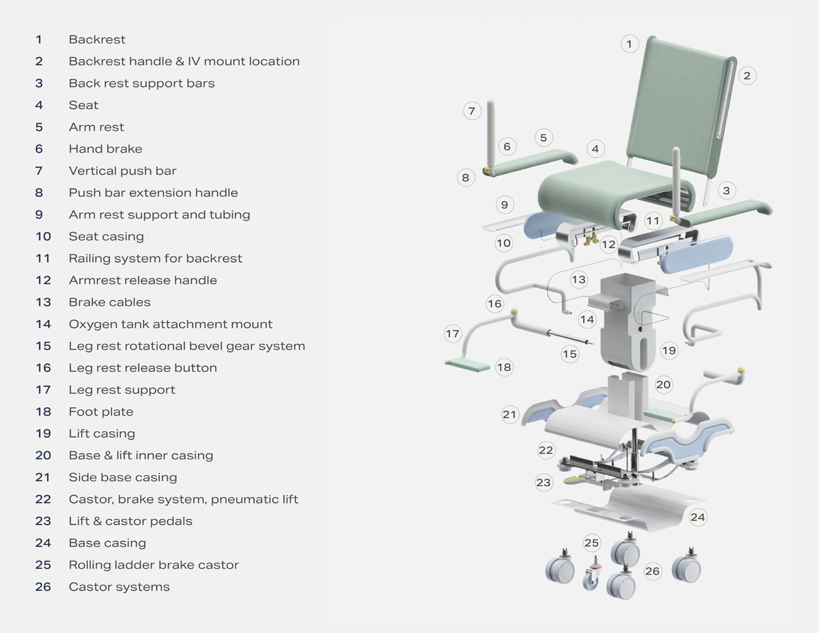
Ideation focused on features, mechanical systems, components, and parts, iterated through sketching, mock-ups, and early-stage prototyping. Benchmarking and stakeholder feedback refined the options. Human-factors engineering and universal design principles were integrated into the workflow.
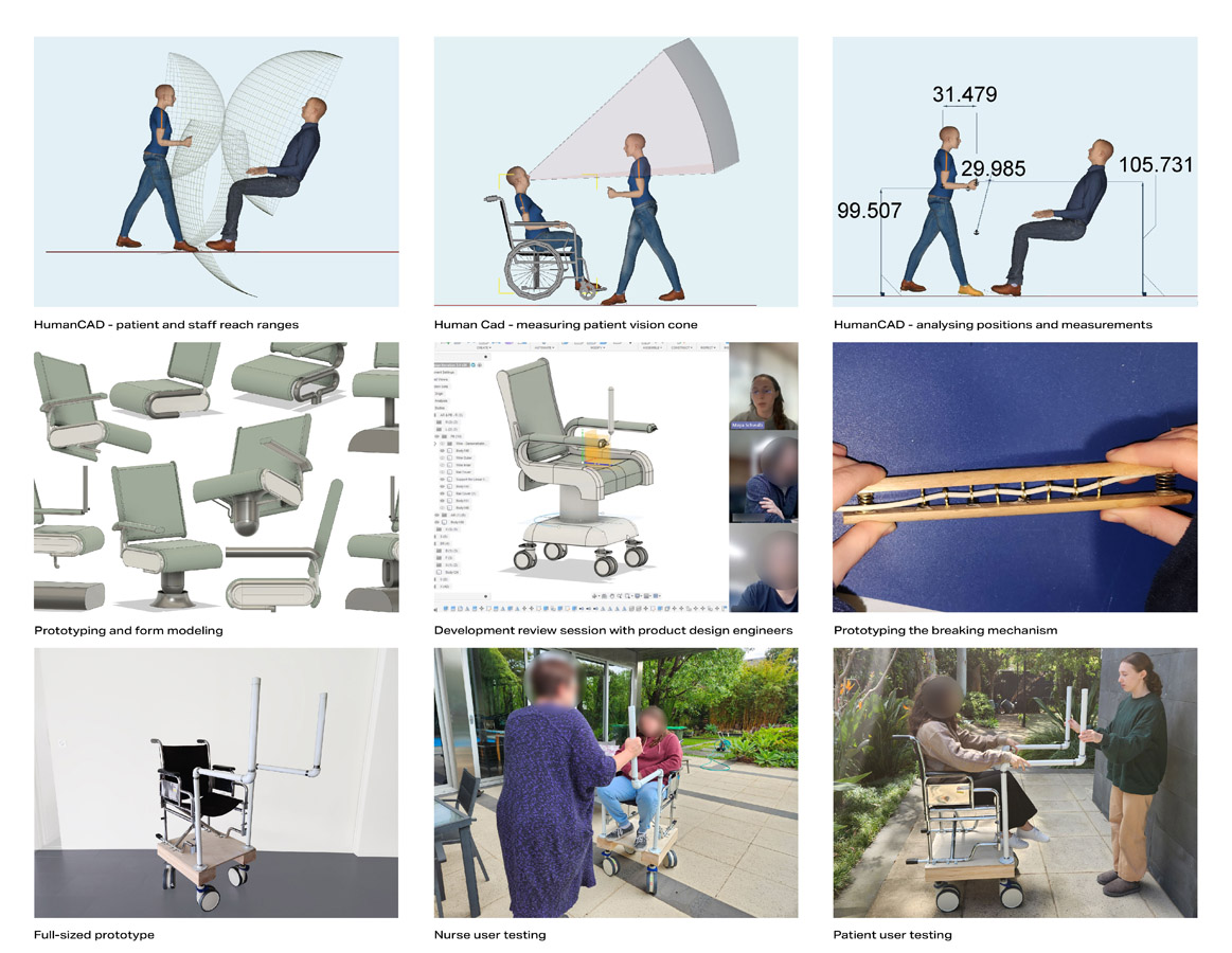
HumanCAD software simulations, based on ergonomics, biomechanics, proxemics, and anthropometrical data, defined the chair’s measurements. 3D modelling tools developed the design and mechanical subsystems. Continuous validation by product design engineers and manufacturer insights on components like the modified castor system addressed challenges of size, weight, manoeuvrability, and changing centre of gravity. A full-scale prototype validated the final design through the nurse and patient testing sessions. Mood boards guided aesthetic development, and user journey maps highlighted system improvements.

