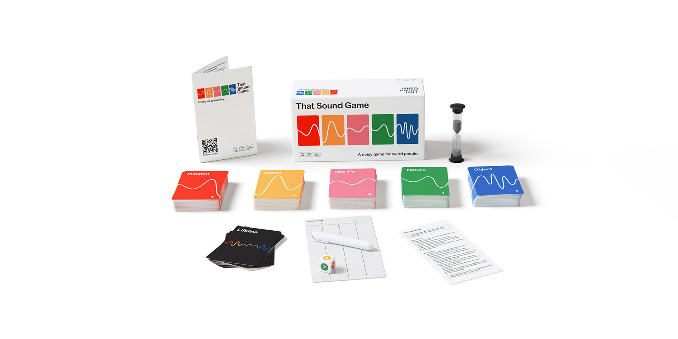
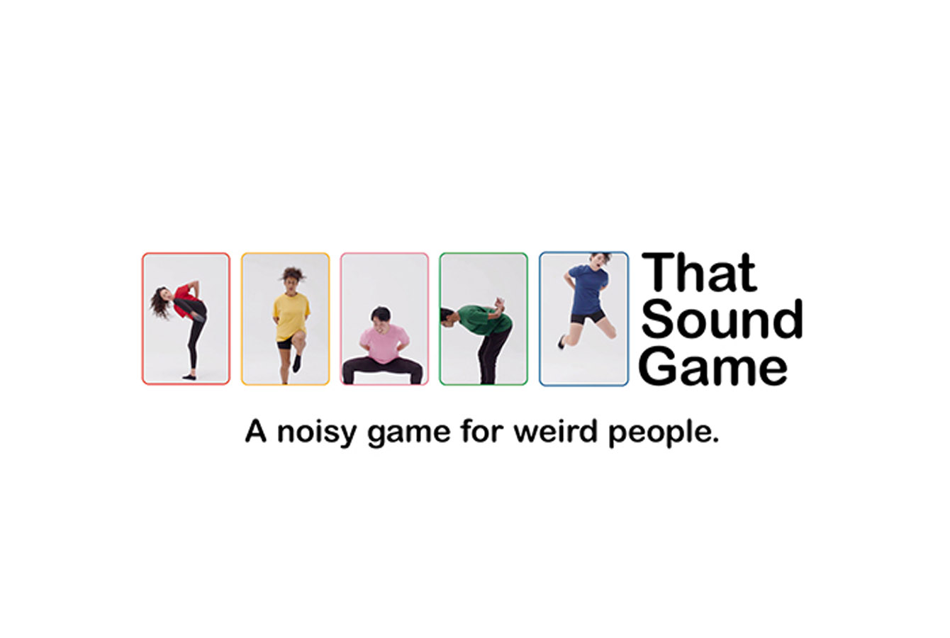
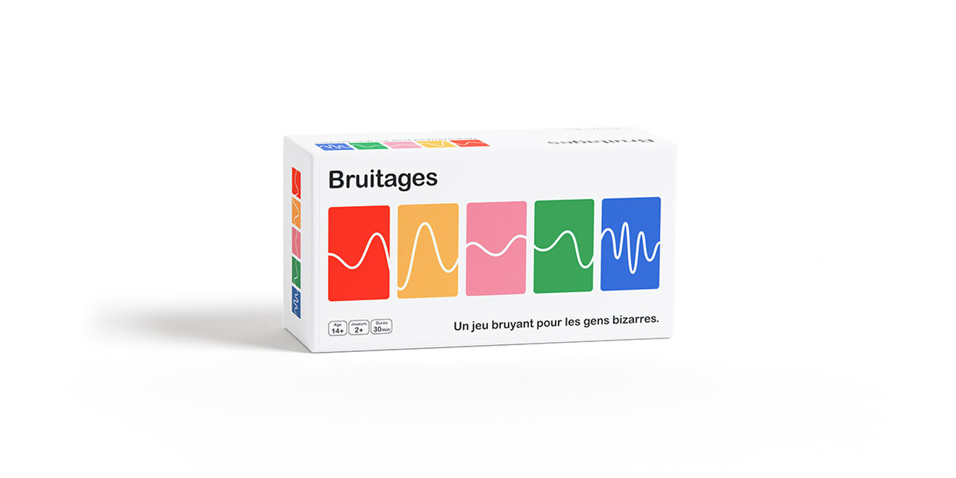
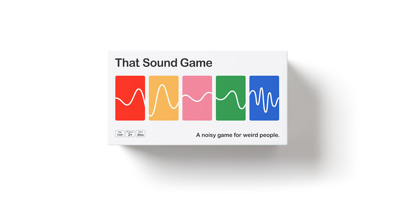
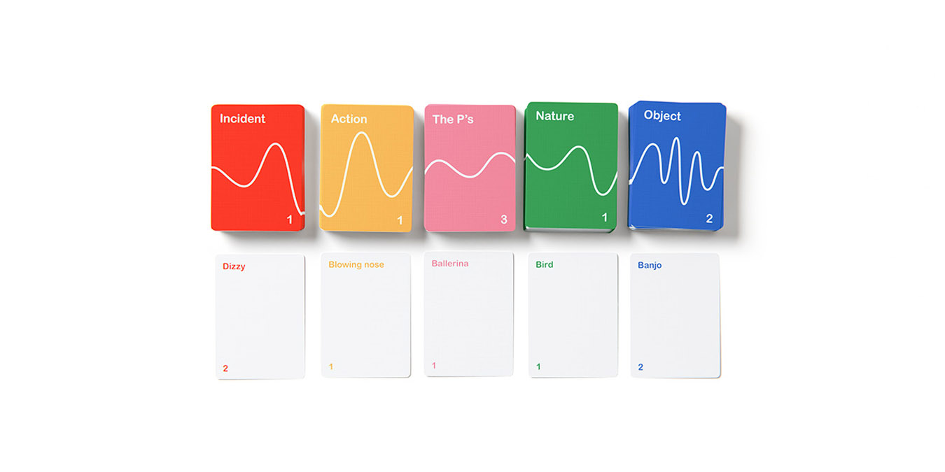
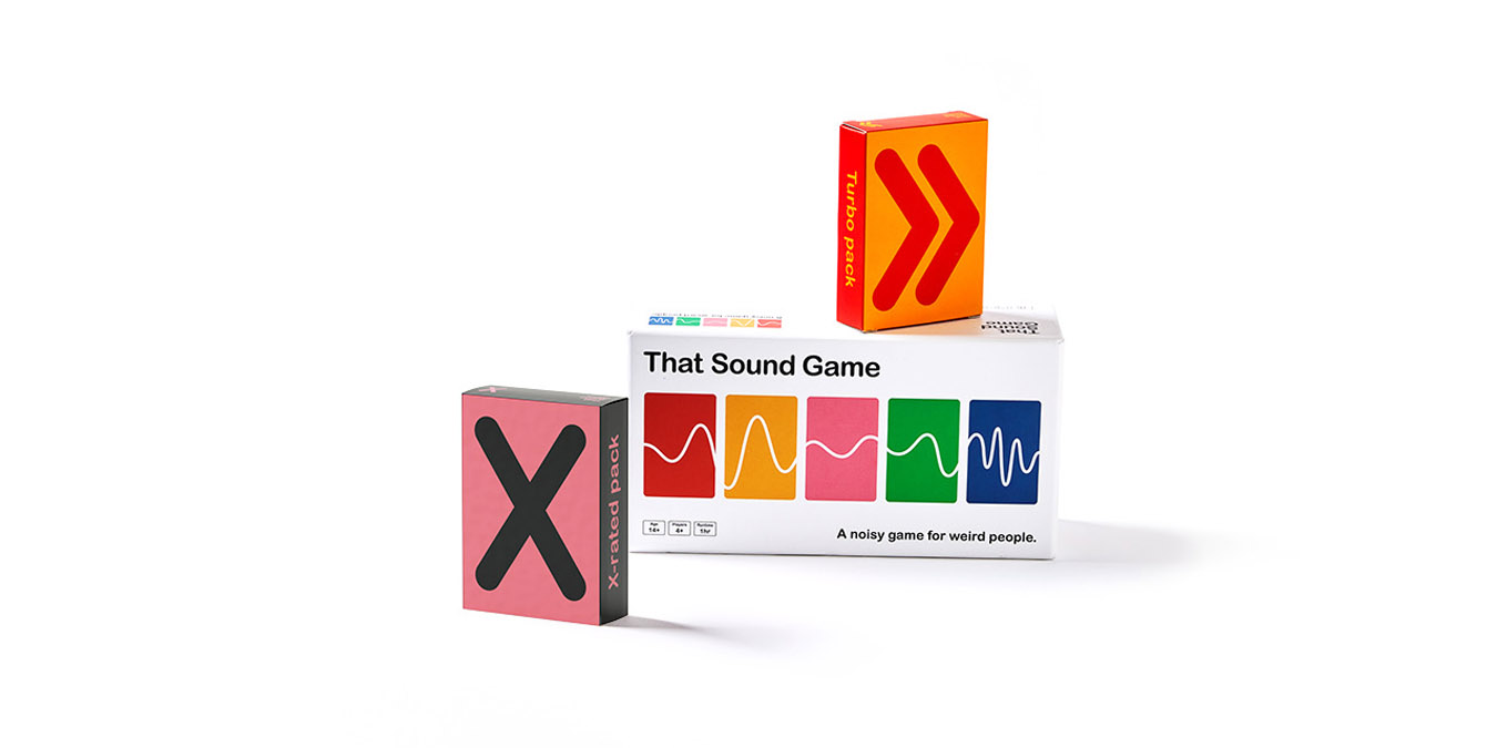
We were clear from day one that we wanted a sound wave on the box to communicate that That Sound Game is a sound based game. Cam(co-owner) and I actually recorded ourselves saying the name of the game and provided the sound wave file to our graphic designer. He then used a simplified version of this to create the logo.
The sound wave runs through the theme of the game and onto the cards themselves. The card design then forms part of the logo allowing us to have continuity of the brand all the way through the game.
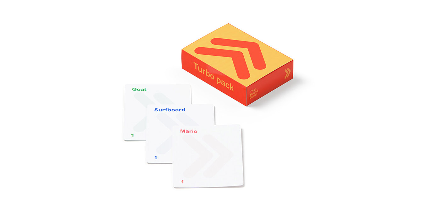
The space on the original cards has allowed room for info graphic/design for our expansion packs and also allows the necessary space for braille to be placed on the cards. We have been working with Vision Australia on the braille placement and aim for all of our expansion packs to have braille on them as the norm and available in mainstream stores. Our goal is to be the first game in the major stores globally that has braille printed on the expansions as a design feature making it truly accessible.
The dice design has evolved as we received feedback upon launching that it was not colour blind friendly. We have been able to adapt the dice to include the letter of the category, overlaid on the colour so that this is no longer an issue. This change went into circulation in our 2nd print run. We are now on our 20th print run.
It was important that the game is reusable and waste is limited. We have created a reusable scorecard with a water-based and removable marker. Thus removing the need for paper and pencil or pen. We also do carbon neutral shipping to offset the carbon emissions of our e-commerce shipping.

