Finalist 2024

Spoony: All of the Friends. None of the Fear.

Shadowboxer / Spoony

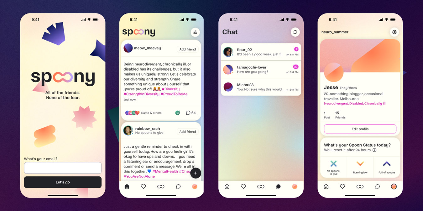
All of the friends, none of the fear. Spoony is a community platform for neurodivergent, chronically ill, and disabled people.

Neurodivergent, chronically ill, and disabled people experience a disproportionately high degree of social isolation. Ironically, existing social networks only amplify this with experiences designed with accessibility as an afterthought and environments that foster judgement, stigma, and misinformation.

Designed by folks with lived experience and in collaboration with accessibility experts, Spoony empowers chronically ill, neurodiverse, and disabled people to make meaningful connections and feel understood.

Design Brief:

Our brief was to build the Spoony brand and translate it into the design of Spoony’s MVP product.

However, successfully answering the brief required solving a unique challenge: Spoony’s audience have particular (and sometimes conflicting) physical and mental needs. What’s stimulating for some may be overwhelming for others – and vice versa.

Overly simplified designs that support some of their audience could be seen as infantilising, patronising, or too basic for others. While Spoony’s audience is niche, their requirements are varied and to create a compelling brand and product experience, we needed to meet them all.

And with Spoony’s waitlist rapidly (and impatiently!) growing, we needed to deliver in just six weeks.

This project was developed by:

Design Process

To move at speed, rapid feedback and iteration played a central role in our design process. The lead project team were also in the target audience bringing lived experience to the design process. Brand and product design was undertaken in parallel, as we were conscious that key decisions in each area (eg. colour palette or content design) critically informed the other.

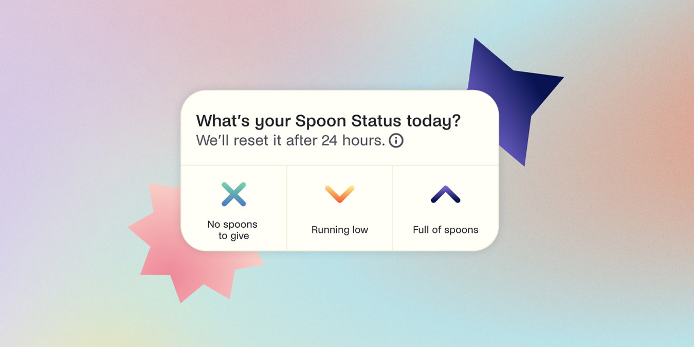
We also leveraged more than 10,000 people on Spoony’s waitlist, directly engaging them on key design decisions including the overall brand direction, brandmark and key product features such as the Spoon Status (a unique feature based on the ’spoon theory’ that lets users tailor their Spoony experience to their energy levels). This co-design process allowed us to build a brand and product that truly answered the needs and preferences of its audience.

In addition, we worked closely with a vision-impaired accessibility consultant, presenting our visual designs verbally to stress test the product experience via screen reader. More broadly, we undertook accessibility training and built detailed guidelines around accessibility (as per PWDA standards) into the brand book.

Design Excellence

Spoony launched its MVP via a closed beta of waitlist subscribers just two weeks ago. And while we’re gaining user feedback and making updates on an almost daily basis, one thing is for certain: Spoony is not your (neuro)typical social app.

It’s setting a new benchmark by designing for accessibility and inclusivity first, not just following the usual standard. By making these things central to the design process from day dot, we’ve been able to debunk the design myth that accessibility comes at the cost of aesthetics and realise the ’curb cut effect’ where disability-friendly features create a greater experience for all.

This comes to the fore in several ways:

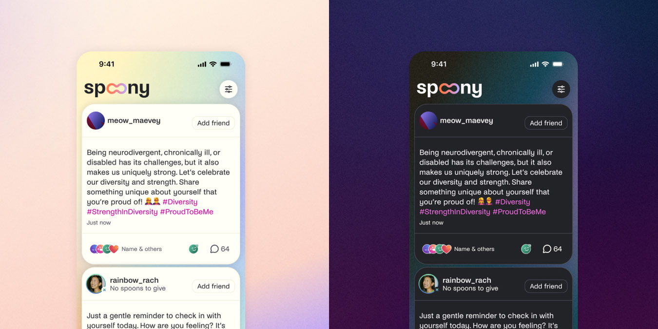
  • Choice as a key design principle: people can define their boundaries by deciding how much personal information they share, the cadence of notifications received and what mode (light/dark) suits their sensory and visibility needs best
  • Simple, direct language and layouts designed to translate naturally via screen readers, while removing visual overload
  • Gentle gradients create subtle movement and depth across the interface, while instilling a sense of calm and safety throughout the experience
  • Strong emphasis on hierarchy of information and colour contrast to ensure clear guidance, easy readability and maintained legibility throughout
  • Gentle guidance and reminders throughout the experience that demonstrate empathy for our audience. Eg. prompting people to consider their Spoon Status and helping them start a conversation with a new connection

Design Innovation

While it’s near impossible to validate whether something is a ”world-first” we feel pretty damn confident that Spoony is a one-of-a-kind solution. Of course, there are plenty of online communities ”for” our audience, but all exist within larger platforms where their needs are an afterthought, leading to a sub-par experience. What’s more, our design process uncovered that our audience’s capacity for interaction (with both people and our product) can vary greatly day-to-day. This led to the development of Spoony’s most unique feature — the Spoon Status.

Christine Miserandino, who has lupus, created the spoon theory metaphor to help people understand what it’s like to experience fatigue and manage her daily occupations as a chronically ill person. Essentially lots of spoons = lots of energy. Zero spoons = none. It’s a theory that resonates so strongly, that much of our audience call themselves ”Spoonies” (hence our name!).

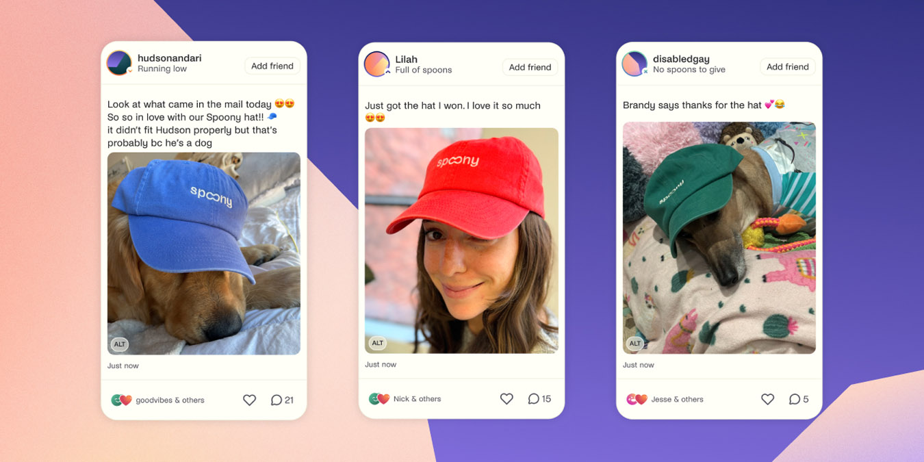
The Spoon Status is the Spoony equivalent of a Facebook status. But rather than an open-ended prompt to tell people how you’re feeling with no real impact, users are asked to set their Spoon Status. There are three simple choices: ”Full of Spoons” ”Running Low” or ”No Spoons”. This helps Spoonies better connect with their body’s needs, while helping others gauge their appetite for social interaction. It also removes the shame and stigma often felt by our audience for not replying to messages or engaging with others.

In addition, the Spoon Status directly influences the user’s product experience by adjusting the cadence of notifications to suit their energy/capacity and respect their needs/boundaries.

Design Impact

Released just two weeks ago and still in closed beta with plenty of updates to come, Spoony is already demonstrating product:market fit.

  • 1,200 Spoonies joined
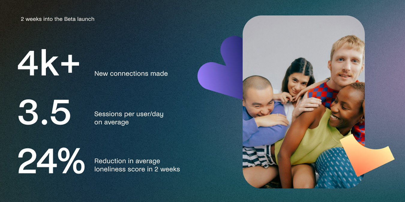
  • Over 4,000 new friends made
  • More than 3,200 posts covering everything from diagnosis support to stylish walking sticks, colonoscopies, the best beige food recipes and pets — so many pets.
  • Average of 3.5 sessions per user, per day (and lasting an average of 33 minutes)
  • Retention rate of 25% (compared to an industry standard of just 3.9%)

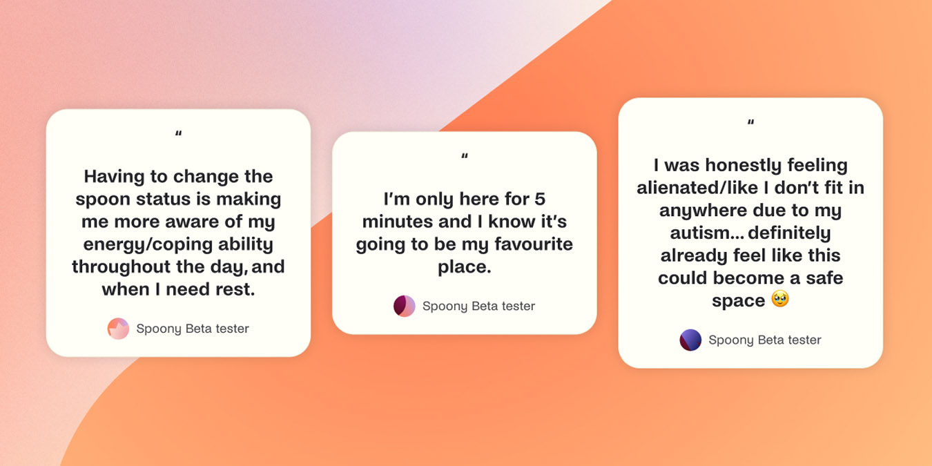
But perhaps most importantly, the average loneliness score of our audience has decreased by 24% since using Spoony. Here’s some verbatim feedback we’ve received:

”It’s genuinely such a strange but lovely feeling to be able to talk about neurodiversity knowing no one thinks I’m lying or being dramatic.”

”This is a safe space. I feel so much less alone even just hearing other people’s weird interests.”

”It can be such a lonely world for people like us. This place feels like such a safe haven and I’m so thankful.”

”I just wanted to say how comforting it is to have a space to talk about all these things that we sometimes have to hide.”

”This app already feels like home.”

”The world has needed an app like this for the longest time.”

Digital Design 2024 Finalists

Smart Cities, Wyndham Tech School

Wyndham Tech School / Wyndham City Council Smart Cities Office / Spiire Visual Media Studio

Blackmagic Camera App

James O Shea / Alexander Diaz / Mio Hu / Jeremy Marsh / Hailey Choi / Cassidy Van Bloom

My Drive Hero | Get Rewarded for Simply Driving Safely

Mo Hamdouna, Andres Herrera, Lidya Hartando, Ezequiel Gallo (Mo Works) / Blake Robinson, Josh Wong (MyDriveHero)

Berry Street Gifts

Yump Digital / Berry Street

Vic Vice- Victorian Virtual Industry Careers Experience

Goulburn Murray Local Learning and Employment Network / Spiire Visual Media

Empathy in Action: The National Centre for Action on Child Sexual Abuse’s Website Design

The National Centre for Action on Child Sexual Abuse / Storyfolk

Eleventh Planet

Joanne Mott and John Power / Hacer Group / Rothe Lowman Architects

Goldee: The AI Personal Assistant for Busy Families

Shadowboxer / Goldee / Timba Smits, The Jacky Winter Group

Quit Website

Northmost / Quit

Multicultural Framework Review

Think HQ & CultureVerse / Department of Home Affairs

Ripple 2.0 Design System

Single Digital Presence - Department of Government Services / Department of Premier and Cabinet (VIC)