Finalist 2024

Franklin.ai - Supporting the Diagnosis and Reporting of Cancer with AI

Franklin.ai

Designing Pathology AI to improve diagnostic accuracy, efficiency, and patient outcomes in prostate cancer treatment.

Pathologists diagnose and grade cancer by inspecting human tissue under a microscope. Their diagnosis determines the treatment plan for patients. If they find cancer, they need to determine its severity by counting and measuring its qualities. This process is manual, tedious and time consuming.

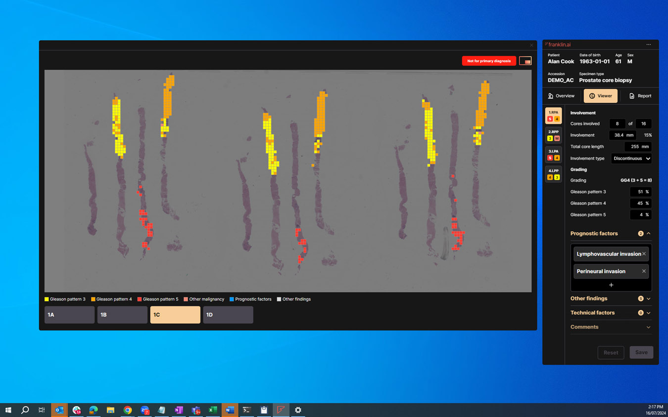
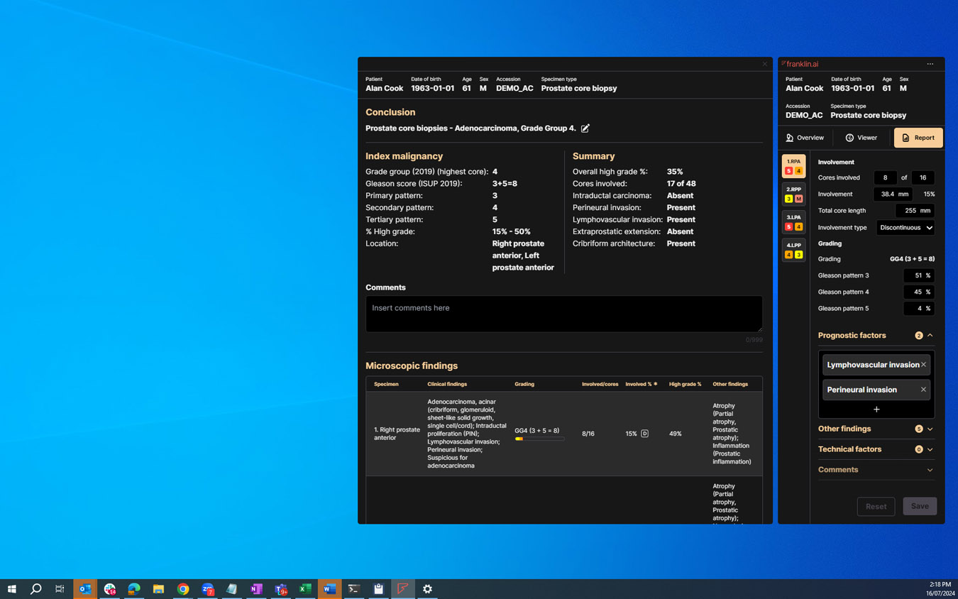
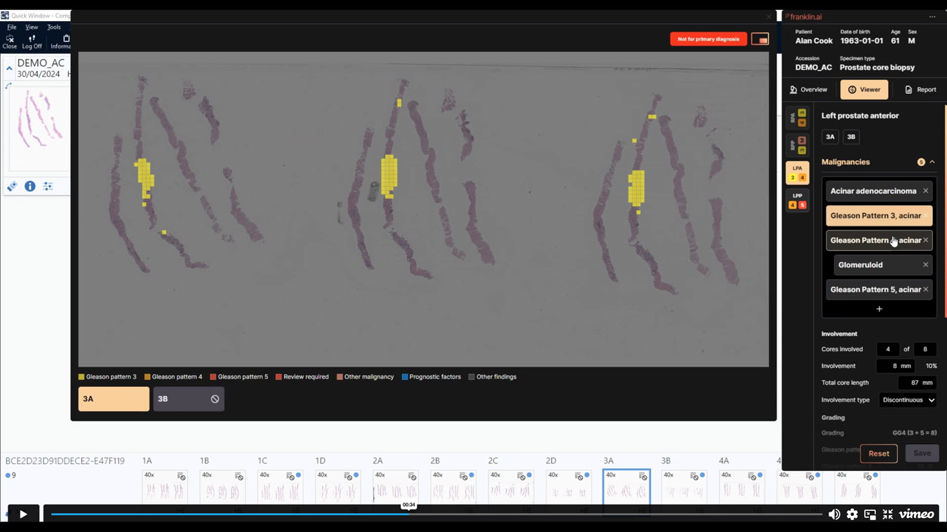
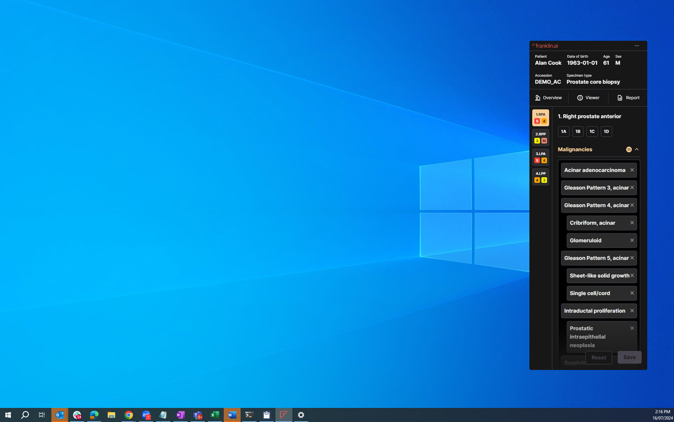
Franklin.ai has built an AI that helps detect prostate cancer and, where it is present, quantify it and pre-populate a report. Our design allows pathologists to collaboratively work with the AI through a pathology case, identify and quantify findings, and produce a report for the referring clinician.

Design Brief:

The problem we wanted to solve was ”How might we enable pathologists to interact with AI findings to improve their diagnostic accuracy and workflow efficiency?”

The intended outcomes for Franklin.ai’s software was:
1. More accurate diagnosis
2. Faster reporting turn-around times
3. Happier, more confident pathologists

This project was developed by:

Design Process

First, we conducted research to understand how pathologists go about their tasks in their offices. We shadowed eight pathologists, observing them diagnose and report cases. We documented their tasks and workflows with a particular focus on:

  1. How they interacted with objects, including their microscopes, desktops and reference materials
  2. What information they were using to help diagnose and report, including the notes they wrote or dictated
  3. What ’work-arounds’ or ’rules of thumb’ they used to make their work more efficient

This helped the team develop a shared understanding of the opportunities to help pathologists.

By collaborating with our colleagues, we helped define a product scope that would not only help pathologists but also be technologically feasible and financially viable for our business.

Second, conceptual mock-ups went through over ten rounds of iteration. Each of these ”design sprints” involved focussing on a specific product question, designing an experiment and concepts to elicit feedback and having at least five pathologists interact with a prototype.

We first delved into questions and decisions that would have the most far-reaching consequences for our product. These included:

  1. When and how should the AI findings be presented to the user?
  2. What was the right ’unit of analysis’ - slides, specimens, or something else?
  3. How should we summarise findings for reporting?

The feedback helped inform workflow, functionality, information architecture and high-level interaction design decisions.

Once these big, consequential decisions were made, we delved more into more nuanced questions such as:

  1. What should the report look like?
  2. How should we communicate the probabilistic nature of AI findings?
  3. How might our product need to adapt to a variety of labs and jurisdictions?

These helped refine our user interface and information design.

Design Excellence

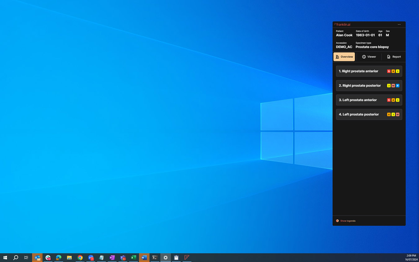
Our product shows the AI’s findings to pathologists. They can then agree or disagree with them. If they agree, they can move through a case faster. If they disagree, they can use our interface to find the cause and edit as they see fit. Our interface purposefully limits information to only what is necessary at a given time. That is, our design answers the most important questions in succession:

  1. Have you found cancer?
  2. Where have you found it?
  3. How severe is it?

This lets pathologists optimize their workflow. They can find the most relevant specimens for diagnosis.

Our aesthetics reflect this focus. We avoided overwhelming the user with data and chose a muted colour palette. We use colours to encode the most important information - the type and location of findings - so they stand out against the background.

We also added design touches that honor pathologists’ real-world practices. An example is rotating a specimen badge 90 degrees once a pathologist has viewed a specimen. This mimics real-world pathologists. They review a slide, then turn it upside down to check their progress on a case.

We also developed a range of checks to prevent illogical reporting. For example, the grading system reflects the percentage of cancer that is high grade versus low grade. If high grade cancer is over 50%, we prevent the user from reporting the specimen as a low grade specimen. Our product can help minimize illogical errors with our built-in checks.

Design Innovation

Our software will enable more accurate diagnoses and faster reports. It will make pathologists happier. We designed some novel features with pathologists from Sonic Healthcare. These include:

1. Specimen triage is a quick overview of findings in a case. It helps pathologists find the diagnosis-defining specimen first.
2. Clear, high-level visual and textual overviews of findings and their quantification. They should let pathologists quickly decide if they agree with the AI’s entries.
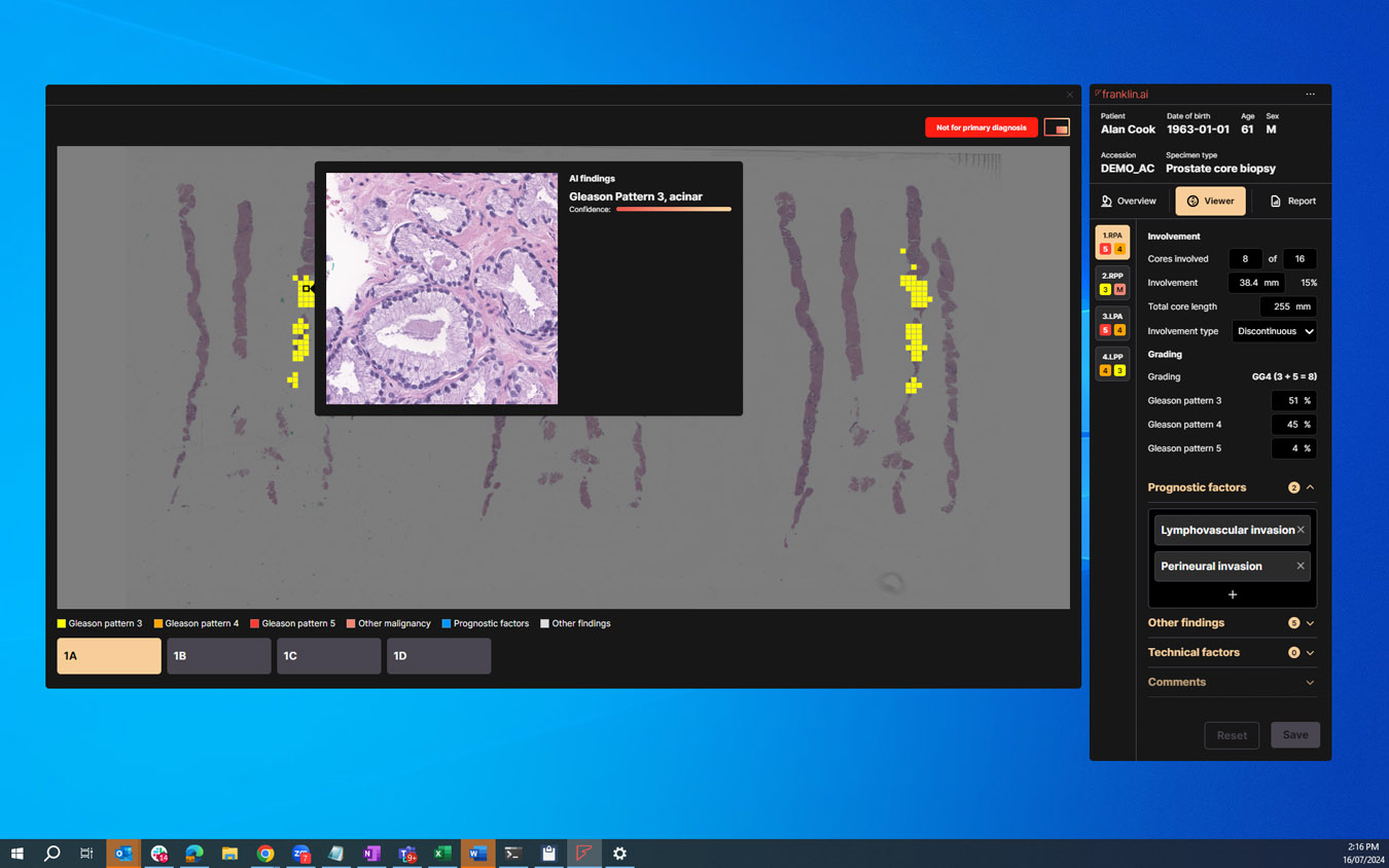
3. ’Showing our workings’ for cancer grading. This explains how we quantify the ratio of low to high grade cancer, which in turn drives treatment.
4. Showing AI confidence levels. This will help pathologists use the AI better and optimize their workflow. For example, they are more likely to spend time reviewing findings the AI is less confident in.

Design Impact

Our product sets the standard for medical imaging AI software. Since the beginning, our core belief was to augment, not replace, human pathologists. By humanizing AI and making it useful, we can improve patient outcomes. We aim to support human decision-making.

Pathologists will be less likely to miss small bits of cancer.

Less time on reports will help diagnose and treat patients faster.

Referring clinicians will better measure key diagnostic and prognostic indicators, like cancer grading.

Digital Design 2024 Finalists

Quit Website

Northmost / Quit

Blackmagic Camera App

James O Shea / Alexander Diaz / Mio Hu / Jeremy Marsh / Hailey Choi / Cassidy Van Bloom

Empathy in Action: The National Centre for Action on Child Sexual Abuse’s Website Design

The National Centre for Action on Child Sexual Abuse / Storyfolk

Goldee: The AI Personal Assistant for Busy Families

Shadowboxer / Goldee / Timba Smits, The Jacky Winter Group

My Drive Hero | Get Rewarded for Simply Driving Safely

Mo Hamdouna, Andres Herrera, Lidya Hartando, Ezequiel Gallo (Mo Works) / Blake Robinson, Josh Wong (MyDriveHero)

Ripple 2.0 Design System

Single Digital Presence - Department of Government Services / Department of Premier and Cabinet (VIC)

Multicultural Framework Review

Think HQ & CultureVerse / Department of Home Affairs

Vic Vice- Victorian Virtual Industry Careers Experience

Goulburn Murray Local Learning and Employment Network / Spiire Visual Media

Berry Street Gifts

Yump Digital / Berry Street

Smart Cities, Wyndham Tech School

Wyndham Tech School / Wyndham City Council Smart Cities Office / Spiire Visual Media Studio

Eleventh Planet

Joanne Mott and John Power / Hacer Group / Rothe Lowman Architects