To tackle the limitations that held Berry Street back from achieving its goals, Yump knew it would need to invest in research before drafting a solution.
Yump ran an extensive discovery phase of many parts, outlined below:
- A best practice review alongside competitor sites and comparable organisations in the charity gifting sector.
- A Google Analytics audit to understand user behaviour on-site, including traffic sources and exit points.
- A functionality audit to understand how features worked (and therefore how Yump could assess the impact of change).
- Stakeholder workshops with Berry Street staff to validate user needs, business requirements, and technical requirements.
- 6 x interviews with fundraisers, a marketing agency and one staff member to define user needs.
The outcomes of this phase led to significant key findings that both pinpointed critical weaknesses of the existing site as well as great opportunities – and this informed what changes Yump would make.
Yump proceeded to develop user personas, journey maps, and an intuitive information architecture that established:
- Main sections of the new website
- How content would be structured (e.g. menus, body, footer)
- Hidden pages, and
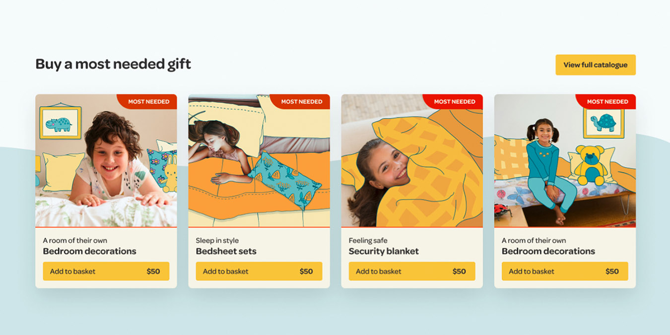
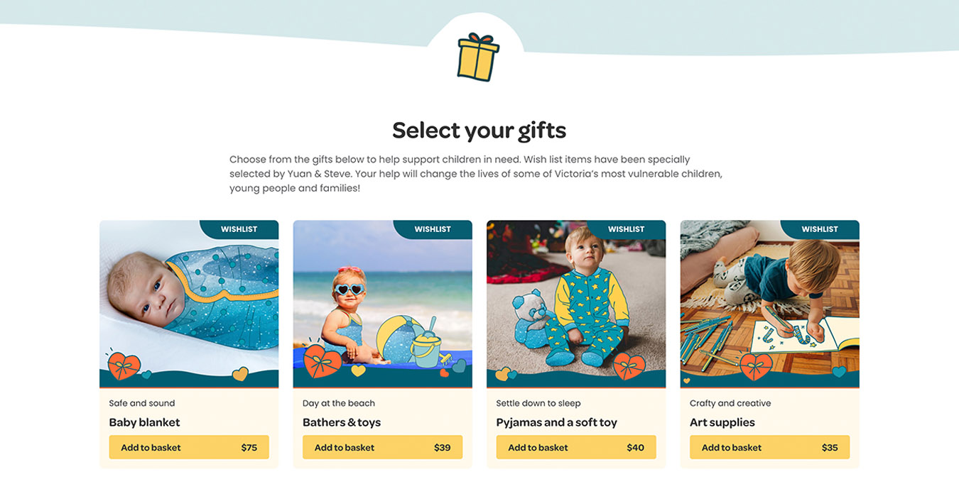
- Gift filters and sorting.
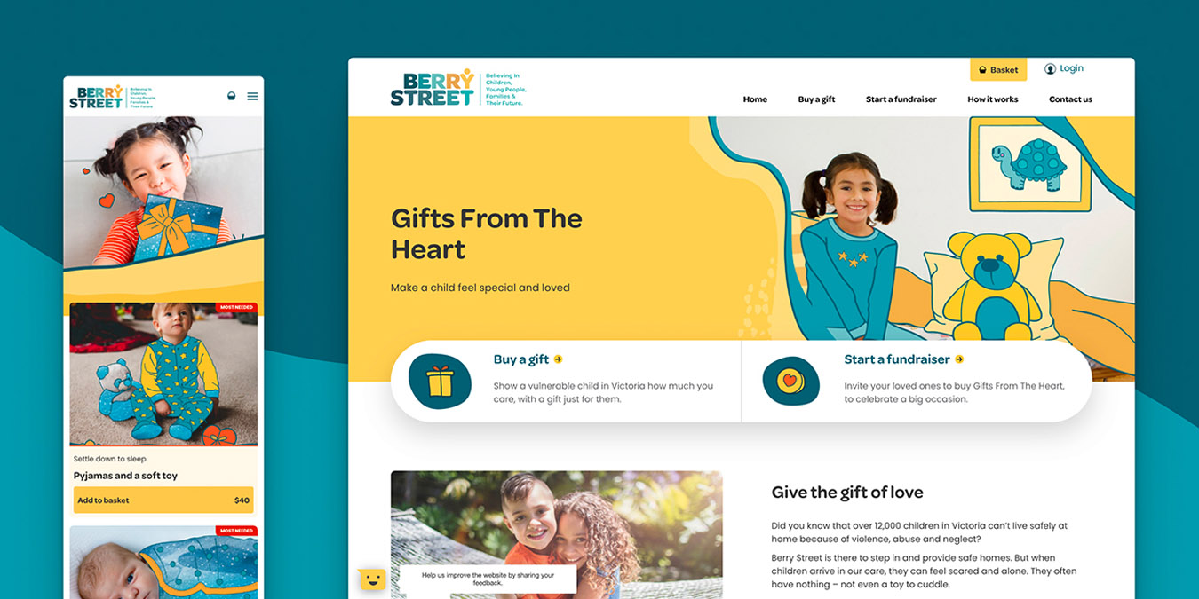
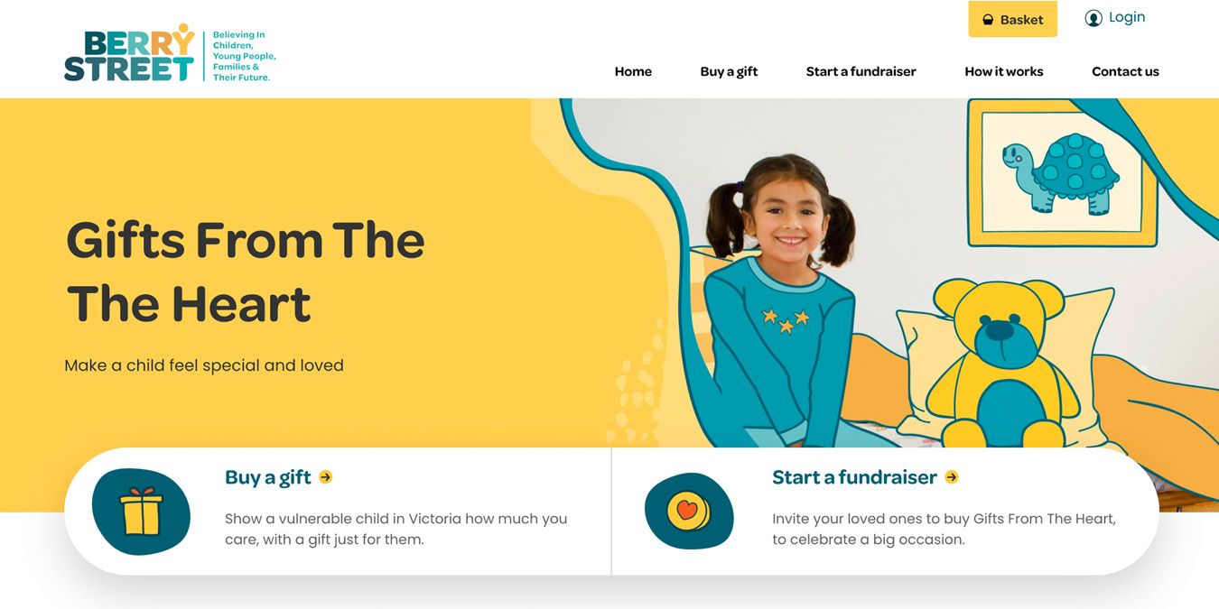
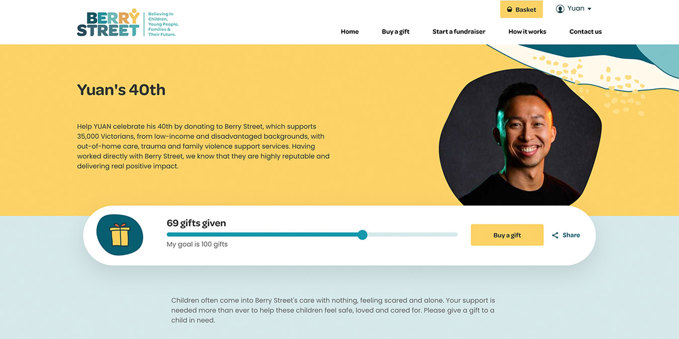
Together, these activities shaped a comprehensive roadmap that Yump could action. It also considered that the website refresh also needed to complement the organisation’s overall digital transformation strategy – meaning its look, feel, and function had to match (and connect with) the overarching Berry Street brand and main website.
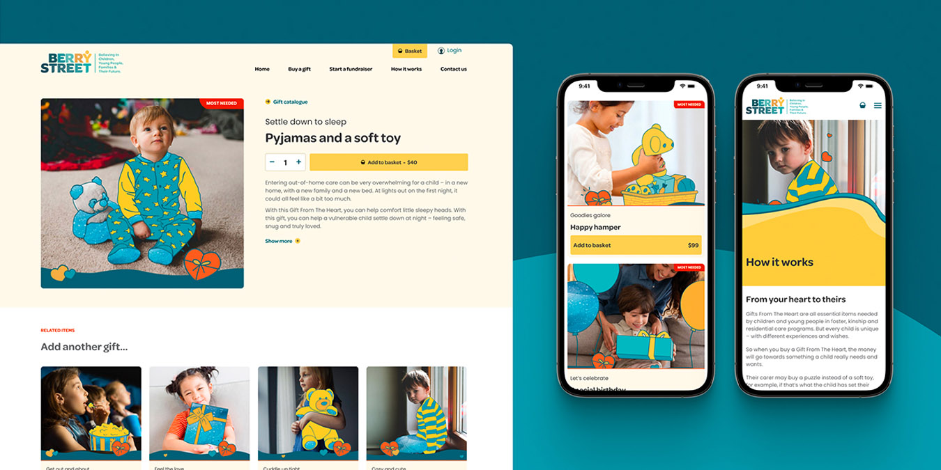
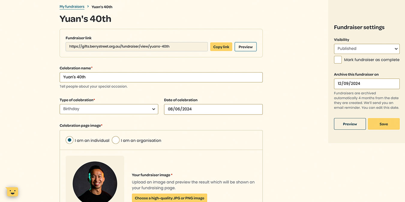
Work that followed on after the discovery phase included wireframing, design, development, testing, and deployment. The site was optimised for AA-compliant web accessibility and conversion, and the result was an engaging, seamless gift-purchasing experience.

