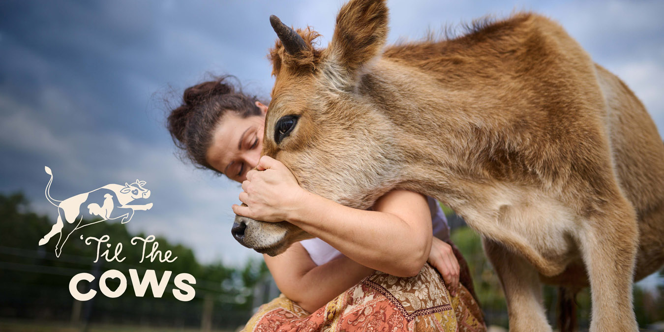
From the outset, it was important for us to understand the ”why” behind ’Til The Cows’ offering. We consulted with ’Til The Cows’ leadership and board to determine their evolving vision and goals. To learn more, we pulled on our gumboots, meeting dedicated volunteers on-site and witnessing first-hand the passion and generosity of ’Til The Cows’ foster carers and supporters.
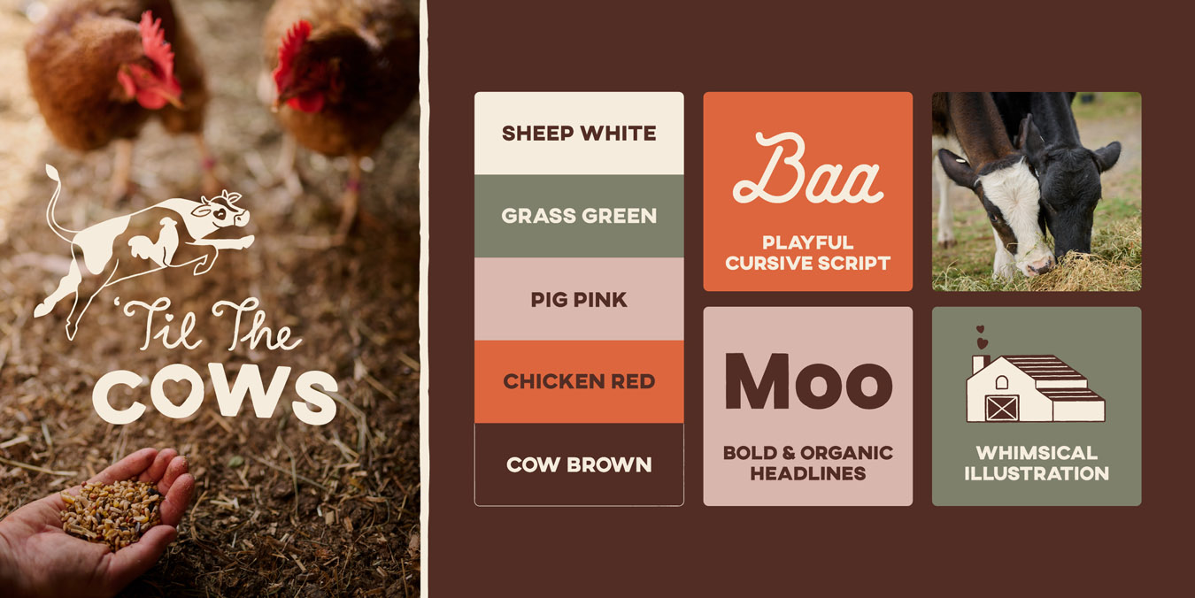
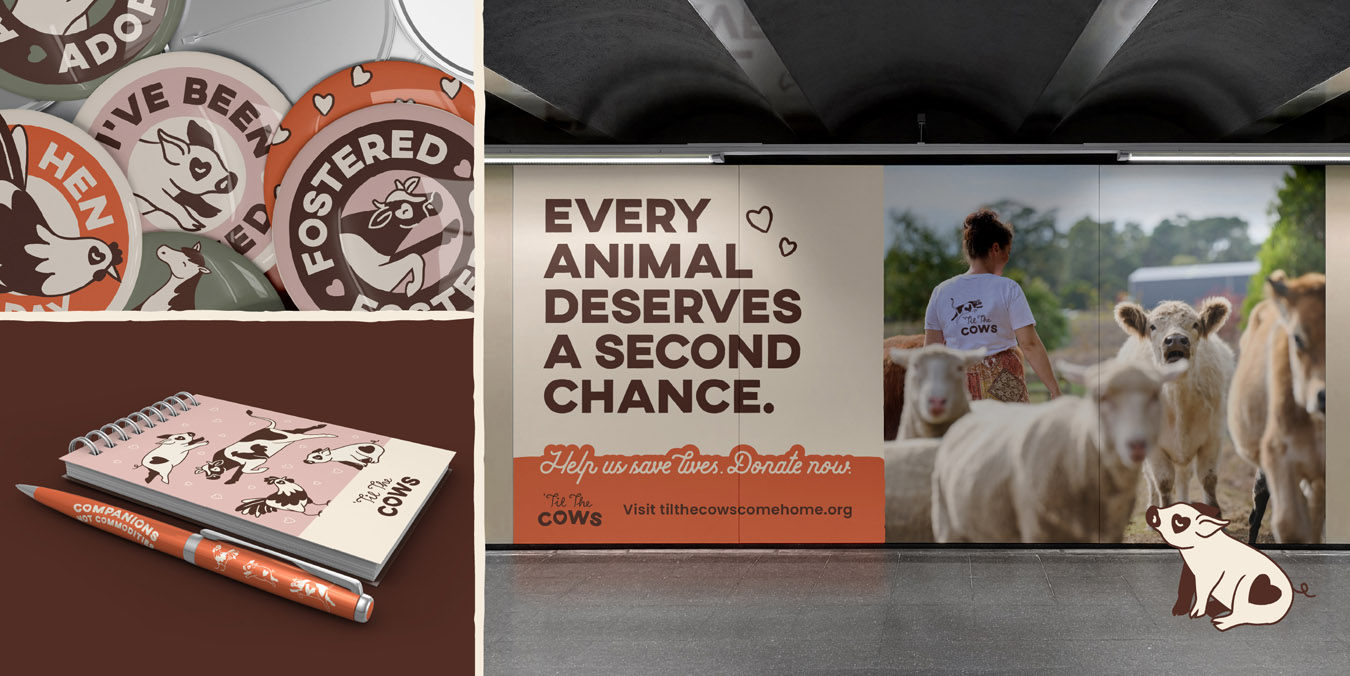
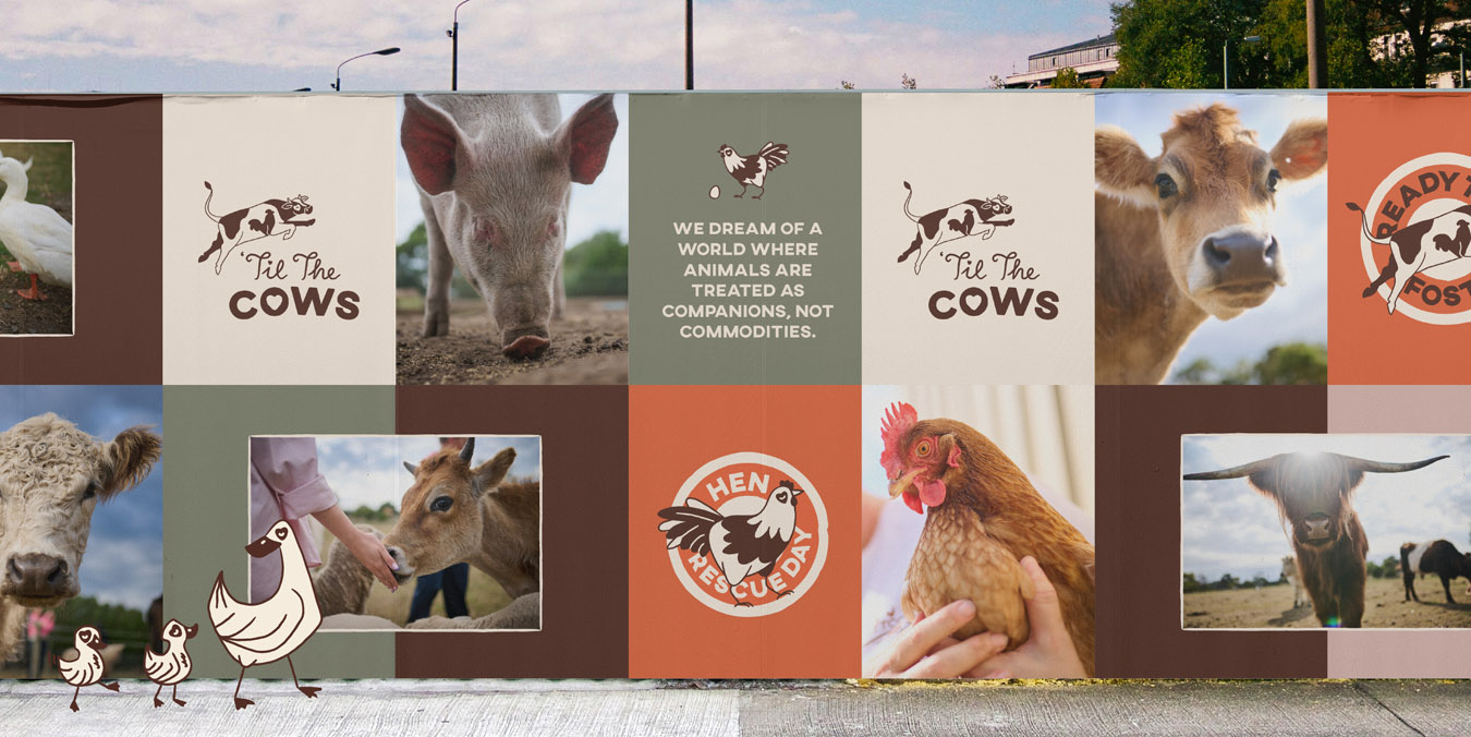
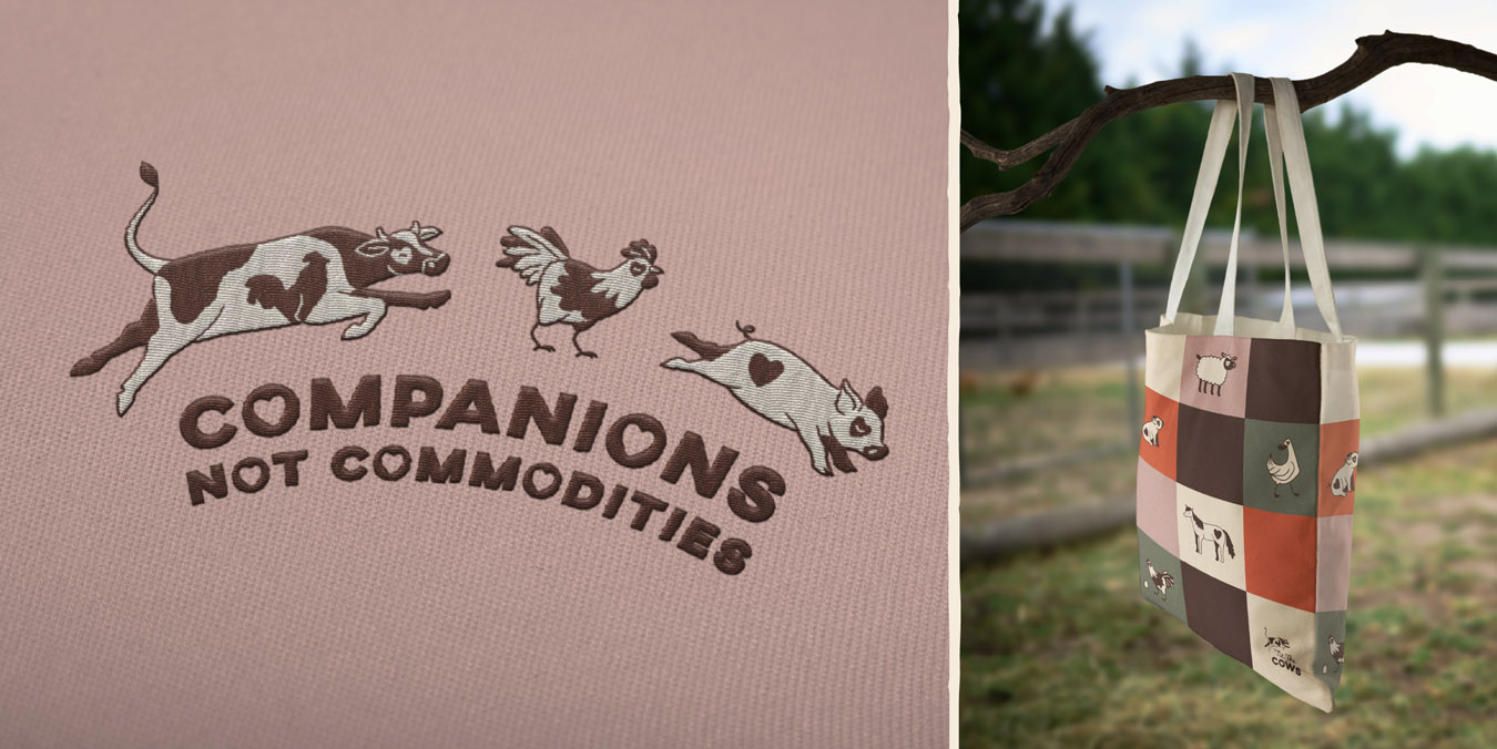
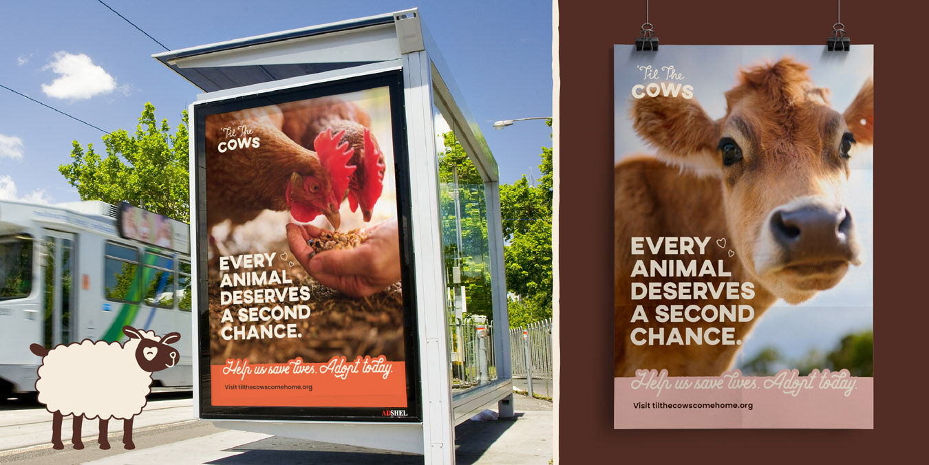
Taking off our (muddy) boots, we headed back to the studio to delve deeply into ’Til The Cows’ ethos, crafting a range of well-informed creative concepts that each uniquely embodied their values and aspirations. Each direction featured a distinct logo identity, bespoke illustrations, typography treatments, and a refreshed colour palette, complemented by in-situ mock-ups to visualise the proposed look and feel. Through collaborative refinement equally with volunteers as with leadership, we finalised a preferred approach that now proudly defines every facet of ’Til The Cows’ identity.
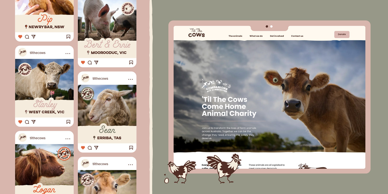
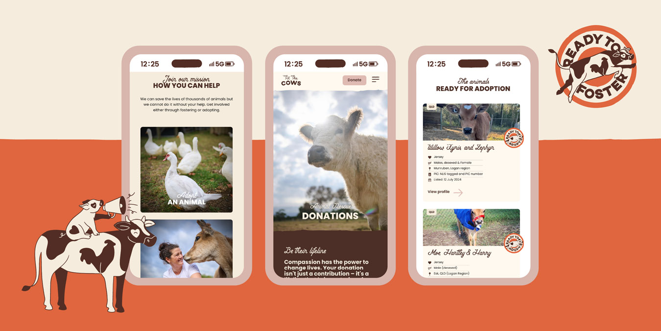
Next, we turned our attention to revamping ’Til The Cows’ website. Collaborating closely, we addressed previous shortcomings, starting with wireframing and developing information architecture. Prototyping and user journey testing ensured an intuitive online experience. The site was then dressed in the new brand, enriched with seemingly limitless in-house illustrative creations along with pro-bono photography by Andrew Craig, and video content captured by Second Breakfast Agency, and built with phased content integration for a seamless launch. Key functionalities such as donation portals, enquiry forms, resources, and heartwarming animal adoption and volunteer stories were meticulously integrated.
’Til The Cows’ refreshed brand resonated deeply with supporters, attracting a new wave of change-makers, evident in increased online engagement and donations.

