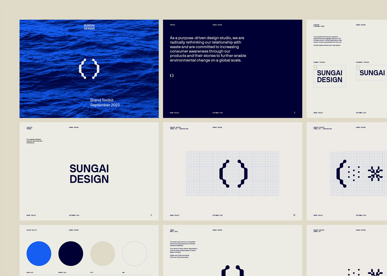
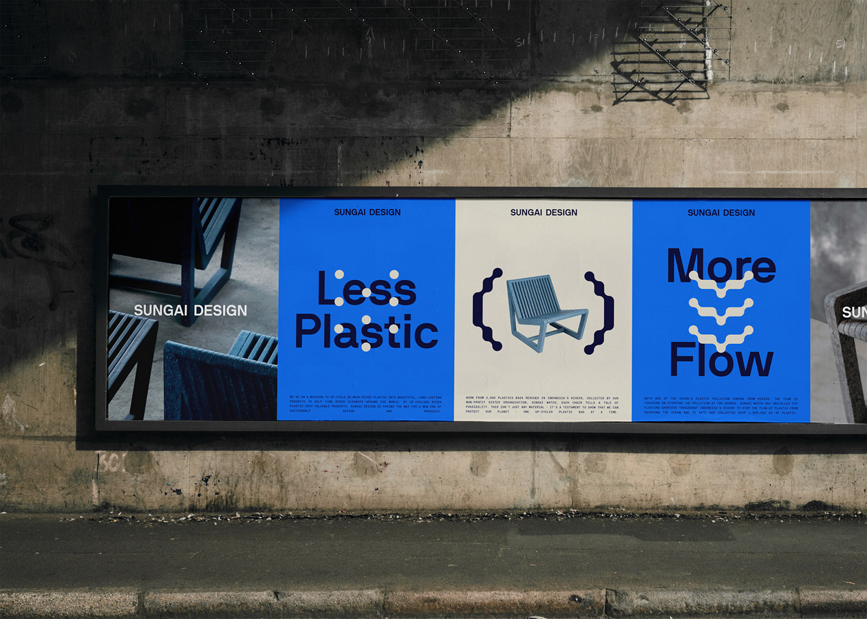
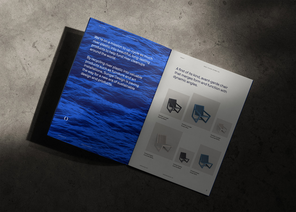
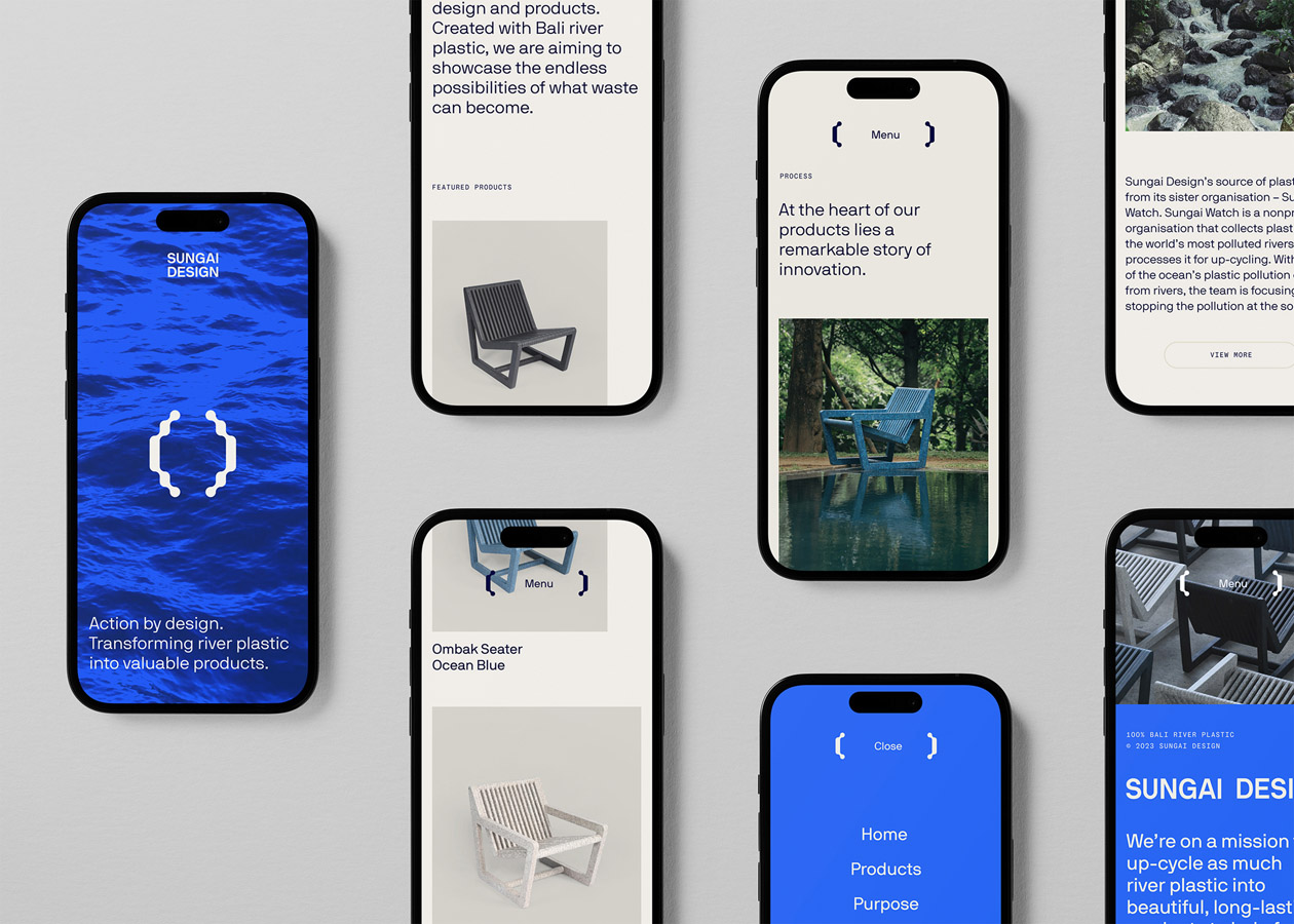
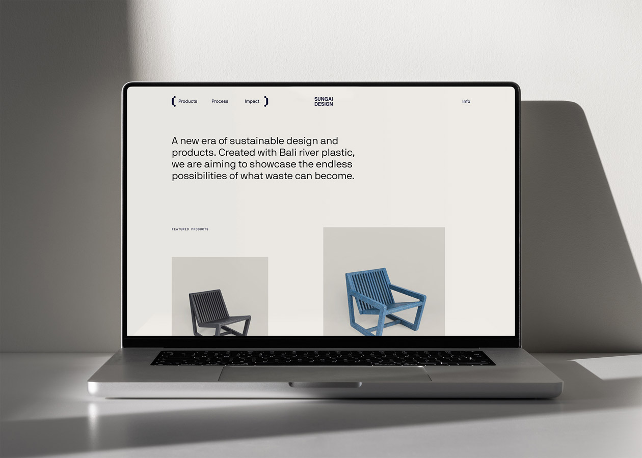
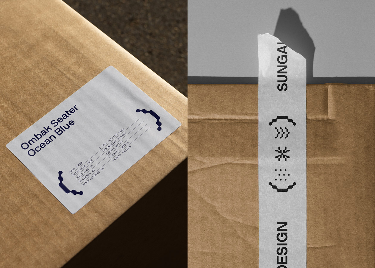
Central to communicating the story of Sungai Design is the brand symbol – inspired by the architecture of Balinese temples, it metaphorically depicts a gateway to a more sustainable future, a method for capturing river plastic and a bracket device to draw attention to impact statements.
The familiarity of the core brandmark connects with the local community and also echoes the shape and process of creating plastic CNC furniture panels. In concert with the symbol, a bold logotype and flexible brand language, including a vibrant blue core brand colour and animated icons, introduce a playful approachability to the identity.

