Finalist 2024

Rosie

Your Creative / Victorian Victorian Women’s Trust

Co-designing a safe space for young women and non-binary people to navigate life’s tricky situations.

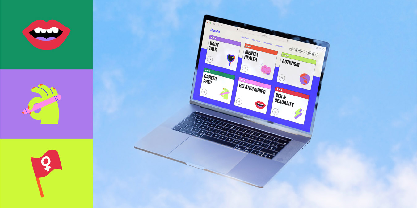
Rosie is a harm prevention initiative, a digital platform that provides young women and non-binary people with a safe space. Its content and online community are dedicated to debunking taboos and navigating life’s tricky situations.

Design Brief:

We were engaged by the Victorian Women’s Trust to rebrand and relaunch Rosie, a harm-prevention initiative running for over 10 years.

Offering crucial and quality resources on topics like climate activism and LGBTQIA+ rights, the brief highlighted a key challenge: adapting to the evolving needs of our audience post-pandemic. This period revealed increased mental health issues and economic disparities among young women and gender-diverse individuals.

Our goal was to transform Rosie to focus on contemporary issues like school, family, and gender identity, improve user experience, and rebrand with a fresh, engaging aesthetic.

We needed to ensure Rosie’s visual and verbal identity stayed relevant and relatable to today’s young people. Emphasis was placed on accessibility and redefining femininity while making Rosie a fun, colourful, and interactive space. It should feel like a ”cool older sister,” offering reliable information and facilitating engagement among young feminists aged 13-25.


This project was developed by:

Design Process

A digital environment users gravitate towards.
Our all-female in-house team designed Rosie as an engaging digital space tailored to its users. During the discovery phase, we conducted co-design workshops with teenagers aged 14-18. Their insights and ideas were essential in shaping the needs, aesthetics, and nuances of the brand and platform.

Workshop participants identified a need to not look like a government affiliate, and to ensure the communication design redefined what ‘femininity meant’, reflecting a new definition across touch points: to be bold, loud, empowering and unafraid to speak.

Throughout the discovery phase we took a deep dive into trending online cultures amongst teenagers, utilising trending hashtags and self-generated content from TikTok and SnapChat.

A space that feels inclusive, and engaging and truly reflects our findings visually.
From the discovery phase we identified four key visual themes that led our conceptualisation phase; activism posters, self-care consumer products, Y2K and neon trends. Our design team ideated several concepts that were then vetted by our UX designers for AA digital compliance.

Putting it to our audience, again and again
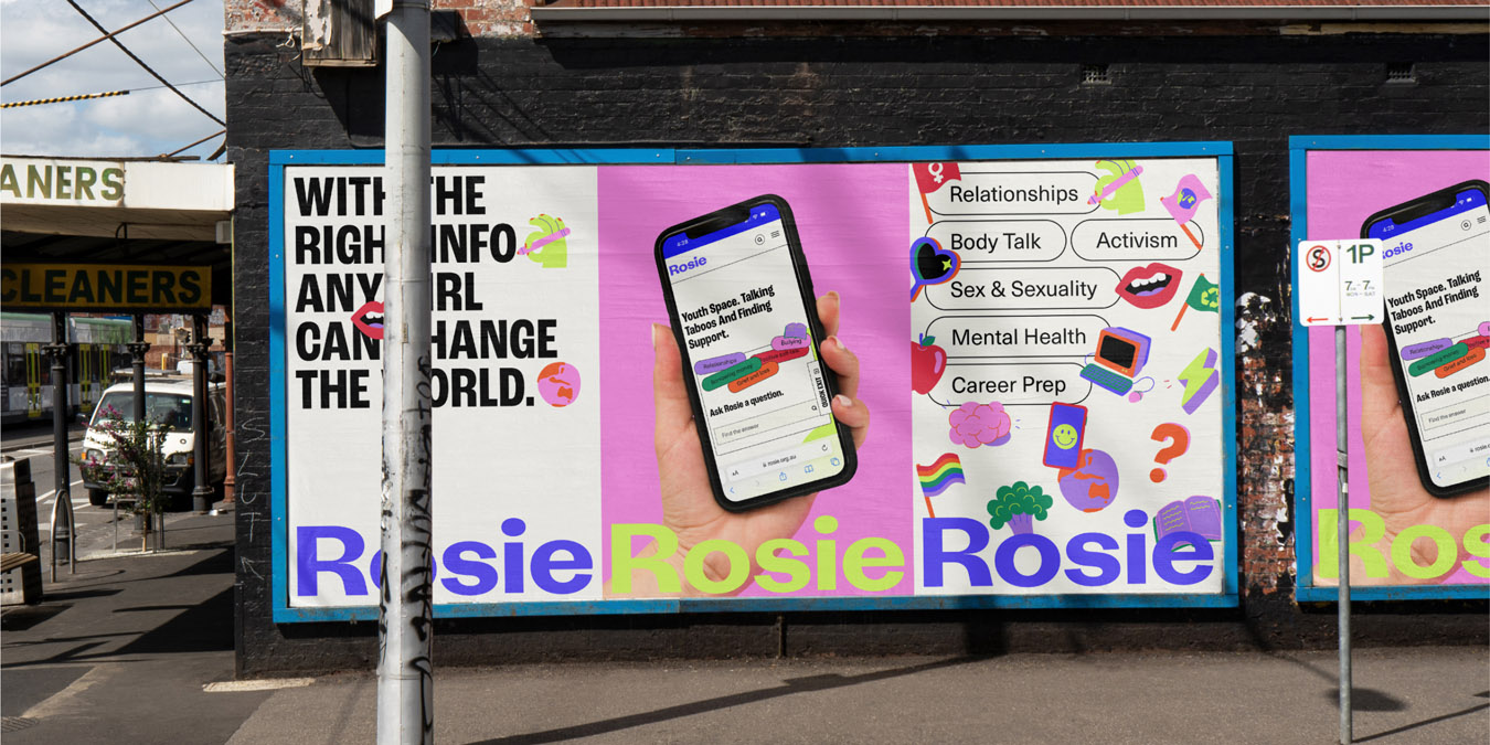
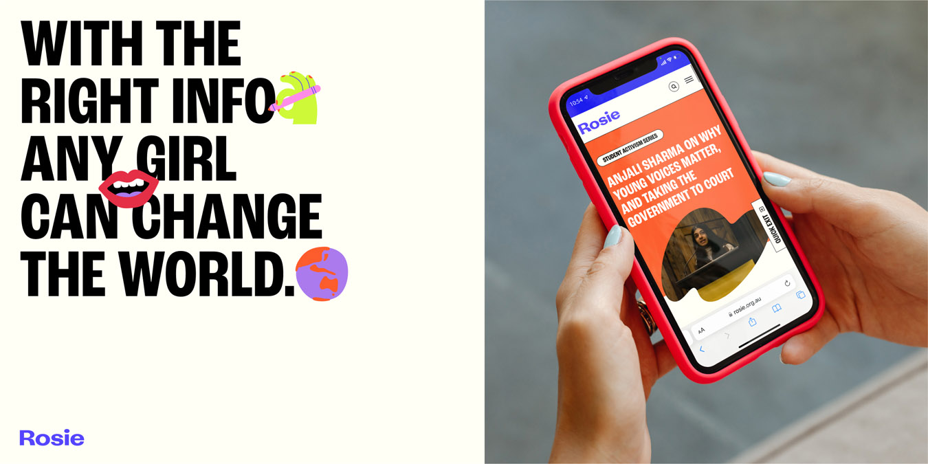
Once two concepts were finalised showing the new ‘Rosie’ in situ across a digital platform, posters, and social channels we reengaged our youth cohort for feedback, and ultimately they picked the concept that represents their space today.

Addressing Our Secondary Audience
Rosie’s secondary audience is ‘teachers and educational decision-makers’. Rosie in the Classroom is a program of Rosie that assists teachers in talking about difficult topics. The program advocates for topics like sexting or respect in relationships to be incorporated into the curriculum so that all teenagers are aware of their rights and can encourage respect within their school community. These lesson plans are suitable for students in years 7-10.

Design Excellence

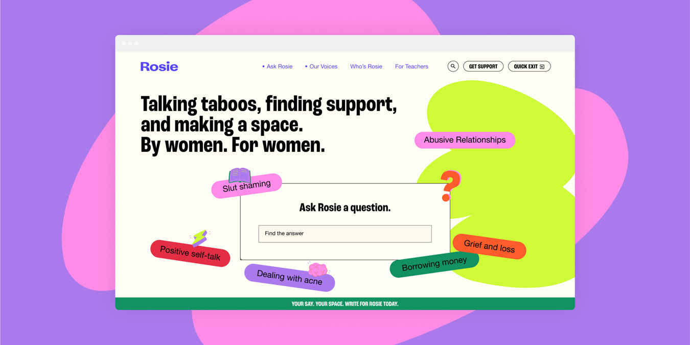
Rosie sets a new standard for user-centred digital spaces by seamlessly integrating aesthetics functionality, accessibility, safety and sustainability. This digital-first brand identity and web platform, tailored for Gen Z, addresses sensitive topics while providing a safe space for young women and non-binary people. The platform is not only visually appealing but also highly functional, ensuring users can easily access and navigate the resources they need. Rosie excels in user experience by incorporating insights from co-design workshops with teenagers aged 14-18. This collaborative approach ensures the platform resonates with the target audience, giving them a sense of ownership. The site’s accessibility features, such as intuitive navigation and barrier-free design, make it easy for all users, regardless of ability, to engage with the content.

The platform’s modern and vibrant aesthetics reflect the youthful energy of its users while maintaining a professional and welcoming atmosphere. Safety and quality are paramount for Rosie. The platform offers a secure environment where young women and non-binary people can explore challenging topics such as stress reduction, violence prevention, and sexual harassment. Respect and healthy relationships are emphasised throughout the platform, reinforcing its commitment to user well-being.

Sustainability is also a key consideration. The digital nature of Rosie reduces the need for physical resources, contributing to environmental sustainability. The platform is designed for longevity, with the flexibility to evolve as user needs change, ensuring it remains a valuable resource for years to come.

Design Innovation

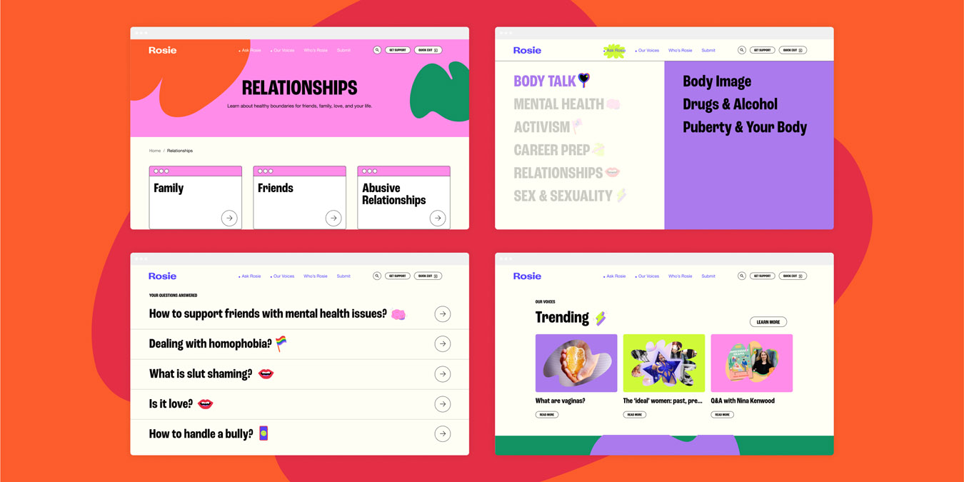
Rosie is a community, a space that youth can rely on and grow with. Our research indicated that a large majority of youth are craving trustworthy information delivered by community. Rosie responds to this need via the inclusion of an open submission process ’Our Voices’, inviting and calling on community to contribute to the platform.

A flexible design system
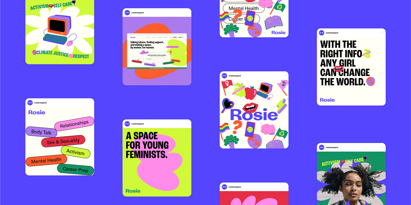
The design system is innovative in its approach to visual storytelling and user engagement. Graphic frames were created to fit both portrait and landscape orientations, allowing for flexible content placement. These frames can be layered in a single brand application, ensuring that any included photography is placed prominently in the top frame. This method not only maximises the use of available resources but also maintains a visually cohesive and engaging design across the platform and social channels.

A modern, relatable visual language
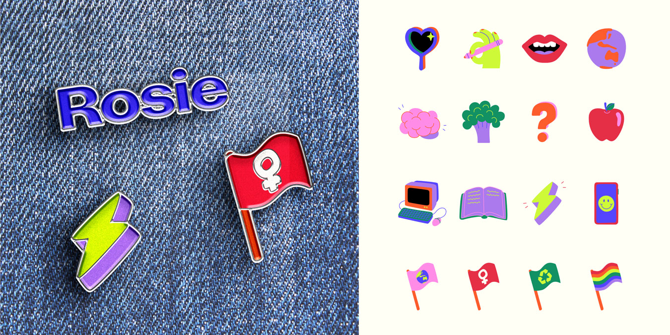
The custom emoji set is another feature of Rosie’s identity. These brand emojis serve as a fun and pictorial way to indicate article categories and communicate the common issues faced by today’s youth. By incorporating emojis into blocks of bold, all-caps text and using them as ’stickers’ in social posts, the design maintains a modern, relatable, and highly engaging aesthetic. This approach ensures that the content remains familiar and relevant to the target audience.

Typography
Fonts and typographic expression also play a crucial role in the innovative design of the Rosie platform. The ’Wavy Text’ treatment, used in custom brand applications, adds a playful and dynamic element to key topics or words relevant to the subject. This distinctive typographic style enhances the overall visual appeal and reinforces the brand’s identity.
By addressing the constraints of low budgets and the need for sensitive content, the Rosie project exemplifies how innovative design can solve legitimate problems and create new opportunities.

Design Impact

The Rosie project’s overall outcome has the potential to make a long-lasting and positive impact on society, the economy, and the environment. By creating a safe and inclusive digital space for young women and non-binary people to access resources and engage in discussions about sensitive topics, Rosie fosters a sense of community and support.
Socially, Rosie addresses the needs of youth culture by providing invaluable resources that help navigate life’s challenging situations. The platform’s design system, built for longevity, allows Victoria’s young people to take ownership, write for it, share information, and tackle tough issues. This sense of ownership and participation not only empowers users but also promotes a culture of openness and inclusivity.

While Rosie remains a predominantly female and female-identifying targeted resource, it strives to create an atmosphere of freedom without taboo around the journey of teen hood, regardless of gender. Rosie’s inclusive design represents youth culture and the issues they currently face, providing invaluable resources to this community and effectively representing them.

From an environmental perspective, the digital nature of Rosie minimises the need for physical resources, thereby reducing waste and environmental impact. The design adheres to the principles of a circular economy by focusing on sustainability and longevity. The platform is designed to evolve with the needs of its users, ensuring that it remains relevant and valuable over time.

Economically, the project showcases the positive impact of investing in professional design. By creating a platform that effectively represents and engages its target audience, Rosie demonstrates the value of a thoughtful and user-centered design process.

Communication Design 2024 Finalists

Sungai Design

Swear Words

Madjem Bambandila: The Art and Country of Kelly Koumalatsos

Museums Victoria Publishing / Julia Donkersley

Feeels - Motivational Design in Youth Mental Healthcare

Feeels Co / Rachel Wilson / Campbell Wilson

’Til The Cows Come Home Rebrand and Website

U-bahn Design / ’Til The Cows Come Home

Rural Women Online

Your Creative / Victorian Victorian Women’s Trust

RMIT University Communication Design Field Guide

Sandwich Press / RMIT University, School of Design, Communication Design / Shuai ShaoJiayu Cheng / Ruiying Zeng / Dr Nicola St John

HEALTH by DESIGN | The Future of Healthcare

Ian Wong / Dr. Indae Hwang / Evan Stainsby / Remy Wong / Monash Design Health Collab / Monash University Art Design and Architecture

Dwelling on the Platform: Housing Access and Equity in the Digital Society

Jacqui Alexander with Alexander & Sheridan Architecture / Warren Taylor, Monash University / Exhibition in collaboration with "Architecture of Care" / Anthony Clarke, BLOXAS; U–P (Paul Marcus Fuog, Uriah Gray and Timon Meury)

ECHO

C.Street Projects

A Once-in-a-Generation Opportunity to Reshape the Conversation on Child Sexual Abuse

The National Centre for Action on Child Sexual Abuse / Storyfolk

Air Playground II

Museums Victoria / Aeroplane Workshop / Giant Inflatables

Timeless Light

Nicholas Azidis / Rose Staff / Stefan Torto / Seoul Light Gwanghwamun

My Brunswick, Our Brunswick

Designed by Georgina Nolan

Future Classic: Recomposed

Jack Vanzet / Future Classic

ISO Brand Identity

Motherbird / ISO

Flemington, Prahran & Brighton Housing Renewal Project: Artwork Integration and Wayfinding

Little Rocket / Icon Construction / Homes Victoria / Arterial Design / Kobi Sainty Art / Alex Kerr, Ash Firebrace / Uncle Shane Clarke

Wren - the Women’s Recovery Network

Ward 6 / Alfred Health / Ramsay Health / Goulburn Valley Health

Joy Exhibition

Museums Victoria