This was a deeply personal project for Kelly, and the design process was inherently collaborative. In many ways, the project followed what Kelly calls a ‘non-Western’ publishing process.
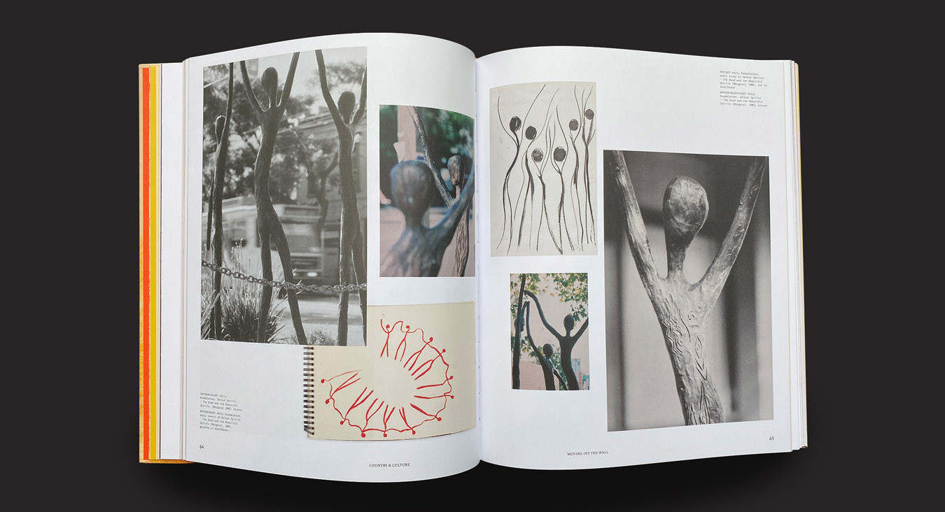
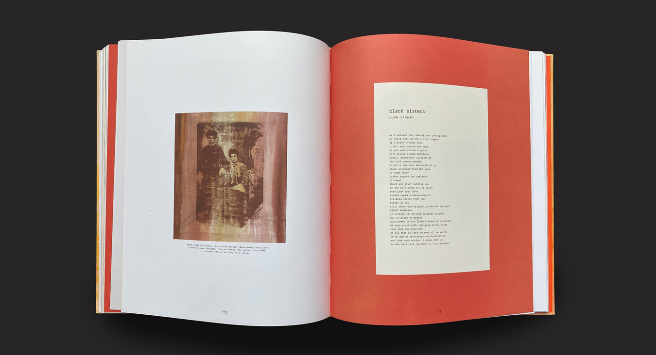
We began by visiting Kelly’s studio and exploring her extensive archive of artworks, sketchbooks and photography. It was a process of discovery and reflection, and in many ways the book became a meditation on what has been recorded. There is little documentation of Kelly’s early work, and what exists is often low-res or damaged. We made a design decision to lean into these imperfections, as these images record vital aspects of Kelly’s practice and reflect the time in which they were captured.
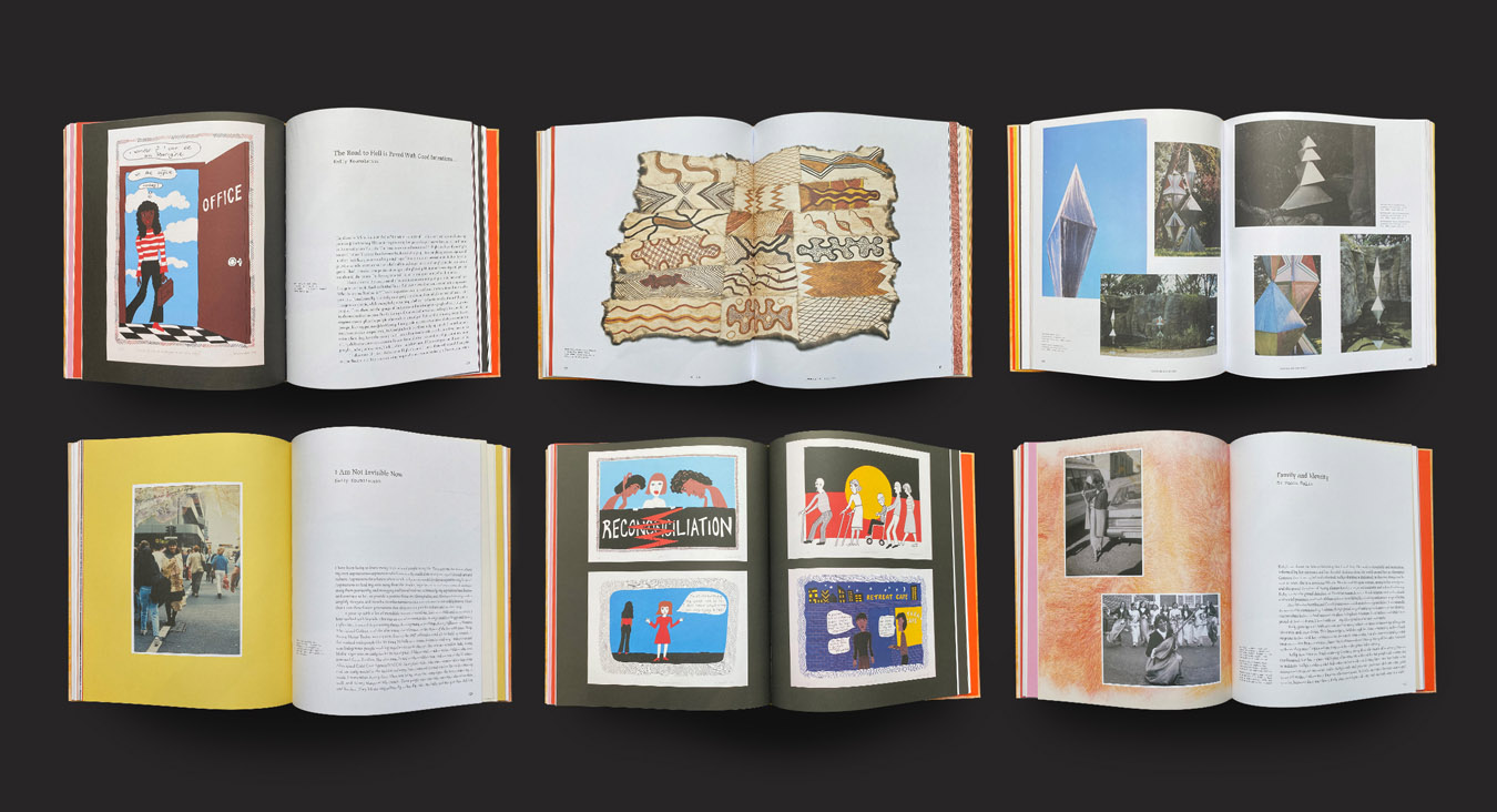
Kelly is driven to highlight the work of others, which is evident in the many voices featured throughout the book. The book’s form contracted and expanded throughout its development as new contributors were engaged and new imagery was uncovered. The design was required to shift seamlessly to incorporate this gradual flow, folding in each element as it arrived.
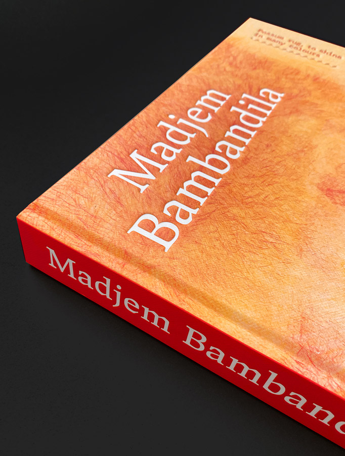
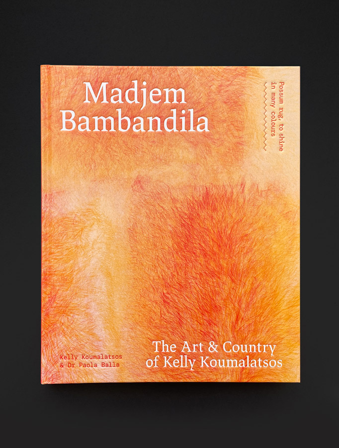
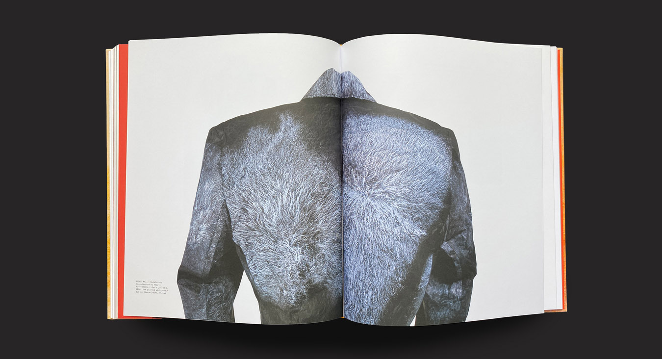
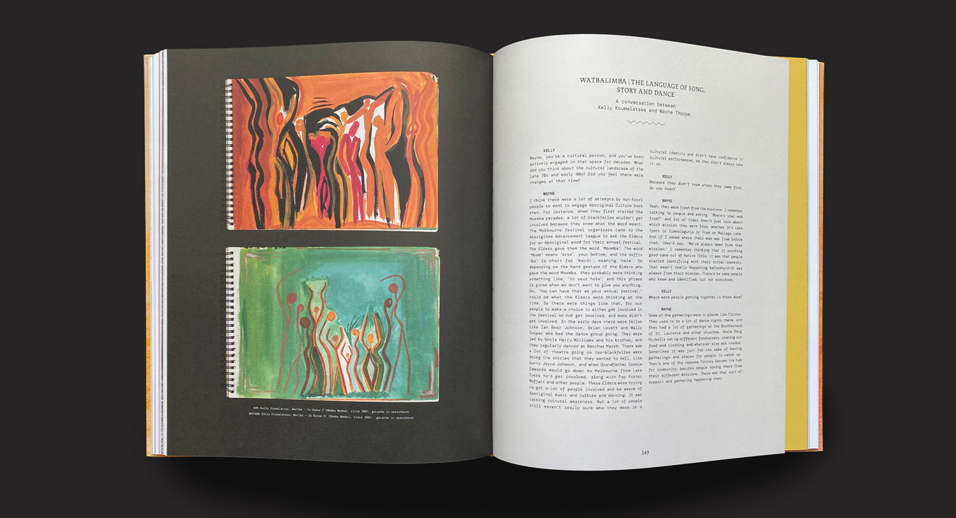
As Kelly notes in her introduction, ‘the book is beautifully produced and is a work of art in itself. Every detail was carefully chosen to celebrate and complement my artistic practice.’ The book’s treatment of colour was informed by Kelly’s body of work, with the warm, bright palette reflecting her contemporary vision. A deep respect for Kelly’s work is evident in the design details, from the repeated use of diamond and zigzag motifs (south-eastern patterns that are a feature of Kelly’s work) to the typewritten font that reflects Kelly’s involvement with 80s poetry zines. The cover’s grain embossing mirrors the texture of the paper used for Kelly’s possum prints, and the debossing of the book’s title type echoes the marks made by carving wood and lino – another vital aspect of Kelly’s practice.

