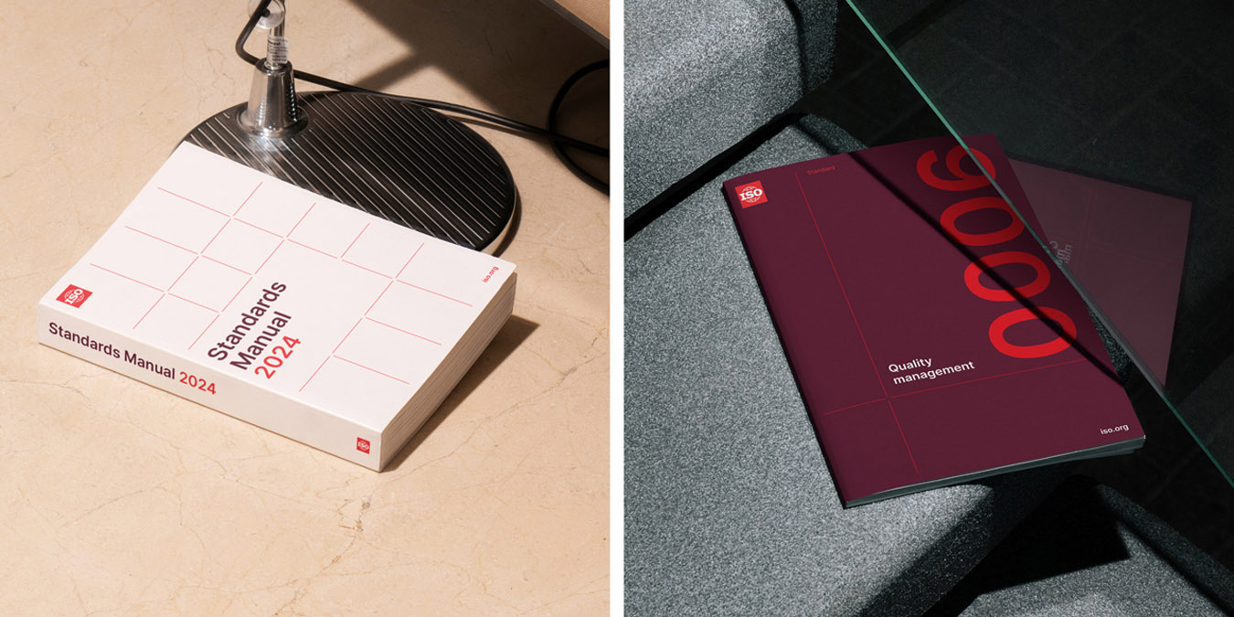
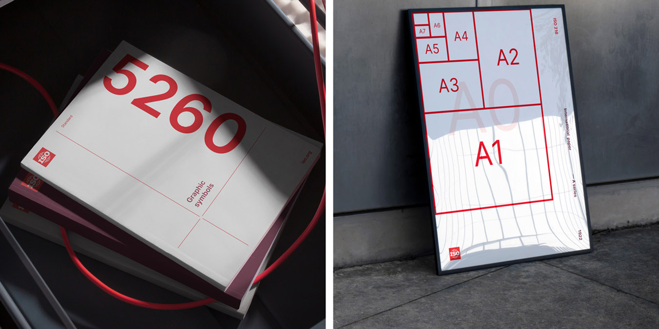
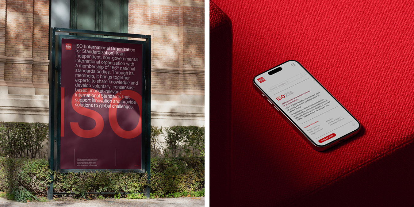
The design process for ISO’s new brand identity involved several key steps. Motherbird conducted a brand audit with a focus group to assess ISO’s current brand and identify areas for improvement, laying the strategic foundations for the new identity.
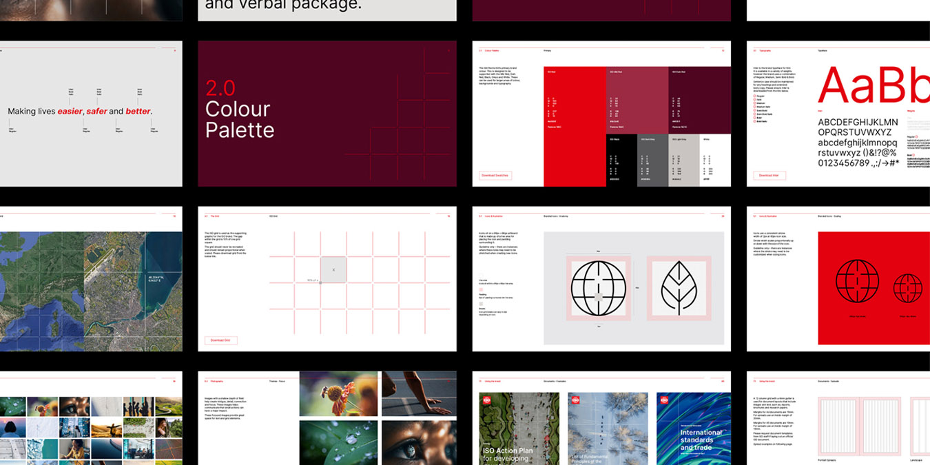
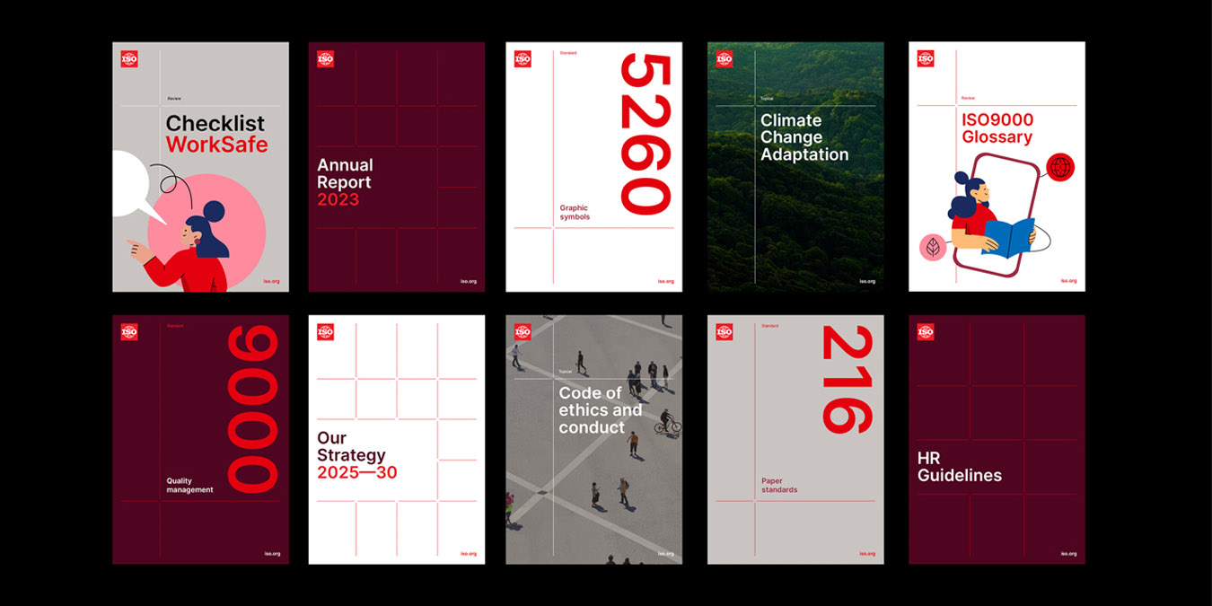
The audit revealed existing equity in certain brand elements, especially the brandmark. This was updated to align with the new brand direction and provide a stronger digital focus. However, it was apparent that ISO had a highly disorganised brand identity, featuring different approaches throughout the brand. To address this, Motherbird developed a ’Micro Meso Macro’ grid system, inspired by Earth’s longitude and latitude lines. This system enabled scalable brand communication, ensuring flexibility and consistency across platforms, regions, and audiences.
There was further brand development and exploration via a curated library of images and a customisable illustration asset kit that showcases ISO’s global influence and diverse impact. This includes custom-branded and fully accessible secondary icon sets to support the brand. A brand typeface that ticked all the accessibility boxes was carefully selected and a robust brand guideline created. From here the team at Motherbird commenced rollout of all ISO collateral, including a well-considered suite of motion assets ensuring the internal marketing and communications team were equipped with a set of templates and assets that would be useful for years to come.
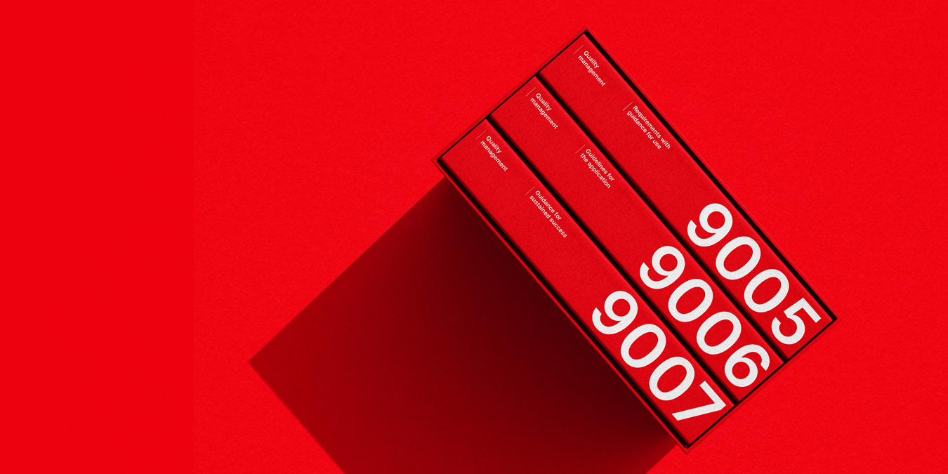
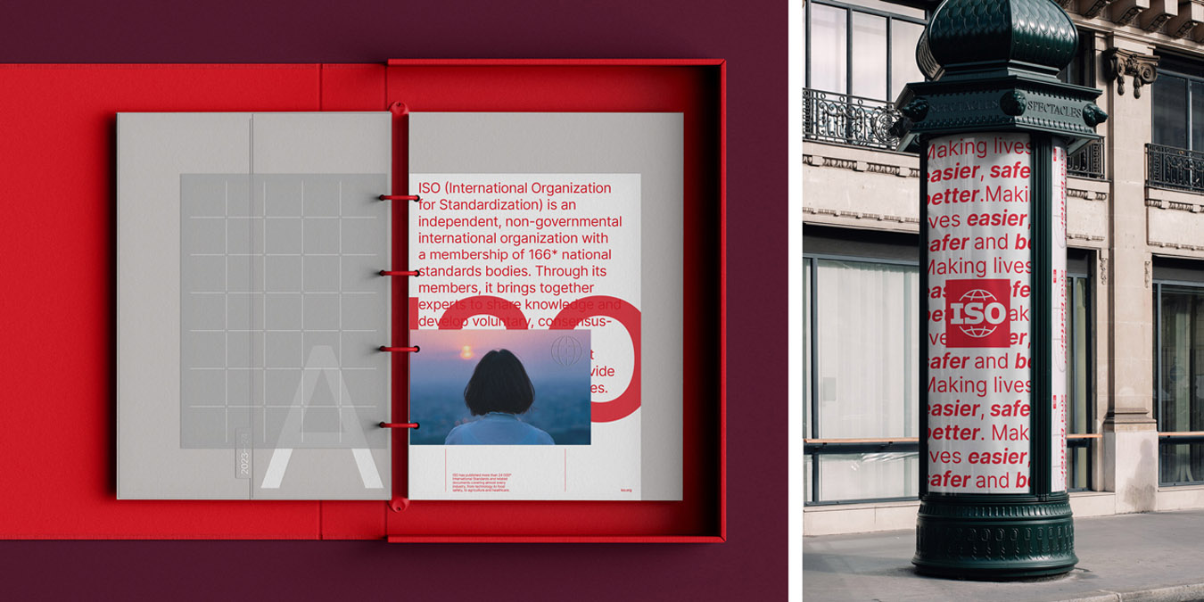
Ultimately, the design process undertaken culminated in a powerful system to manage ISO’s vast amount of collateral, ensuring the brand remains organised and consistent. These steps collectively ensured that the new brand identity is structured, precise, inclusive, and adaptable, aligning with ISO’s global reach and purpose and providing the marketing and communications team with a strong and cohesive brand to work with.

