Assemble’s purchase pathway had been designed around the challenge of saving enough money to buy a home. We discovered the challenges that people are experiencing in the housing market went well beyond this. People were struggling with rapid rises in rental agreements, a sense that the goalpost of home ownership were always shifting, and anxieties about buying from ‘dodgy’ developers. They described the home buying experience as ‘absurd’.
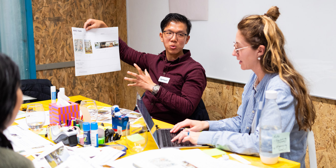
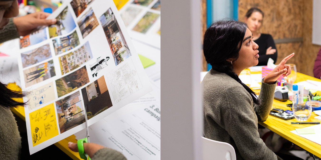
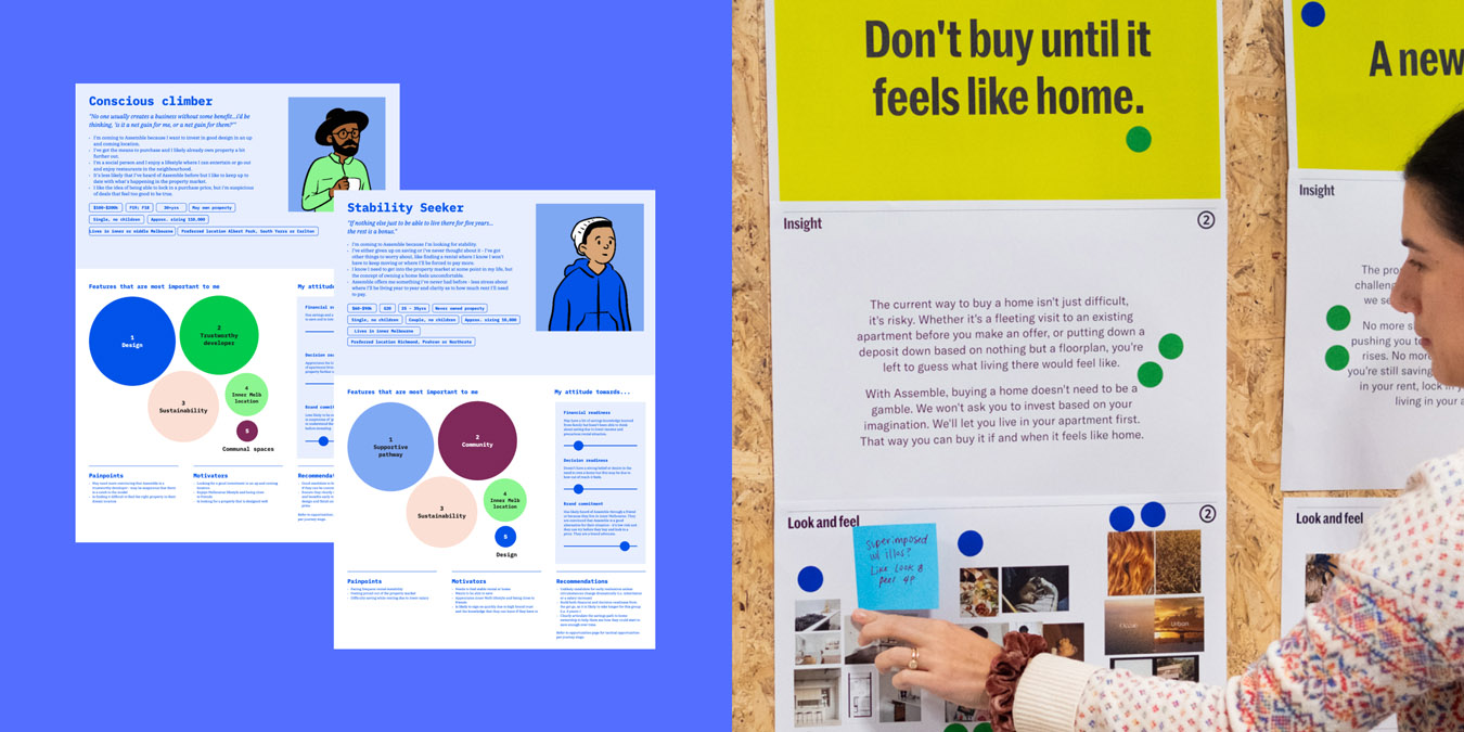
We ran design research with 45 people including current, former, and prospective residents. We learned about their hopes, pains and experiences through conversation, usability testing, and co-design.
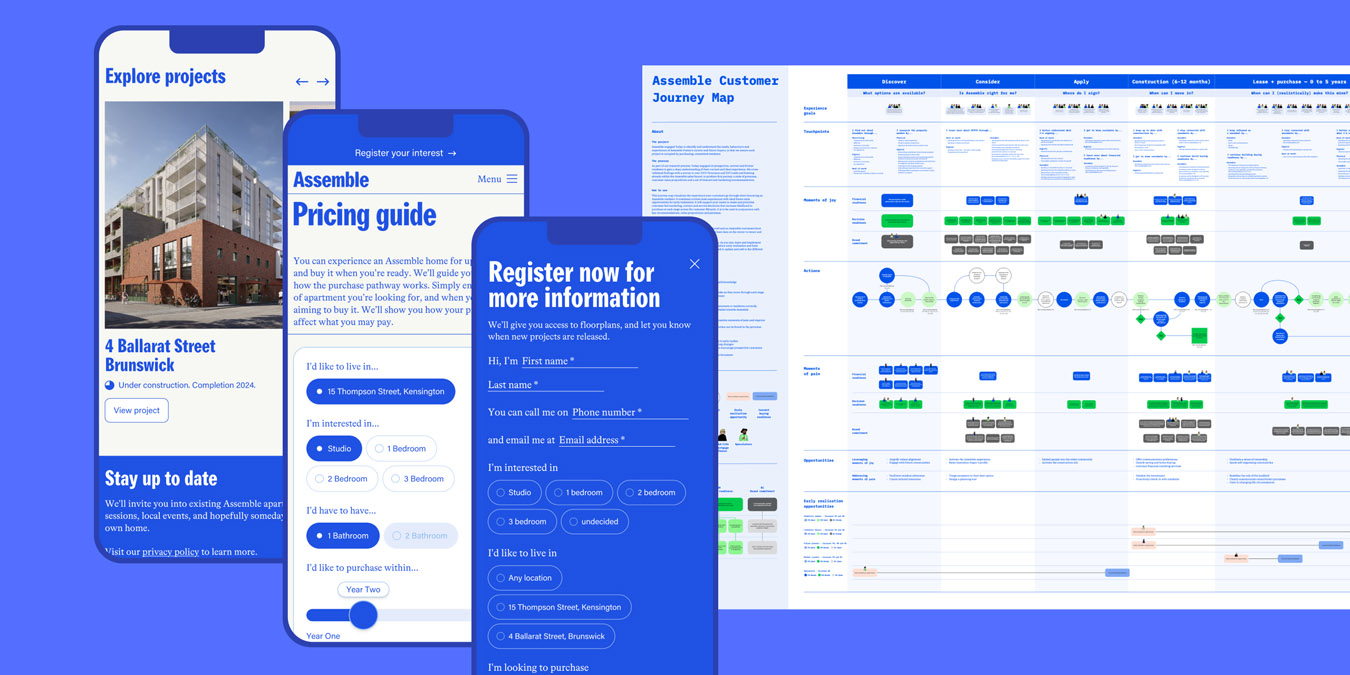
We mapped the end-to-end, 5+ year journey that residents would go on with Assemble, identifying opportunities for improvements at each stage of the experience. Based on our findings, we undertook a significant evolution to the customer strategy—who they serve, what they offer, how they communicate their value, and the channels they use to reach them.
Based on our findings, we undertook a significant evolution to the customer strategy—who they serve, what they offer, how they communicate their value, and the channels they use to reach them.
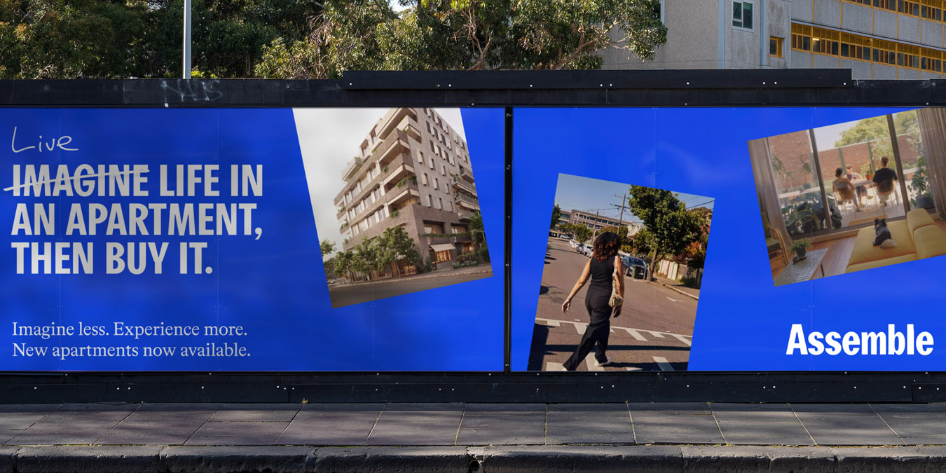
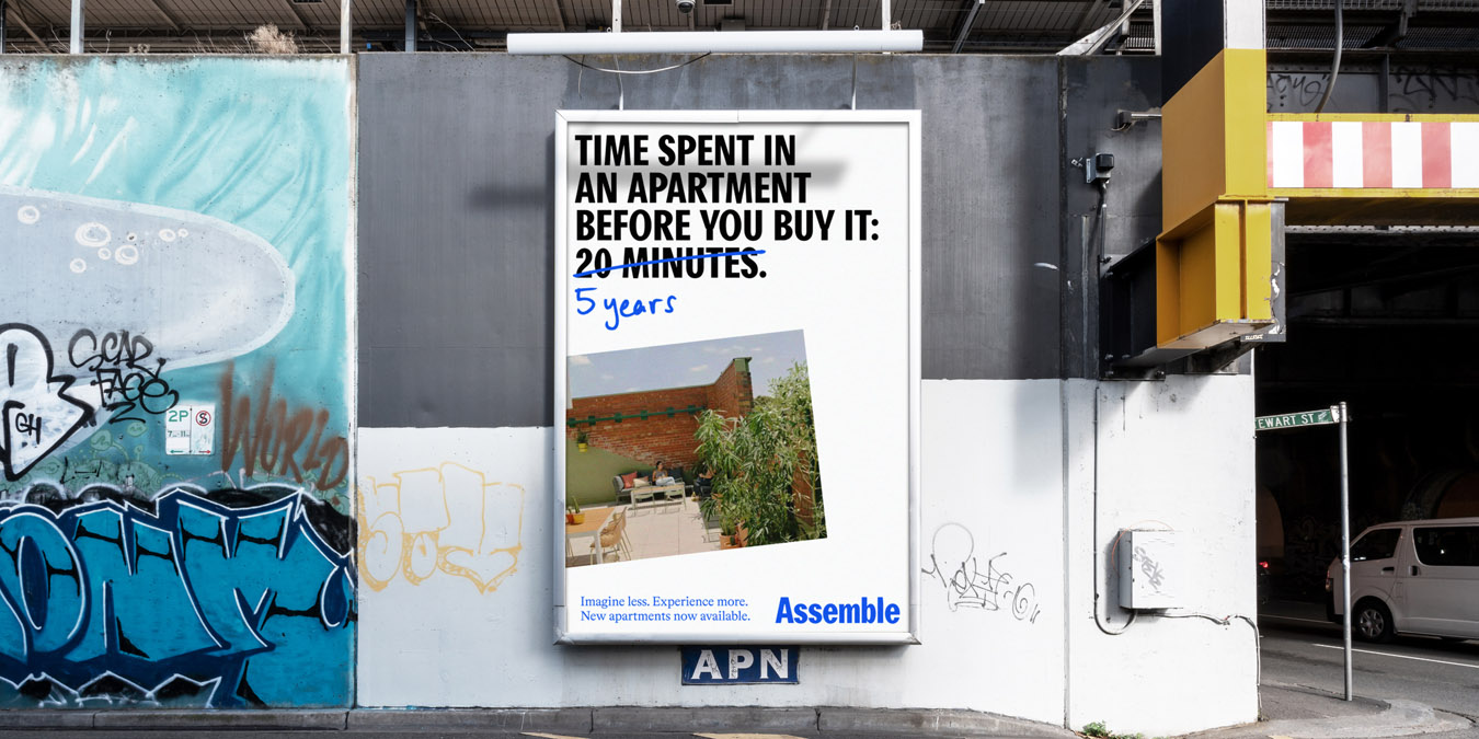
We used this as a basis to reimagine the prospective customer experience, developing a new marketing campaign and website that helps residents explore Assemble’s apartments and pricing model. We developed a new platform — ‘Imagine less. Experience more’ — that deliberately challenges the absurdity of the housing market.
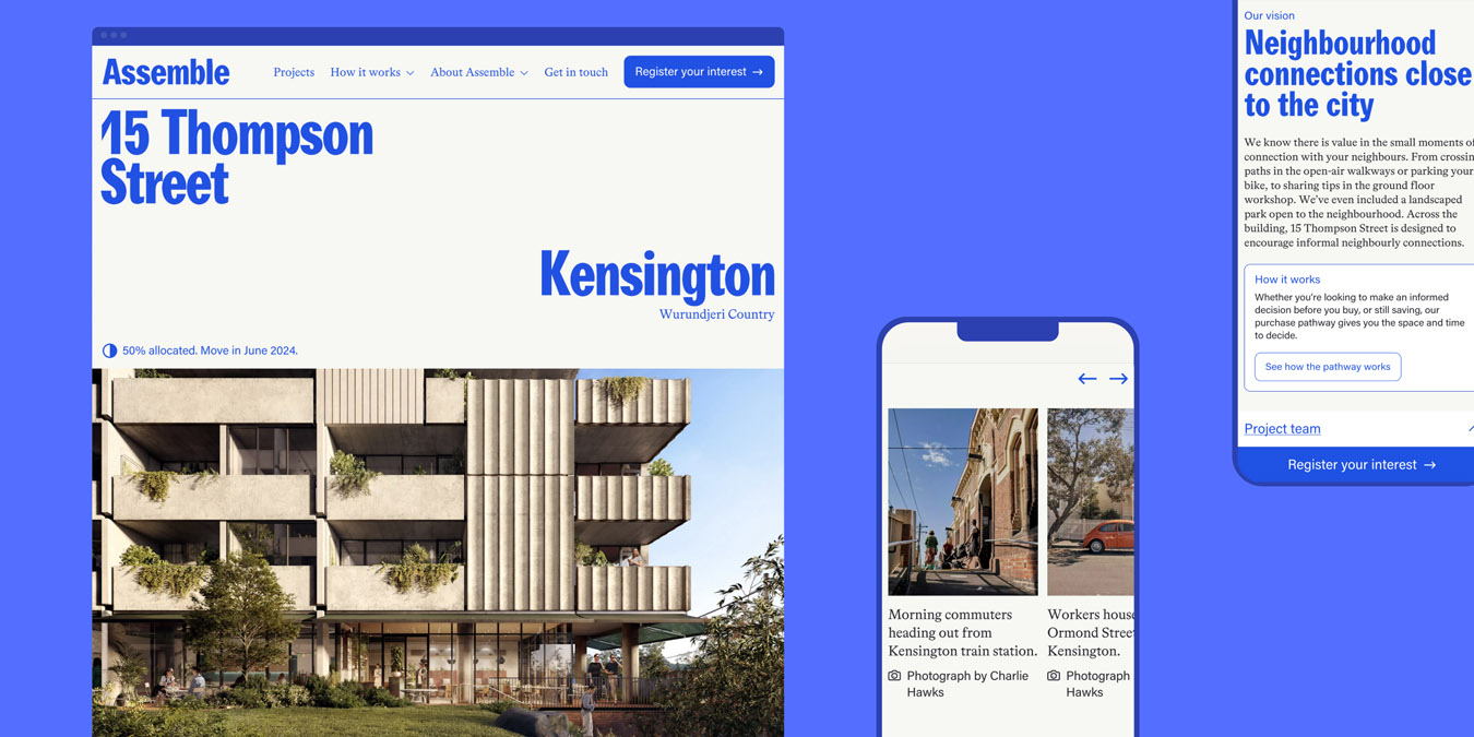
This platform came to life in the digital experience, where we stayed true to a strategy of transparency—giving people the information they want, where other property developers would hide it or hold it ransom in exchange for personal data.

