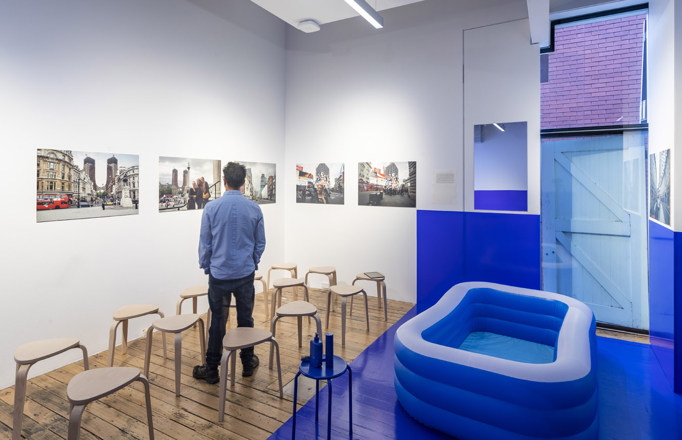
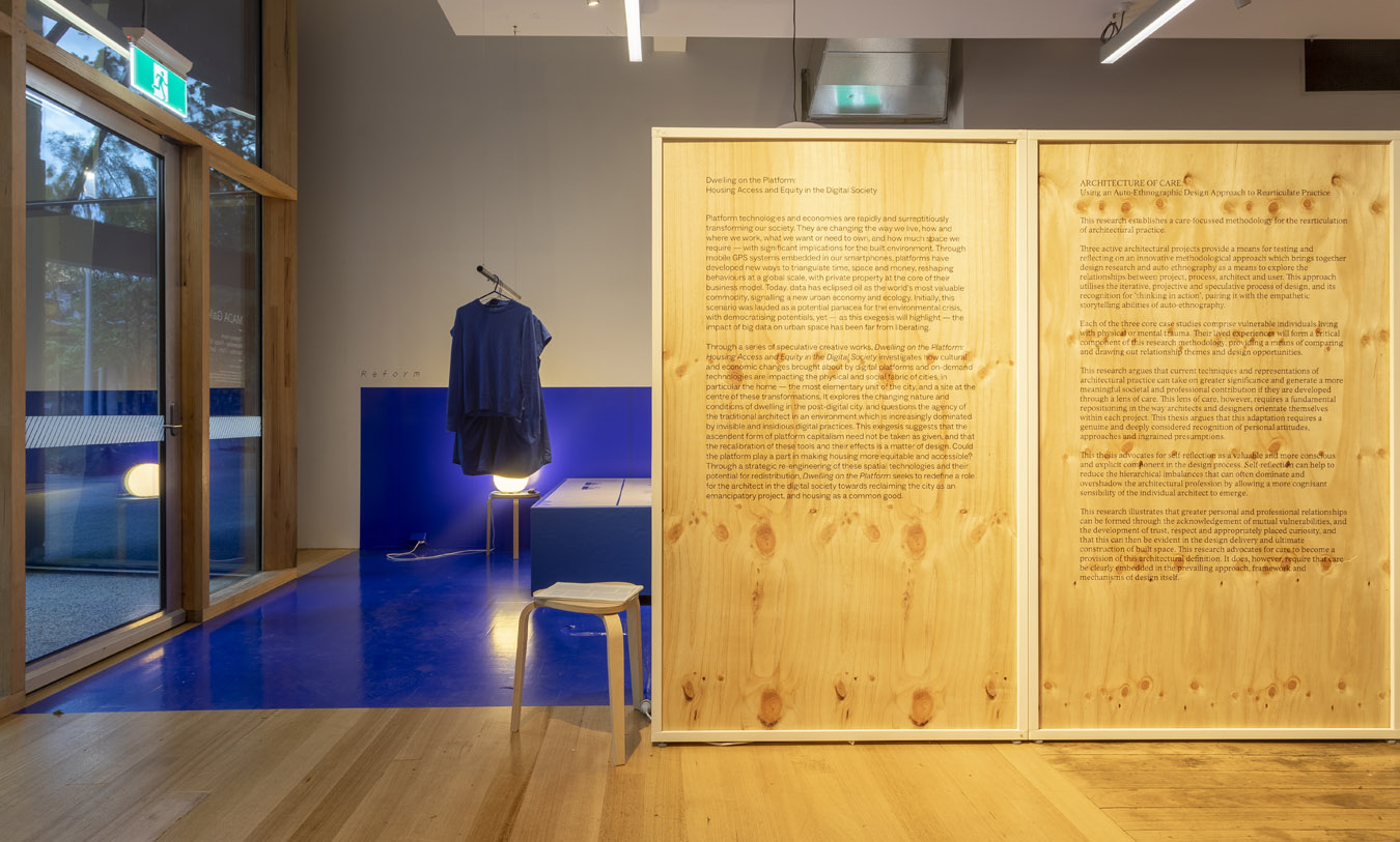
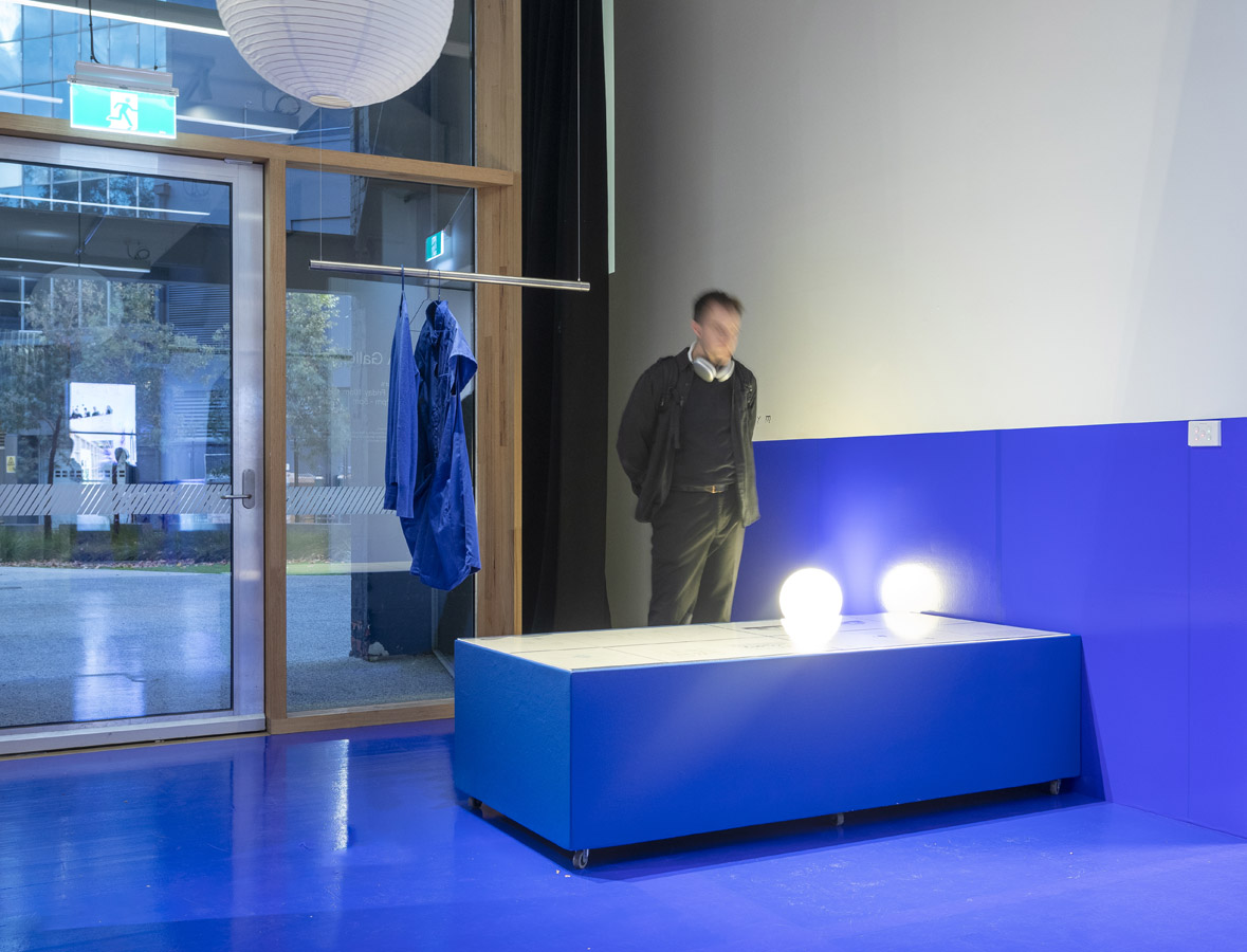
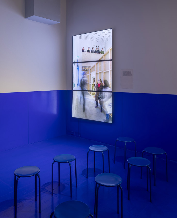
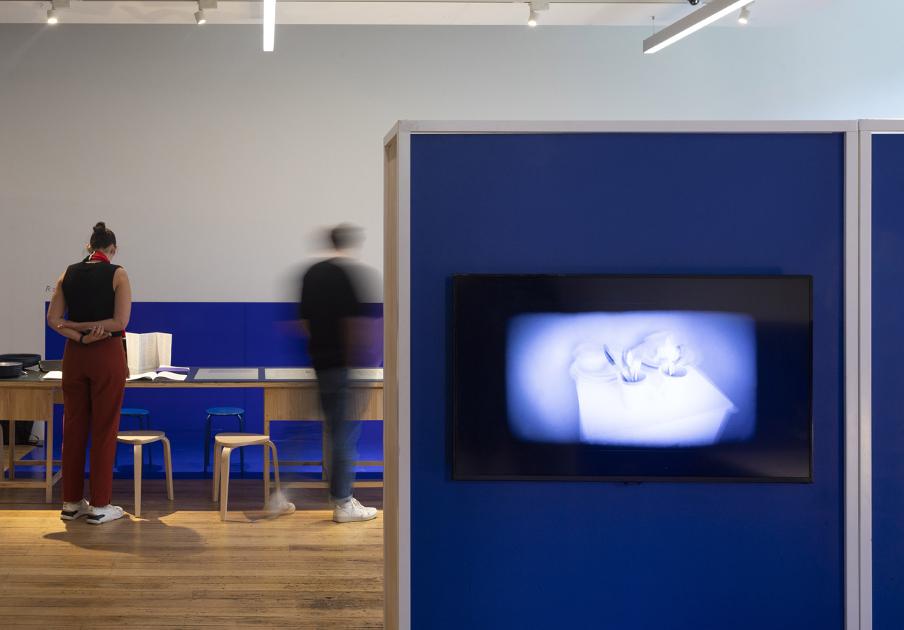
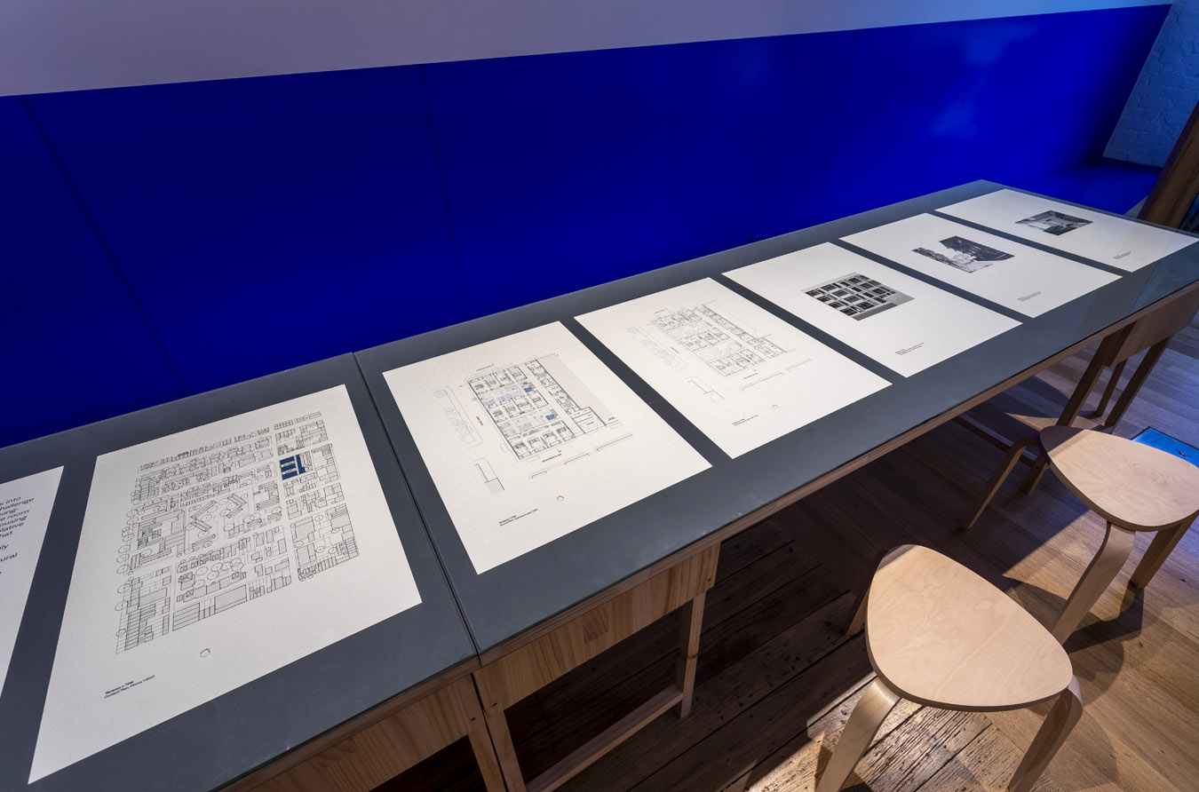
The exhibition featured a range of content including screen-based work, pamphlets, large-scale images, and architectural drawings. The work was arranged within the distributed domestic spaces most aligned with its content. For example, video footage documenting a new 18-bed house, purpose built for Airbnb in an inner Melbourne suburb played on a ‘hotel-like’ wall-mounted TV in the bedroom.
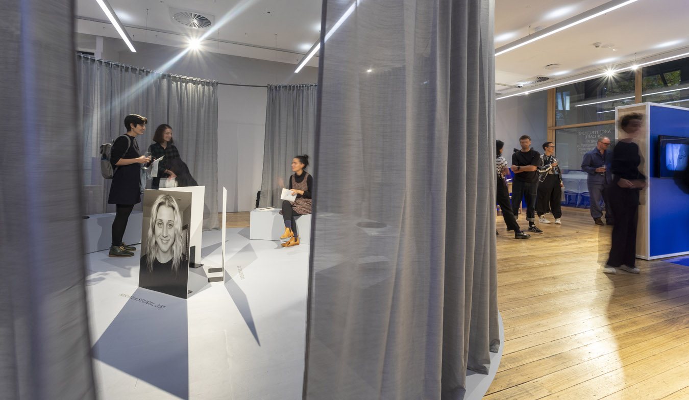
The exhibition deployed platforms to provide an immersive experience of their role in reshaping domestic space. Each of the rooms in the show were listed on a space-sharing platform pertaining to their use: Airbnb (bedroom), Swimply (bathroom), Peerspace (kitchen) and Creative Spaces (media room). Available rooms were implied through their distinctive electric blue block colour which hugged the corners of the gallery, demarcating zones for use through paint and vinyl that subsumed all furniture arranged within them. The central circular space – “occupied’ by Anthony Clarke’s exhibition “Architecture of Care” – was articulated in grey and delineated a sheer silver curtain to signal its enclosure. In other words, Clarke’s exhibition was treated as a permanent exhibition nested within the overall exhibition, further demonstrating the performative and programmatic possibilities of the platform.
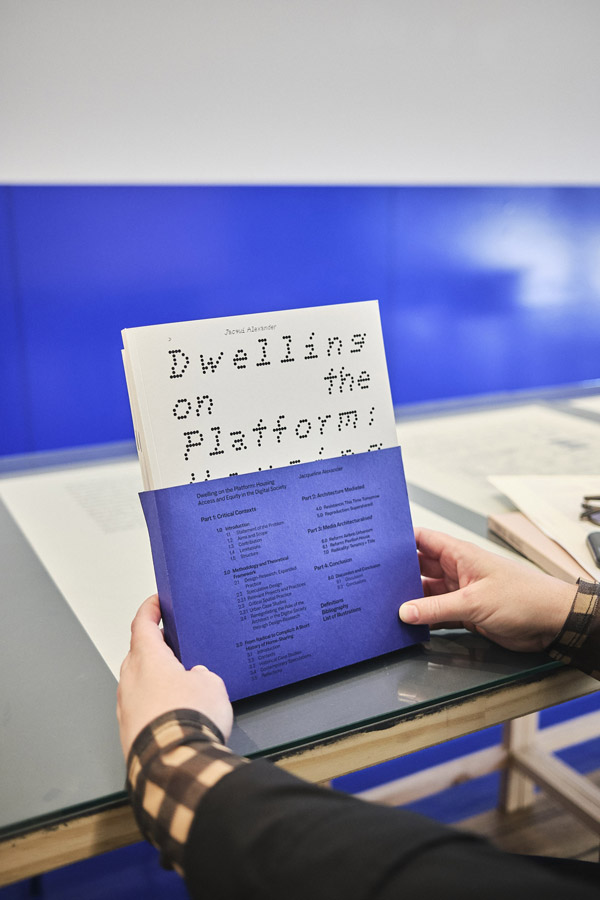
The exhibition design for ”Dwelling on the Platform” and ”Architecture of Care” was, in actuality, a highly integrative concept co-designed by Alexander & Sheridan and BLOXAS, in collaboration with Warren Taylor and U–P who designed the accompanying publications respectively, as well as printed take-aways. Dwelling on the Platform’s blue vinyl datum references the blue dust jacket of the publication, and adopts a common design language. In this way, the architectural and graphic components work cohesively together to deliver the content across a range of formats to engage different audiences.

