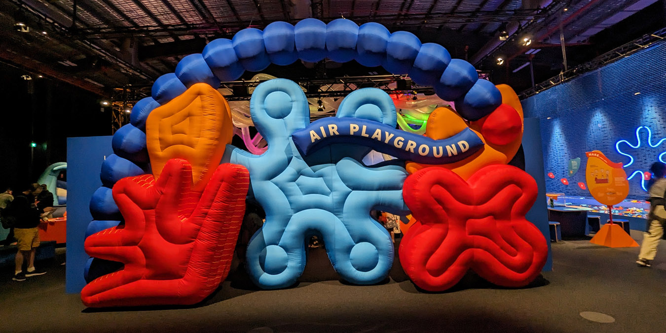
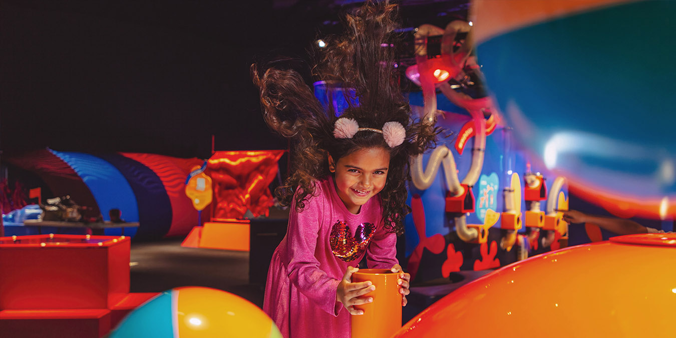
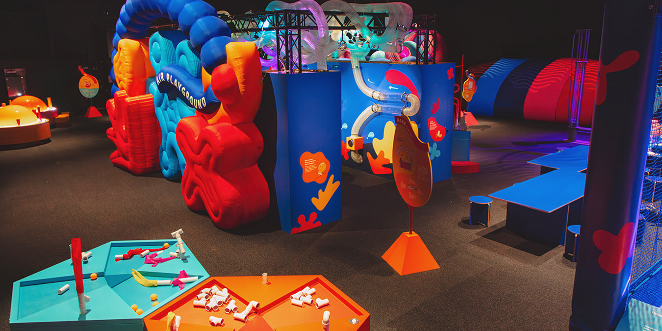
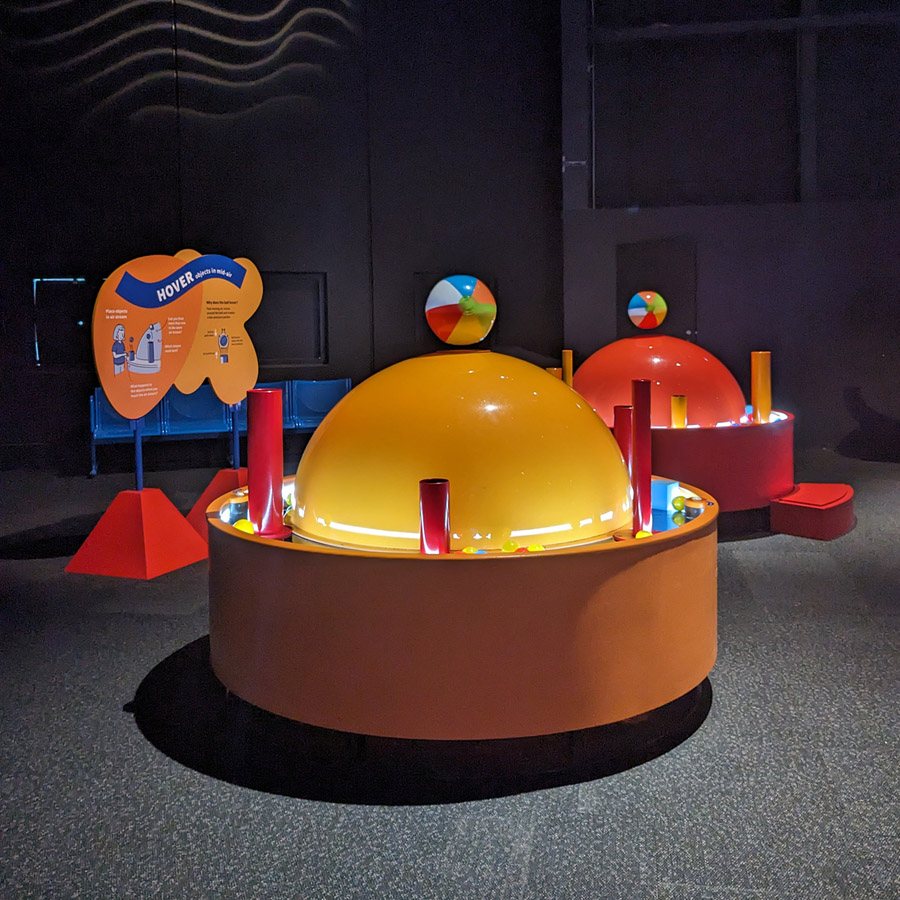
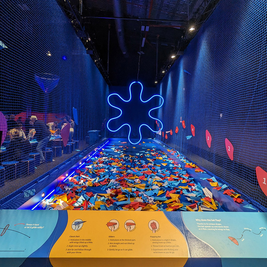
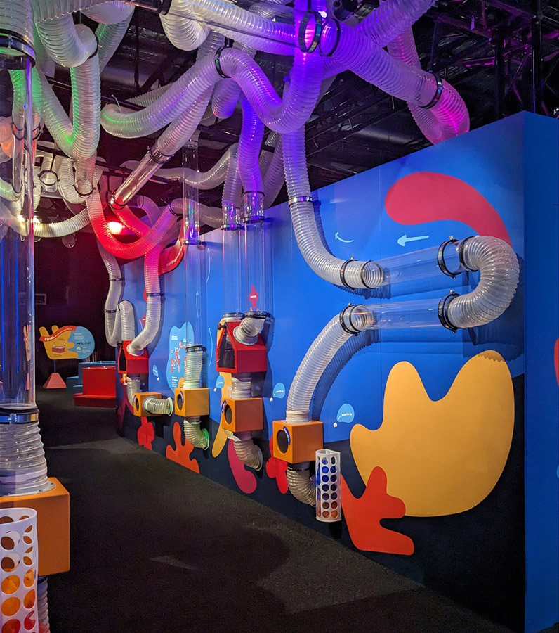
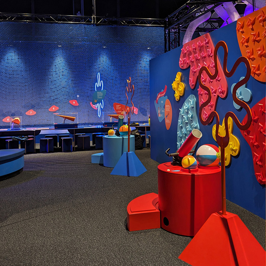
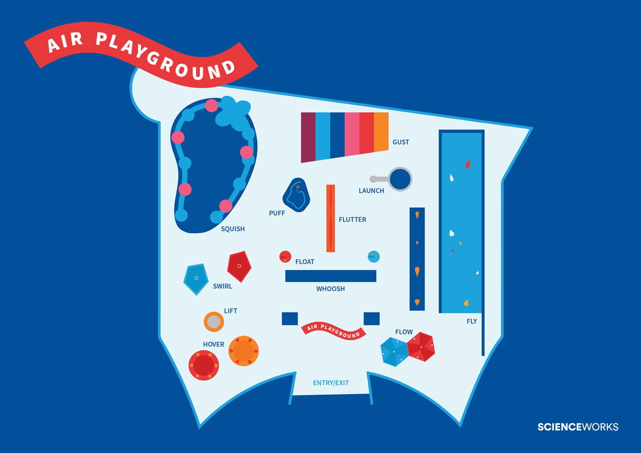
Air Playground II was a united effort between the spatial, communications and experience development team. The design process commenced through analysing the successes and opportunities for development within the original exhibition. This uncovered a need for a brighter, bolder identity whilst retaining some of the existing interactives. This required a focus on colour, shape, and movement. In particular, the movement of air became the chosen concept for the exhibition, which was inspired by mid-century mobiles and flying ribbons. We then worked closely with the external team from Aeroplane Workshop to refurbish the interactives, collaborating to expand the vision for Air Playground II to incorporate 12 activity stations: fly, gust, squish, launch, flutter, puff, swirl, hover, lift, flow, whoosh and float.
Faced with the inability to change the existing walls and infrastructure within the gallery at Scienceworks, the designers developed a darker space with vibrant spot-lit features, to obscure the presence of the walls and shift attention to built form. Existing interactives, which were previously geometric and mechanical, were reworked to become stylistically soft and more playful. This conveyed a sense lightness and fun that was more strongly aligned with the core concept of air.
Alongside the spatial elements, our communication design team focused on providing clear instructions and educational content connected to the fields of Science, Technology, Engineering and Mathematics (STEM). This inspired a set of lively illustrations utilising bright colours and floating shapes, introducing ideas in an exciting and absorbing way for our target audience of 6-10 year olds. To ensure the educational content was communicated clearly, we performed consecutive rounds of audience testing during the school holidays (a peak visitation period for families). This provided the feedback required to improve audience satisfaction, balancing educational messaging with an engaging and memorable experience for our target audience.

