Finalist 2023

The Homeless Project

Katarina Kopecka / Swinburne University of Technology

Making a difference one brick at a time

The Homeless Project is a registered charity in Victoria with a mission to provide safe and affordable housing for people in need. Vouched to dedicate 100% of raised donations to the cause, the charity has little capacity to grow. This project proposes a new brand identity, a marketing campaign with emotional appeal, and a website that communicates the value this charity brings to the community. The new design and strategy should help increase awareness and raise enough funds to fulfill the charity's vision.

Design Brief:

The Homeless Project is a registered charity with a mission to provide opportunities for all people to access safe and affordable housing. The organisation runs a variety of interventions aimed at fostering a sense of belonging, engaging the broader community, and empowering people who have been homeless or at risk of homelessness with skills to foster change.

The charity vouched to dedicate 100% of donations to the cause, which leaves them with no budget for staff, design, or marketing. This makes it challenging to create brand awareness and drive donations that could make a difference.

This capstone project offered The Homeless Project competitive branding, a new website design, as well as a marketing strategy that can help to change the behaviour of the local community, drive interest, create an emotional attachment with the brand, and ultimately drive donations, sponsors, and volunteers.


This project was developed by:

Design Process

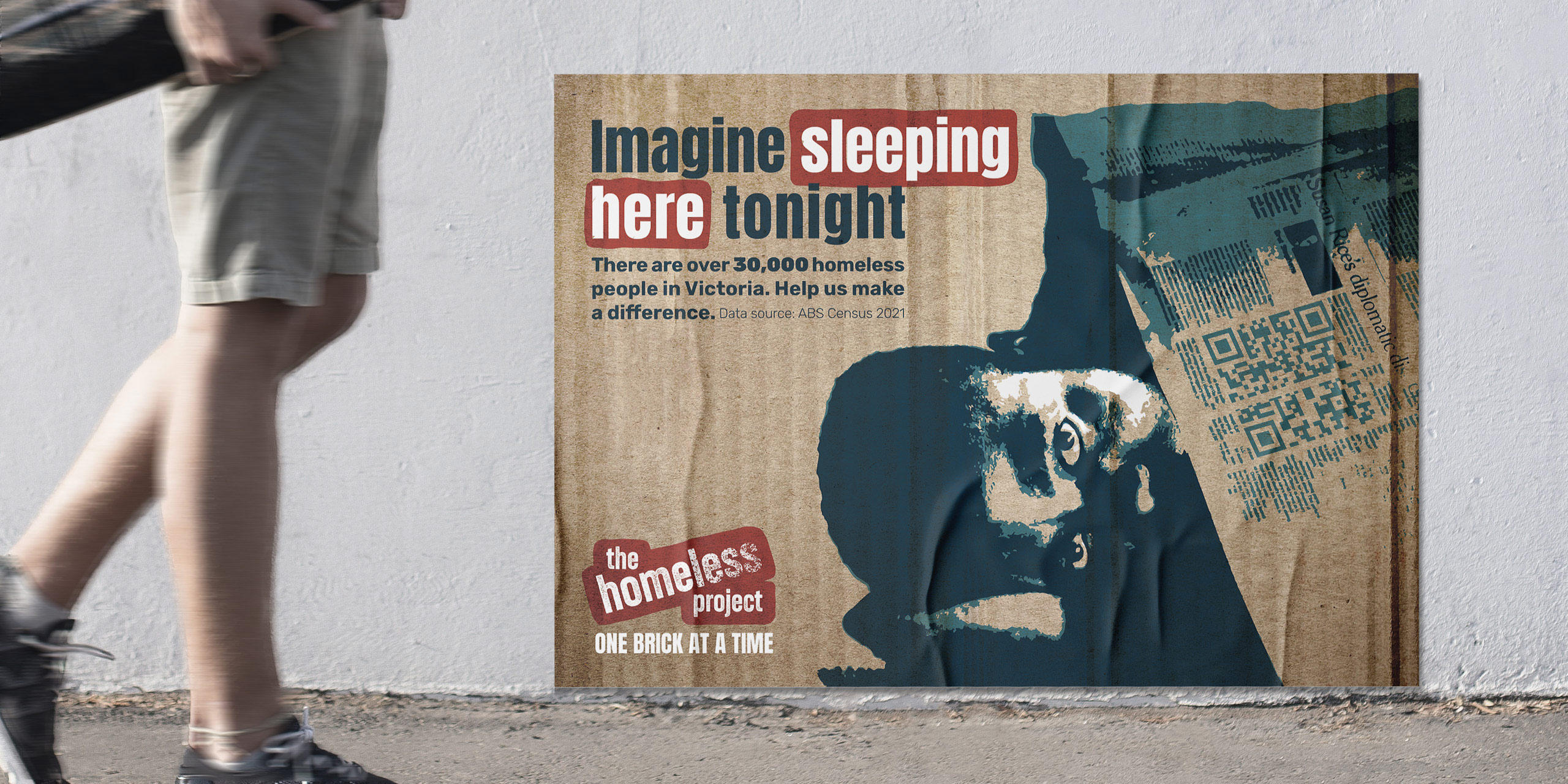
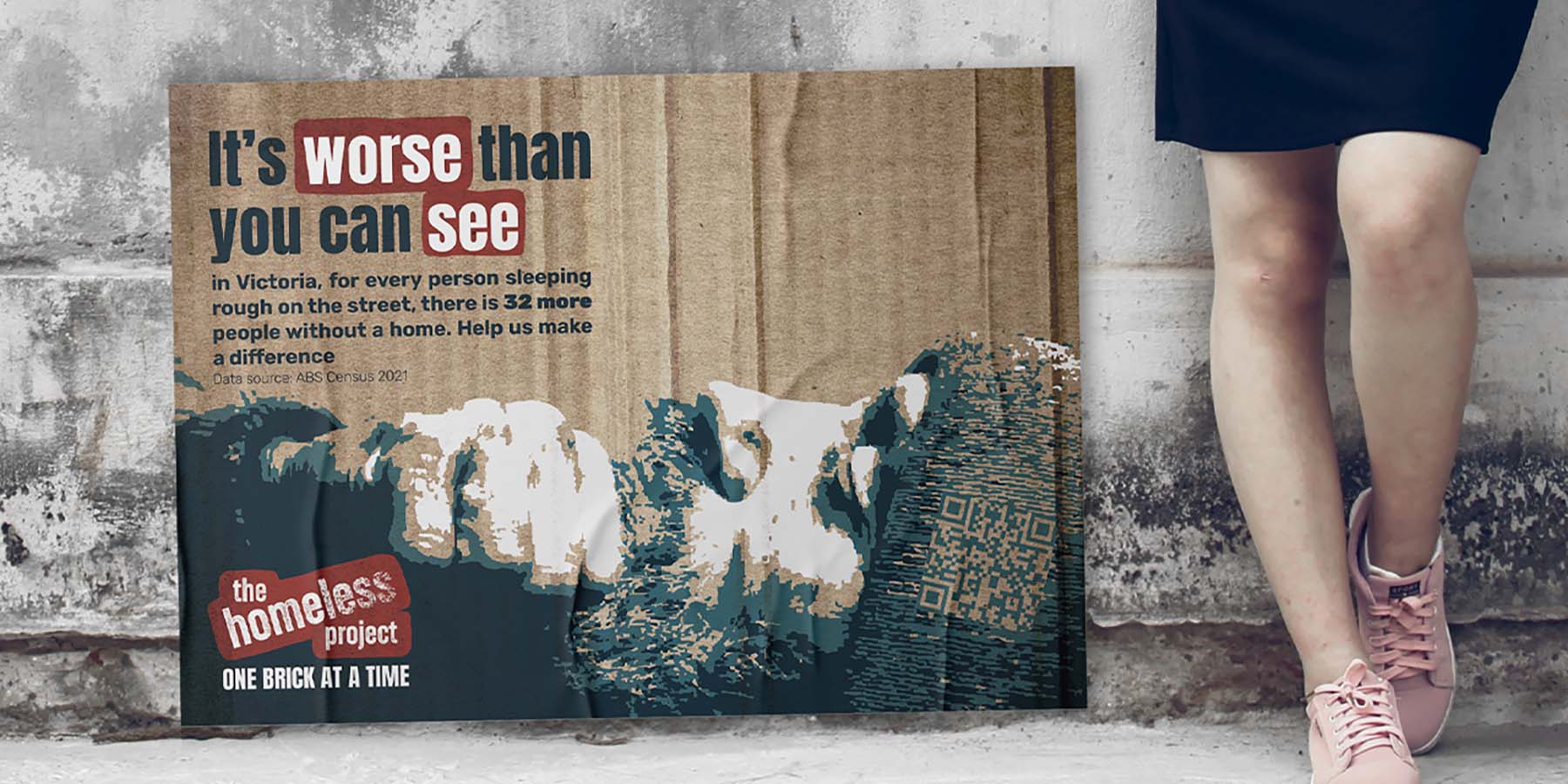
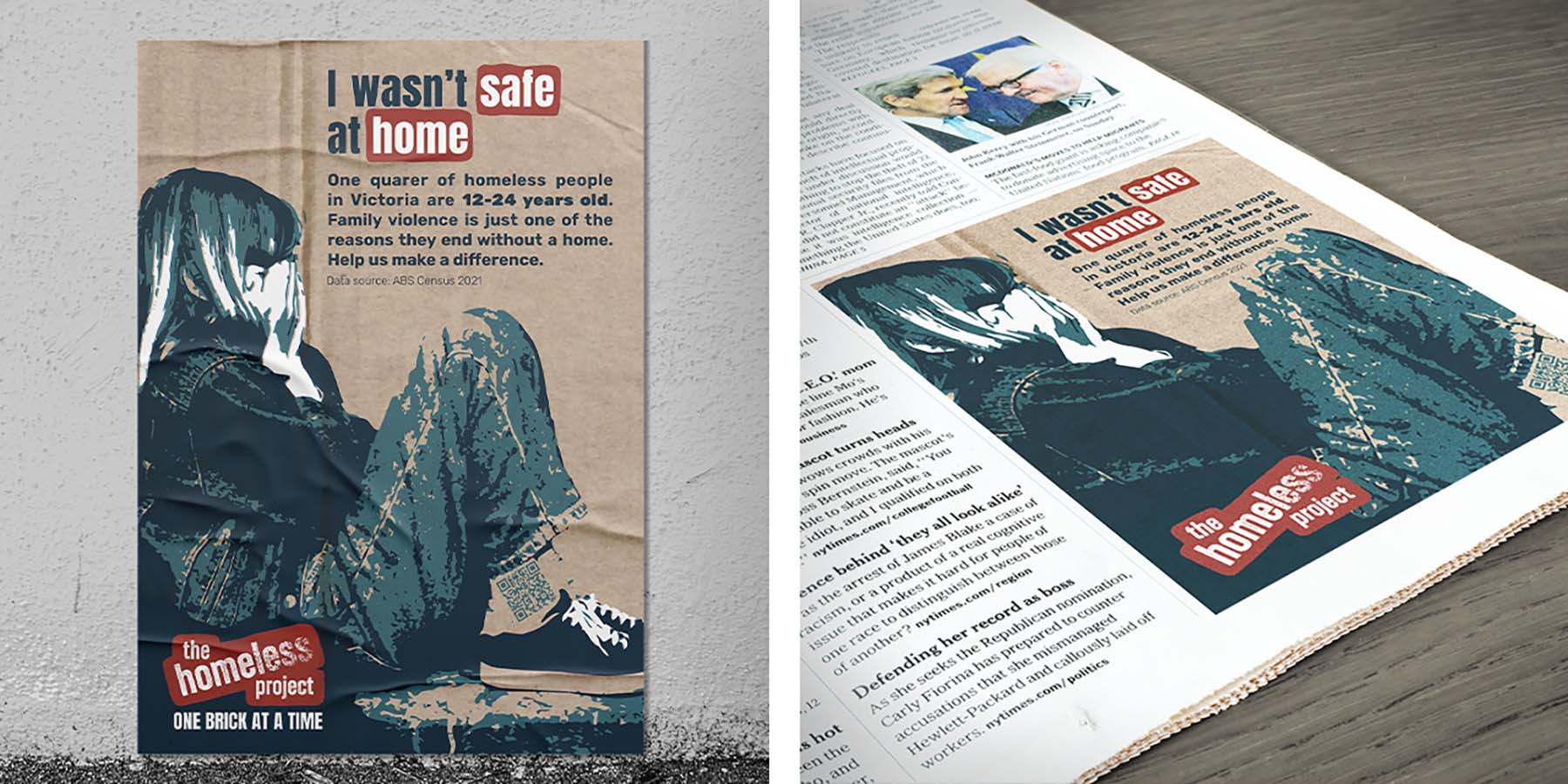
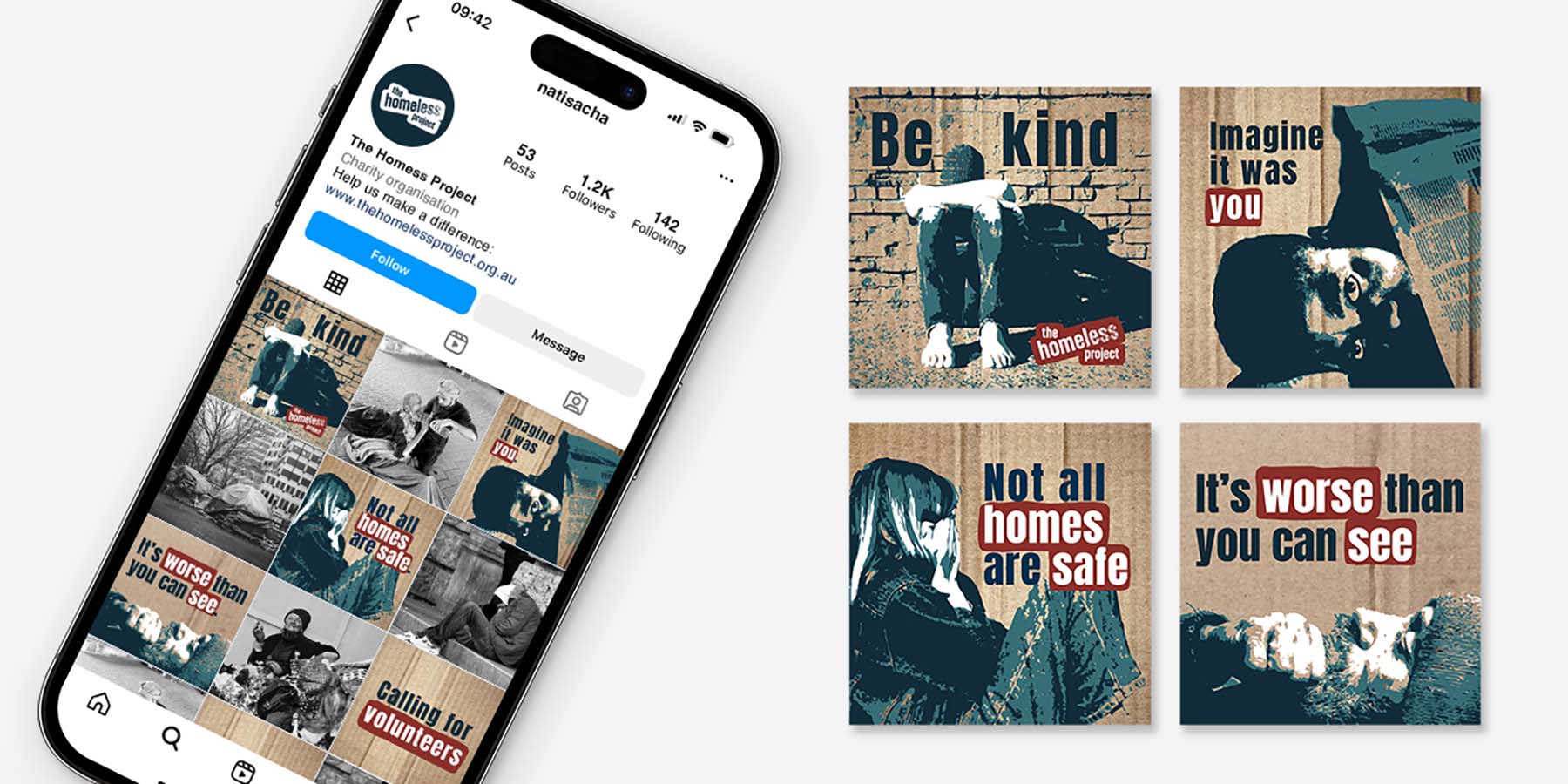
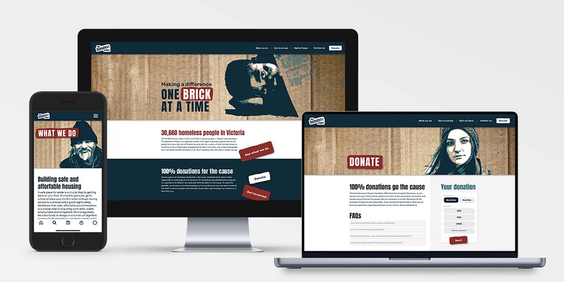
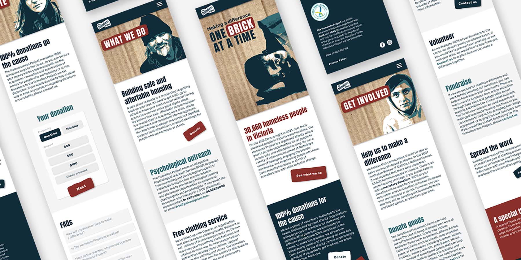
For my design capstone project, we had the opportunity to create our own brief. I hoped to put my work towards a good cause and so I contacted the owner of The Homeless Project and offered to donate my time. In the research stage, I gathered all possible information about the charity from the charity owner as well as their online resources, and also looked thoroughly into 'competition'. I have identified and researched the target audience (young to middle-aged Victorians) and two main issues to be addressed: creating a point of differentiation from other charities (why to volunteer/sponsor/donate to The Homeless Project above other charities), and motivating people who are not even considering it to care and act. The deliverables were identified as brand design and collateral to grab attention and interest, collateral for online and offline marketing campaigns that can create emotion, and website design that can motivate action.

I have brainstormed and sketched many ideas around the brand's visual communication and strategies before settling on the final outcomes and tweaking and improving them along the way. Consultation with the client as well as our tutor and classmates helped me to push the design even further. I made sure every part of the design had a thought-through meaning and communicated important information about the charity, cause, message, or emotions, and that the design is all strongly tied to the organisation's mission and vision.

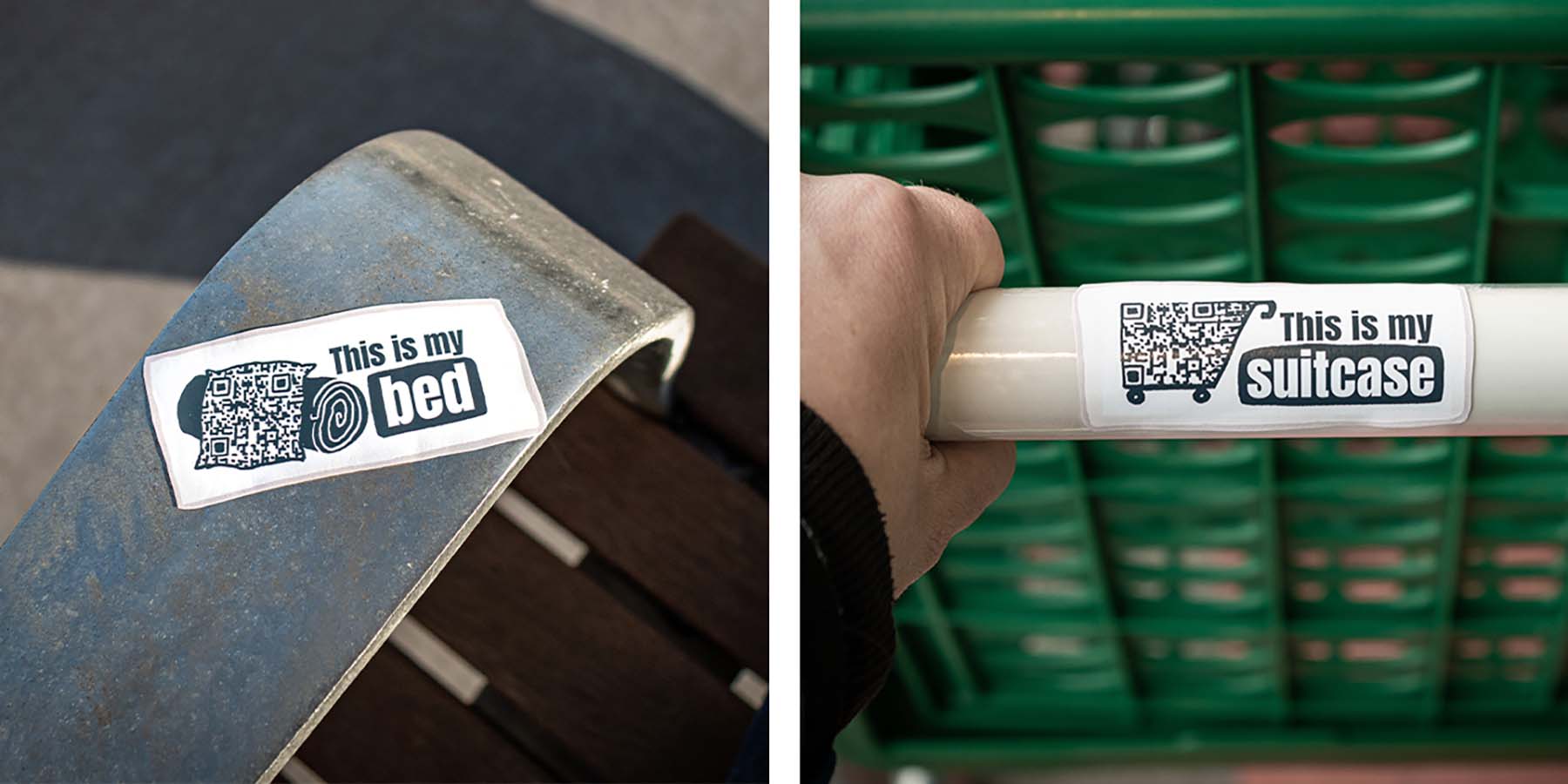
The finished art pack the client received included the brand assets (brand guide, logo files, stationery, donation jars, signage, and car wrap), marketing assets (social media profile assets and posts, newspaper ads, posters, and a set of stickers for guerrilla marketing), and website assets (including design and content brief and thank you email template).

Design Excellence

Every part of the design was carefully considered and communicated something about the company. The logo composition is a metaphor for bricks, a link to the main goal of the charity which is to build and provide housing solutions for people in need. The “less” is crumbling away, as the charity’s activities help to decrease the homelessness issue and through building a home - so metaphorically turning into “The Home Project”. The roughness of the logo links to the roughness of the issue, the use of lowercase suggests the kindness and openness of the charity and the dynamic composition ties to the energy and motivation of the volunteers and anyone involved.

The two primary colors in the branding have their own symbolics. The navy is for sadness, the seriousness of the issue, and the building of trust. The contrasting red is for urgency and action that the charity is inspiring and ties back to the narrative of building a home through the symbol of bricks. The main brand element, a cardboard structure creates a strong visual identity across most assets. Together with strongly treated photographs of people, it supports the narrative of this charity and helps to capture attention while defining a strong brand presence.

The user experience was strongly considered not only from the communication point of view but also when designing marketing collateral. Posters placed on the bottom where homeless people would be, QR codes hidden in illustrations, stickers around the town that create interest and bring emotions, all the elements were thought of by putting the user at the front of mind, understanding their journey, and providing them with experience that is somewhat different to the everyday life. The website was also restructured and redesigned to optimise the user experience and ease of navigation.

Design Innovation

The main challenges in the marketing campaign were getting the audience's attention and creating emotion - getting people to feel for the cause and motivated to help. Heroing the campaign are the posters, set on a cardboard background to enhance the relationship to the cause, and positioned at the bottom part of the wall. This creates an unusually placed piece of marketing communication and gets people to look down where the people sleeping rough on the street might be. This simple yet effective placement helps to create interest and make the issue even more relatable. The set of three posters touches on the main cause issues: 'Imagine sleeping here tonight' talks about the number of people without a home in Victoria, 'I wasn't safe at home' touches on possible causes of homelessness as well as on the number of young people on the street, and 'It is worse than it seems' talks about the severity of the issue going well beyond the number of people we can see sleeping rough on the street.

A little guerrilla campaign was also designed to run alongside the other assets. This campaign consists of small stickers that are placed around different locations to tell a very relatable story. Hidden in the illustration is a QR code that leads to the charity's website. The stickers mark different areas: 'This is my home' around outdoor areas, 'This is my bed' around benches and bus stops, 'This is my suitcase' on shopping carts, and 'This is my pantry' on public bins. The stickers are designed to look handmade and personal, and without being too aggressive get people to understand this is an actual person's situation to create empathy.

Design Impact

This design project was offered to The Homeless Project charity as a donation and has a large potential if implemented.

The branding communicates the good cause focus, youth and trust through composition, typography, colour and visual elements, and creates a recognisable and memorable brand identity that can stand out in the current and future market. The website communicates the business value, navigates the users through a clear journey, and provides opportunities for further growth if the charity decided to take on sponsors or drive individual fundraising events. Together with the marketing strategy and assets, the design solution can help The Homeless Project to build brand awareness within the community, grow a base of volunteers and supporting businesses, and ultimately raise more donations that will help them to continue their activities and make a difference in the homelessness issue in Victoria.

I hope this project among many others proves that the professional design process can help create strong brand strategies and have an invaluable impact on business presence and growth. Being clear on what, why, and who we communicate with and the purpose of the design towards our audience and their goals not only drives results but uncovers new opportunities and creates strong experiences.

Student Design 2023 Finalists

Rift Snowboards - Sustainable Snowboard Design

Harvey Edmanson / RMIT University

Forces Of Nature

Designed by He Huang and Zhengxi Xian / Commissioned by Lyons Architecture / RMIT University

UNCURVED

Sherine Yonarto / Elizabeth Amanda / Supervisor - Frank Feltham / RMIT University

Reverie

Maneet Singh / RMIT University

SPOT

Alessia Tsolakis / Monash University

SoundStamps

Sam Quinn / Supervisors - Dr. Judith Glover & John Cherrey / RMIT University

YANA: You Are Not Alone

Jacqueline Johnstone / Monash University

Ngulu Djeembana (The Gathering of Voices)

Shao Tian Teo / Taylor Ristevski / Alexander Barr / Dr Christine Phillips (RMIT Design Studio Leader) / Stasinos Mantzis (RMIT Design Studio Leader) / Professor N'arwee't Carolyn Briggs AM (Boonwurrung Elder/RMIT Design Studio Leader) / RMIT University

Kennett River Tower

Lachlan Hartnett - RMIT University, School of Architecture and Urban Design / Tutors: Mietta Mullaly, Jack Heatley and James Cosgrave

SAF.ER - Solar Aqua Filter Emergency Response

Zoë Ryan-Ferdowsian / Chung Hei Heidi Chan / Kristian Slatter-Jensen / Zach Daniells / RMIT University

Technology of Interactions (ToI)

Jian Shin See / Monash University

Project Shift

Trystan Paderno / RMIT University

Bioscope

Chetan Shastri / Alfred Health / RMIT University

Ver - Post-op Recovery for Transgender Individuals

Lily Geyle / Swinburne University of Technology

A Speculative Circular Economy Innovation

Dawei Cao / RMIT University