Our philosophy is that the best outcomes are always underpinned by a thorough understanding of the problems to be solved. For this reason, the engagement commenced with a comprehensive discovery process.
The discovery phase began with internal stakeholder consultations to gain a high-level understanding of the challenges and objectives of the organisation. From here, we moved into analysing the available data, including: Analytics Review, Brand and Heuristic Reviews, and Competitor and Comparator Reviews. Following these reviews, the discovery moved into user interviews, where we recruited a range of representatives from the audiences we identified in the earlier stage of the process, including teachers, parents, students, philanthropists, jobseekers and volunteers. The insights gleaned from these interviews informed user flows and process maps outlining what each audience was trying to achieve on the site.
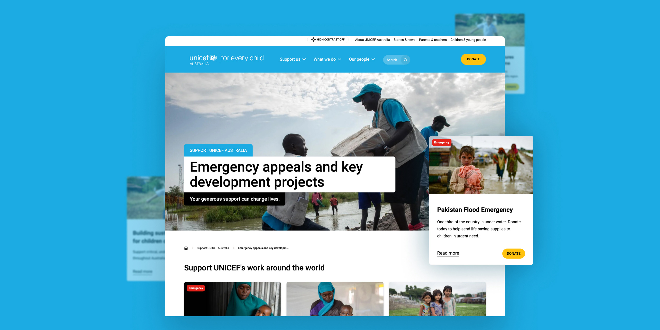
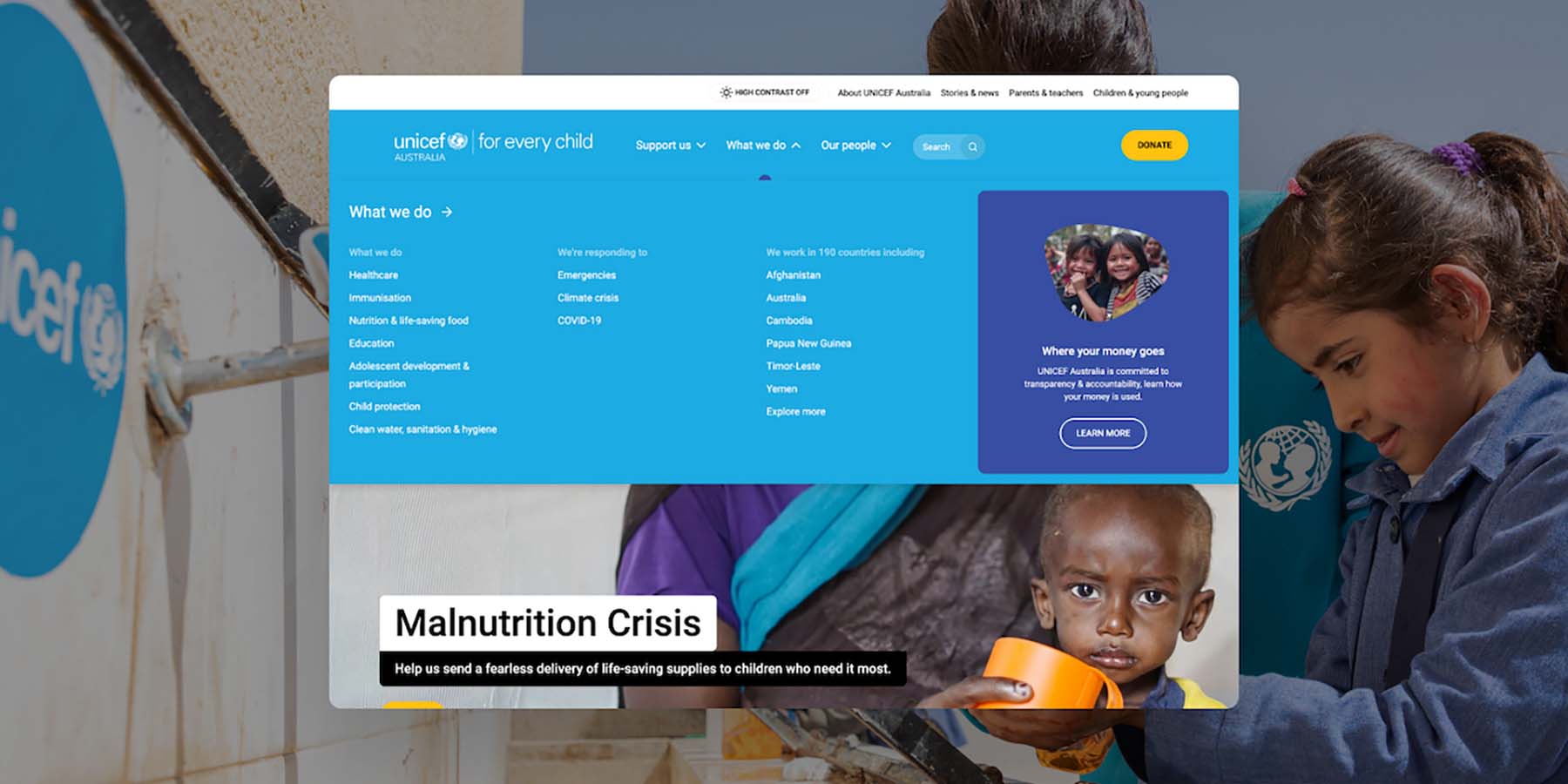
The next stage was to take a deep dive into the site’s Information Architecture (IA), with a workshop involving representatives from the primary audiences. During this workshop, four groups sorted 100 pages into four sitemaps, which we then distilled into a single draft sitemap. The resulting IA features were – among other things – a simplified navigation structure and a tool that allows users to self-select their audience category to tailor their user journey.
The final stage of discovery focused on technology, with a review of UNICEF Australia’s technology requirements and a recommendation on CMS selection.
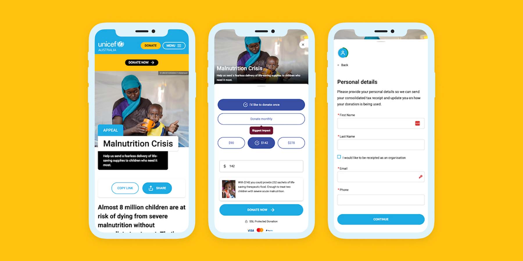
The findings of the discovery process helped to define the direction of the resulting site, with key takeaways including a greater emphasis on storytelling based on individuals, as well as highlighting the impact of donations. There were also valuable insights into how best to connect with youth audiences, including focusing on inspiring youth figures and utilising Instagram and Tik Tok.

