Finalist 2023

TLC for Kids "Tap 2 Distract" App

Avenue / TLC for Kids

A digital playground to support children through painful medical procedures.

The TLC for Kids Distraction Boxes Program, launched in 1998, supports young Australian patients aged 3-12 through challenging medical procedures by using engaging activities in a box to reduce distress, anxiety, and pain, minimising the need for sedatives. These boxes, originally delivered physically to medical facilities, have made the program one of Australia's most successful charitable initiatives. However, recent supply chain challenges and healthcare system shifts have highlighted a need for a digital adaptation of the program.

Design Brief:

The project was undertaken in two strategic phases.

Phase 1: Brief
Convert TLC for Kids’ Distraction Boxes into a digital form to test its effectiveness in real-world medical service environments. Accordingly, a MVP prototype approach was required to test the digital concept in real world scenarios allowing detailed analysis to inform TLC for Kids if the investment into a native application was beneficial. The activities developed needed to focus on the same psychosocial support benefits the activities the physical box delivered. To cater for usage in areas with low connectivity, the prototype needed to be conscious of data bandwidth usage requirements.

Phase 2 Brief:
Following successful testing and feedback of the MVP prototype, design and develop a native mobile application for iOS and Android. This version of the app is to best utilise the technology and user experience advantages afforded by native application development.


This project was developed by:

Design Process

Through discussions with TLC for Kids, we agreed the best path forward for testing a digital version of the charity’s signature program was an HTML5 app prototype complete with custom designs and full functionality. Although prototypes are sometimes thought to be rough and tumble, we made sure to provide a robust, premium solution that mimicked the experience of a full-on native app.

We chose this route not only for its cost-effectiveness, but because it allowed us to apply real-world learnings in an agile, iterative, and interactive way. HTML5 development technologies are known for delivering amazing graphics, high-definition videos, and crisp multimedia. Better still, HTML5 is free, works across all devices, and is supported by all modern browsers. With ease of access a key consideration for our client and their end users, we got straight to work making it happen.

Our design process methodology is extremely thorough, and consisted of the following components:

1. Discovery + Strategy phase - Included thorough discovery analysis of the following:

  • Brand values + characteristics
  • Target audience needs
  • Information architecture
  • User experience requirements
  • Required Functionality

All of this led to an accurate proposal including technical specification

2. Design + Development phase - Included the following:

  • UX + UI Design concept development
  • Detailed UX + UI Design mock-up presentations
  • Detailed UX + UI Design finalisation
  • Front-end and Back-end Development

3. Testing + Acceptance - Included the following:

  • Acceptance Criteria documentation
  • Thorough User Acceptance Testing (UAT) process

4. Go Live + Beyond - Included the following:

  • Deployment + Launch of MVP prototype
  • Continual Improvement Analysis, Review + Evolution
  • On-going Service Support

This identical process was used in both the MVP prototype and Native app design and development phases.

Design Excellence

The project demonstrates design excellence through its blend of functionality, accessibility, aesthetics, safety, quality, and sustainability. It provides a seamless user experience while addressing a critical societal need, effectively transforming the physical Distraction Boxes into an engaging digital platform that caters to young patients.

The platform's functionality is evident in its intuitive interface, which allows children to navigate through various engaging activities effortlessly, maintaining the program's core aim of distraction during medical procedures. With the introduction of gamification, we have ensured that the digital transition is not just a mere replication, but an enhancement of the original idea.

Accessibility has been a major design consideration. Given the wide age range of 3-12 years, the platform is designed to be universally easy-to-use, regardless of the child’s technical competence. The design also caters to children with different types of illnesses, ensuring inclusivity.

Aesthetically, the platform is appealing with its vibrant colours, interactive elements and friendly characters, which contribute to reducing anxiety and creating a positive experience for the children.

In terms of safety and quality, we created a safe and anonymous space for children to interact and explore. All content on the platform has been meticulously curated and tested for quality assurance.

The project promotes sustainability by eliminating the need for physical boxes, contributing to the reduction of environmental impact.

The design deliverable offers a high-quality, fit-for-purpose user experience that promotes interaction, engagement, and ease-of-use, thereby exceeding the holistic user experience criterion.

This project delivers design excellence by showcasing how digital transformation can enhance societal good. Furthermore, it demonstrates the benefits of investing in professional design – not just in terms of aesthetic appeal but also in terms of functionality, user experience, inclusivity, and societal impact.

Design Innovation

We took special care to design an effective user experience for the target audience using these five rules:

  • Everything, from looks to functionality, has to be fun.
  • Users must be able to dive in straight away (without the need for a login or other delay).
  • Everything needs to be completely intuitive.
  • Creating an engaging, immersive experience is the best way to capture and keep attention.
  • Incorporate visual and audio cues to increase and optimise usability (regardless of age).

Across design and development, we strategically wove in touch points that help ease patient anxiety and support the organisation’s mandate:

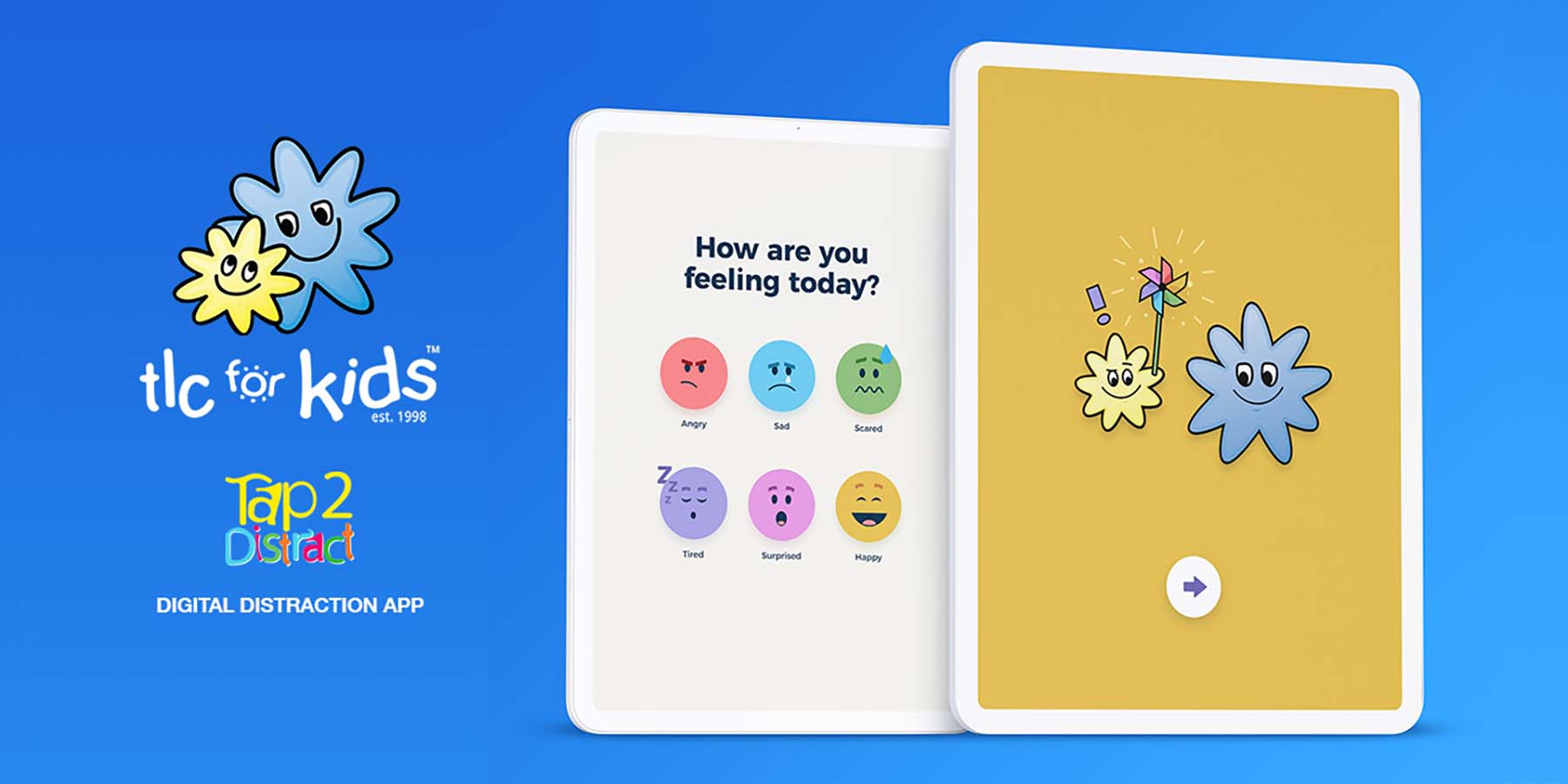
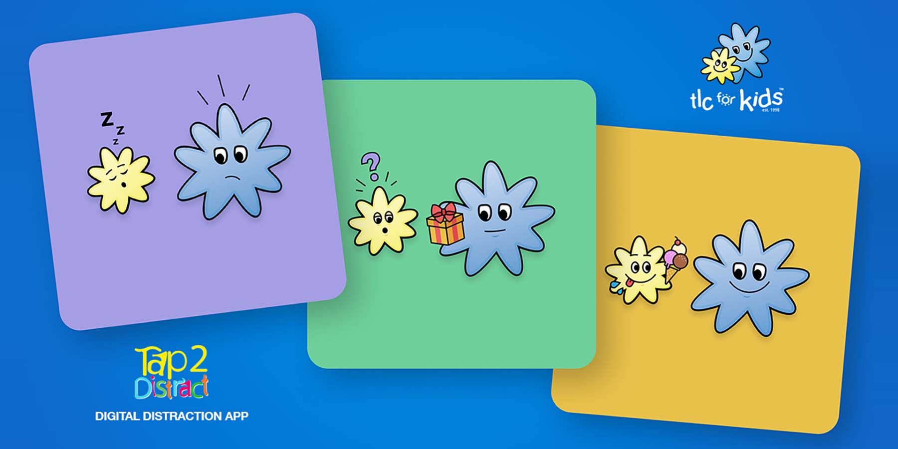
Playful, memorable visuals: "Splidge" and "Splodge" are two of TLC for Kids’ beloved brand characters. We wanted them to sing on screen with plenty of colour and other fun branded visual elements.

Digital check-ins: At the beginning and end of each session, users are invited to share how they’re feeling. We chose colourful emoji-style icons to help children self-identify; in doing so, TLC for Kids and medical professionals both receive invaluable emotional information.

Feedback screensaver: In the spirit of accessibility, we added a simple “screensaver” animation to keep children distracted without requiring direct interaction. In some cases, children may be unwilling or unable to play, or they’ve completed a game before their procedure has ended.

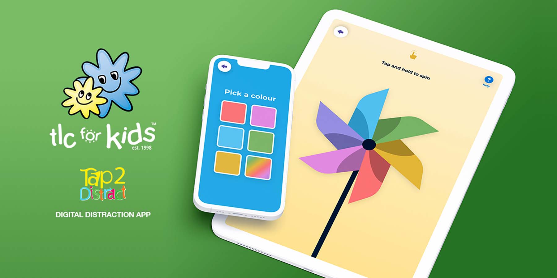
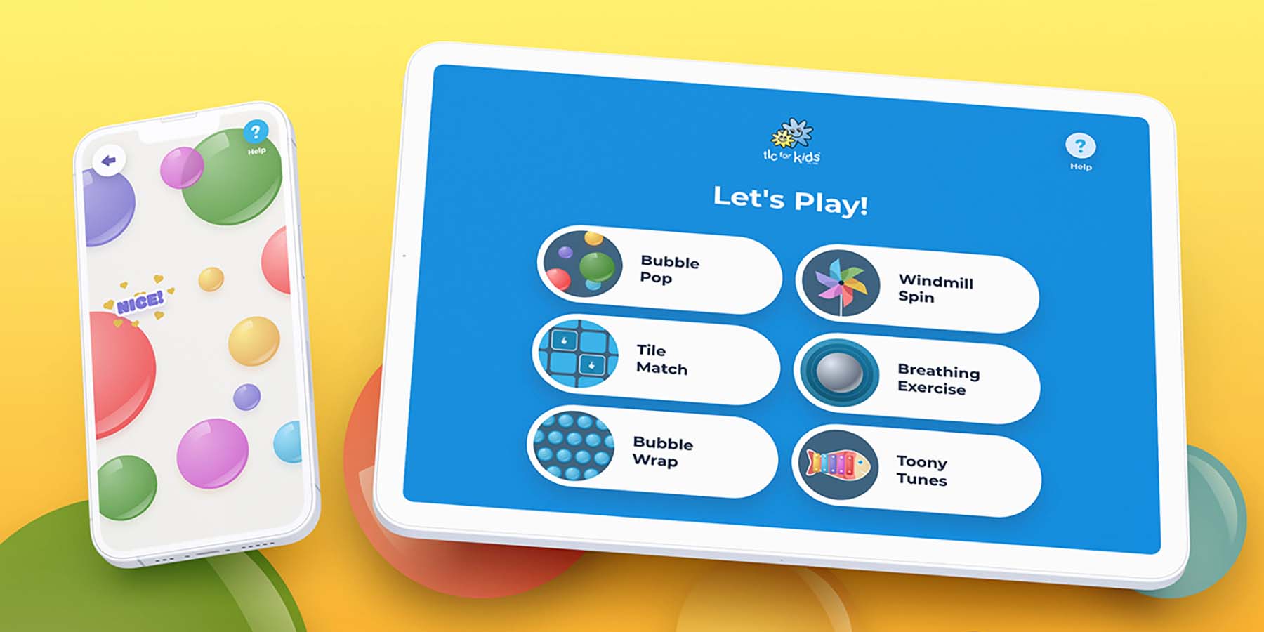
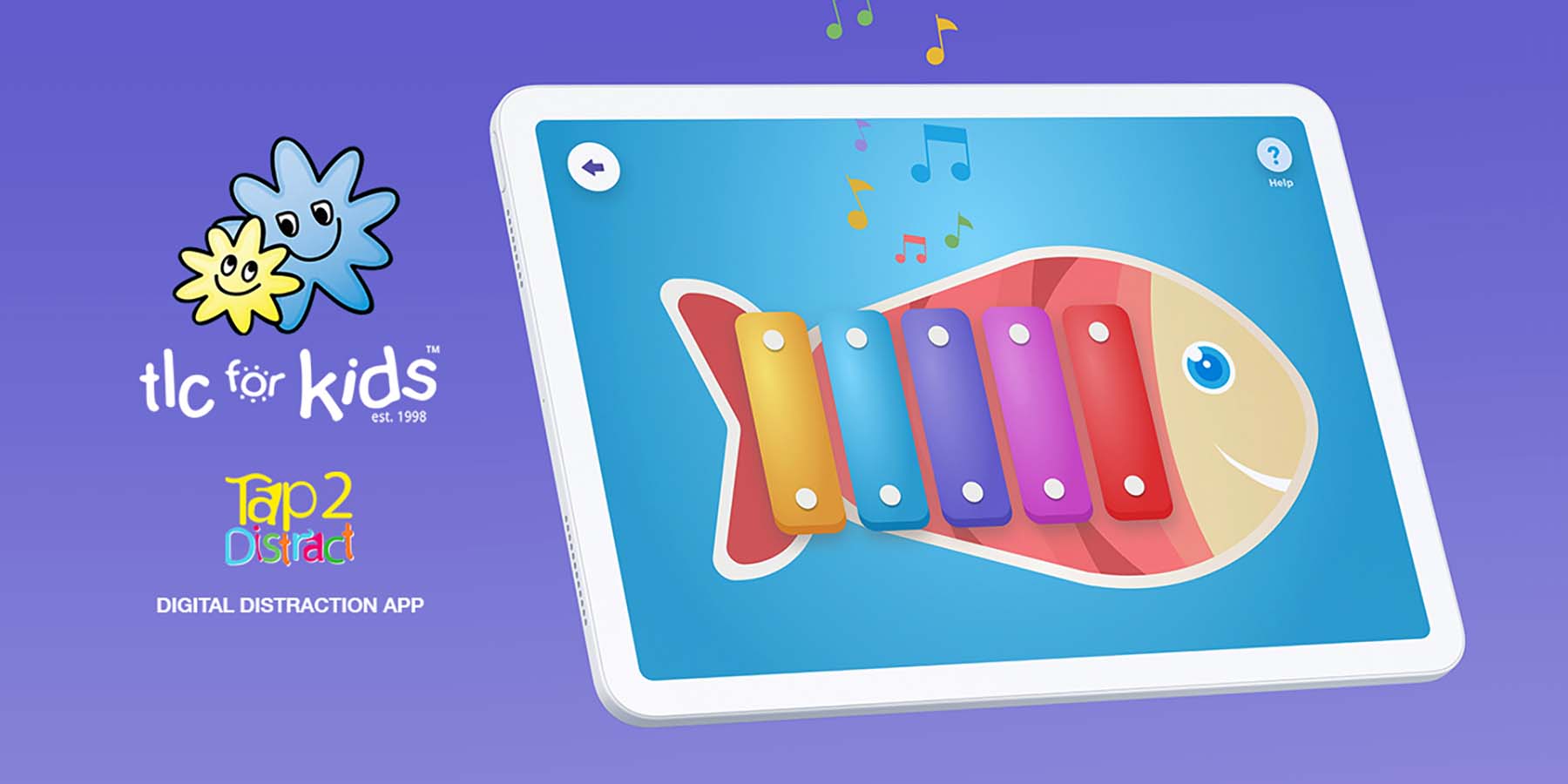
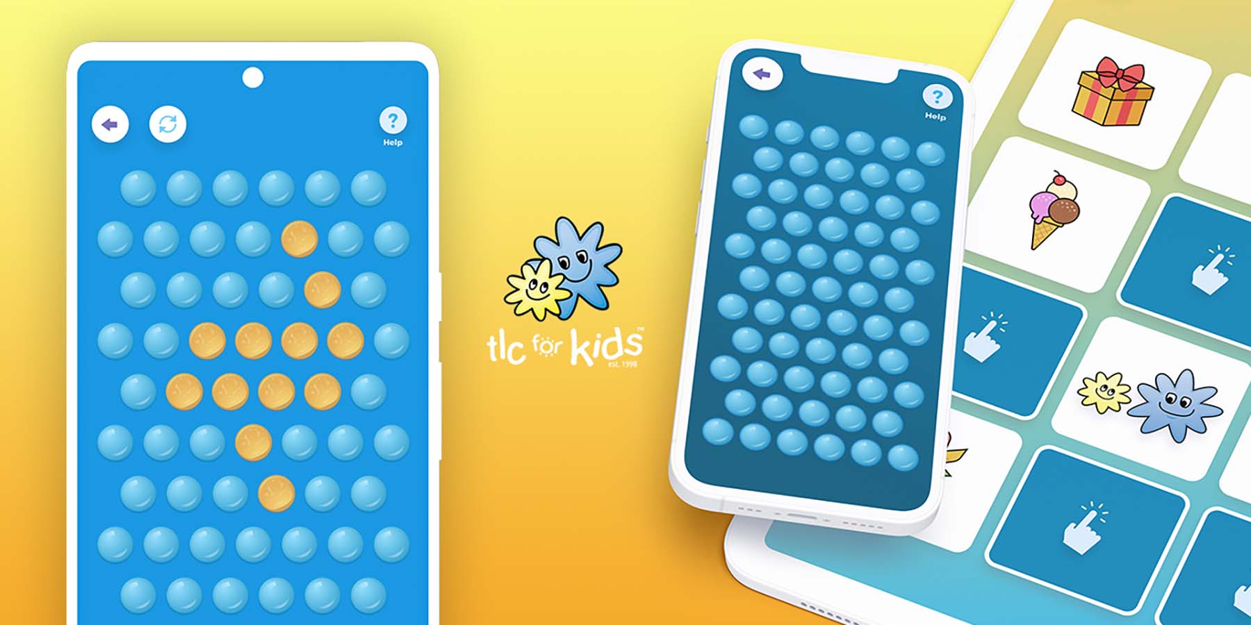
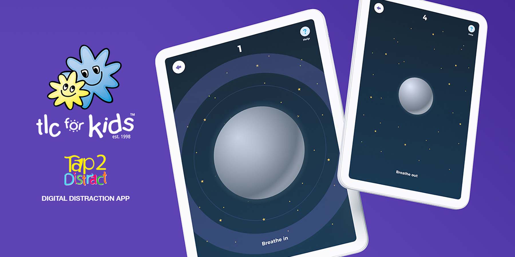
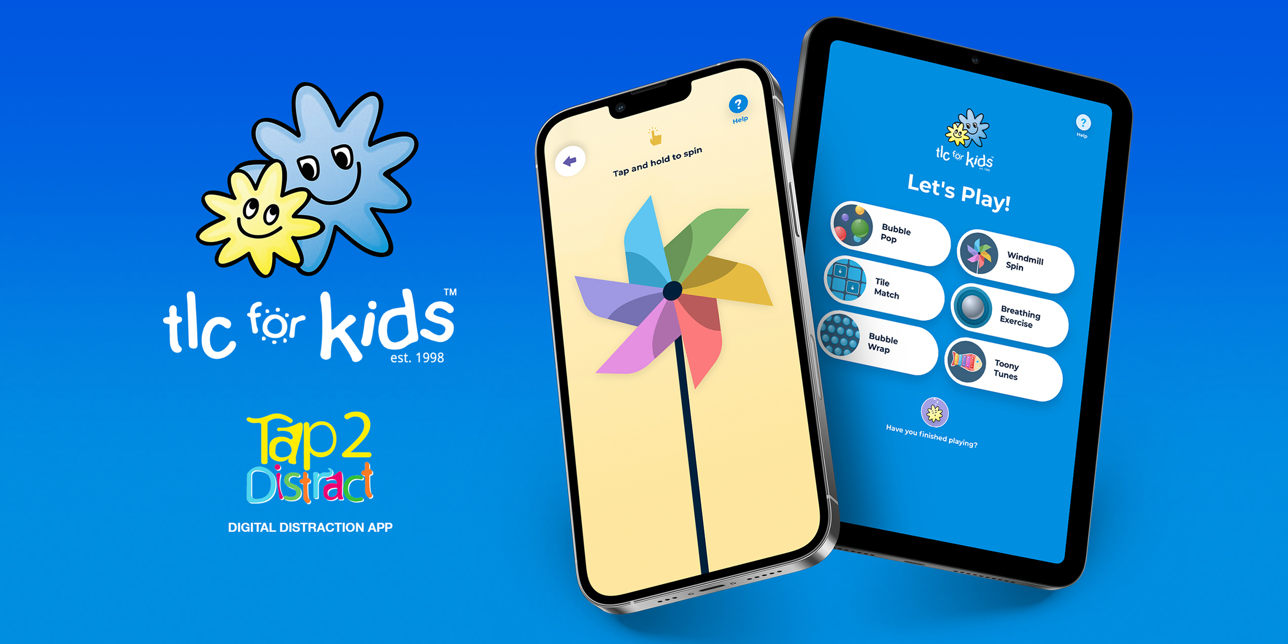
Six digital distraction games: Some games (like the windmill) are digital adaptations of tools children would find inside a physical Distraction Box, while others (like the bubble wrap) are new to the program but perfectly suit the digital medium and distraction criteria. Each distraction activity is built into repeatable 30-second blocks to align with medical procedure timelines.

Following the successful MVP prototype phase, the native app development is undertaking a further phase adding 3 new distraction game activities.

Design Impact

Part of TLC for Kids’ success comes from the value the organisation places on understanding and responding to its audiences’ needs. An approach that prioritised feedback from doctors, nurses, parents, and even sick children themselves was an essential element of our work.

We engineered both the HTML5 functional prototype and Native app so that backend analytics and user feedback could together paint a data-driven picture for future revisions, additions, or re-imaginations. As new waves of data are collected, the organisation is able to deepen their understanding of how, when, and why the prototype is used.

We are also collecting data on the native apps, however there is no data linked to the actual user. Hence data is collected for statistical usage purposes only, but none of this data is linked to an individual's identity, and accordingly it provides a safe and secure user experience.

The success of the original HTML5 MVP prototype to a select group of hospitals across Australia led to the development of the full native application for iOS and Android.

The combined statistics for the HTML5 MVP prototype and Native app since launch are as follows:

  • Unique Users = 15,775
  • User Sessions = 29,344
  • Total Screen Views = 221,673
  • Average Screen Views Per User Session = 6.58 screens
  • Average User Session Duration = 2 minutes & 42 seconds

Of all the statistics, the Average User Session Duration of 2 minutes and 42 seconds is possibly the most profound, as this user timeframe has allowed the medical professionals ample time to properly administer the care to children without needing to be rushed, and ensures children are fully distracted for the duration of their care procedure.

Circular Design and Sustainability Features

The project reduces the need for physical boxes and associated materials, which cuts down resource consumption significantly. The transition from physical to digital not only limits the utilisation of tangible resources, but it also eliminates the manufacturing processes linked to these boxes, thereby decreasing the associated environmental impact.

Reusing is evident in the project's intention to keep the essence of the Distraction Boxes alive. Rather than discarding the core concept, the project reused the idea and gave it a digital form, maintaining its essential purpose of providing distraction and psychosocial support to children undergoing medical procedures.

In terms of recycling, the project recycles the knowledge and experience accumulated over years of operating the physical boxes program and repurposes it into a new, sustainable digital format. The design solutions and activities within the digital platform are re-imaginations of effective techniques used in physical boxes, showing a successful circularity of ideas.

The digital project also embodies sustainable design principles by not only reducing physical resources but also eliminating the carbon footprint associated with the transport of physical boxes. The significant decrease in manufacturing, handling, and transportation costs makes it a more sustainable solution.

Moreover, the project demonstrates the principle of "Design for Dematerialisation" by shifting from a physical to a digital platform, drastically reducing material usage and waste.

Finally, the digital platform, unlike its physical counterpart, is not subject to wear and tear, thus extending the lifecycle and reducing the need for replacements.

Through its resource-efficient, low-impact, and long-lasting design, the TLC for Kids digital project sets an exceptional example of circular and sustainable design, proving that it is possible to achieve mission effectiveness while caring for our planet.

Digital Design 2023 Finalists

HalleyAssist HealthWatch® - Remote Patient Monitoring

HalleyAssist Pty Ltd / La Trobe University, Centre for Technology Infusion / Northern Health, Patient Watch Program / Proactive Ageing

Chop Out Convos: Supporting mental health of tradies

IPC Health / No Moss / Tradies of West Melbourne

Headspace Homepage Redesign - Digital Design

Portable / headspace: National Youth Mental Health Foundation

Book an Artist

Book an Artist / Your Creative

BUBBLE

Spacesuit&Co / Mirvac / The Ci Group

GetMee

GetMee - Balendran Thavarajah / AMES Australia - Mirta Gonzalez- General Manager of Education / VFS Global- Harpreet Singh- Global Lead- Australia and New Zealand Regional Head / VFS Global / Deakin University- Dr. Pubudu Pathirana & Carol Doyle- CEO You Study International College / GetMee Anjali Kushwah - Experience Designer

UNICEF Australia Website

Luminary / UNICEF Australia

To Future Me

Kids First Australia / Curio

Passing Electrical Storm

Shaun Gladwell / Stefan Greuter / Gerard Mulvany / Matthew Jigalin / Leigh Russell / Pete Grove