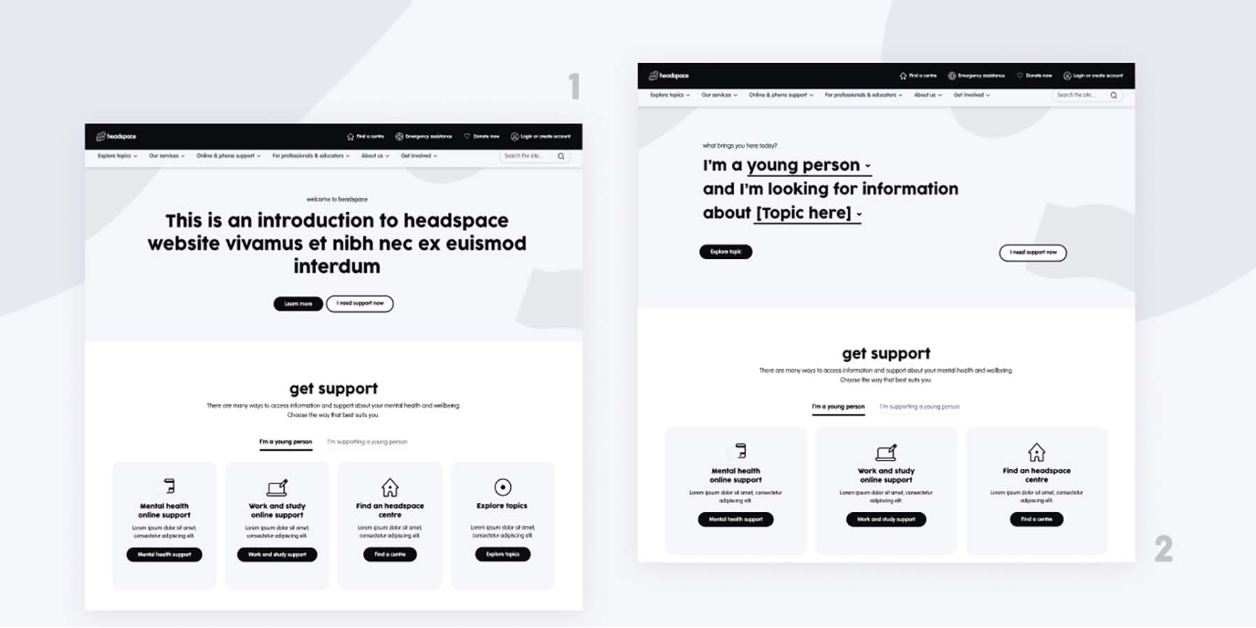
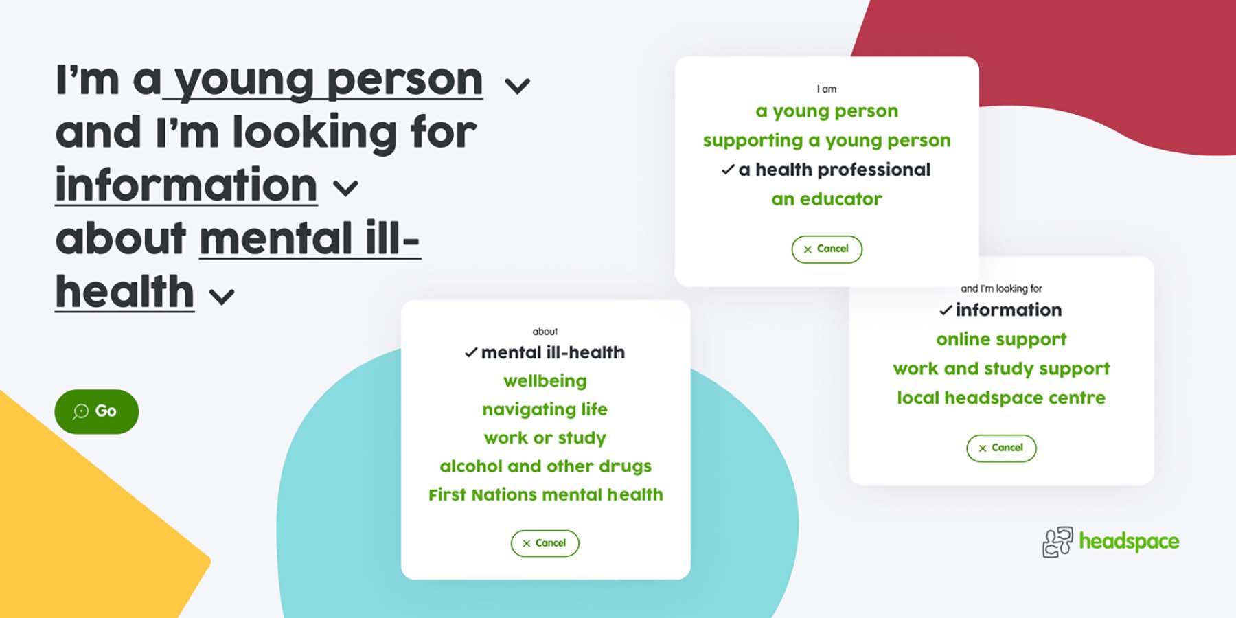
The project was approached using a waterfall model, as it suited the context of the engagement. We started by gaining a deep understanding of headspace's requirements and the research that had led to the need for a homepage redesign. These informed our user stories and acceptance criteria. From the brief, our Experience Design team developed two prototype solutions, which were presented to the headspace team for collaborative feedback and then user tested with website visitors.
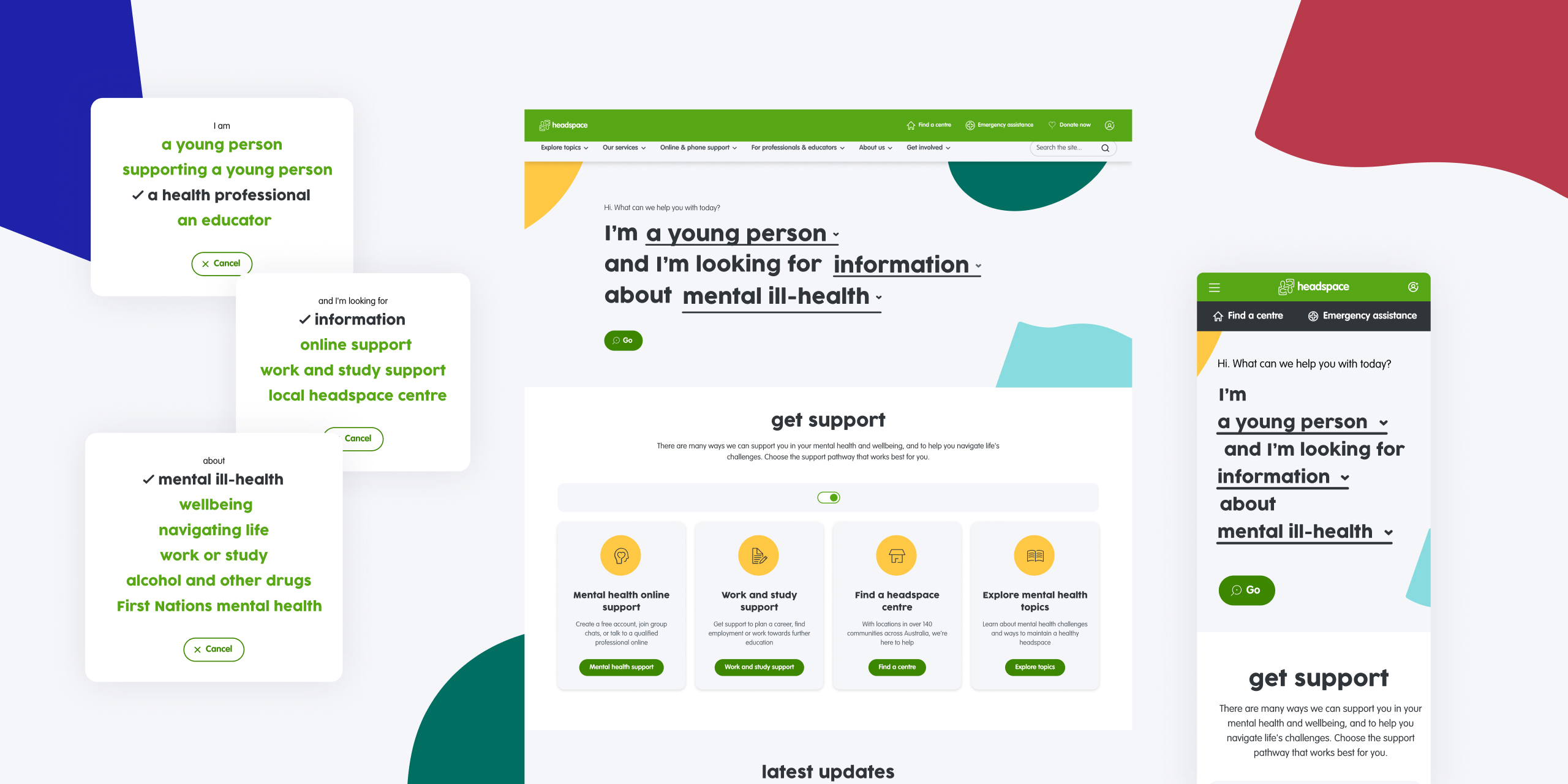
Feedback from these sessions was instrumental in guiding the design direction. The final design, featuring a central banner that allows users to specify their group and content preferences, was selected for its intuitive nature and ease of navigation.
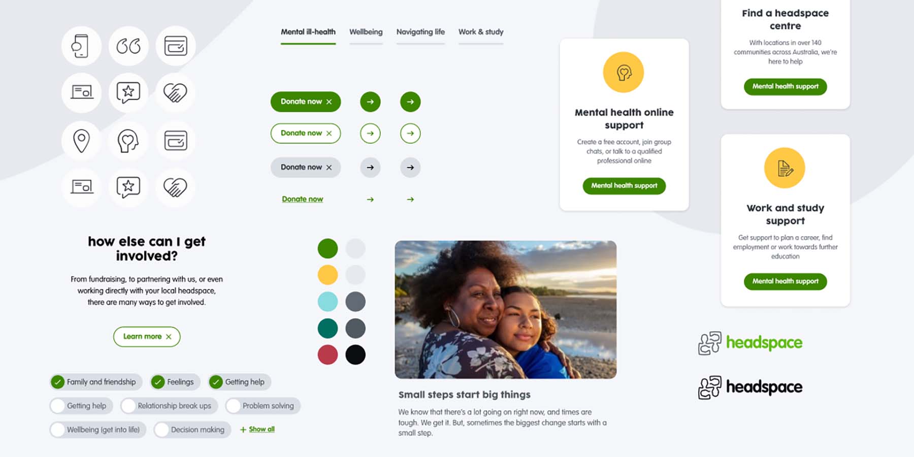
Using the established headspace design system, our designers created a high-fidelity design template for implementation on the front end. The technical team developed the new editable components, ensuring full accessibility. Custom Google Tag Manager events were added for data insights.
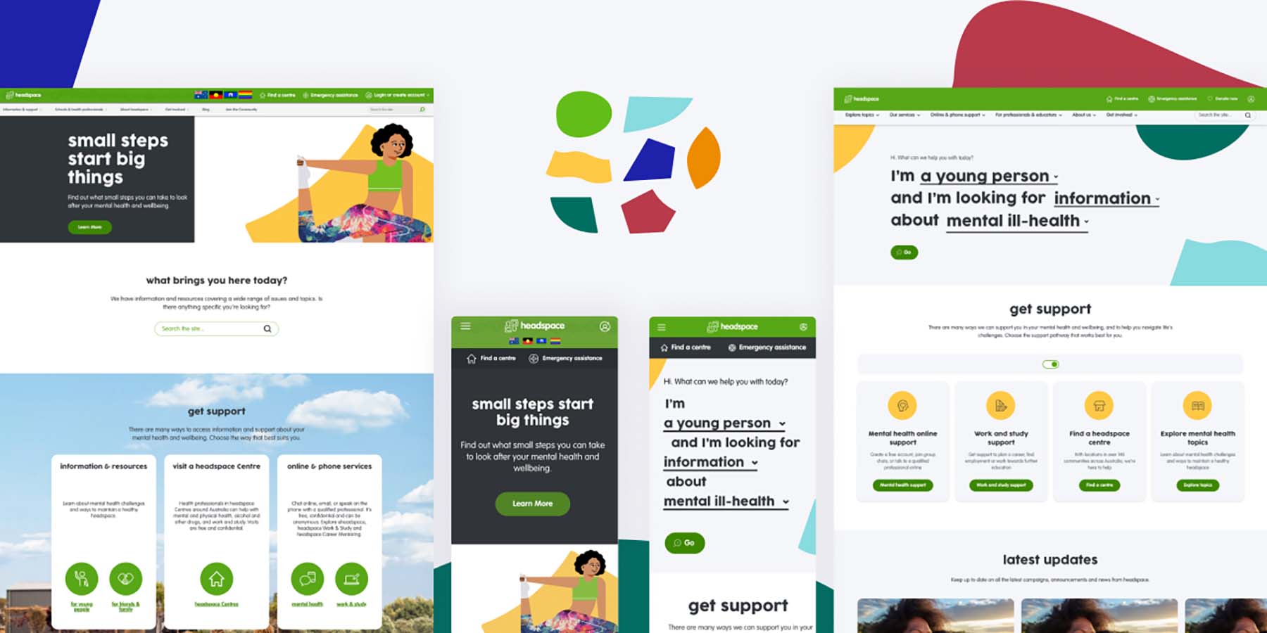
The new homepage was launched after quality assurance and user acceptance testing was completed.

