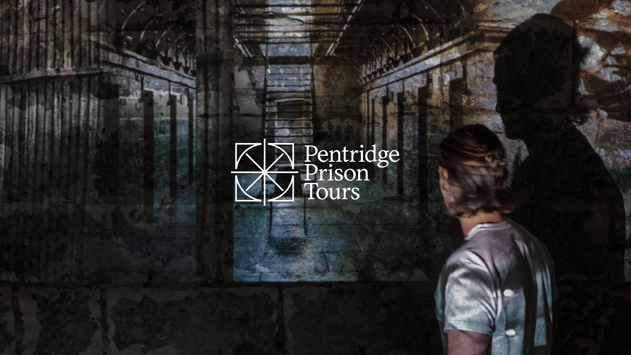
The design solution needed to acknowledge Pentridge’s history whilst maintaining commercial assets to drive sales. From a user/visitor perspective, the identity seeks to evoke curiosity and emotion, but which emotion? Should visitors feel empathy, sadness, or anger towards a broken penial system? The design solution needed to allow a wide spectrum of emotions, making minimal assumptions. The complexities of the project’s audiences formed the base of a high-level brand strategy that led creative.
Parallel to our target audience’s needs was the needs of the Precinct, the Prison Tours brand exists within the same ecosystem. This includes bars, restaurants, a cinema, a hotel, and a supermarket. The community spends time here, respecting Pentridge as a place. Taking from that insight, our solution too, drew inspiration from the place.
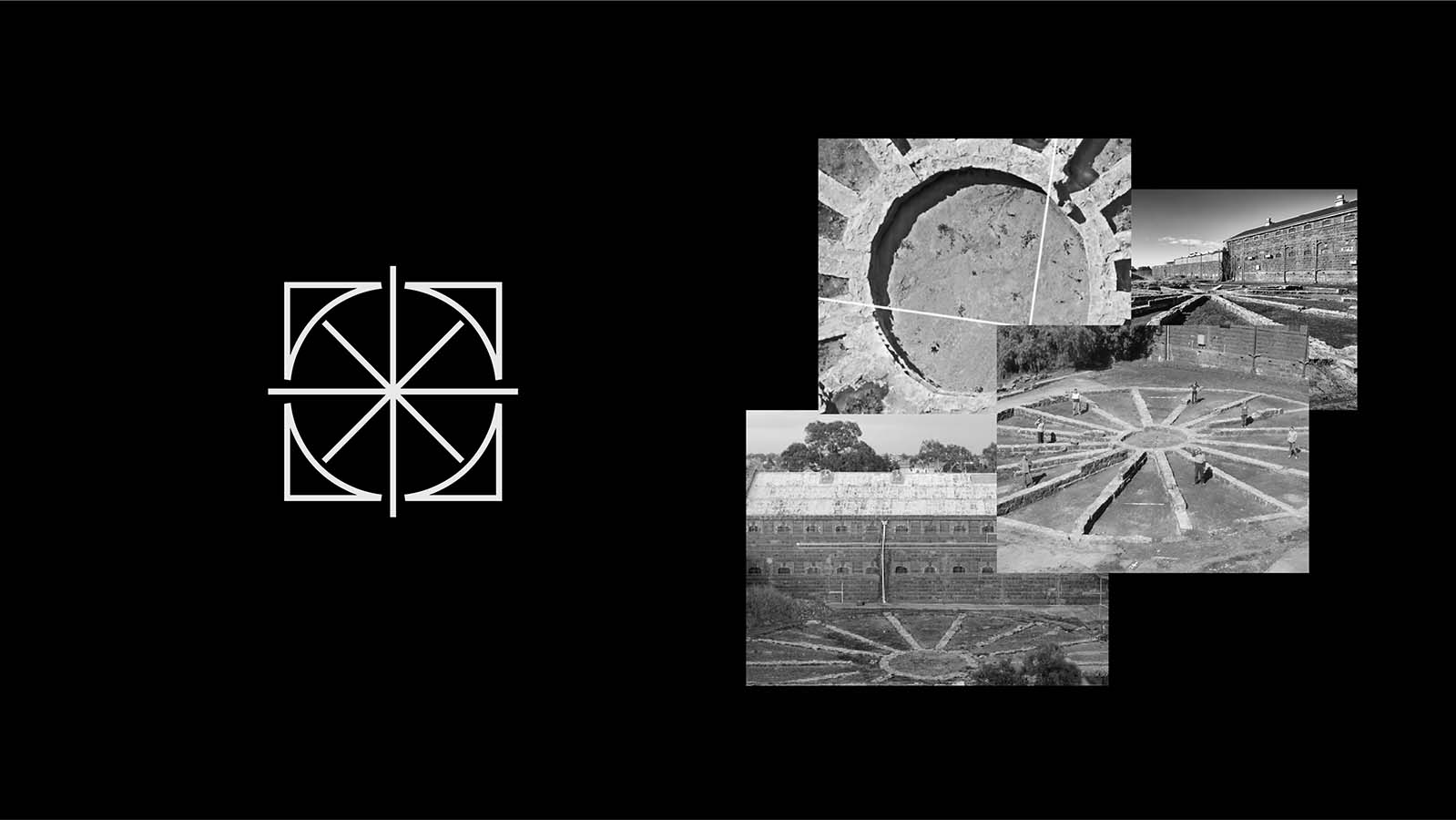
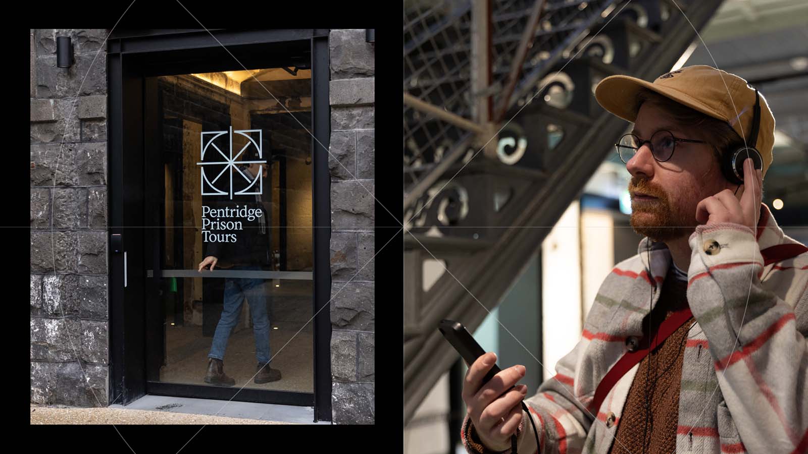
The brand mark represents the physical experience; when during Pentridge’s restoration period, archeologists unearthed remains of an old panopticon at Pentridge, initially used to keep prisoners isolated. As part of the tour experience design, the panopticon serves as a reflection garden.
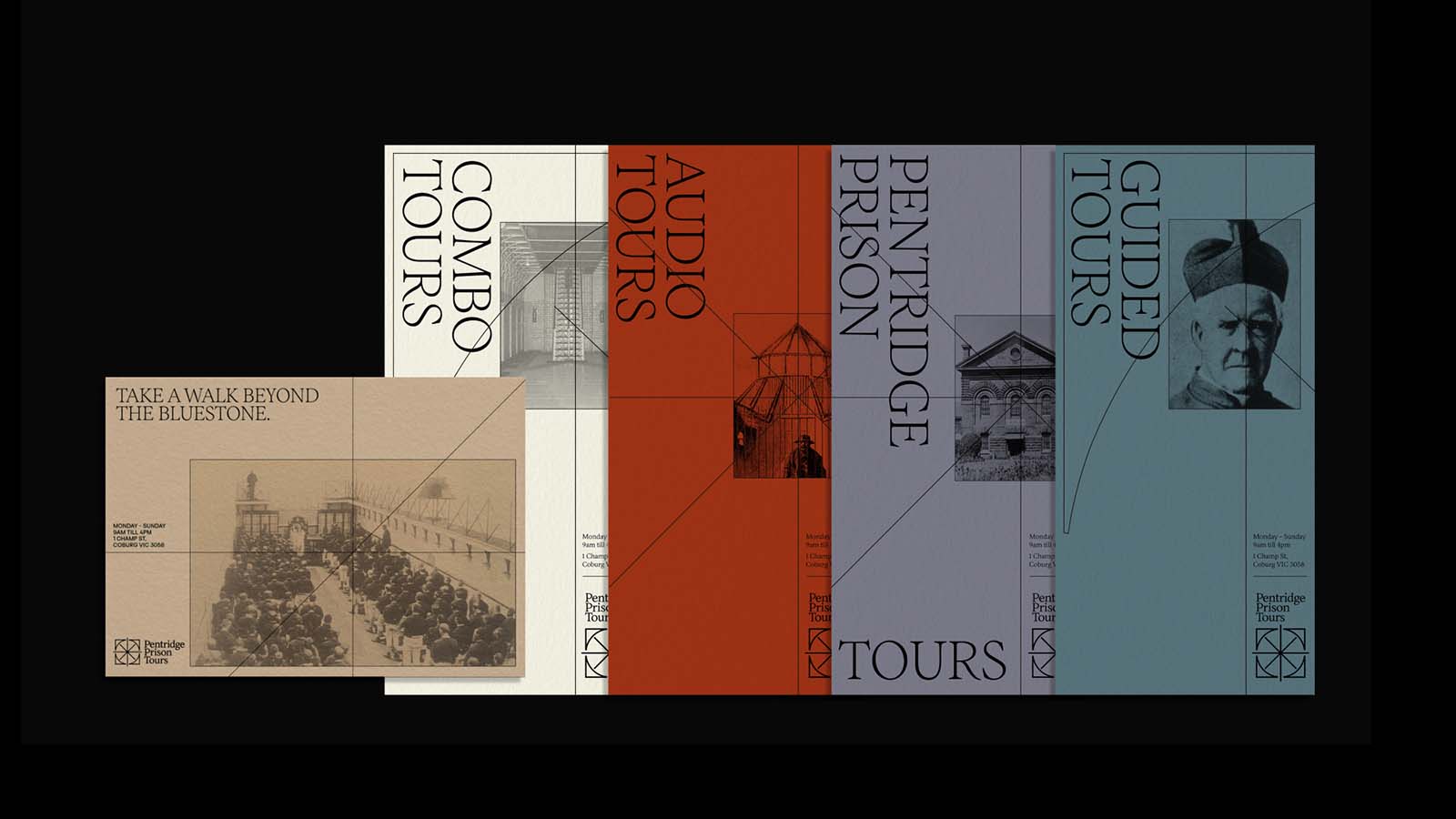
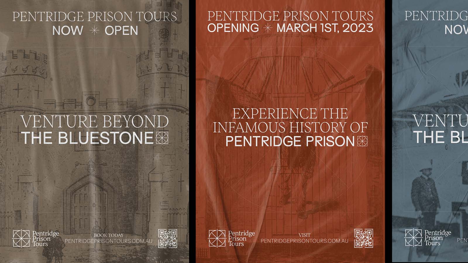
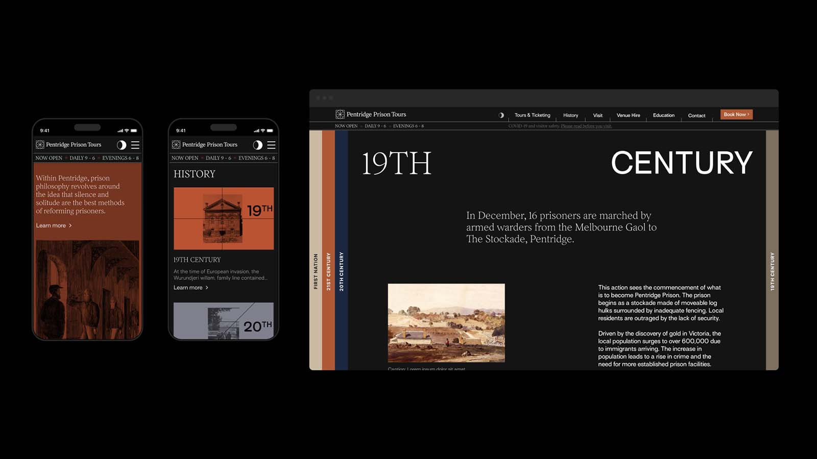
Stripping this panopticon back into vector art forms, created the base for a concept. The colour palette is also inspired by Pentridge and its surroundings, with the iconic bluestone creating the base. Earthy colours with nods to history through darker, sombre hues helped convey the tone.
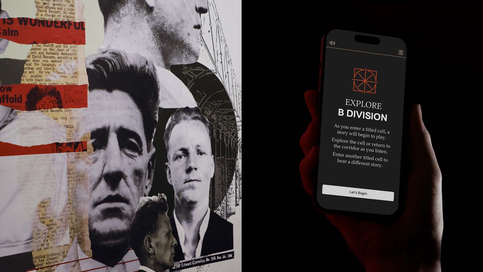
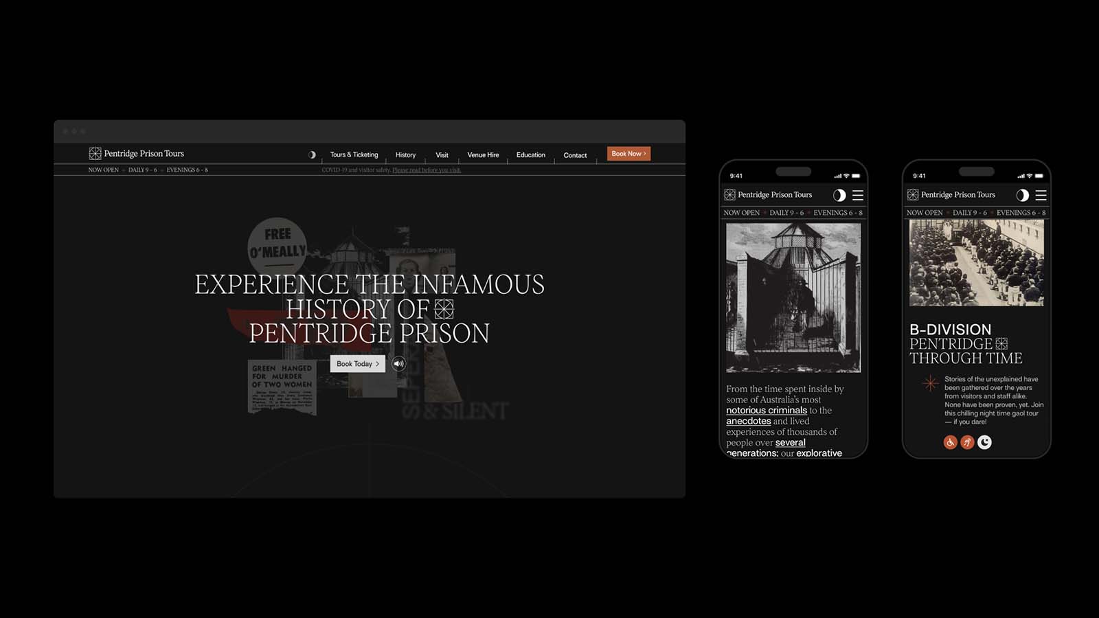
For representing archival materials, a distinct collage style, along with specific graphic iconography shaped the future of the brand and website concepts.
Lastly, experience design was fundamental to our design solution. Art Processors designed a range of immersive audio tours which meant ensuring the brand complimented the tech-driven storytelling taking place within cells.

