Finalist 2023

NAB Brand Evolution

Principals / NAB

An illuminating evolution of the NAB Masterbrand using current best practice and evidence-based brand identity design.

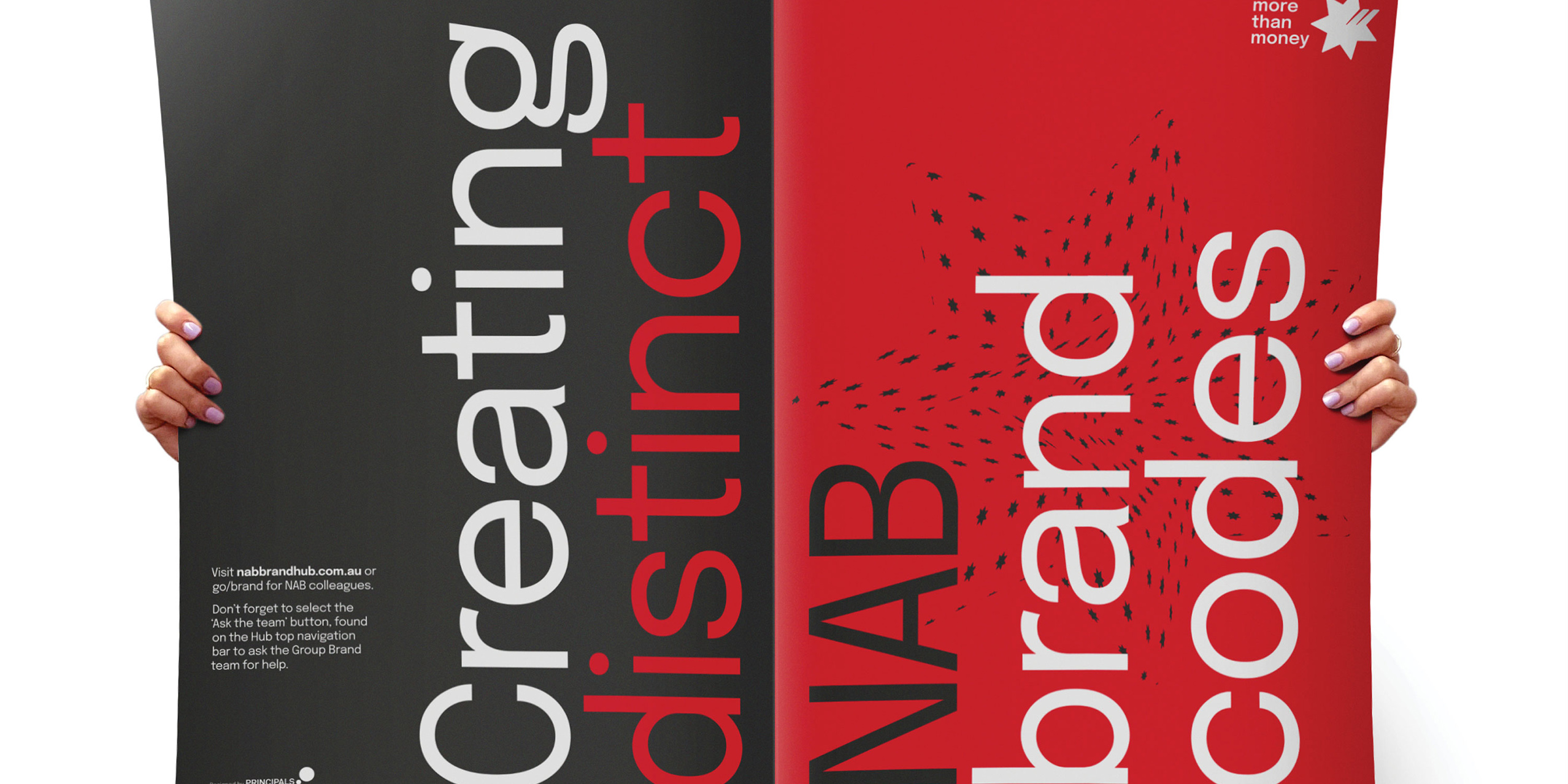
In late 2022 NAB evolved its brand identity, strengthening their position as the experts in money, further cementing them as the bank that really gets Australians. Over our 18-year partnership, Principals has helped NAB evolve before. And while this was the 3rd time we’ve revitalised the Masterbrand, our approach built an evidence base of best practice whilst seeking new opportunities to leverage our brand codes and share new ideas.

Design Brief:

Brand evolutions for big banks – national institutions – are complex, multi-dimensional and multi-disciplinary. The overall mission was to modernise and bring a fresh energy to the NAB identity. We tackled the following challenges:

  • To create an evidence base to build a substantial internal case for change
  • To meaningfully assess the relative significance of different identity elements to define the scope
  • To ring new energy, dynamism, and flexibility to NAB’s brand identity system to allow for a seamless customer experience across all audiences, all contexts, in all digital channels
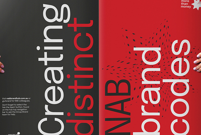
  • To develop simple self-service tools for the whole organisation to unify communications under one evolved Masterbrand. In turn, increase the brand attribution by research-qualified, unique, and distinctive brand codes.

This project was developed by:

Design Process

Using research findings, we started exploring how we could best evolve NAB’s brand identity to meet the needs and beliefs of banking customers in Australia.

We conducted a full audit and testing of NAB’s current visual identity elements — looking at how they were used in application. This gave us insight into how to best modernise and optimise the brand identity across all channels, ensuring it stood out from competitors.

From these findings, we created high-level concepts that leveraged NAB’s most famous brand codes in different ways. Ranging in bravery and impact, flexibility and ease of use. Each concept detailed how each of the new visual elements met the objectives and showed how they would be applied across NAB’s range of touchpoints: digital, social, branch, advertising and print reporting.

Following their selection and the consolidated feedback from all the stakeholders, we refined the concept and conducted further experimentation of the visual elements. Testing for compliance with digital best practice, consistency across all channels as well as stress testing these across a wider range of customer segments and touchpoints.

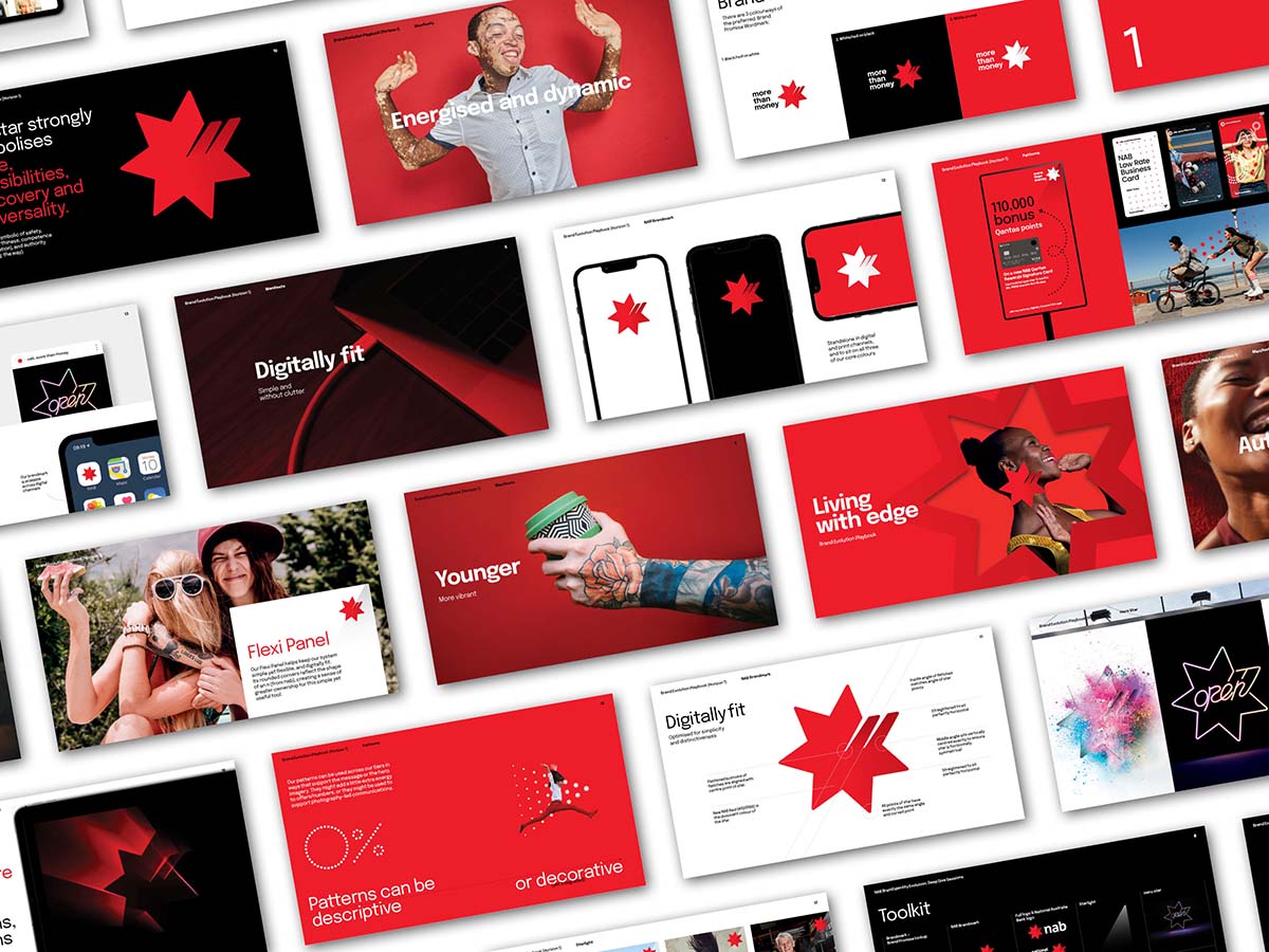
Once approved, we created an extensive library of final artwork assets and guidance on how to bring the evolved identity system to life.

To help successfully launch the evolved codes we facilitated a series of workshops with NAB’s internal teams and external agencies, collaborating to iterate and develop the codes on an ongoing basis; and training to share the purpose behind the refreshed tools and how to best implement them creatively and consistently.

Design Excellence

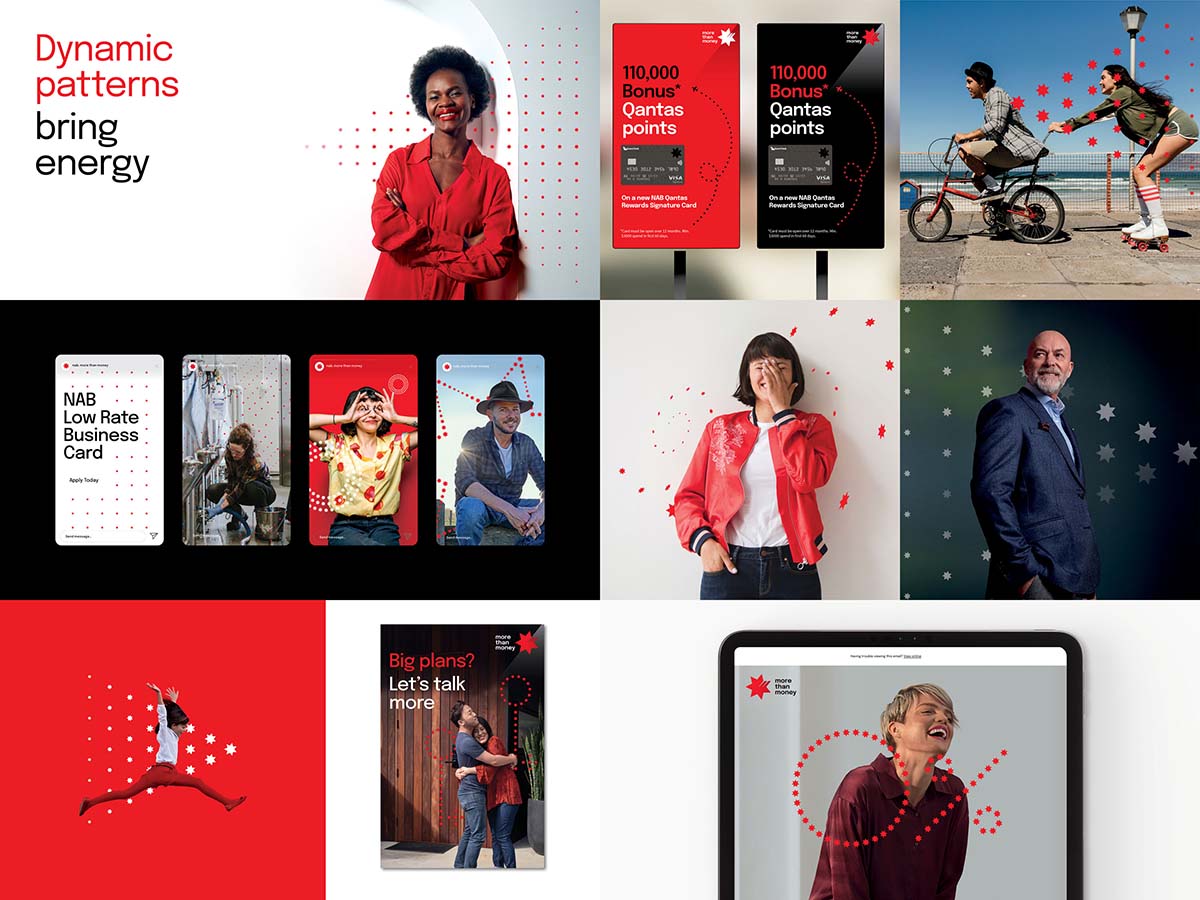
NAB’s brand codes, like the star for example, sparks and illuminates ideas. Digitally-fit with simplicity at its core, the evolved identity is easy to apply across all applications.

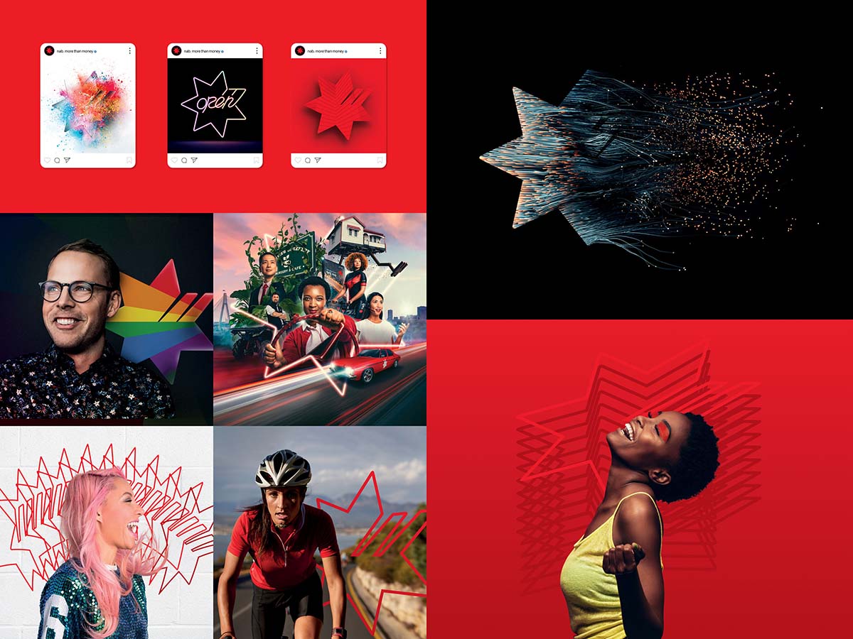
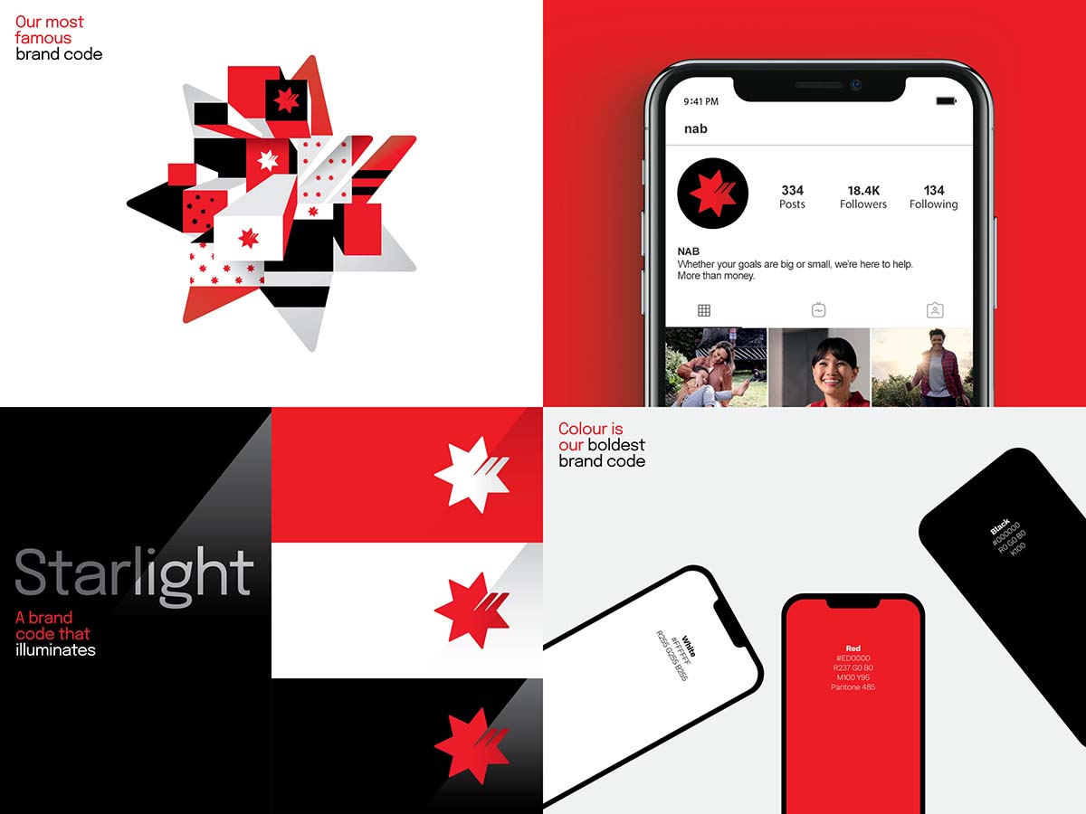
Driven by research (semiotic, qualitative, and quantitative), design thinking, strategy validation, competitor analysis and system auditing, we leveraged our best assets and created new elements that hero NAB’s unique, ownable star, allowing for more freedom and impact. We also created new patterns to better embrace this distinctive asset.

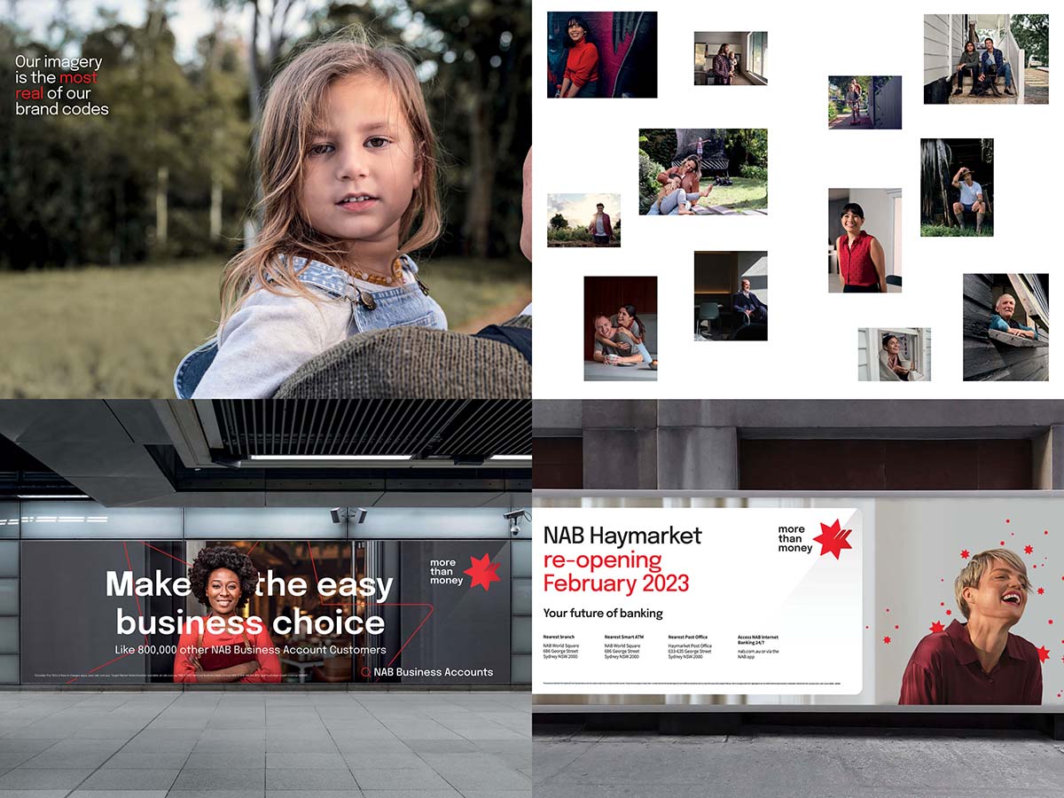
Supported by more human, inclusive, and authentic imagery that captures diverse representations of what it means to be Australian.

We simplified the identity system with a set of flexible tools, while expanding on the ideas of illumination, hope, and pathfinding.

We found opportunities to amplify distinctive edge and effectiveness across all touchpoints. And aligned the refreshed strategy with more nuance around human character, expertise and emerging trends.

The identity is creative, flexible, unique, and dynamic system that supports NAB’s brand attribution goals.

Design Innovation

Democratisation of imagery for the brand breaks the rules of the category. In this sector, photography is often stylised, polished, retouched, and sourced from international stock libraries. At times, the briefs and budgets might demand specific talent, specialised retouching, or post-production.

We used this as an opportunity to consider different ways to:

  • to assess individual brand identity elements using distinctiveness metrics based on marketing science best practice.
  • explore ideal bank brand identities.
  • explore the intrinsic cultural meaning of the Star as a symbol.

    Central to our intent for the brand evolution, and the identity challenge at hand, we focused not just on what and why, but how.

    Our ongoing ambition is to democratise the brand evolution process. To build emotional and intellectual commitment to the refreshed system by featuring real people in real and often more intimate scenarios.

    We’ve brought colleagues in to contribute to and build on our image library. This will help us create a platform for further participation, so that who our colleagues are, is accurately represented within the organisation.

    We see it as inclusiveness redefined, which allows us to push an already human and authentic photography style into the future. Moving away from the existing polished, stylised and vibrant imagery. Instead, we’re running even more toward authenticity in an honest and more immediate style of imagery.

Design Impact

NAB’s new identity launched in April 2022 and early data shows that we’ve improved its distinctiveness across all our brand codes.

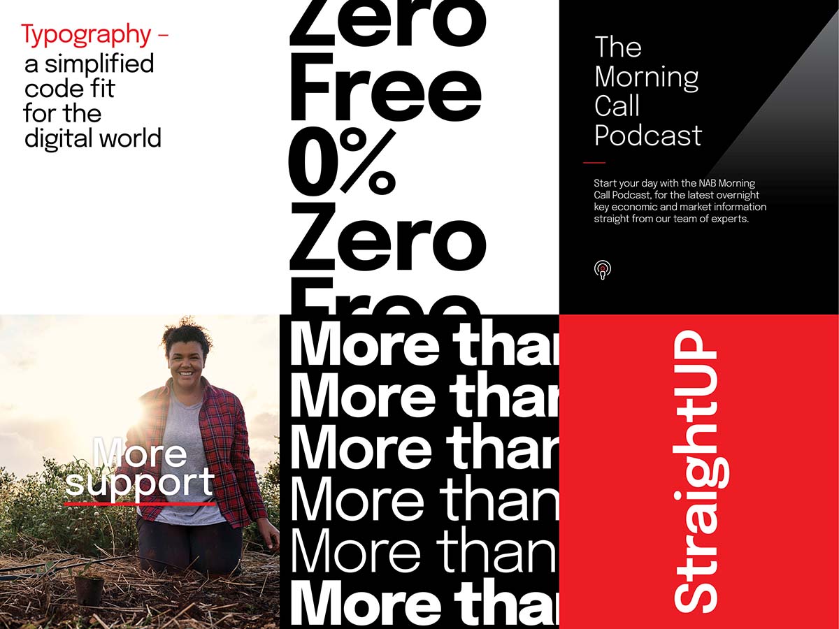
Based on the research, we’ve boosted brand recognition by ‘freeing the star’, evolving the brandmark, colour palette, typography, photography, illustration, and patterns.

Our evidence-driven evolution has brought more energy and youthfulness to the brand, without compromising NAB’s diverse range and style of communications.

The evolved brand codes have significantly increased NAB’s attribution scores.

It’s a simple system that’s easy to manage with clear tools that flex across customer segments and channel requirements. This system ensures consistency for impact and clarity for both customers and the people of NAB in each and every brand interaction.

“The new brand identity is being embraced with so much enthusiasm and excitement by everyone at NAB! It’s been the catalyst to make us more modern, dynamic and digitally fit.
“Early results show a significant uplift in our distinctiveness and brand recognition metrics.”

Suzana Ristevski
NAB CMO

Communication Design 2023 Finalists

Submerged: A Journey Through Living Light

TKM9 Group / Sealife Melbourne / Merlin Entertainment

Head on: how Victorian nurses and midwives confronted COVID

Multiple Studio / Byrne Kelley / Australian Nursing and Midwifery Federation (Victorian Branch)

Southside Justice

Design by Nature / Southside Justice

IM-PERMANENT

Ellis Jones / RMIT Industrial Design

Pentridge Tours Branding

Pentridge Precinct / Art Processors / Your Creative / National Trust Victoria

Australian Open - Infosys: Reimagining Tennis with Technology

Sandy Tsindos - Account Director (Charles Elena)  / Tomas Palazzo - Creative Director (Charles Elena)

Up Down and All Around: Daniel Emma for Kids

National Gallery of Victoria / Daniel Emma

Royal Botanic Gardens Melbourne: Wayfinding Design

Royal Botanic Gardens Victoria / Studio Binocular / Aspect Studios / Greenaway Architects / Deakin University

Design Wall 2023

National Gallery of Victoria / Hassell, Melbourne

Australian Birth Stories

Australian Birth Stories / Public Journal / Murdoch Books / Jodi Wilson / Hilary Walker

Consenting Cities

Monash University / European Cultural Centre Italy

Powerhouse

Side By Side Studio / Powerhouse

Pentridge Prison Tours

Art Processors / National Trust of Australia (Victoria)

LIGHT COLOUR HUMANITY - The Alastair Swayn Legacy Showcase

Ian Wong / Dr Indae Hwang / Jo Pritchard

Port Phillip Creative Wayfinding

Arterial Design / City of Port Phillip

Tyama: A Deeper Sense of Knowing

Museums Victoria Design Studio / S1T2 / Yaraan Bundle / Yoolongteeyt Dr Vicki Couzens / Colleen Burke / Dirty Puppet