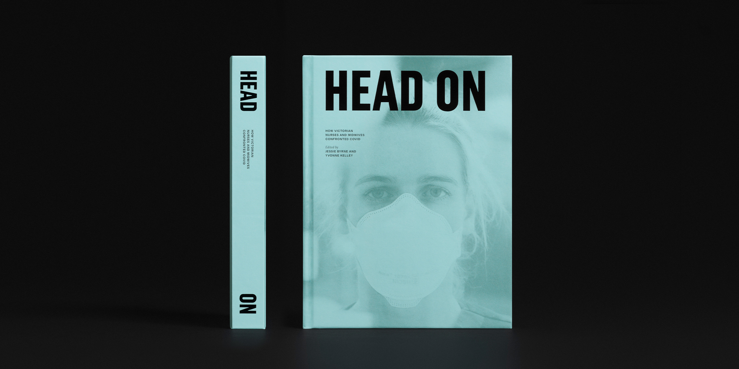
To capture the authentic experience of Victorian nurses and midwives through the COVID-19 pandemic, every design decision was made with the emotional, physical and psychological experience of the nurses and midwives front of mind.
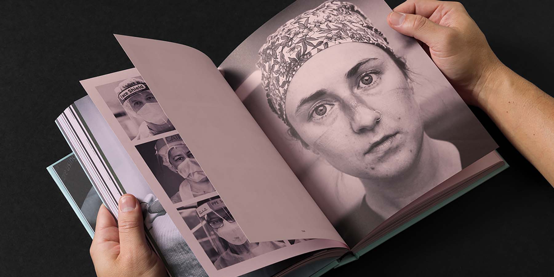
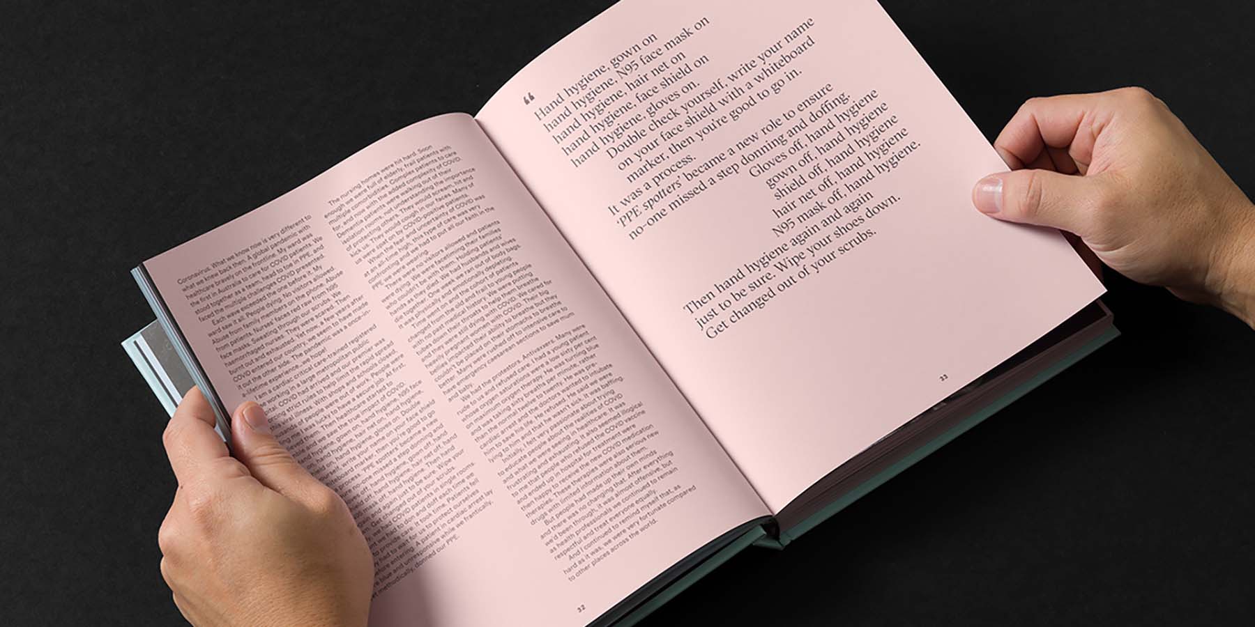
The design process was one of careful balance, with the designers taking great care to give each story the space, reverence and individual voice it deserved. In so doing, the stories became both written and visual elements, with each page typeset to emphasise the story’s unique theme – highlighting the repetitive donning and doffing of PPE, the overwhelming fear, the sense of loss, the great compassion, the joy in new ways of working or the deep sense of pride in a job well done.
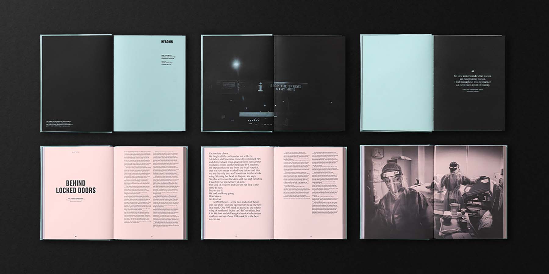
The stories were ordered to create emotional peaks and valleys and blank pages were used to give the reader time to recover from the emotional lows and prepare to share in the highs.
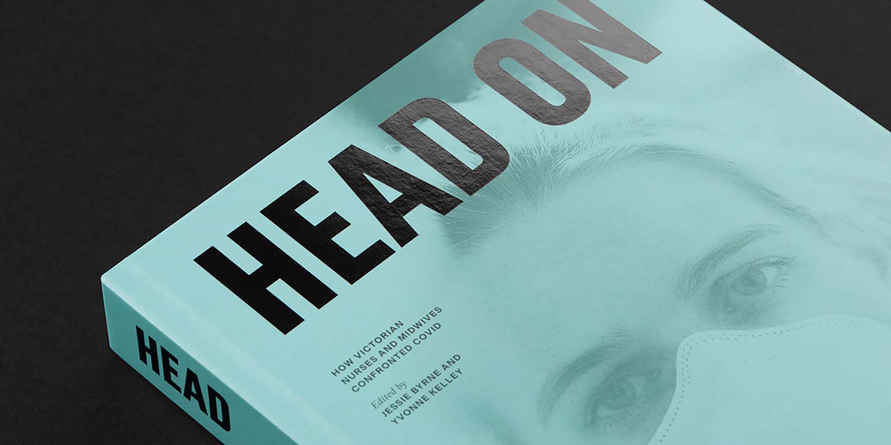
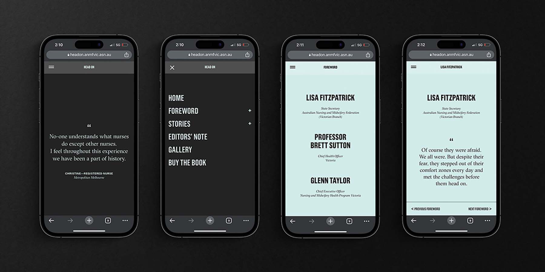
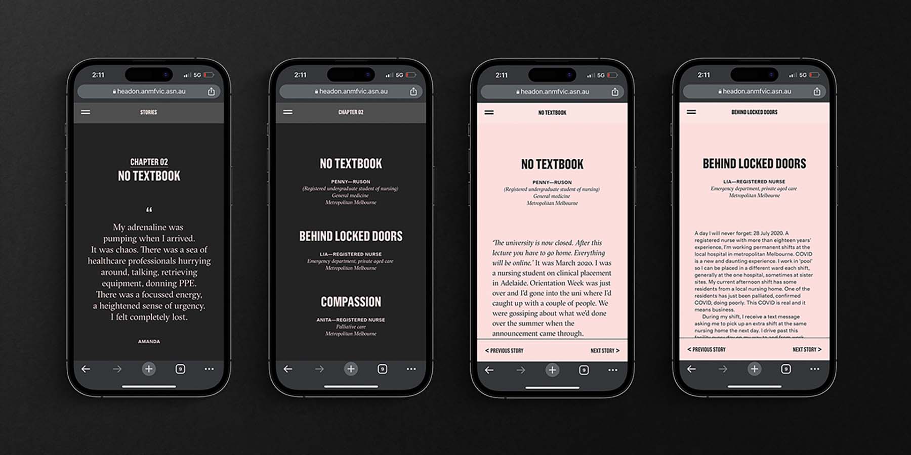
The titles were styled to be intentionally uncomfortable to read. This approach was extended on the website where the titles blur on interaction, a reference to the obscured vision authors experienced when wearing glasses, masks and face shields.
The book and website draw directly from the muted colour palette of PPE equipment. These colours are also washed over many images, most of which are produced as close ups on black backgrounds to acknowledge the individual experience and challenging working conditions.
Produced in hardcover to ensure a long life, the book’s cover features a registered nurse in PPE, a visual synonymous with the COVID-19 pandemic. But this shot was taken post the pandemic phase to stand as a testament to resilience.

