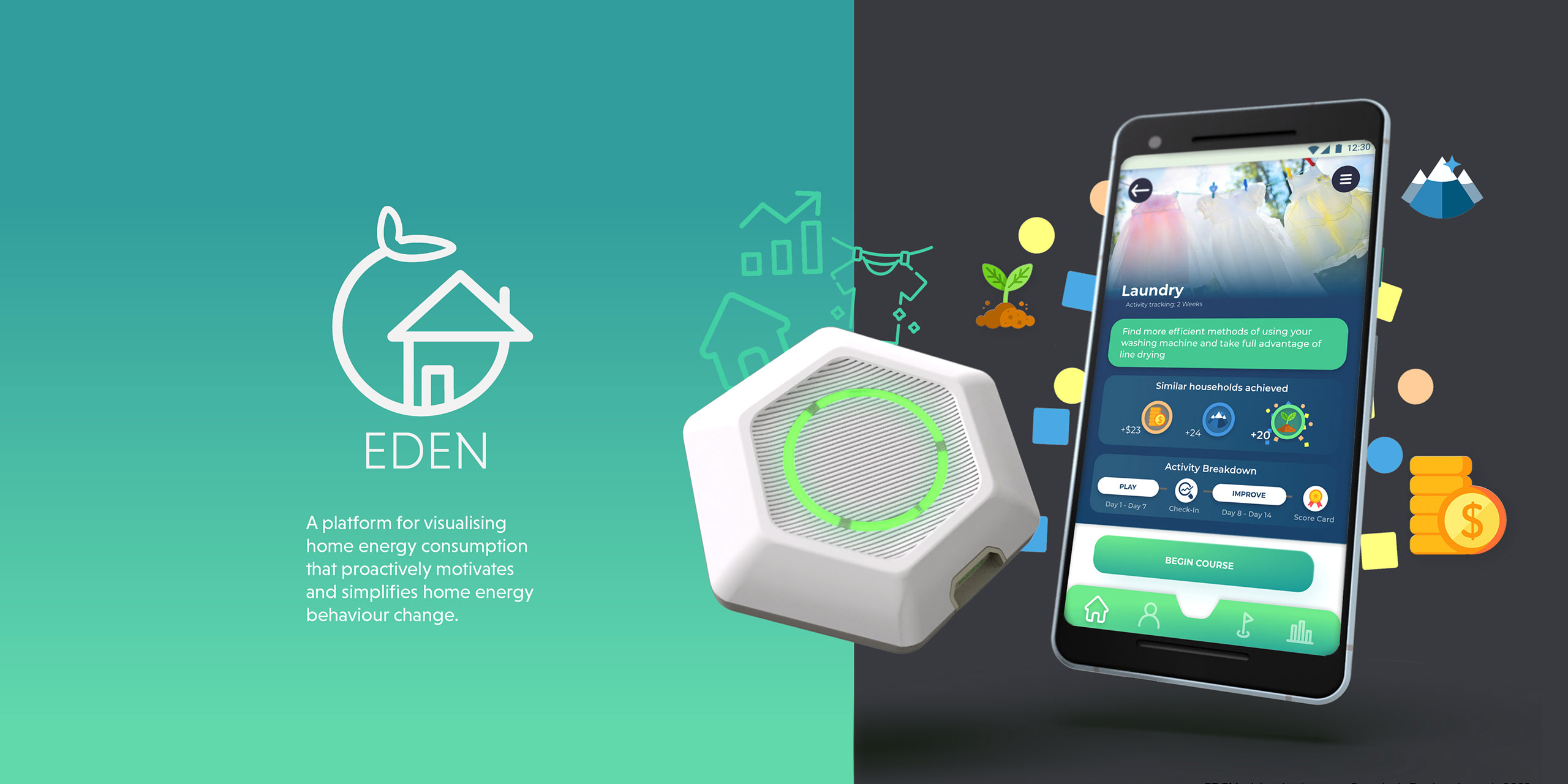
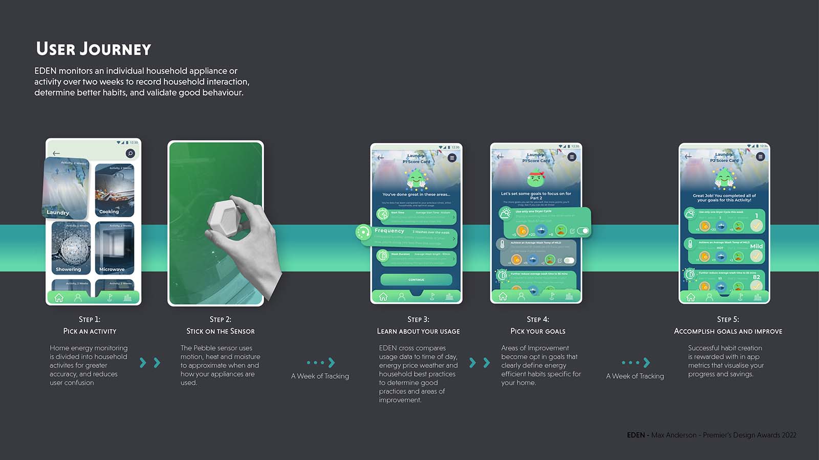
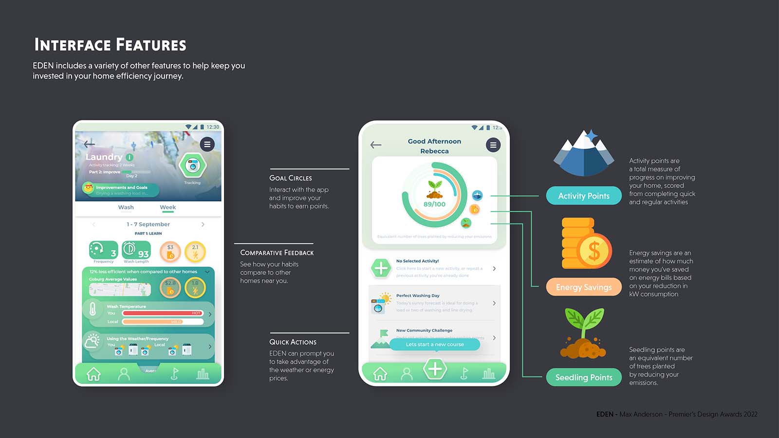
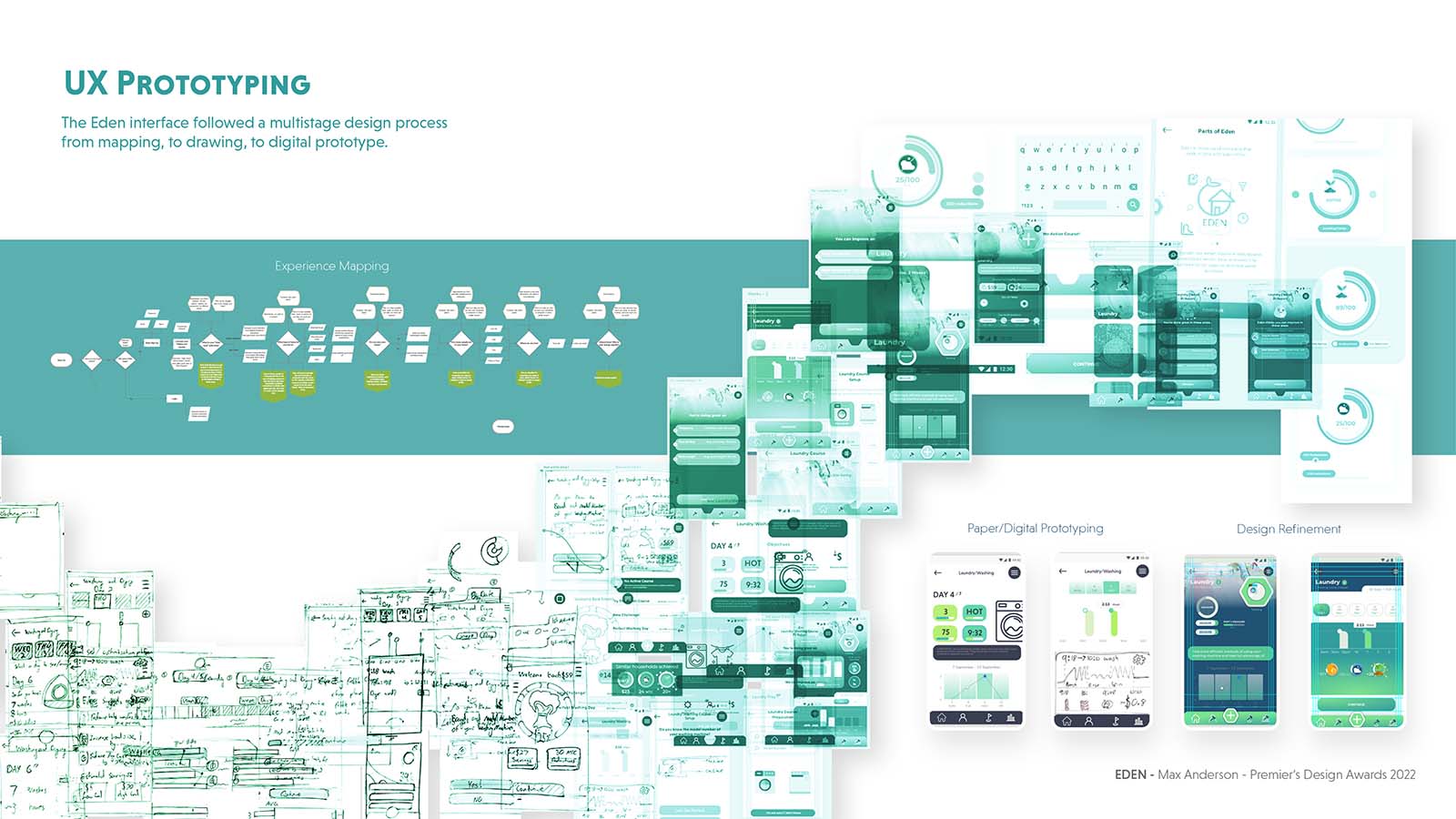
The design process started with understanding where the current problems are in motivating energy use change. Through user mapping, it was found that our current system incentivizes a gradual increase in energy usage through "content high energy households" driving up the energy averages other households comparatively use to determine their efficiency. The literature review found that the best energy usage feedback was specific, consistent and easily understood; all things the common energy bill fails at. This directed development of the UX to be around breaking down household energy usage into appliances, and short burst monitoring sprees. Short term monitoring was a similar technique essential to sports apps, becoming a key inspiration for creating familiar design language in the app.
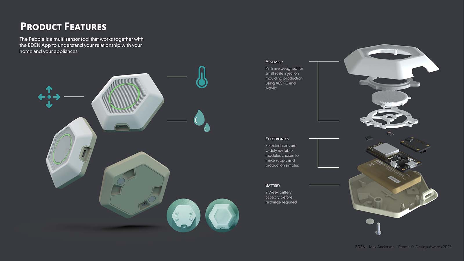
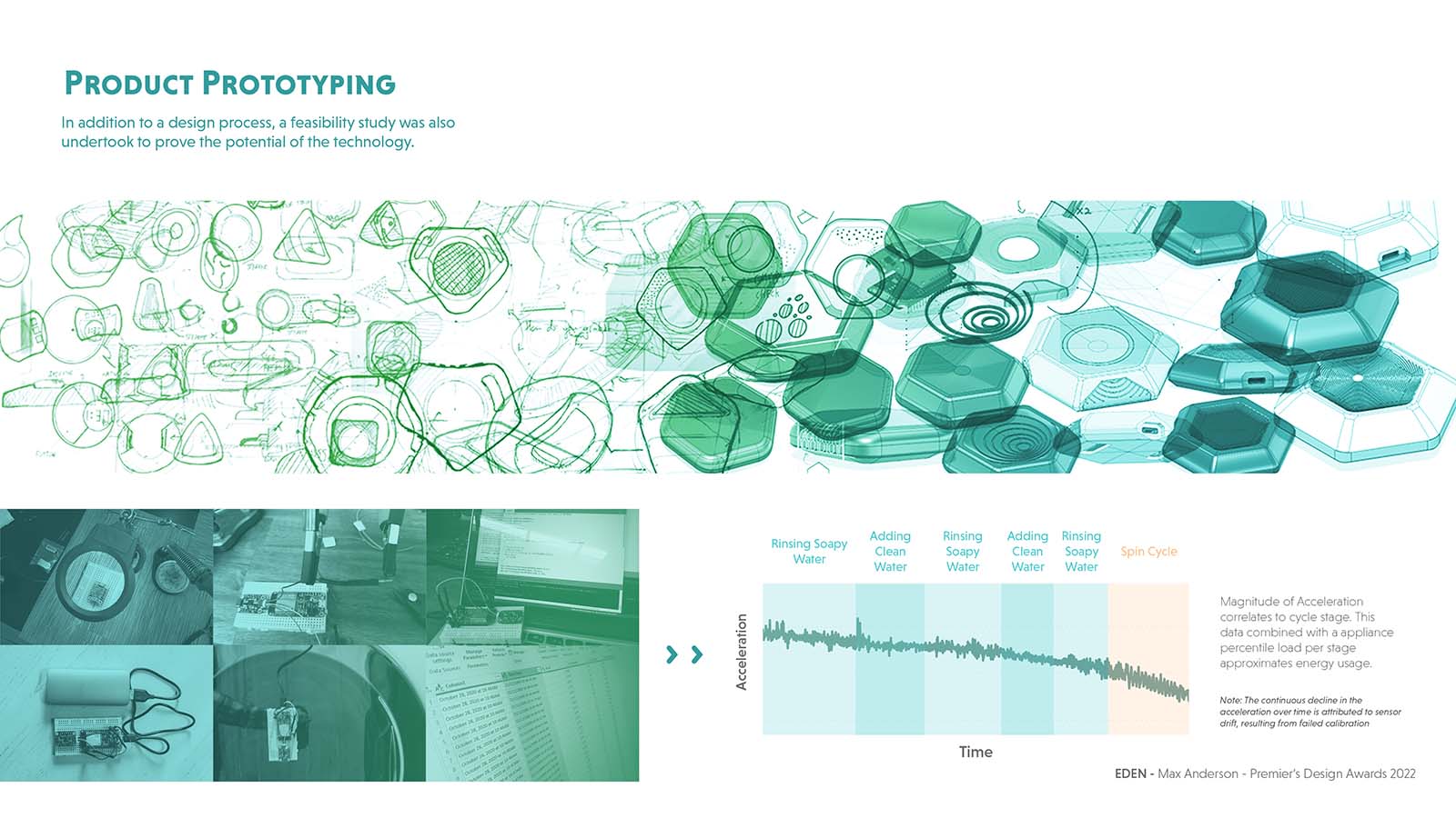
As I was testing energy monitoring methods to connect into the app, I found myself getting frustrated by having to go behind appliances to connect and then disconnect smart plugs. I kept coming back to the idea of an energy stethoscope, a product that could be used to listen to the appliance to understand it.
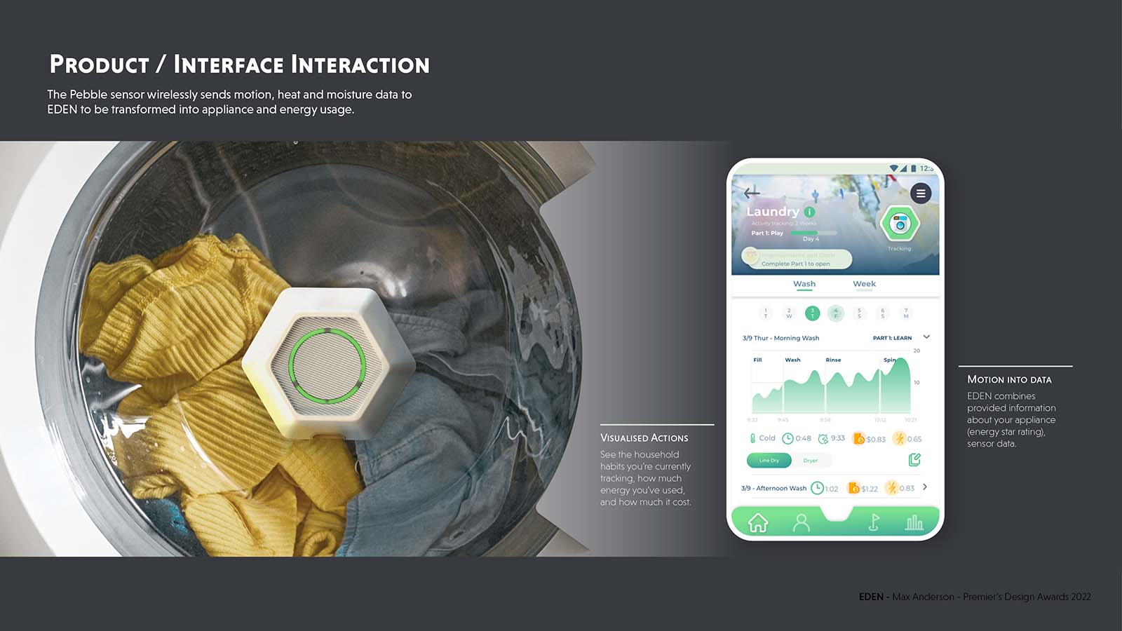
Ultimately I tested using vibration to determine the stages of a washing machine, and saw promise. Having completed this project during the pandemic, I was restricted by the number of people I was able to showcase iterative prototypes to for feedback. However, I worked collaboratively with a graduate UX designer, and used the shareable digital prototype I was developing to run weekly testing sessions with friends and family. Testing included both observational and questionnaire studies to inform changes to the language, user process and visual hierarchy of the prototype.
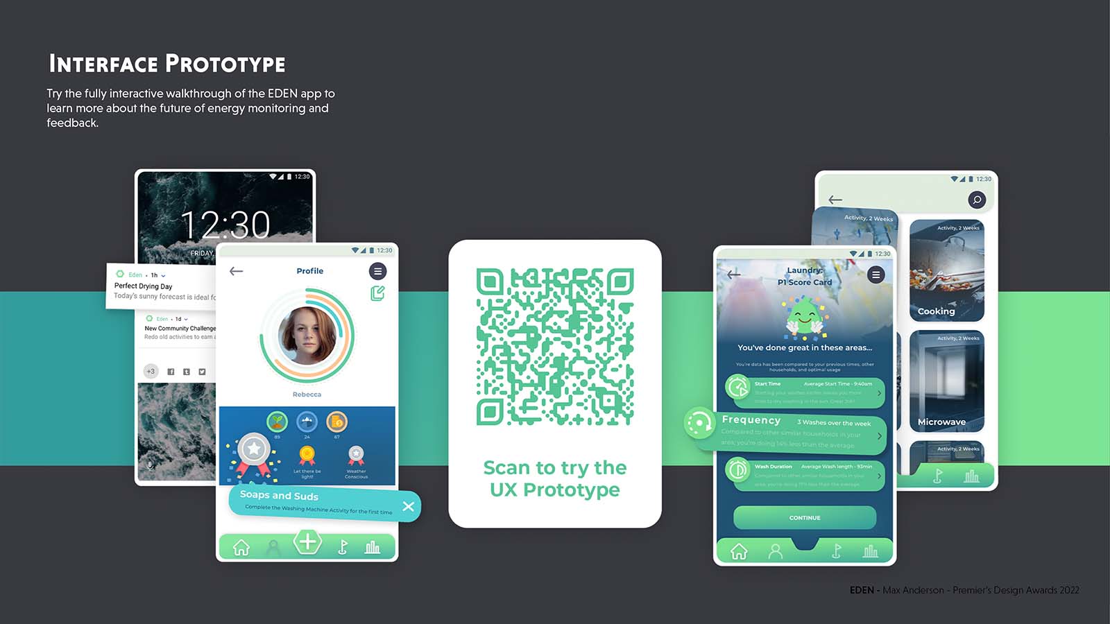
The scale and quality of the project exceeded the original design brief by delivering extra design outcomes (the working sensor unit), and user feedback to the final prototype especially noting the level of realistic polish on display.

