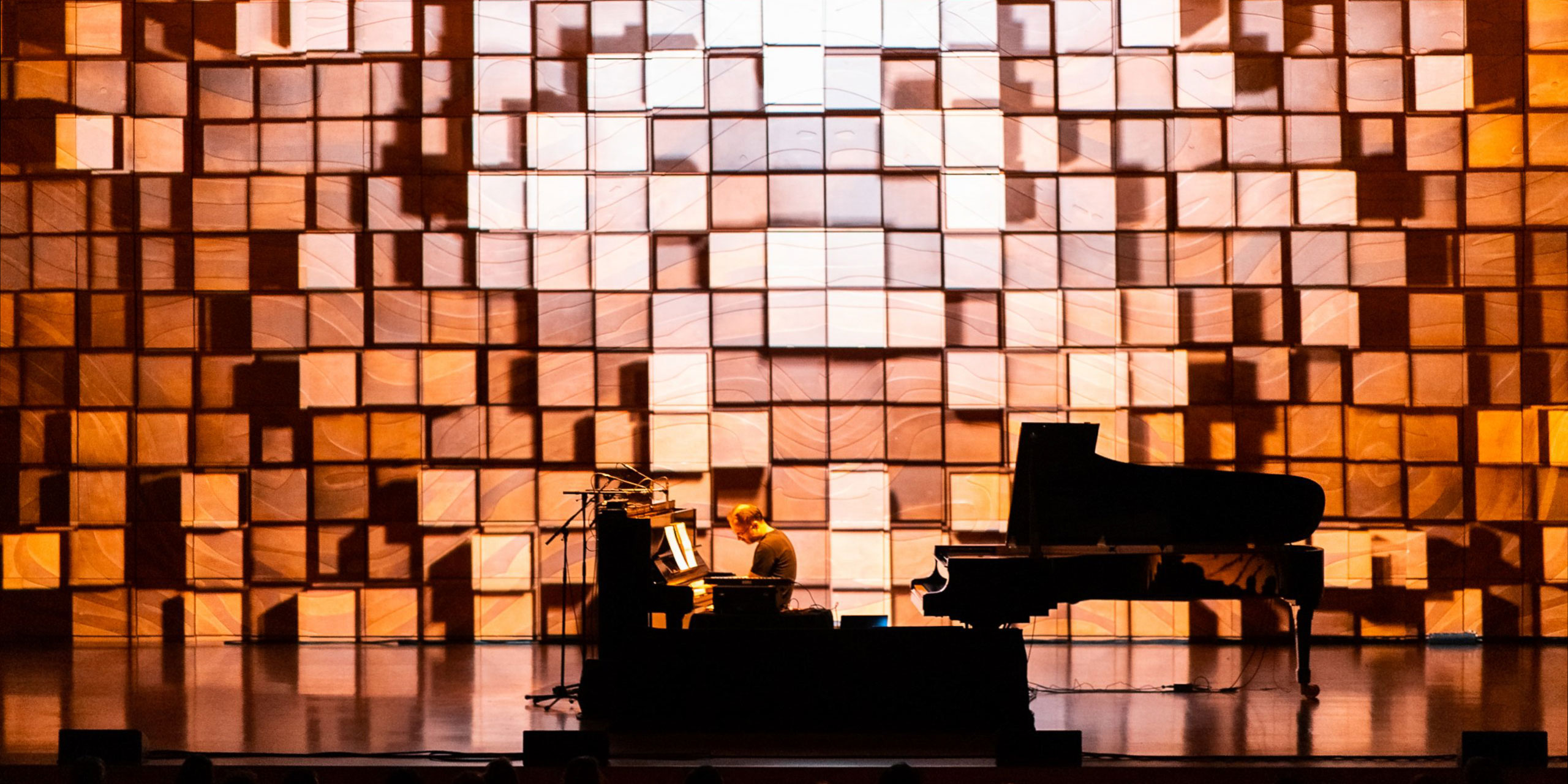
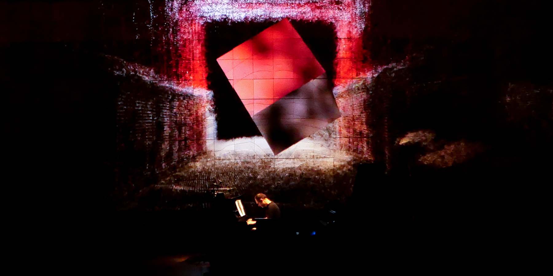
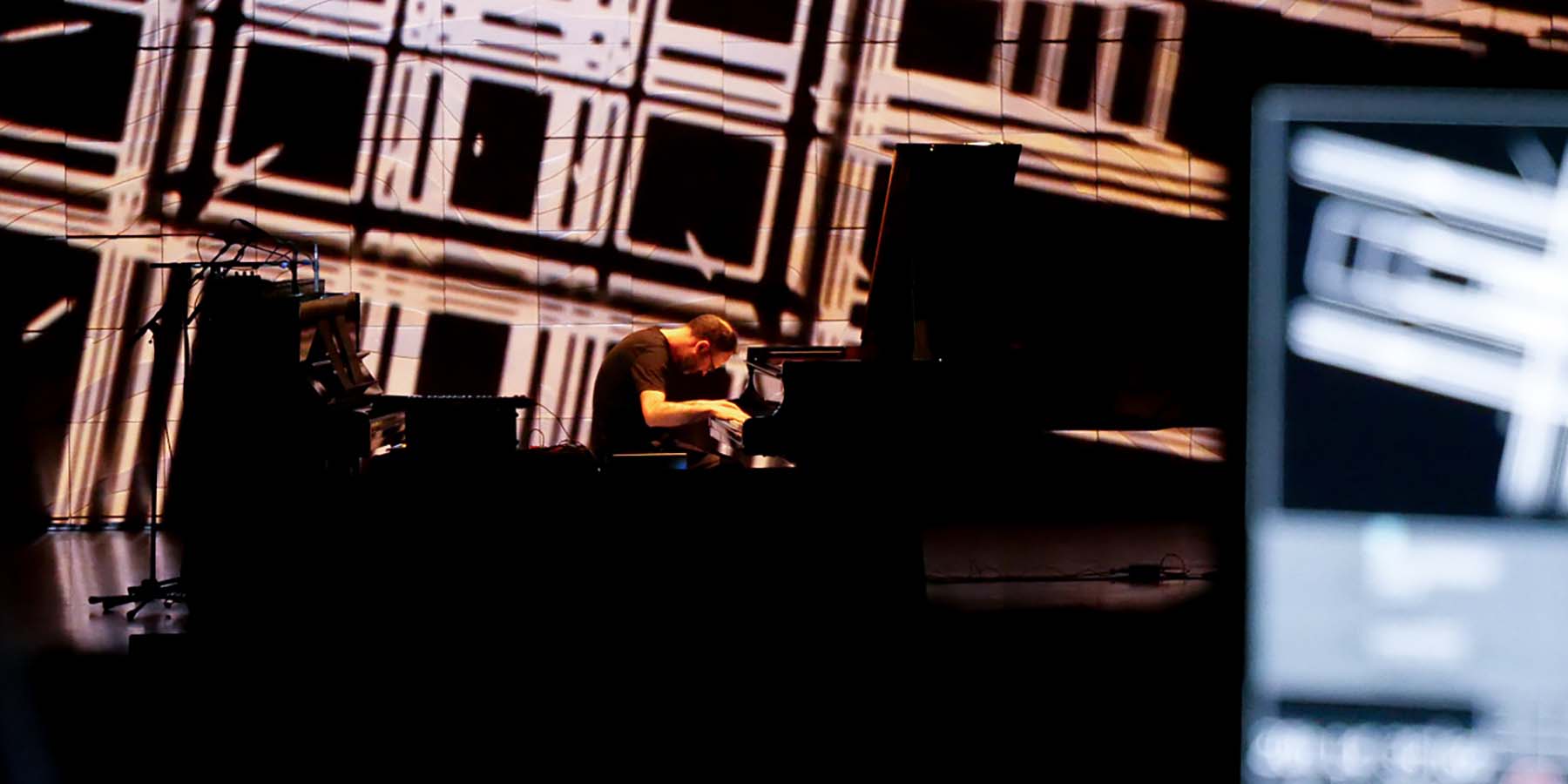
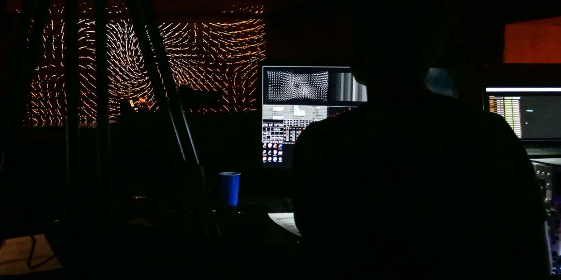
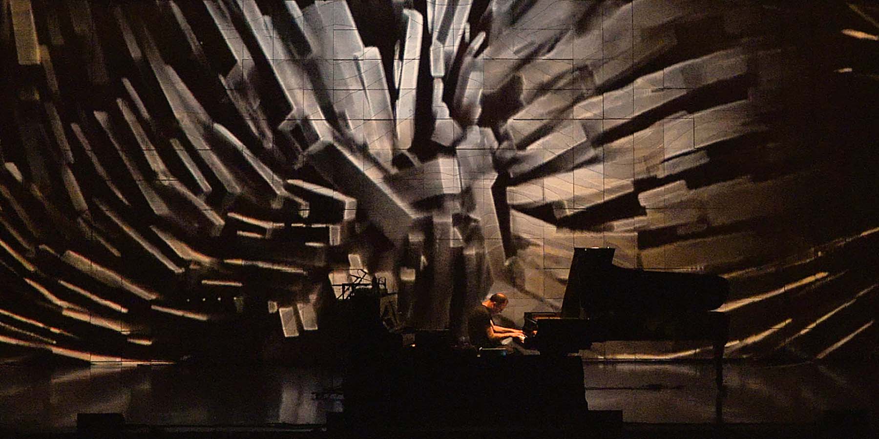
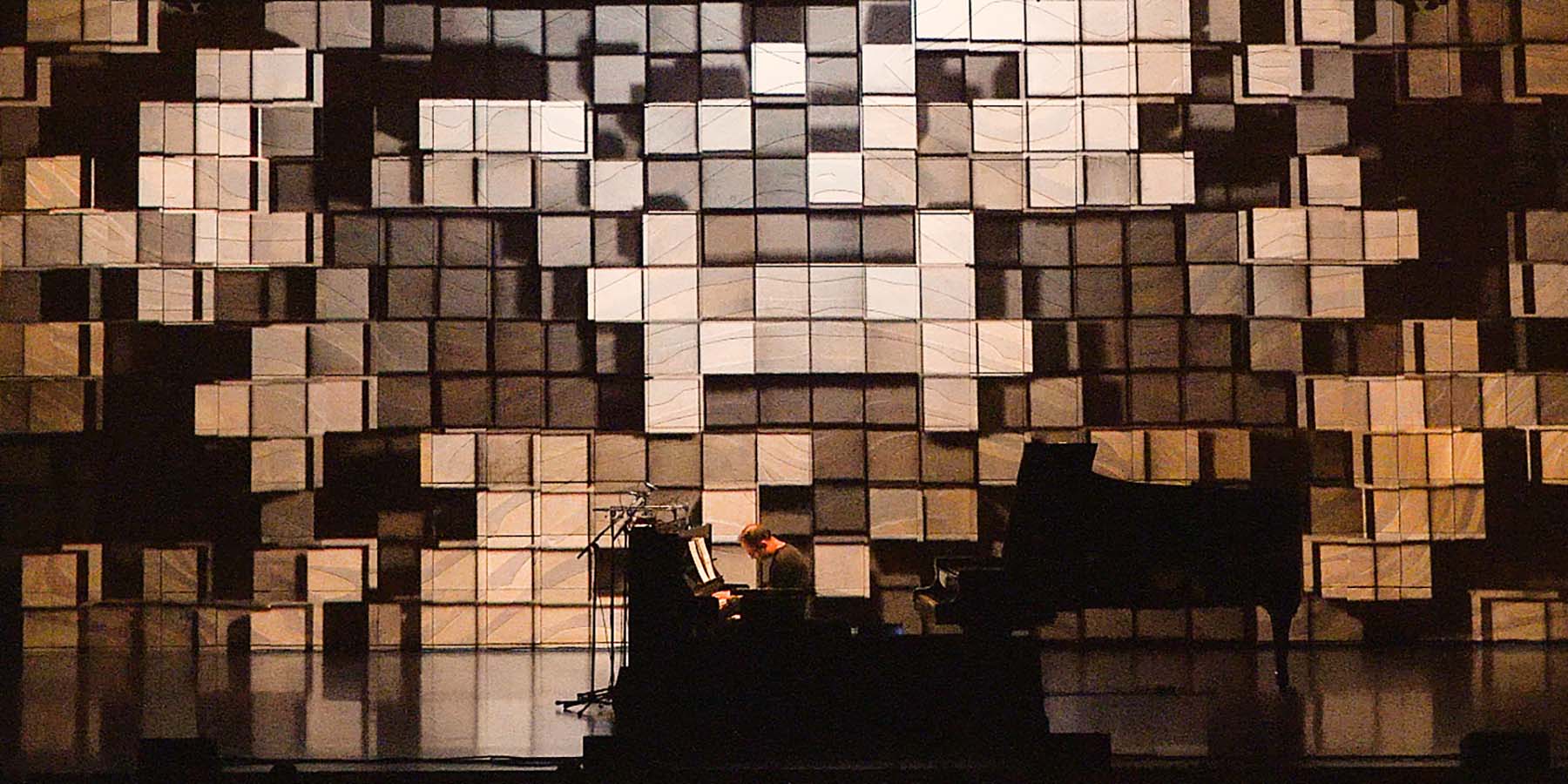
Whilst working alongside Melbourne Music Week and the Melbourne Recital Centre, the artists devised their own design process and production schedule. Firstly we considered the overall audience experience we wished to produce. After devising an initial set-list, a thematic visual structure was sketched that considered the arc of the journey we wished to convey within the parameters of a seventy minute set. After a site visit to conduct projection and technical tests, we outlined an approach that would allow a dialogue between stage performer, digital artist and the projection mapped outcome. These were our blueprints moving forward.
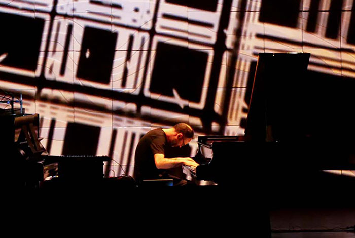
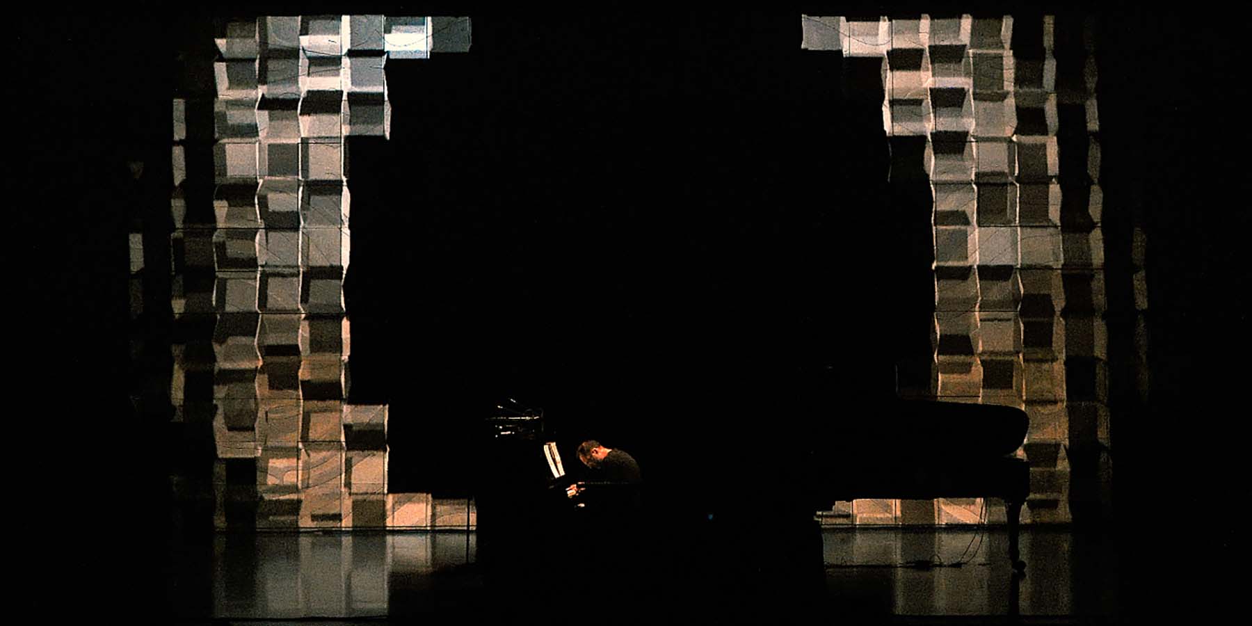
Once in production. Burgin focused on developing an digital art response to Howard's compositions, beginning with a central procedurally driven system that considered the Elisabeth Murdoch Hall's iconic cubic stage facade. When projection mapped and aligned with the architecture, this animated design would produce the illusion of 3D depth and shadows, acting as a reoccurring design motif throughout the show. Building on this, a complete suite of dynamic designs were developed, each with their own personality but sharing a unified sensibility.
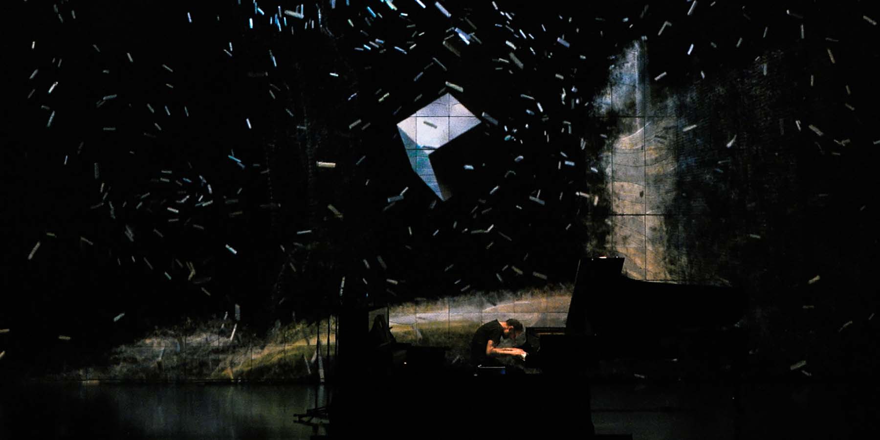
To not detract from the warm hues of the architecture each design was monochromatic, except one. For a later track 'Critical Spirit' we reserved a special treatment, one that reset the audiences immediate expectations with 3D visualisations in rich expansive colour. Howard and Burgin work-shopped the experience and performance format together in the studio. We decided against a conventional format of audience rapport as well as the utilisation of extensive lighting effects. Instead we opted for a simplified approach with a single diminished spot, a continuous performance and almost complete visual emphasis on the projection. Subsequently Howard on stage was fully enveloped and integrated into the large-scale digital response.

