Finalist 2022

Craft Victoria

Liquorice / Craft Victoria / Studio Round

How did Craft Victoria continue to support, present and produce hand-crafted practice through the world's longest lockdown?

Craft Victoria has been a leading advocate for Australian craft and design for over 50 years, supporting the careers of thousands of makers and nurturing small creative businesses. As they approached their 50th anniversary, the team wanted to renew Craft's website and branding to better reflect the organisation in today's digital world. When the pandemic hit, a want became a need, as doors closed and 100% of retail business went online.

Design Brief:

On the eve of their 50th birthday, Craft Victoria suddenly went from running a gallery and retail space, and hosting exhibitions and events – to an online-only delivery model.  In response to the pandemic, Craft asked Liquorice to help update their entire digital presence, from the development of a comprehensive new digital strategy, to the design and development of a new website.  The website needed to be:

  • A platform for Craft members to sell their crafts and advance their practices
  • An online retail shop for buyers to purchase hand-crafted goods
  • An event space and cultural destination for local and interstate visitors

This project was developed by:

Design Process

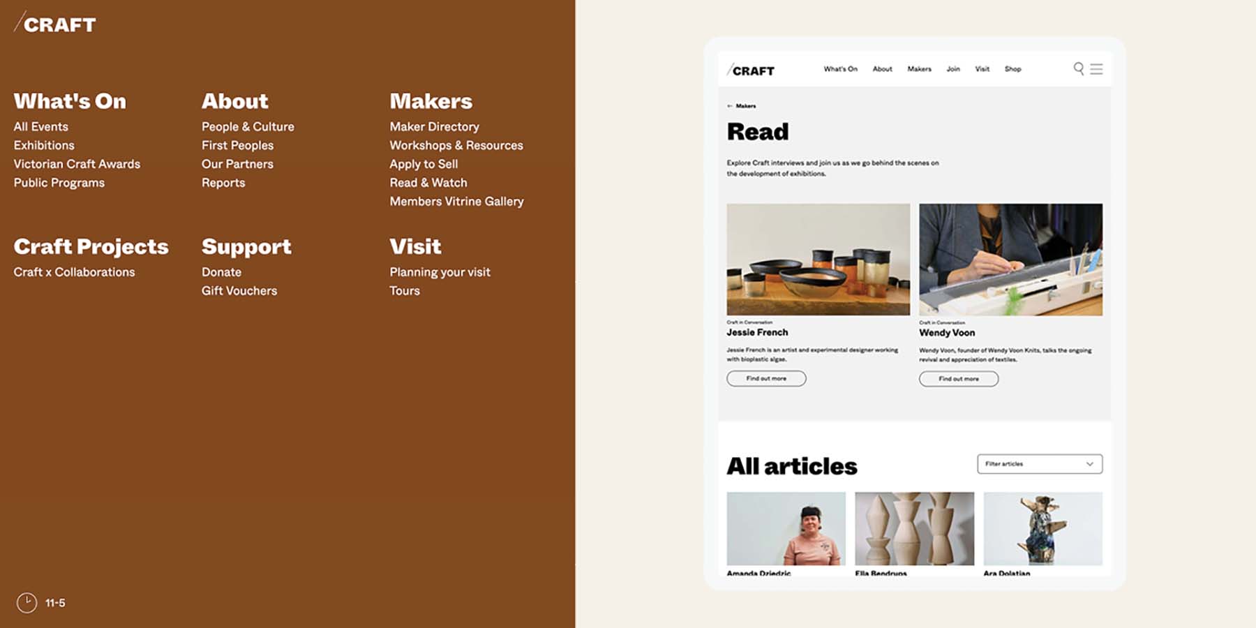
Strategy: We conducted a strategy workshop with the team at Craft Victoria, closely examining the brief and generating a comprehensive overview of the project goals, objectives, vision, priorities, risks and opportunities. We created personas to represent Craft's key audiences, ensuring the needs of each group were not just being met, but anticipated. We worked collaboratively with Craft to develop a new site IA which simplified the navigation and content and aligned to the direct user needs.

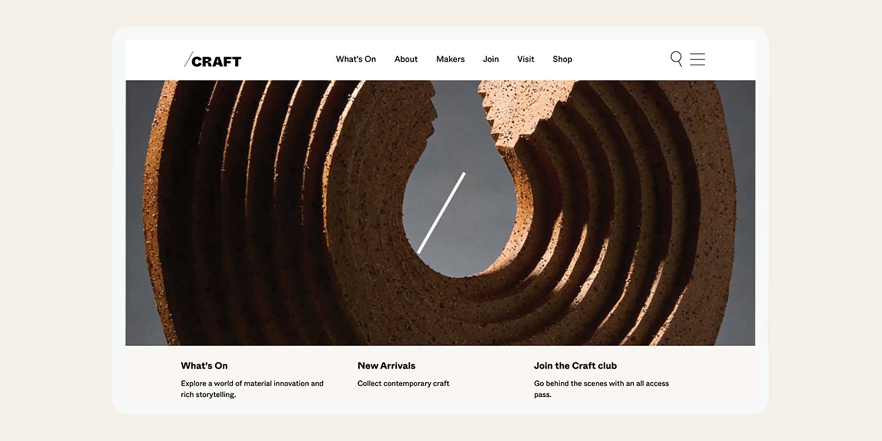
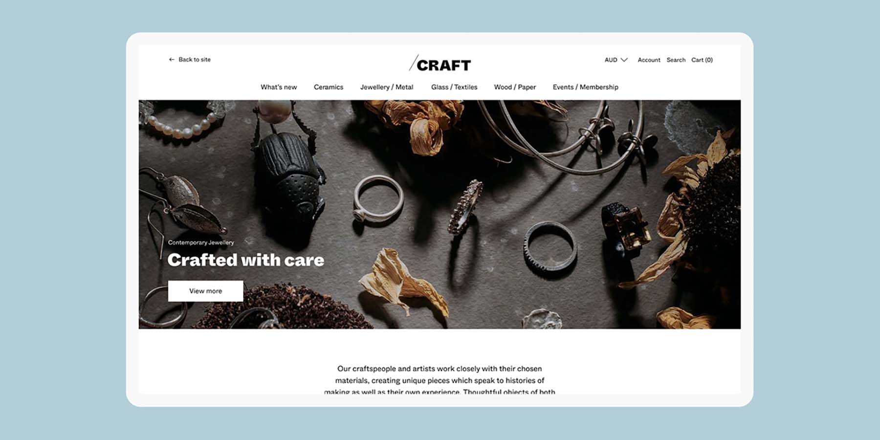
Design: The website design has 3 facets: the main website which would welcome the majority of visitors, the maker portal for artists, and the online store for retail customers. To mirror the feeling of a physical gallery and event space, we utilised plenty of white space and a minimal colour palette, ensuring the designs supported the beautiful, lush hero imagery (as opposed to competing with it). We restyled and restructured the online store, improving navigation between the store and the main website. We also enabled Craft to embed shop items (individually and as collections), as well as workshops and events with prices and “buy now” buttons for quick purchases.

Development: As well as ensuring the website met the 3 key criteria, we wanted the platform to give control back to the Craft team, and allow them to update and enhance the site independently as needed. The existing site sprawled across a huge number of pages and page types, and the navigation was complex and opaque. We created a robust site structure and a set of powerful modular templates which would enable Craft to create a wide variety of page designs without designing them from scratch every time.

Design Excellence

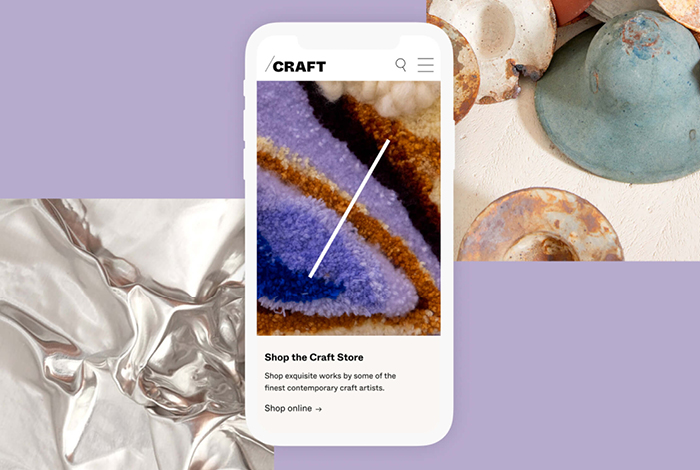
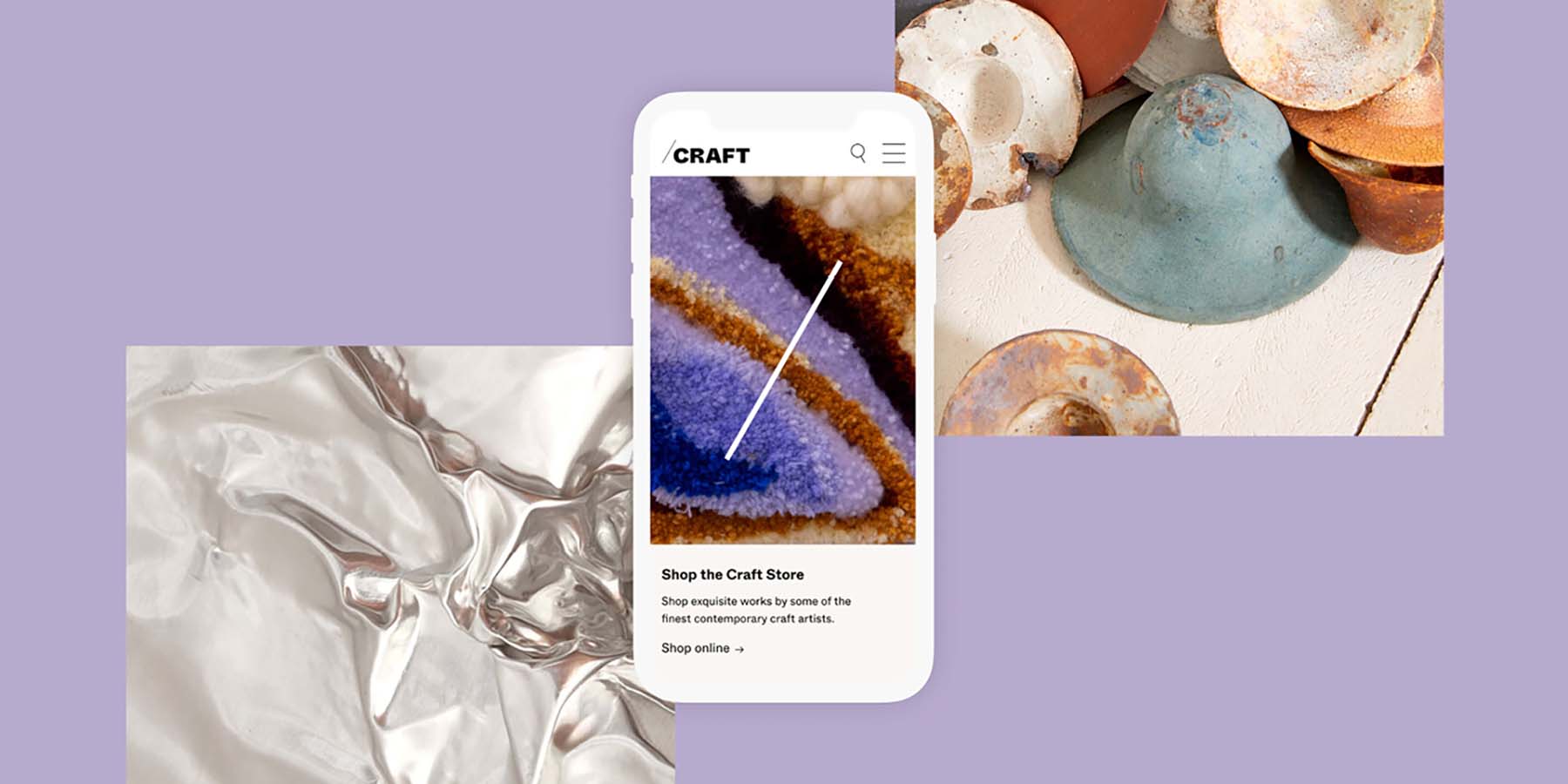
The Craft Victoria website showcases the new vibrant and contemporary branding established by Studio Round through a user-centred, mobile first and accessible, best-in-class digital application. It re-positions an important player in the Victorian arts scene as digital-first leaders.

The website showcases the benefit of investing in professional design by giving a platform for artists to showcase their work and by creating an engaging space which entices the general public to learn more about the Victorian craft market and spend money within the sector. Fundamental to our final website design concept was putting Victorian Craft artists at the forefront of the design. Looking at how we could simplify the colour palette so the work itself was the centre of attention.

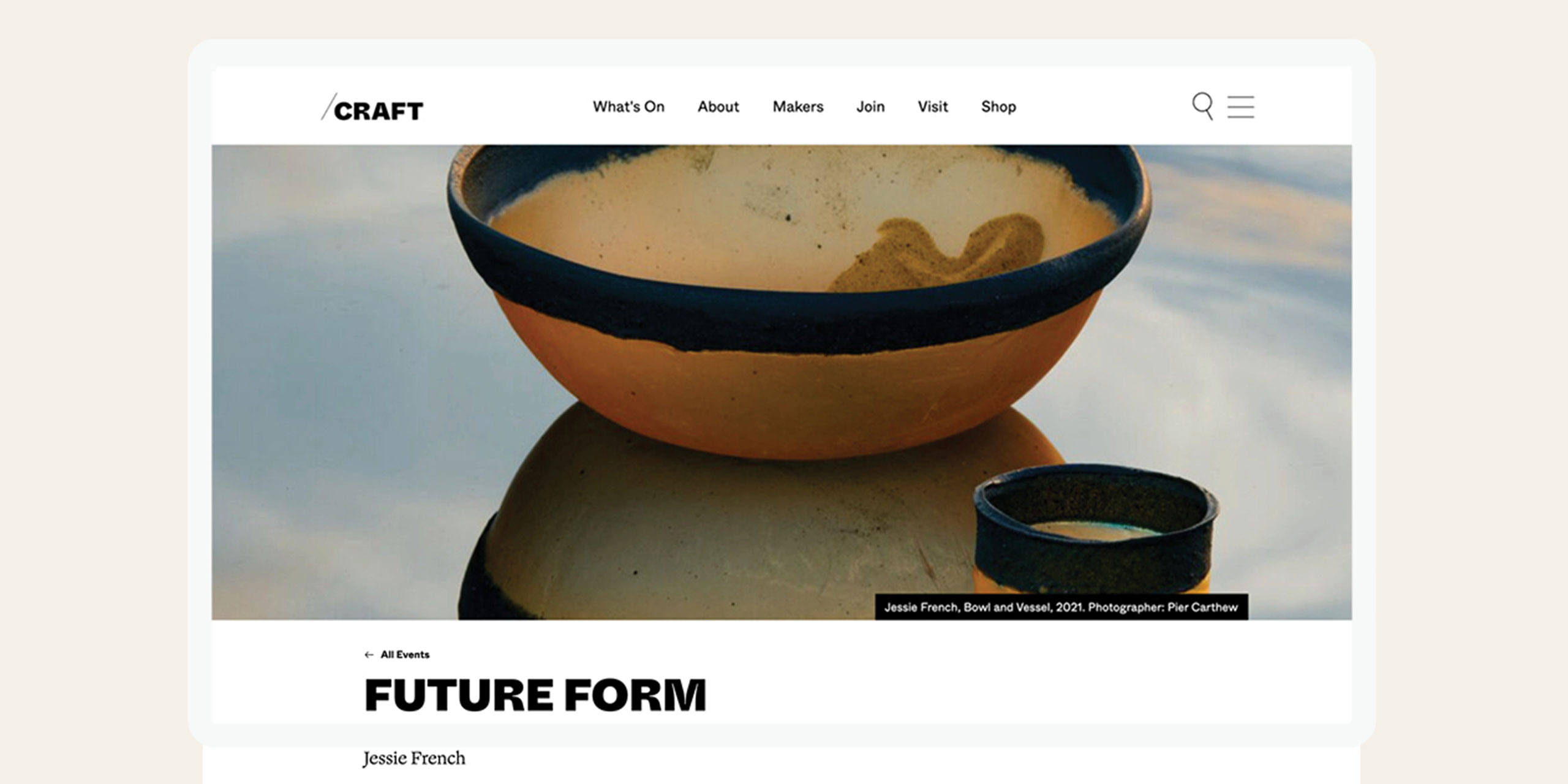
The colour palette we were using contained a lot of bold and powerful colours (as you can see from the menu, CTAs and page headers). However, we chose to minimise the colour and include a lot more white space so that the craft of the Victorian artists we were showcasing really shone. Alongside colour application, we wanted to ensure that imagery was given as much real estate as possible. We were given such a beautiful suite of imagery (all professionally shot), so we want to ensure all pages gave as much real estate as possible to this. This is evident on the artist pages with its full screen image gallery, and the Maker Directory which uses imagery as primary focus for navigation.

Accessibility is mandatory for all Liquorice websites. We worked with Studio Round to establish an appropriate digital application of the brand guidelines, determining what combinations of the colour palette would meet WCAG 2.1 AA guidelines, such as colour contrast requirements, font sizes, and legibility. The final result meant the website could be accessed by as many users as possible.

Design Innovation

Liquorice utilised a user-centred approach to put core users (makers, established artists, educators and consumers) at the forefront of our digital design process. We went through a detailed strategic process to identify the needs and wants of the core user personas for the Craft Victoria website. From there, we built a site architecture which addressed their primary goals and gave multiple pathways for each user to find what they wanted, in their own way, when visiting the site. A lot of work went into creating a clear site navigation and home page which presented the key information users were looking for.

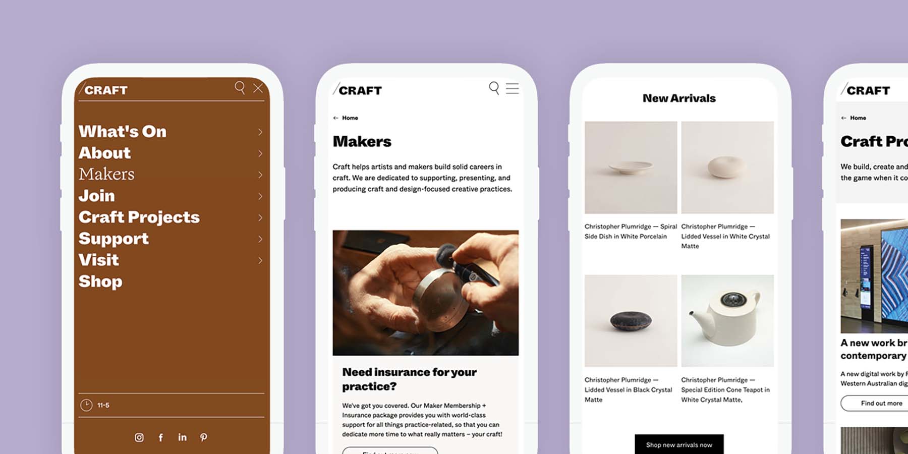
As we decided to strip out a lot of the colour from the rest of the site in order to showcase the imagery instead, we decided to inject the fun colour palette into the navigational components of the site. For example, the menu is a standout design feature, embodying the contemporary colour palette, fonts and mobile-first approach to design. A lot of consideration went into how best the menu would work on mobile devices, as this was the primary way Craft Victoria’s users would access the site. Animation was also a big feature of the website design. We wanted to create a hero piece on the home page which showcased the work of Victorian Craft artists, but also showcased the new ‘/’ symbol of the branding established by Studio Round.

Design Impact

In order to widen the interest in craft throughout Australia and abroad, and present a cutting-edge vision of the discipline, we needed to ensure Craft Victoria’s digital experience was best in class. Through the new website, Craft has increased the number of people using their resources, attending their exhibitions and events (in-person and online), purchasing craft items, becoming members and commissioning makers for commercial projects.

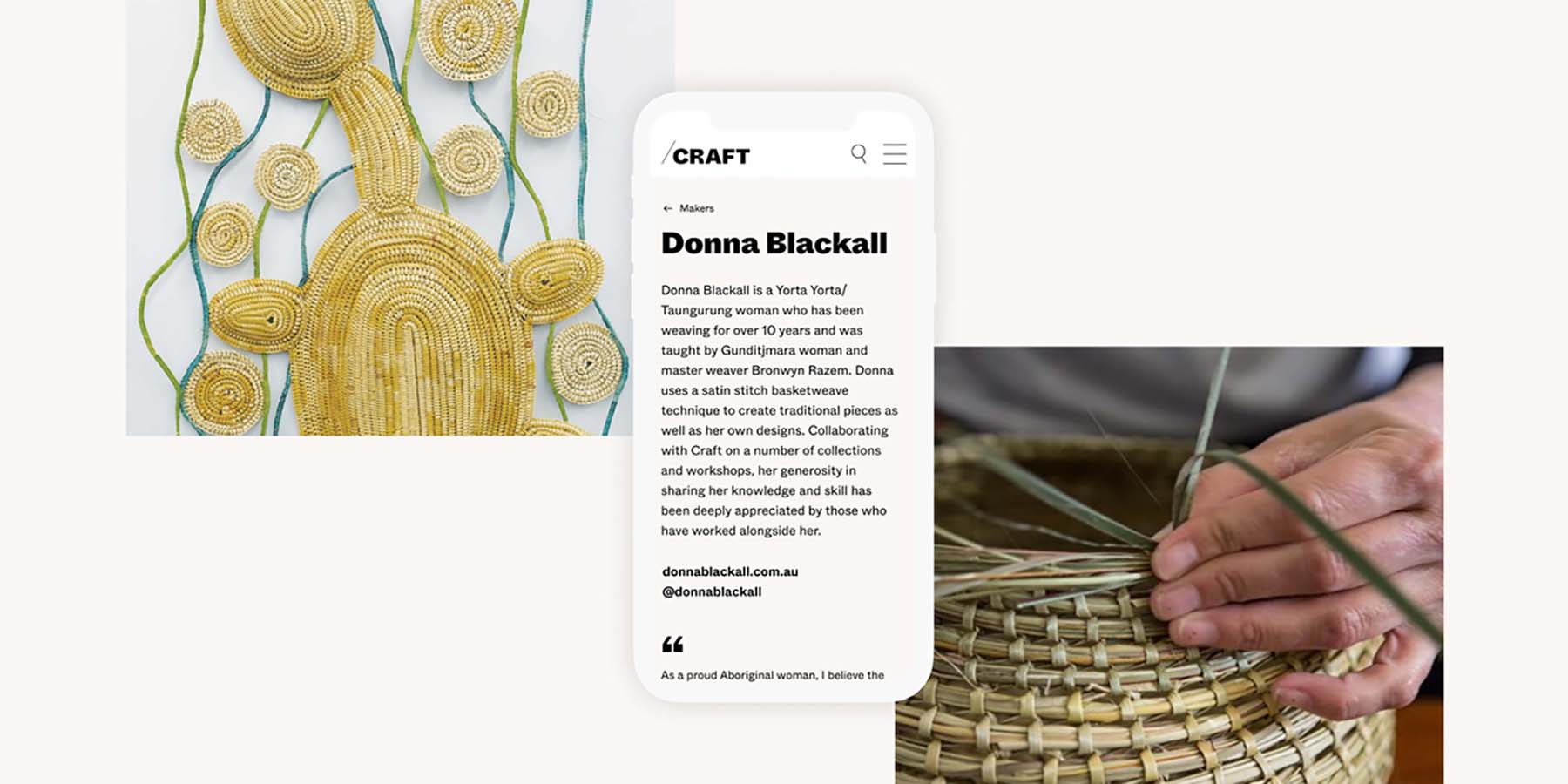
The new Maker Portal has given a space for Victorian craft makers to network, learn and showcase their work. The new integrations with Shopify throughout the site have helped to convert users to customers by adding add-to-cart functionality directly in the site. The new look Shopify store has also made it a lot easier for customers to find what they’re looking for and complete a sales transaction. The individual maker pages have given Victorian craft makers a landing page within the Craft Victoria website which presents their work on a professional, sophisticated platform. These pages have helped craft makers gain consumer awareness.

Circular Design and Sustainability Features

Liquorice embodies our own approach to circular design. We leverage the Double Diamond methodology of discover, define, develop and deliver. Through the double diamond approach, Liquorice deep dived into research very early on to identify the problem before jumping ahead into solution mode. We reviewed analytical data, spoke to users and gained stakeholder feedback very early on, testing and releasing prototypes before moving onto the next iteration of design.

Our delivery model was to release the article and standard pages to Craft Victoria in an initial first phase release, prior to the final staging delivery. This was to ensure they had the time and resources to upload the relevant content in the lead up to launch. As they are a NFP organisation, they are very limited in resources, so undergoing this sprint-style delivery helped with the efficiency for their UAT and content upload.

Once the site was launched, we went through an iterative process of enhancements to ensure the site was functioning as it should. In terms of sustainable design, Liquorice created a website which was open, honest, efficient and resilient. Knowing that Craft Victoria has very limited funding, the website needed to last at minimum five years and up to ten years. We wanted to create a CMS that was easy to use and give Craft Victoria the ability to manage it, without the need of a development company. We also designed the template with clean, white, contemporary layouts which shouldn’t date over the next decade to ensure the site can sustain the organisation as long as possible.

Digital Design 2022 Finalists

Map Your Future

Today / Youth Disability Advocacy Service

The Future of Personal Data Ownership

Mo Works / PwC Middle East

Scouts I Terrain

Scouts Australia / Two Bulls/DEPT®️

Trash

Bin Chicken Studios

Medicines Development for Global Health Website

Ethical Design Co. / Locase / Meyer Literary / Medicines Development for Global Health

Iron App

Maria Tongson / Dr Scott Mitchell (Research Supervisor) / RMIT University

SmileyscopeMRI

Smileyscope Pty Ltd

Three Corners of the City

James Berrett / Sonja Pedell / Simone Taffe / Swinburne University of Technology

Strong Care

StrongRoom AI / Isabella Jorgensen

Triceratops: Fate of the Dinosaurs (Act 3)

Sandpit / Klang / Chris Edser