Finalist 2022

The Pink Book

Trampoline / Henry von Doussa / Clouds of Magellan Press

Designed by Sean Hogan ‘The Pink Book’ is Henry von Doussa’s memoir about beauty and suffering, freedom and constraint.

‘The Pink Book’ is a memoir by author/artist Henry von Doussa about the influence of life’s juxtaposing forces: beauty and suffering, freedom and constraint. The book explores the author’s experiences of sexuality, gender, living with a learning disability, mental health, grief and loss through the HIV/AIDS epidemic, and the power of creativity to understand and help heal the mental ill-health of a multi-generational Australian family.

Design Brief

In 1976 a young dyslexic boy makes a book for Book Week to be displayed in his primary school classroom. He calls it ‘The Pink Book’. It is a collection of softly painted pink pages with no words, no sentences, yet with a very strong story to tell. Forty years later, Henry von Doussa has written into those pink pages to free the waiting story. Henry’s brief for the ‘The Pink Book’ asked to fulfil two main requirements: to weave together the broad elements of art, photography, poetry and short stories into a single narrative; and to acknowledge the dyslexia of the author by designing a book that could be read visually as well as literally; to be engaging, surprising and unorthodox.


This project was designed and commissioned by:

Design Process

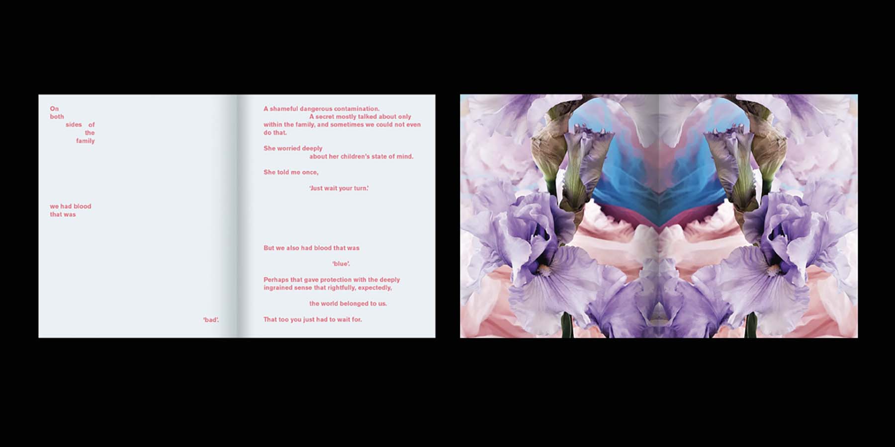
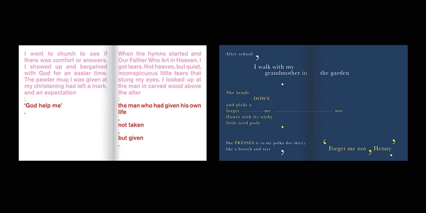
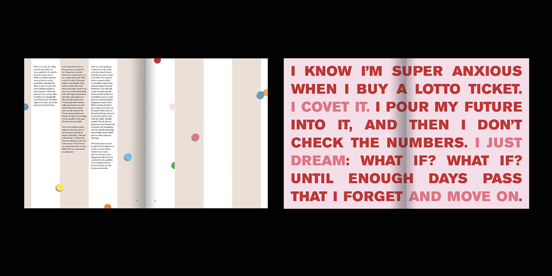
When presented with the memoir in manuscript format, Sean Hogan’s first step was to decide how to tell a story which was recollected through creativity: writing, art, photography, object. How the story was told needed to be as fitting as the story itself. Henry writes “How to illustrate the time that’s passed? Is it chronology or relevance that should govern a story, govern a life?” The Pink Book, pg 23. The design process consolidated the structure and running order of the memoir; choosing not to follow a linear timeline, but rather create vignettes of Henry’s life. This method allowed Sean great flexibility in the arrangement of the pages, for the design to evolve into a rhythmically rich and intriguing visual tapestry.

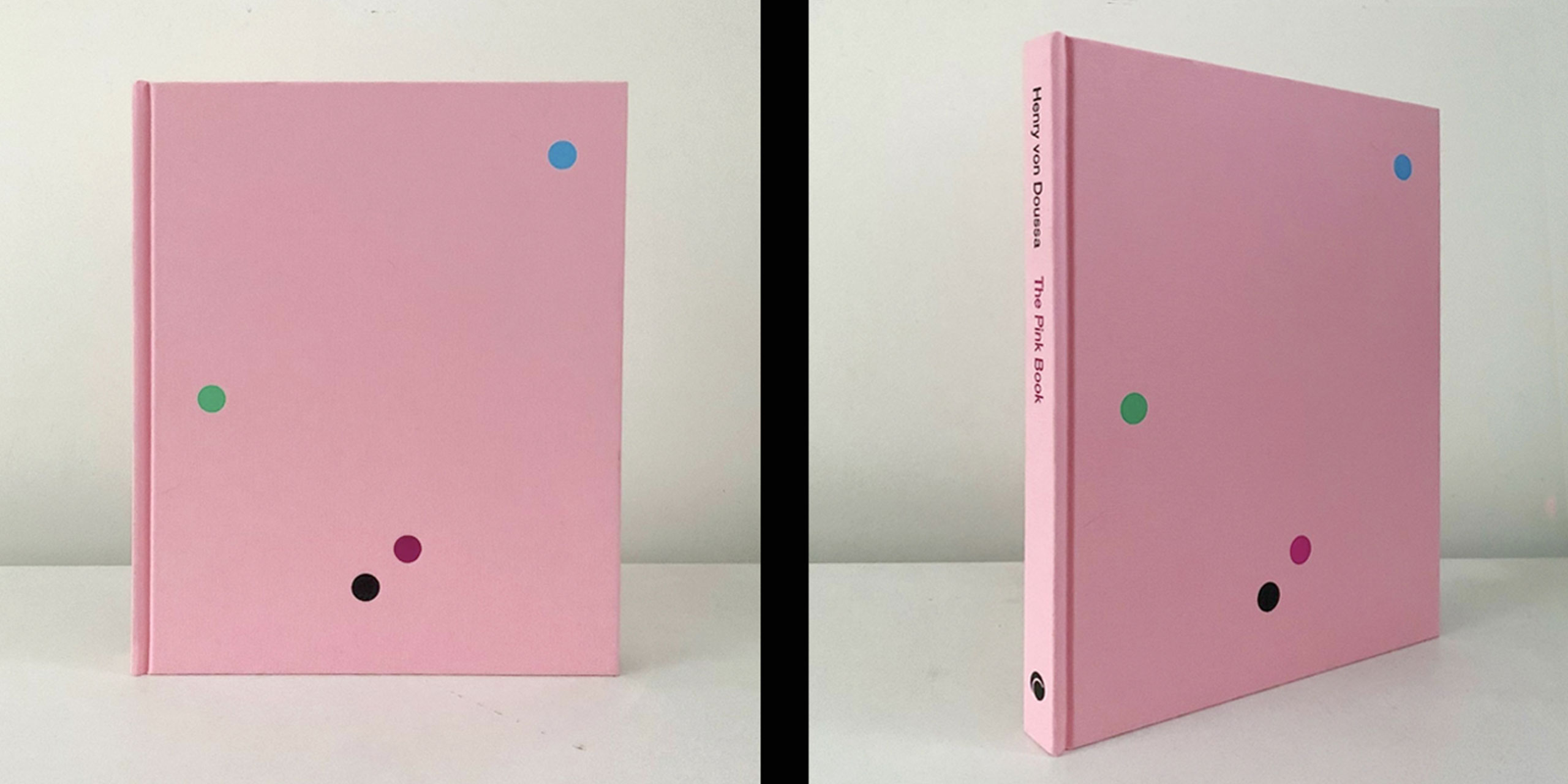
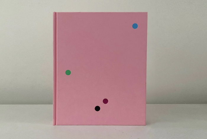
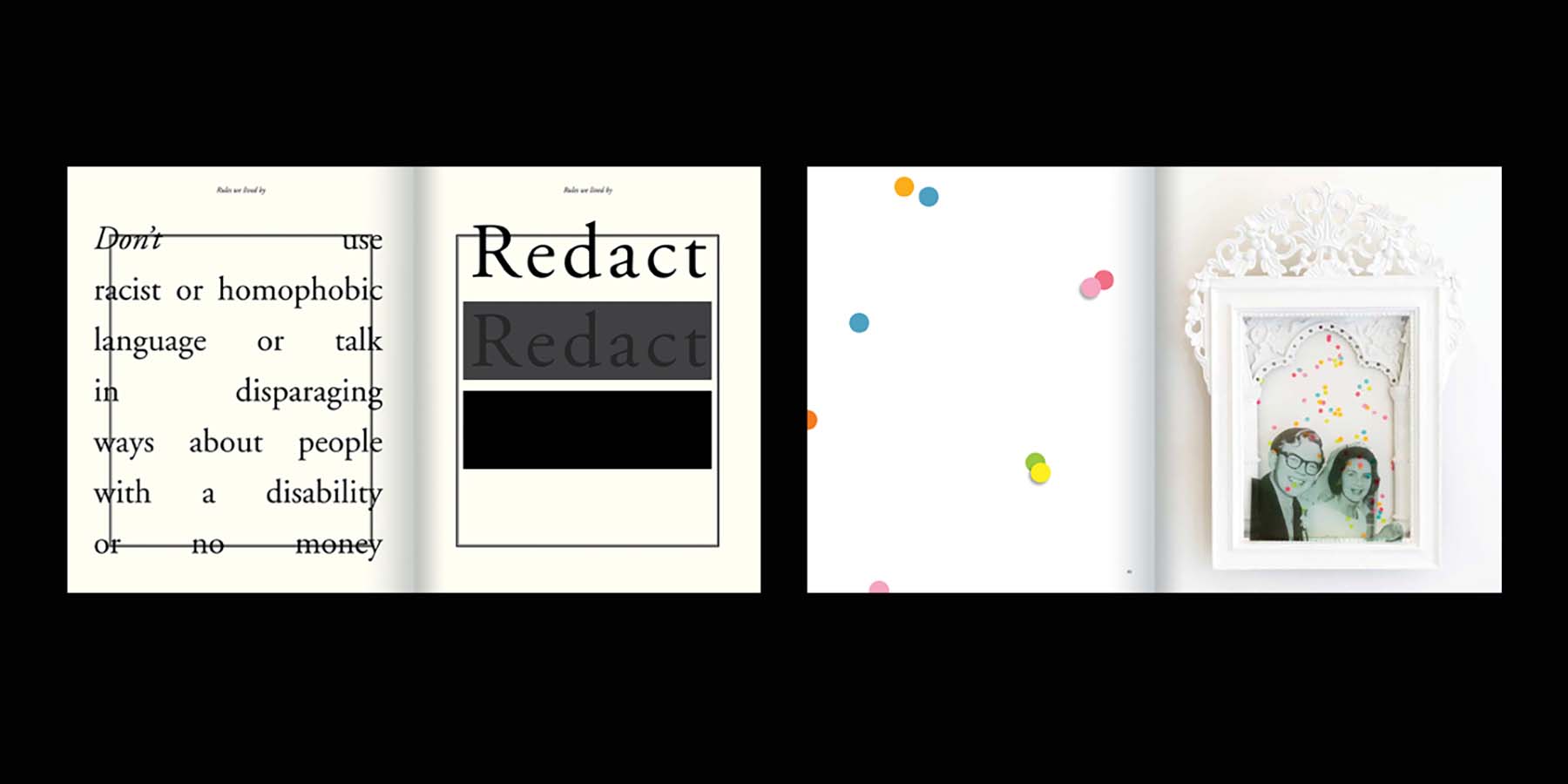
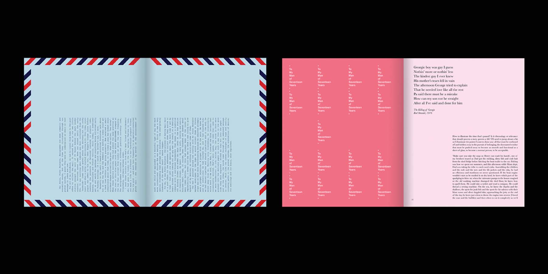
The sum of the book is greater than any individual page, yet paradoxically each page stands alone as its own piece of art. This was achieved through careful attention to typography, colour and layout. Each page was designed with great sensitivity to the subject matter, ranging from the playful and humorous, to puissant themes of sexuality, gender, living with a learning disability, mental health and suicide. Designed with a hard cover, bound in pink linen and pages gilded in magenta, the book is presented as an object to hold. The cover boasts no words, just four coloured circles debossed and foiled, one in metallic to catch the light, referencing the confetti used in Henry’s artworks. The finished book has exceeded the design brief with the client, publisher and general public. The design of The Pink Book has “…created a world of pathos and colour for the reader to enter, away from the black and white of limiting world-views.” Leila Lois, Rochford Street Review, 2022.

Design Excellence

What is the user experience of reading a book? The absorption of the story, the narrative journey, the ping of recognition of self through the characters contained within? When the words and images of the author are enhanced by good graphic design, the story is elevated. The experience of reading The Pink Book is enriched by the way the words and images are laid out on the page - the design of the book elevates the experience of the reader and provides a platform for understanding the author’s life journey through colour, pattern and rhythm.

The subject matter is treated with reverence and presented to the audience with consideration and respect, conscious of the triggering themes and subjects. The non-conventional treatment of the words on the page reflect the unique life story within. Aesthetically it is bold yet tender, complex yet apparent, joyous and sad, poignant and wonderful – a literal and conceptual translation of the author’s life story.  The Pink Book exceeds the criteria for good design by presenting itself as a visual collage of the author’s life experiences, augmenting the traditional role of a book by strengthening the communication of the ideas within.

Design Innovation

A fundamental component of the memoir is the author’s experience of living with a learning disability. Dyslexia effects a person’s ability to interpret words, letters and symbols, but is not a reflection of general intelligence.  The traditional idea of book design utilises a linear, repetitive, and often small layout of words, letters and symbols on a page.

So how do you approach the design of this story while reflecting the difficulty, and very personal experiences of its author? How do you design typography for dyslexia?  The approach was to design the book so it could be read both visually as well as literally. Typography is used as image, designed through the use of colour, size, pattern and aesthetic rhythm. The chapters of the book define themselves, and can be read as individual memories, eschewing a lineal journey through the narrative.

Sean and Henry spent time analysing layout options, with Henry’s personal reactions, interpretations and comprehension of the contents of the page shaping the approach to the design. A true collaborative process, resulting in an engaging, surprising and unorthodox work. It is graphic design problem solving in an innovate manner.

Design Impact

Telling stories is one of the most powerful means that humans have to influence, teach, and inspire. Storytelling forges connections among people, and between people and ideas. Stories convey the culture, history, and values that unite people. Within the pages of 'The Pink Book' such stories are to be found - stories of Australian culture and life, stories of struggles with gender, sexuality, mental health and living and dealing with a learning disability.

If these stories connect and inspire just one person - then, socially and intellectually, The Pink Book has achieved success. By investing in a local designer (award winning Victorian book designer Sean Hogan), the author was able to work closely over a two year period with the designer to achieve the very book he needed. Eschewing many traditions that come with book designing and the constraints of large scale publishing houses, each page was meticulously considered and refined with the authors dyslexia in mind - a feat that working collaboratively was made more seamless by being local. Whilst being told from an Australian perspective the underlying themes in 'The Pink Book' are universal, and as such the book has a broad international appeal.

'The Pink Book' is proudly Australian, proudly international and proudly Victorian.

Communication Design 2022 Finalists

Great Wrap

A Friend of Mine / Great Wrap

Crushed But Okay

Today / Alannah and Madeline Foundation / Banalarama

Natralis Product Launch

Nexus Designs / Sally Evans / Myra Murtagh / Georgia Swinbourne

Keep Running

Monash University XYX Lab / Australian Centre for Contemporary Art

Metro Tunnel Creative Program

Cross Yarra Partnership / Rail Projects Victoria / The Place Agency / Global Arts Projects

Safe and Equal

Studio Binocular / Safe and Equal

EVERYDAY Australian Design - functional objects from the Ian Wong collection

Ian Wong / Jo Pritchard / Dr Indae Hwang / Shepparton Art Museum / Monash University

BETA by STH BNK

Davidson Branding / Beulah

MOST

MASS / Orygen Digital

Port Melbourne Secondary College Brand Identity

Design IS / Port Melbourne Secondary College

Rural Women Online

Your Creative Agency / Victorian Women's Trust