Finalist 2022

Safe and Equal

Studio Binocular / Safe and Equal

Safe and Equal: Standing strong against family violence

Naming, branding and website for Victoria’s newly formed peak body for specialist family violence services: Safe and Equal. This project saw close collaboration with our client, their staff, external member organisations and – most importantly – survivor advocates in the development of a new name and brand for Safe and Equal. By adopting an intersectional feminist philosophy, where everyone’s voice is equal, we worked to uncover the shared values which drive the organisation. Together, we developed a powerful name and brand under which the sector can unite, with common purpose and focus to help address one of Australia's most urgent challenges.

Design Brief:

The Domestic Violence Resource Centre of Victoria (DVRCV) embarked on the ambitious task of consolidating five websites into one single digital presence. This would benefit users – particularly workers across the family violence sector – with all information housed in one location.

It would also benefit the organisation who had unnecessary demands on their team managing content across five different content management systems. To add complexity to an already nuanced project, DVRCV then merged with Domestic Violence Victoria (DV Vic) – both well-established organisations with long, independent feminist histories. The newly merged entity thus also required a new name and brand. It was imperative this brand honour the legacy of both organisations, while also representing the future of the sector.


This project was designed and commissioned by:

Design Process

Research Studio Binocular worked with DVRCV to undertake a comprehensive research phase for the project, including:

  • reviewing Google analytics data
  • digital surveys
  • focus groups with users
  • interactive workshops
  • small groups interviews with internal stakeholders

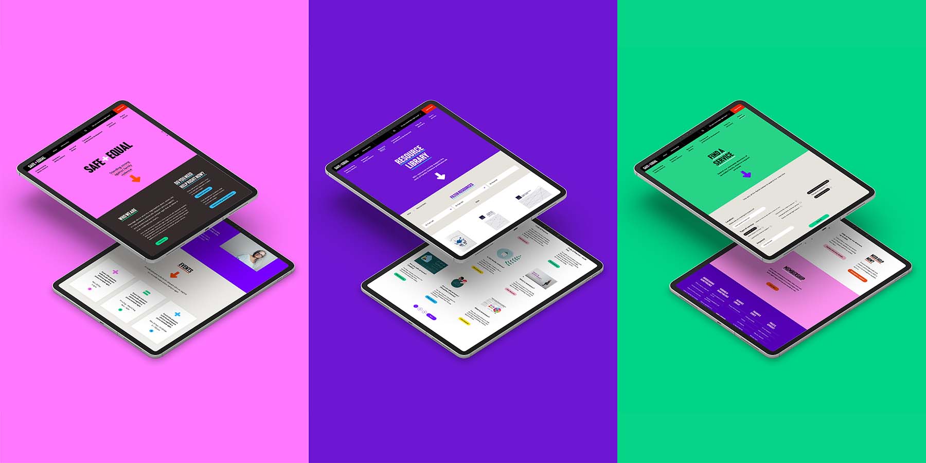
Website IA and User experience design: With our comprehensive research report in hand and a flexible and collaborative designer/client relationship in place, we then set about restructuring the content with a strong user-focus. Together, we developed options for site maps and set about wireframing templates with clear functional specifications.

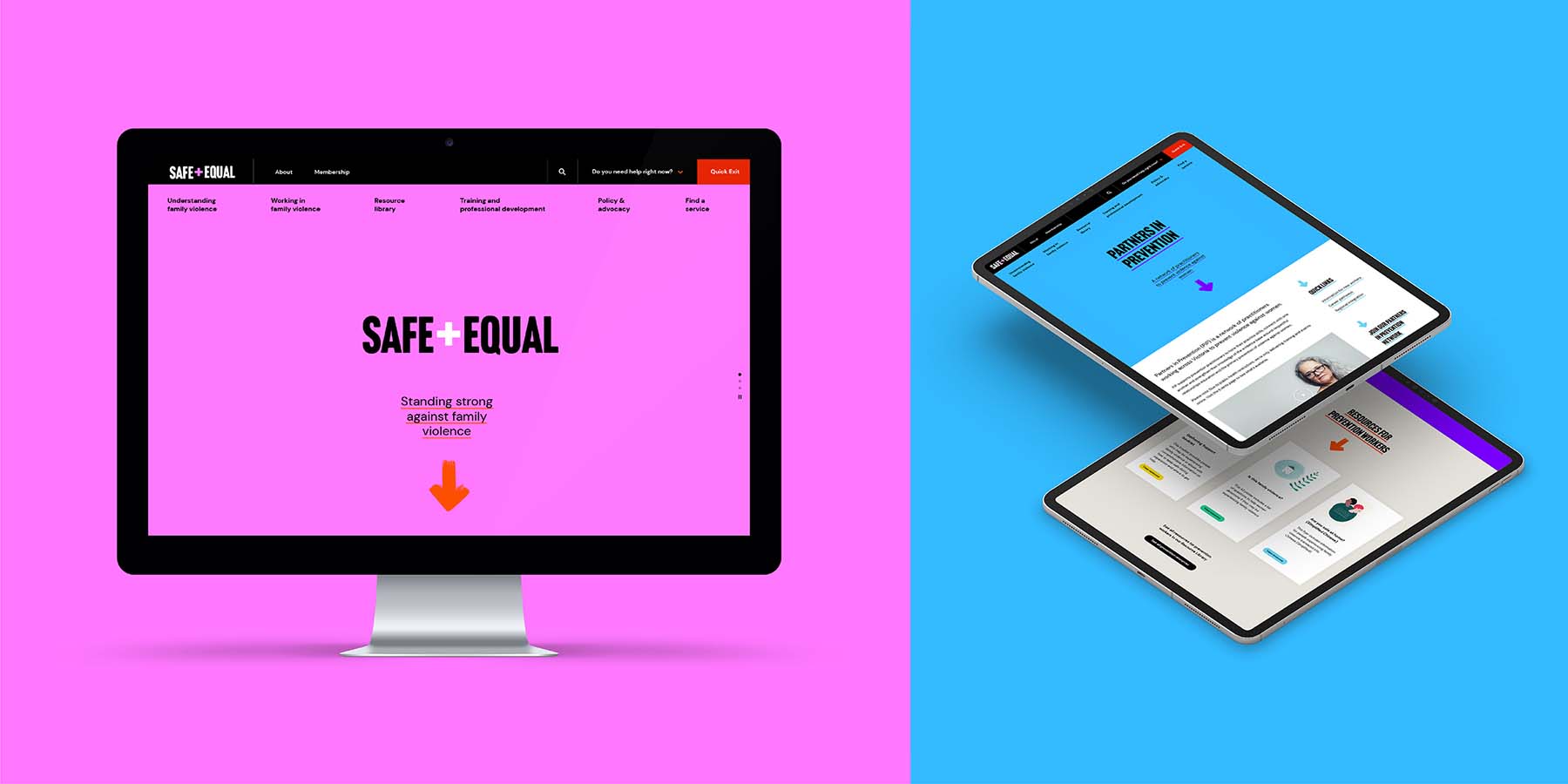
Website Design and Build: We then proceeded to design the user interface and develop the site in an agile way to expedite delivery of this complex and detailed build. We also worked with accessibility specialists to help the site achieve the best possible standards – ensuring that this crucially important source of information was open and accessible to all users.

Naming: In the meantime our brand team worked with the newly merged organisation to assist with naming and branding the organisation: Safe and Equal. The naming process was a really engaged and consultative process, where we ran naming workshops to generate 120+ naming suggestions from across the organisation. Our client undertook a significant amount of consultation with member organisations, staff, external stakeholders and, importantly, survivor advocates – to arrive at the final name, Safe and Equal.

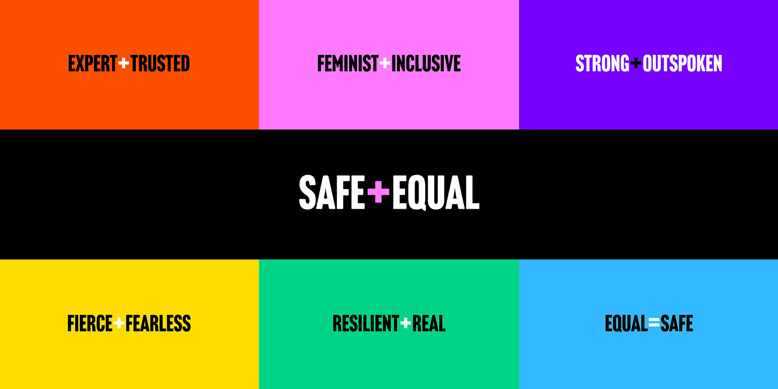
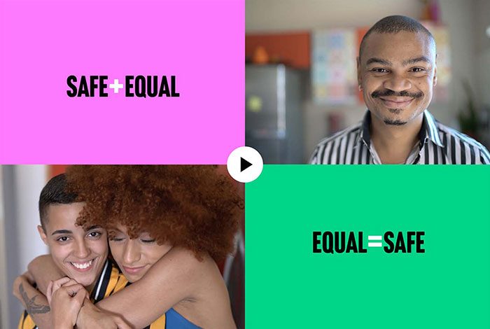
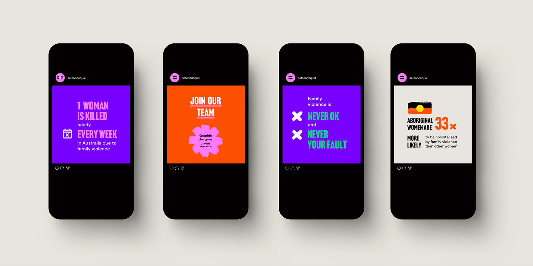
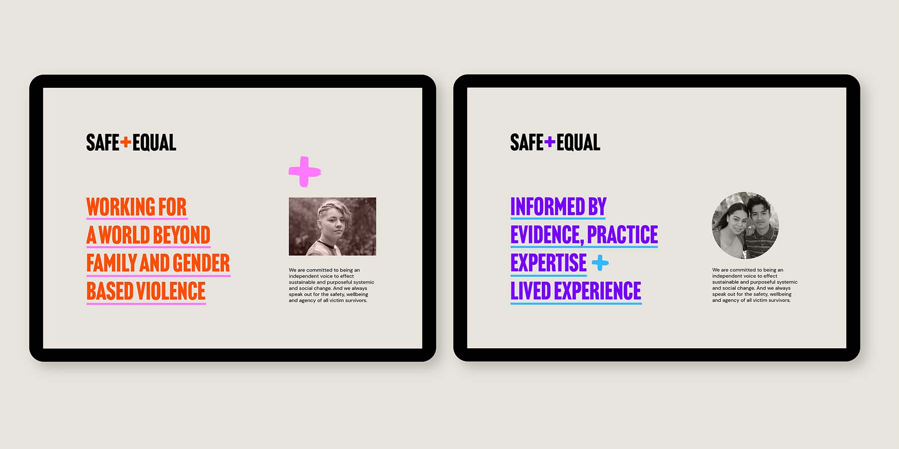
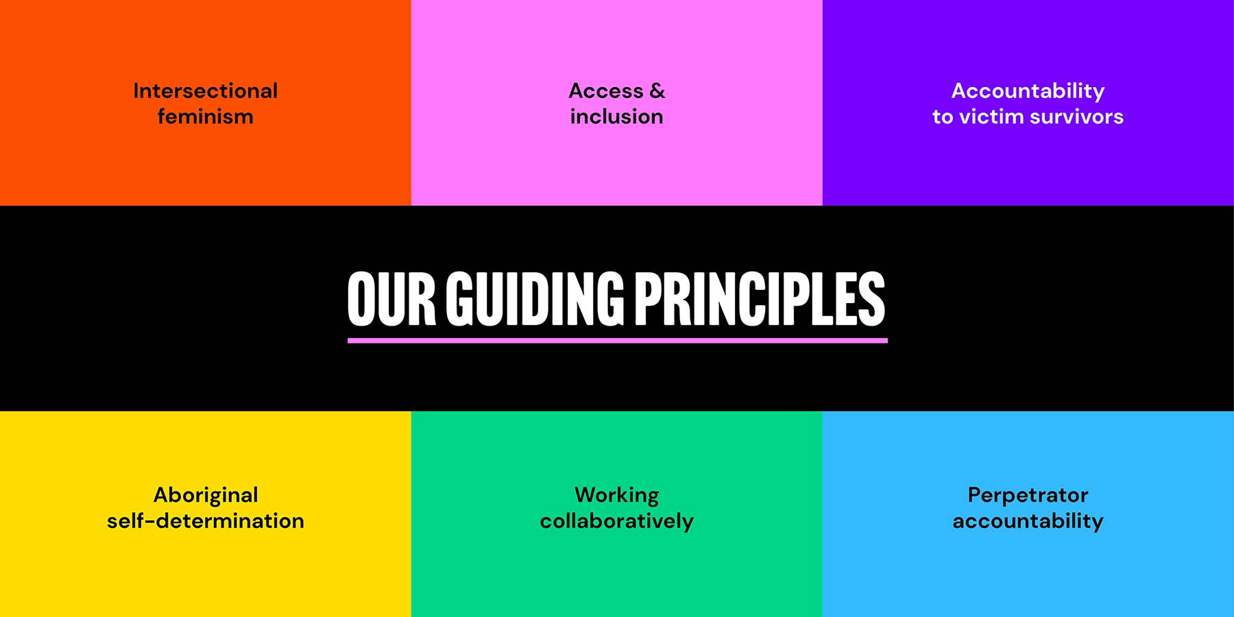
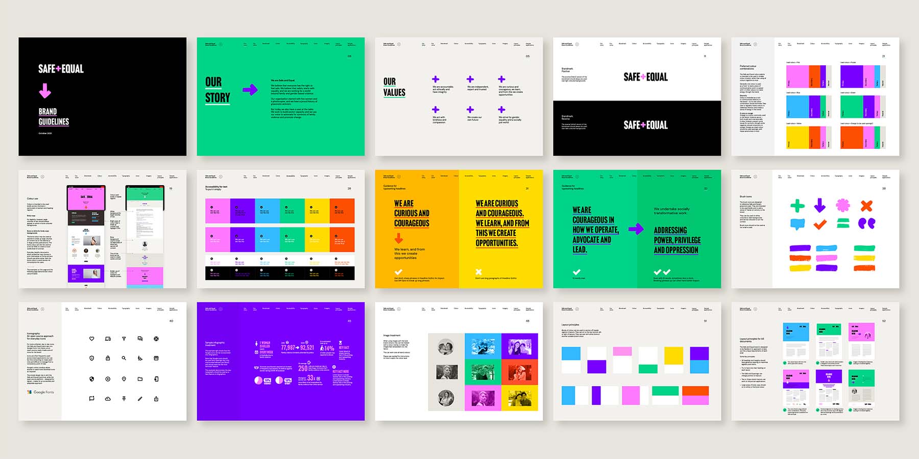
Branding: With such an evocative name in place, we then set about designing the brand. Led by our earlier consultation and research phases, the brand sought to capture the essence of this passionate, intersectional feminist organisation. This new brand was applied across the user interface and brought to life through the creation of brand assets and style guide.

Design Excellence

The design outcome of this project has been celebrated across the sector. The name, brand and website have been thoroughly evidence-informed and represent the voices of so many passionate members, workers and survivor advocates. The project demonstrates how true collaboration between designers, clients and the community can create empowering design solutions which are warmly embraced because of their authenticity and rigour.

The Safe and Equal website is a resource which is entirely fit for purpose, as our collaborative team took the time to ask what was required and custom built the solution. The Safe and Equal name – developed by-the-organisation, for-the-organisation – as part of this process, is a powerful symbol of change. It creates a brave and future-focussed tone, inspired by the passionate voices we heard in the sector and their shared mission to end family violence. The brand itself is driven by diversity. It reclaims bold colour – which for so long was deemed 'inappropriate' for the sector. It breaks free from outdated perceptions of feminism and embodies the idea of intersectional perspectives.

Design Innovation

Safe and Equal itself is an organisation which sits at the forefront of innovation. They support workers and member organisations within the family violence sector to build capacity, follow the latest evidence-informed practice and they are strong advocates for change. This attitude grounded the entire project, as did their intersectional feminist philosophy of all voices being equal. In contrast to so many other organisations who adopt a top-down decision making process, Safe and Equal genuinely levelled out their organisational hierarchies.

One of their guiding principles is to break down the existing power structures which contribute to inequality and gendered violence. While on the surface this principle may not appear to have an 'innovative' impact on the design outcome – in reality it significantly influenced both the process and the outcome. This philosophy and approach pushed our design team to look further and deeper into the needs of the sector and the audiences who most needed support. It enabled us to see past more traditionally 'authoritative' industry voices to hear younger, less experienced voices – those who work with people in need every day, yet who struggle to navigate a complex, stressful and challenging sector.

Surprising as it may sound, this absolute commitment to equality was the true innovation of this project. It was through treating voices equally and speaking to such a diverse group of individuals that we really understood the 'need' and this guided all of our design choices – from the tone of the organisational name through to the structure of content and functionality on the website. It impacted the commitment to accessibility on the project – where we innovated to create a proudly colourful brand which meets AA accessibility as a minimum. This philosophy pushed us to do more and to do better – and to create something that people genuinely need.

Design Impact

The end result is a brand and website which genuinely stands out in the family violence sector. On a practical level, the website has delivered workers across Victoria a statewide service directory; a comprehensive resource library and up-to-date and authoritative practice guides to help ensure the best possible outcomes for survivors of family violence. But more than this, the Safe and Equal name and brand is a beacon for what we are all aiming for – a society where everyone is safe and everyone is equal. After all, if everyone is equal, and everyone is safe, then we won't have family violence. It's a bold voice for a new era in the sector. It captures the organisations' activist history but also looks to a future where women have a seat at the decision making table to create change. We are extraordinarily proud and pleased to have helped such an inspiring organisation deliver a genuinely leading brand and digital tool which helps to address one of society’s most pressing challenges.

Communication Design 2022 Finalists

Natralis Product Launch

Nexus Designs / Sally Evans / Myra Murtagh / Georgia Swinbourne

Port Melbourne Secondary College Brand Identity

Design IS / Port Melbourne Secondary College

EVERYDAY Australian Design - functional objects from the Ian Wong collection

Ian Wong / Jo Pritchard / Dr Indae Hwang / Shepparton Art Museum / Monash University

The Pink Book

Trampoline / Henry von Doussa / Clouds of Magellan Press

Great Wrap

A Friend of Mine / Great Wrap

Metro Tunnel Creative Program

Cross Yarra Partnership / Rail Projects Victoria / The Place Agency / Global Arts Projects

BETA by STH BNK

Davidson Branding / Beulah

Keep Running

Monash University XYX Lab / Australian Centre for Contemporary Art

MOST

MASS / Orygen Digital

Crushed But Okay

Today / Alannah and Madeline Foundation / Banalarama

Rural Women Online

Your Creative Agency / Victorian Women's Trust