Finalist 2022

Port Melbourne Secondary College Brand Identity

Design IS / Port Melbourne Secondary College

This bold school branding conveys a sense of place, a school of excellence and the excitement of a new journey.

Port is a place where journeys start, and students prepare themselves for their life journey. Port Melbourne Secondary College (Port for short) is a new, state-of-the-art public high school in Fishermans Bend, Melbourne. It is a showcase for innovative learning environments with a focus on entrepreneurship, design-thinking and real-world problem solving. Design IS was provided with an exciting opportunity to develop and apply a brand strategy and design that would help set the school up for excellence in education. The outcome of this project well-exceeded the high expectations of the principal and has received glowing feedback from the local community.

Design Brief:

Develop a brand strategy and design that is:

  • Clear / concise – Conveying the school’s values, personality and strong direction
  • Distinctive – Clear differentiation from its competitors
  • Confident – Bold in approach. A leader in education
  • Fresh – Conveying the energy and vitality of a new, cutting-edge institution
  • Memorable – Simple. Powerful. Different.

With the building already two years into construction, the client needed a strategy and style that married smoothly with the school’s ground-breaking architecture and interior design. This response needed to incorporate the Principal’s bold vision of an innovative, dynamic, inner-city school that connects meaningfully with its new community, local tertiary institutions and businesses. Being a local government school the brand needs to convey a strong sense of place. This precinct contains much of the state’s dockyards and has been an area of heavy industry for generations. The State Government’s vision is to transform it into a major innovation hub and significant residential zone.


This project was developed by:

Design Process

Design IS applied their proven branding process:

Background Research

  • Gain insight into the sector to inform the strategy
  • History of Port Melbourne/Fishermans Bend, including indigenous history
  • Current and potential issues / opportunities
  • Trends in education to ensure up-to-date approach

Project Background

  • Target audience – Local families. Who are they? Why this school?
  • Key competitors – Review other school’s positioning and style to ensure difference
  • Key stakeholders and their expectations
  • Principal’s vision and ambitions
  • Establish desired perceptions of the school
  • Reference the school architect's, interior designer's influences, strategies and styles

Brand Strategy

  • Establish Core Values, Brand Personality, Points of Difference
  • Develop Brand Essence and Brand Story
  • Prepare Brand Matrix to set boundaries for brand design
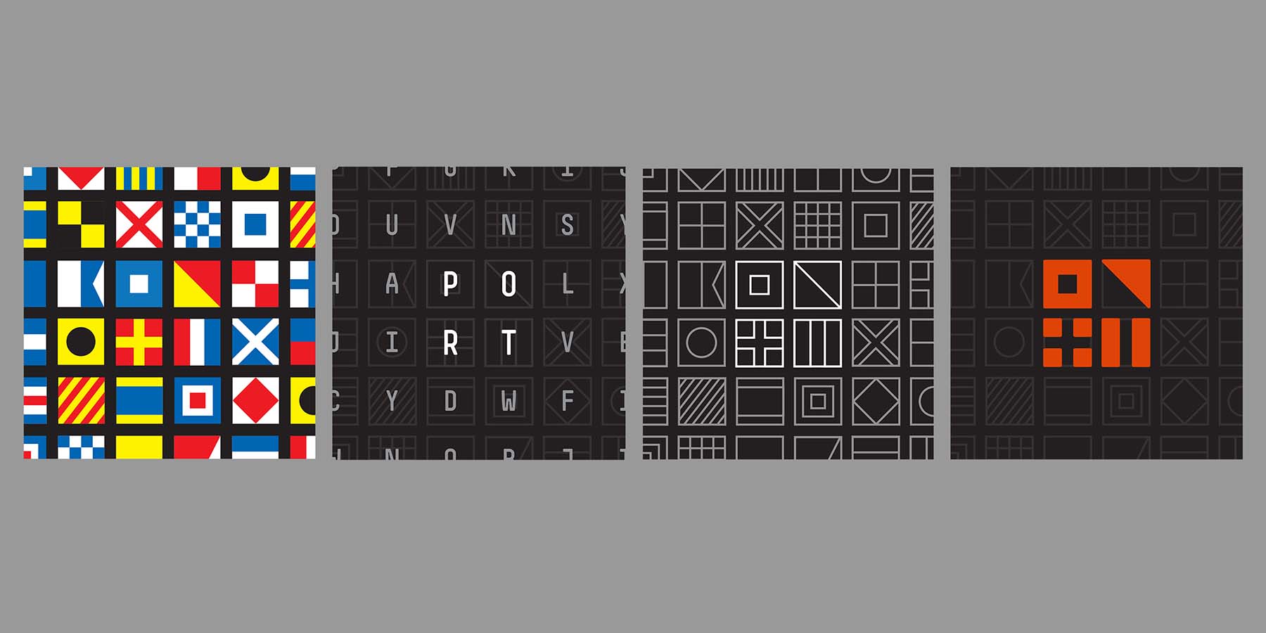
Brand Design

  • Develop concepts for the brand identity, based on strategy and background
  • Present uniform concepts to supplier. Establish design parameters based on timelines and manufacturing processes
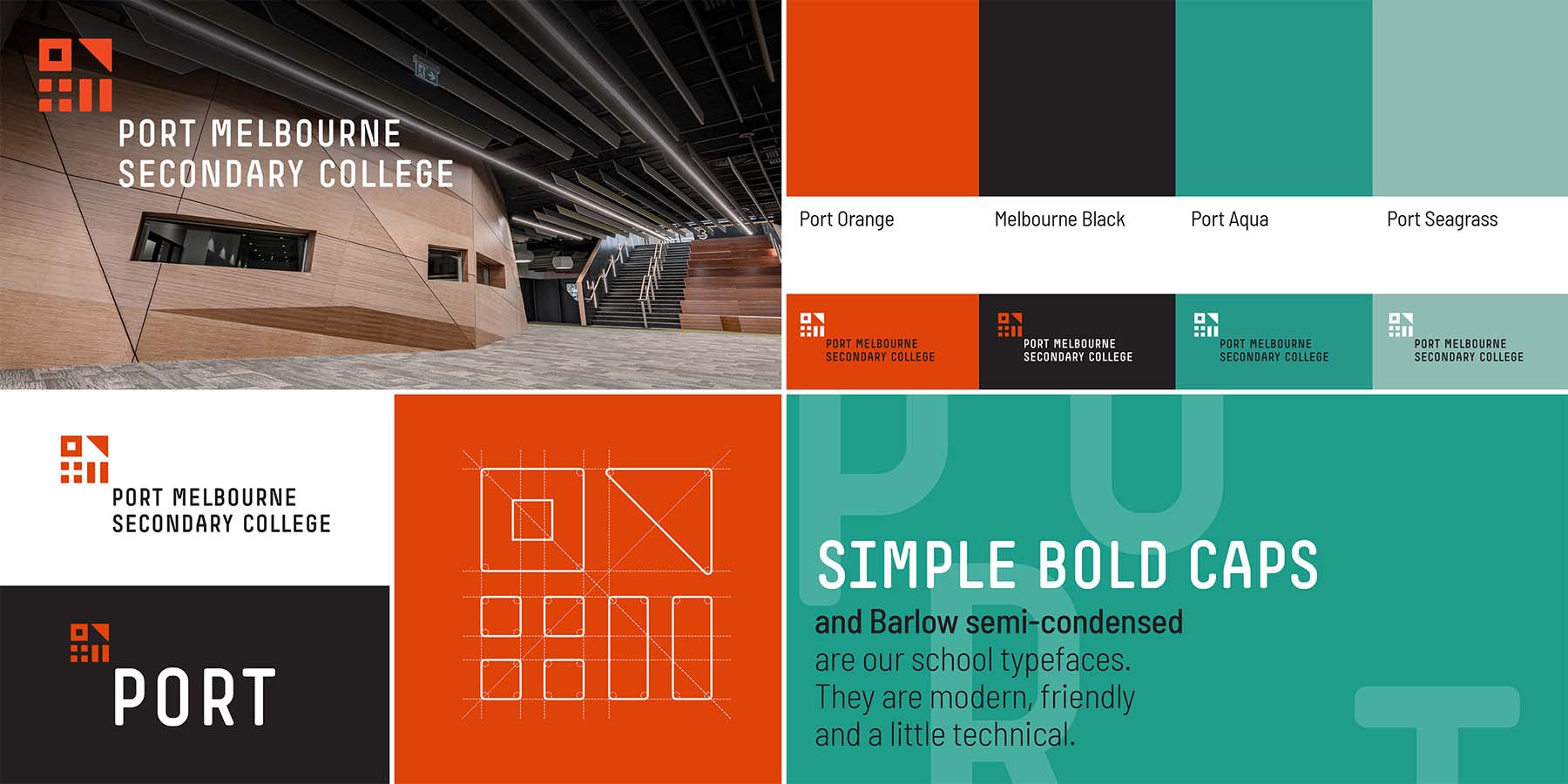
  • Finalise design of the brand identity, including mark, colour palette and typography
  • Develop Brand Style Guide

Brand Application

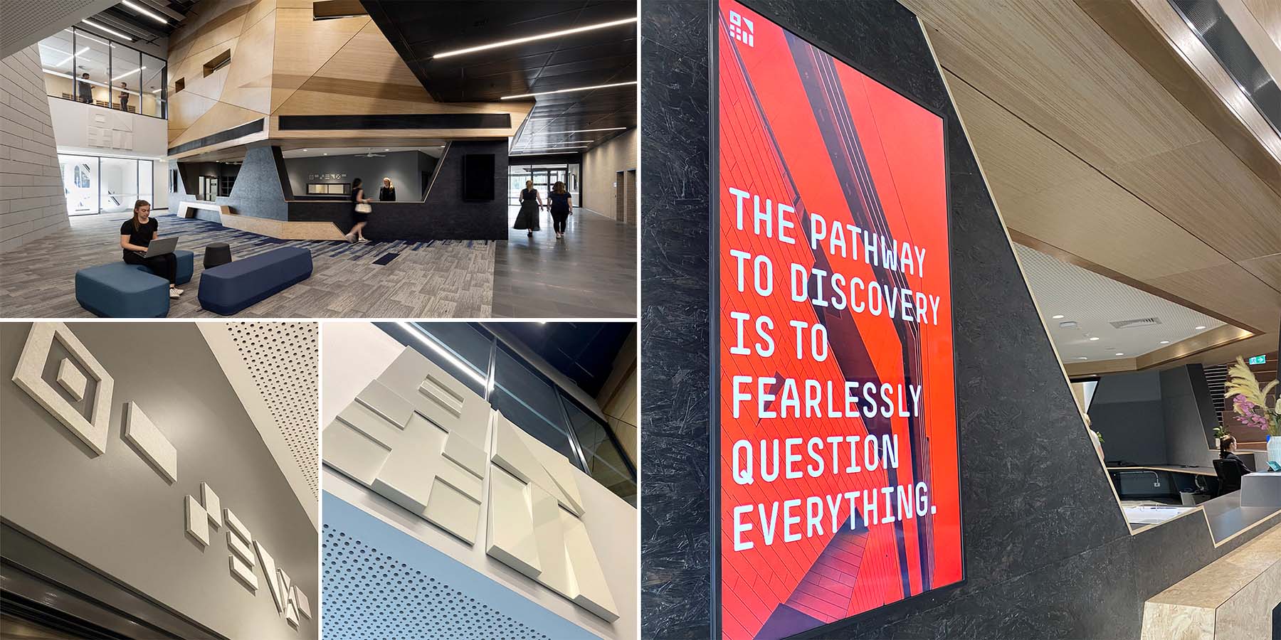
  • Apply brand design to initial applications – uniforms, external signage, communication materials, promotional collateral, website
  • Work with suppliers to deliver outcomes

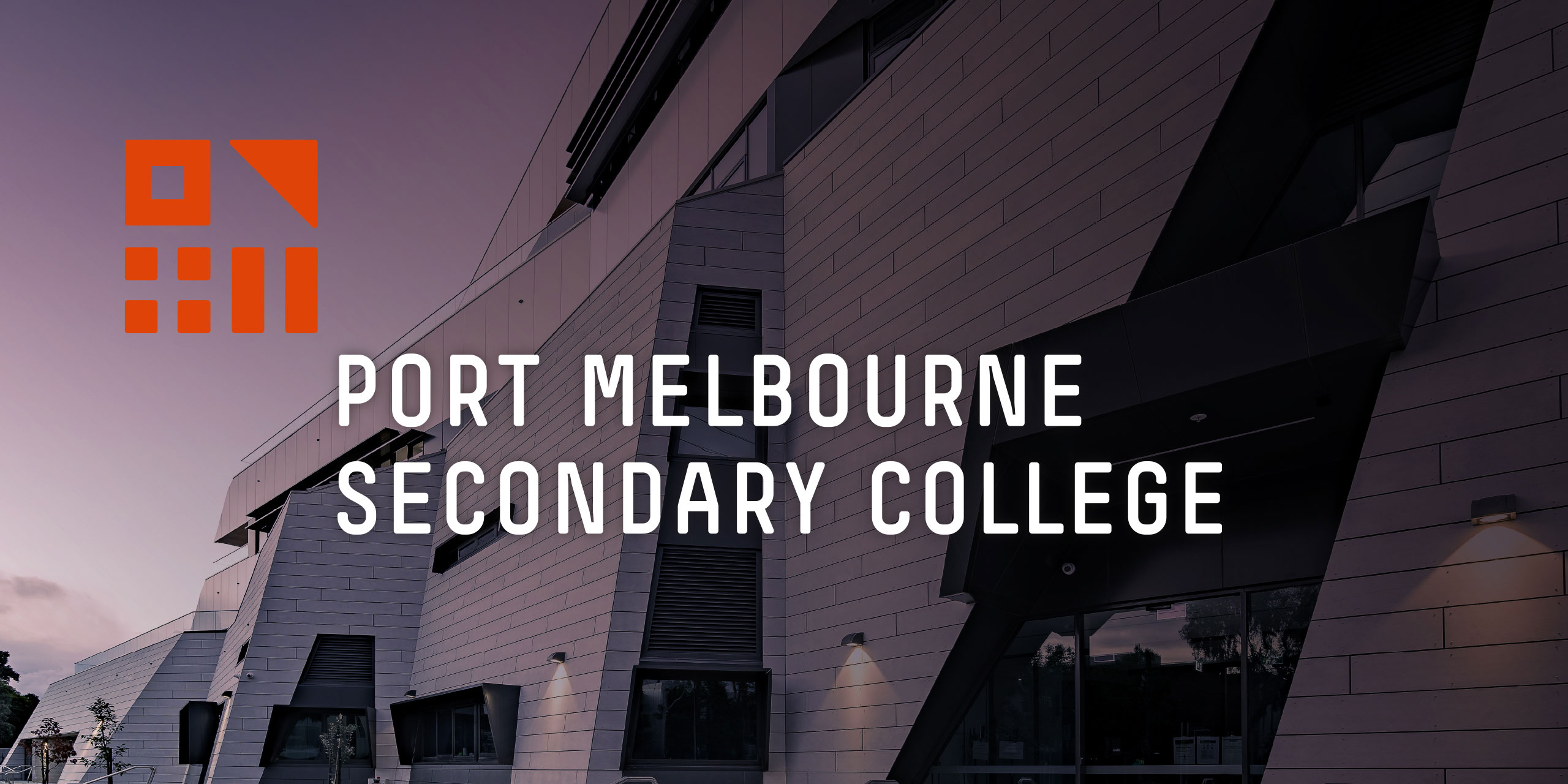
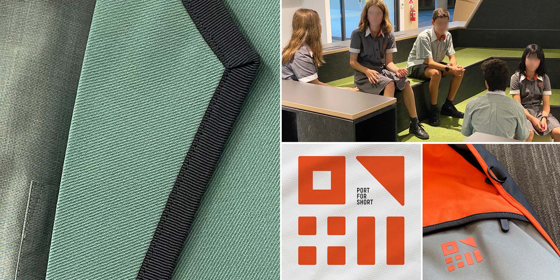
It was essential to establish what makes Port Melbourne the place it is and what differentiates it from other bayside suburbs. Seagulls, waves and beaches were all too common icons. The real points of difference were around the docks, shipping, industry and the new technology hub. The challenge was how to adapt these elements in a refined and appealing way. The school’s uniform is undoubtably the major brand touchpoint and the most distinguishing part of the brand. Partnering with a fashion consultant and cohort of senior student advisors, established the team for designing the schools seasonal and sports uniforms. It was important to have the principal heavily invested here, so that her vision and need for wearable, practical elements be central to the design process.

Design Excellence

We were acutely aware of the need to marry the brand design with the distinctive architectural design. This meant an understanding of the architects concepts and aspirations were an important place to start the brand strategy. Importantly, the physical aspects of the building design, such as colour, shape, texture and layout were taken into consideration with the start of the design process.

Students are the primary users of this brand. They have to wear it and spend most of their days working and socialising in this branded environment – so it had to appeal to them. Younger students tend to be more accepting and excited by a new brand, then after a few years become more critical, so we sought feedback of brand elements, from a range of older students from both private and public schools. This particularly guided us in application of colours and fabrics for the school uniforms. To promote diversity and inclusivity, we kept the uniform designs as simple and interchangeable as possible.

All elements of the school uniforms and sports outfits can be worn by anyone, irrespective of gender identities, with varying cuts to suit body shape. The Principal was in regular contact with prospective parents and community partners and kept them updated with design progress, noting and passing on useful responses.

Design Innovation

With a focus on exploration, innovation and connection, and the distinctive ship-inspired structure of the building, a nautical flag theme developed and became the central focus of the brand design. It created a distinctive point of difference from other Melbourne schools and strongly reinforced the essence of the brand. Our concept was to utilise these functional communication symbols, with meanings that to some were not instantly recognisable, and transform them into a bold mark, creating a unique and contemporary spin on the traditional.

We strongly believe that when a viewer works out something for themselves, they connect more intensely to that brand or product. The flags for P, O, R, T were simple, strong and interesting, but different enough to create a visually exciting solution when brought together. This clean, graphic interpretation of nautical flags conveyed a dynamic sense of adventure, the importance that language and communication plays in education and provided a distinctive base for ongoing brand development.

Given the length of the official name and the likelihood for (potentially unwanted) abbreviations, we introduced the friendly, confident, shortened version of ‘Port’ as part of the brand, for use in non-formal applications. This opened a window for use of the name in engaging ways – opPORTunity, suPORT, rePORT, sPORTs, and connected well with the principal’s desire for the brand to have an element of fun. To avoid a corporate feel at the entrance and let the alluring architecture welcome students and visitors into the building, we proposed branding the entry foyer in a unique yet low-key manner.

We created a large white-on-white sculptural interpretation of the PORT flags protruding from the wall above the main doors and the word ‘welcome’ positioned behind reception in soft 3D flag graphics. A bold application of the bright orange made the school bags highly visible, and a safety feature for students cycling or walking to school.

Design Impact

Design IS: is immensely proud of the outcomes of this project, which has been validated through the response from the Principal and ‘Port’ community.

“Design IS has created for us a unique, contemporary and stylish brand that has been a significant talking point in our new community, and which plays an integral part in our new college’s identity, promotion and story. The brand mark offers a genuine nod to our port location and industrial heritage, and our local community has appreciated the recognition of Port Melbourne’s history within the college's brand story. Alongside this, the playful, clever nature of our brand mark sparks curiosity and a sense of fun, making people think and question who we are and what we represent. Intelligent in its conception yet simple in its aesthetic, Design IS: has created a strong branding that reflects our college’s philosophy, vision and ethos and this is clear the moment the brand mark comes into view.

Across all touch points, from uniform and signage, to multimedia and communication collateral, Director Ian Scott’s considered and deep interrogation of our vision, strategic intent and values has resulted in a brand that strongly reflects who we are, and also allows us to play with our message and our look, adapting the branding to materials that are both expected and unusual with equal ease. I have been overwhelmed with positive feedback about the concept that Design IS has produced, and I could not be happier with the outcome, which adds depth and spirit to our new organisation.”

- Anne Stout, Foundation Principal

Communication Design 2022 Finalists

The Pink Book

Trampoline / Henry von Doussa / Clouds of Magellan Press

BETA by STH BNK

Davidson Branding / Beulah

Great Wrap

A Friend of Mine / Great Wrap

Keep Running

Monash University XYX Lab / Australian Centre for Contemporary Art

Metro Tunnel Creative Program

Cross Yarra Partnership / Rail Projects Victoria / The Place Agency / Global Arts Projects

Natralis Product Launch

Nexus Designs / Sally Evans / Myra Murtagh / Georgia Swinbourne

MOST

MASS / Orygen Digital

Safe and Equal

Studio Binocular / Safe and Equal

Crushed But Okay

Today / Alannah and Madeline Foundation / Banalarama

Rural Women Online

Your Creative Agency / Victorian Women's Trust

EVERYDAY Australian Design - functional objects from the Ian Wong collection

Ian Wong / Jo Pritchard / Dr Indae Hwang / Shepparton Art Museum / Monash University