Finalist 2022

MOST

MASS / Orygen Digital

A new strategic positioning and identity for MOST that empowers young people who are seeking therapy. Supporting Individuals, Together.

The pandemic has impacted mental health. In response, Orygen Digital asked MASS to create a visual identity for MOST, their new digital platform that provides care to people aged 12 - 25. Through an extensive participatory design process, we learned that the MOST audience is wonderfully diverse, creative, searching for safe ways to express themselves, and, importantly, going through hard times. To support what we learned, we settled on the brand narrative ‘Supporting Individuals, Together’, which gave us permission to move away from talking only about the ‘platform’ and provided the space to focus on the community and personalised support.

Design Brief:

We were excited to design a new brand for MOST, a digital platform that provides continuous, integrated face-to-face and digital care to people aged 12 - 25. To help the young and often apprehensive audience feel safe, we needed to design a brand that felt authentic and true, as well as inclusive, accessible, and committed to accepting the involvement of its audience. The brand had to be digitally led and needed to inform the subsequent redesign of the platform and marketing applications. It needed to complement the existing Orygen brand and fit comfortably within their visual landscape of products. Most importantly, it needed to resonate with users of the platform. We are proud of the outcome; a brand that appeals to young people, that breaks through the barriers of mental health stigma, tames negative perceptions around seeking help and engages people in a meaningful way.


This project was designed and commissioned by:

  • Tim Kotsiakos, Creative Direction and Strategy, MASS
  • Marty Coghlan, Design Direction, MASS
  • Denny Louis, Design, typography, animation, MASS
  • Larissa Boyd, Orygen Digital
  • Daniel Hoult, Orygen Digital
  • Marc Pearson, Illustration, Orygen Digital

Design Process

We immersed ourselves in the business, reviewing the existing brand, platform, competitors and previous research. We facilitated surveys within the business, with peer workers and creative teams, to capture important attitudes about the audiences and the brand. We designed several consultations with the audience, using mood boarding as a technique to not only understand attitudes towards the existing brand, but also gain an insight into what wanted it to be. Together with the business, we defined irrefutable truths and ambitious goals to keep us centered.

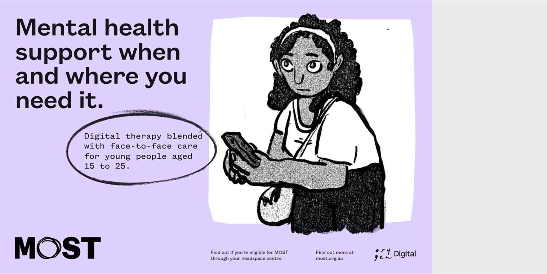
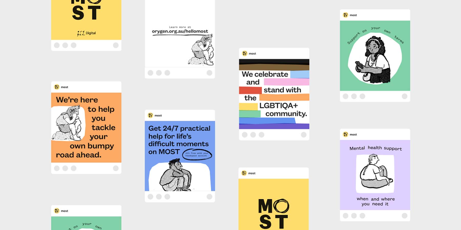
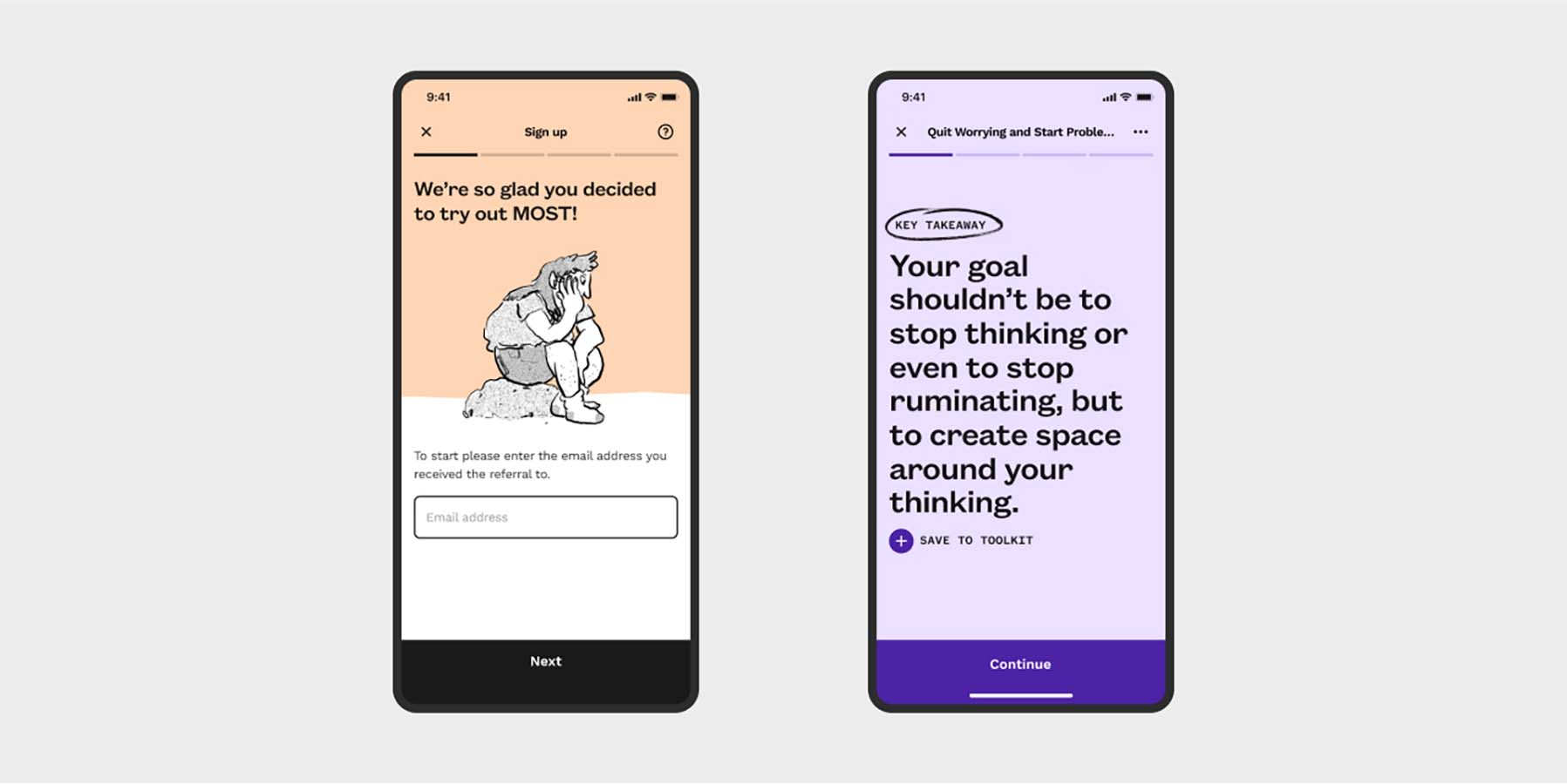
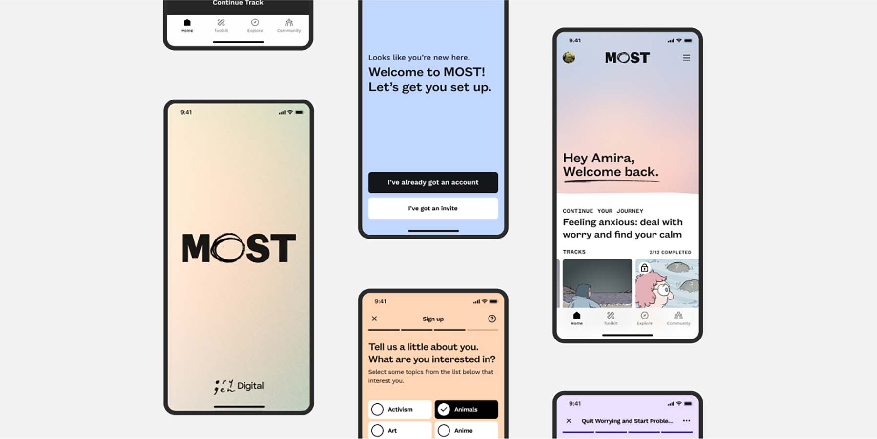
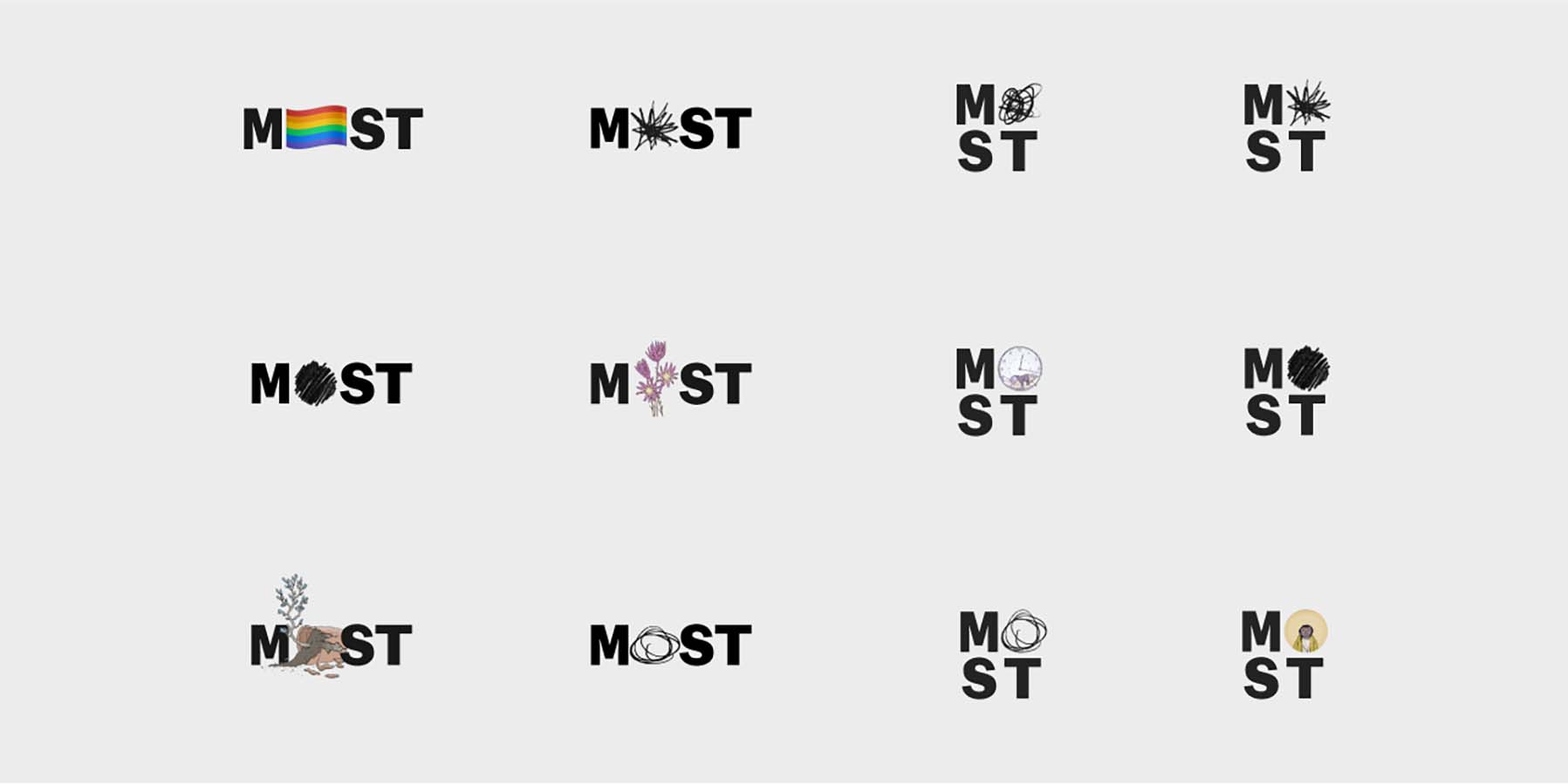
After exploring multiple strategic directions, we developed the strategic narrative ‘Supporting Individuals, Together’. We developed copy samples and a Tone of Voice guide, and sense-checked the strategic narrative through additional consults with the audience and wider team. We developed multiple creative territories, visual representations of the same strategic narrative, and tested them with the audience before selecting the final direction. We developed and refined a final logo mark, visual language and sample applications, and developed the final branding guidelines. There was extensive collaboration throughout the design process; we adopted reoccurring rituals like stand-ups, sprint planning and regular showcases for stakeholders, all with a view to ensure transparency and joint ownership for the duration of the project. The benefits of strong participation and partnership are well illustrated in the project's rewarding and successful outcome.

Design Excellence

If the past few years have taught us anything, it's that a pandemic can be damaging to our mental health, particularly that of younger people. We know it has likely resulted in even higher levels of distress in those with pre-existing mental health disorders. For MASS, this was an important and timely project. We employed a thorough and thoughtful participatory design process, exploring problems and solutions collaboratively and opening the project's goals and suggested outcomes to user input. We were careful to consider our neurodiverse audience, paying close attention to the role of colour, typography and illustration, and how our visual language might appeal to the somewhat broad category of youth between the ages of 12 and 25.

A significant amount of effort was taken to balance creating something fun, vibrant and exciting with care for the subject matter, being mindful not to make light of the serious topic of youth mental wellbeing. We designed a brand that embraces uniqueness and individuality, subtly demonstrated through the multiple variations of the logo, implying an acceptance of differences and freedom of ownership. We took subtle cues from the Orygen brand including cut paper style shapes, hand-drawn visual assets, etc. As a non-biased third party consulting directly with stakeholders, by putting the users needs at the heart of the process, we were able to produce a result that is proudly owned by the MOST team and its audience. The design solution was an honest balance between community needs and commercial constraints.

Design Innovation

Occasionally, the biggest innovation is simplicity. The fact that the logo mark changes and adapts says everything we wanted to say about MOST. The word-mark itself is purposely extensible, featuring an interchangeable letter ‘O’, which can appear as hand-drawn or interchange with other symbols, illustrations, photos, or flags. The many variations of the logo communicate the vast diversity of the audience and supports the strategic narrative of ‘Supporting Individuals, Together’. The interchangeable 'O' is a subtle signal to the audience that this is a brand that they can make their own, that aligns with their personal character and individuality. This is important because it represents how the service caters to individuals and suggests that MOST is a community that embraces individuality.

Posters, leaflets and other marketing material are colourful and attention-grabbing, while application screens are mostly white with sporadic moments of colour and peaceful gradients. The typeface is quirky and friendly, again implying inclusivity and acceptance. Words are further emphasised with hand-drawn marks and sentences, which are sometimes arranged around other objects in a cut/paste fashion. Illustration plays an impressive role in the new brand; Marc Pearson's effortless, non-pretentious style was the perfect asset to accentuate. Each illustration is loaded with personality and is sincere and genuine, representative of the content on the platform.

Design Impact

MOST provides a pivotal next step in enhancing connection and engagement with a mental health resource that's in use by thousands of young people across much of the eastern seaboard of Australia. MOST exists with the support of the Victorian government, rolling out as part of their pandemic response in 2020 and over the past 18 months expanding to help young people in other states. Supporting MOST means supporting the evolution and growth of a youth mental health resource that meets young people where they're most comfortable, as digital natives. The strong partnership and collaboration between MASS and Orygen contributed to an outcome we are immensely proud of. Together, we have produced a platform that provides a strong sense of ownership of the brand/higher brand recognition and enhanced user satisfaction and advocacy.

The involvement of young people in the design process helped to shape a youth-informed brand. By giving young people a sense of agency in the process, the project has produced a resource that is current, trusted, understood and, most importantly, accessible. Young people now have safe and greater access to evidence-based therapy and clinical support, without judgement, and on their own terms.

Communication Design 2022 Finalists

Natralis Product Launch

Nexus Designs / Sally Evans / Myra Murtagh / Georgia Swinbourne

BETA by STH BNK

Davidson Branding / Beulah

Keep Running

Monash University XYX Lab / Australian Centre for Contemporary Art

Great Wrap

A Friend of Mine / Great Wrap

Metro Tunnel Creative Program

Cross Yarra Partnership / Rail Projects Victoria / The Place Agency / Global Arts Projects

Safe and Equal

Studio Binocular / Safe and Equal

EVERYDAY Australian Design - functional objects from the Ian Wong collection

Ian Wong / Jo Pritchard / Dr Indae Hwang / Shepparton Art Museum / Monash University

Rural Women Online

Your Creative Agency / Victorian Women's Trust

Port Melbourne Secondary College Brand Identity

Design IS / Port Melbourne Secondary College

Crushed But Okay

Today / Alannah and Madeline Foundation / Banalarama

The Pink Book

Trampoline / Henry von Doussa / Clouds of Magellan Press