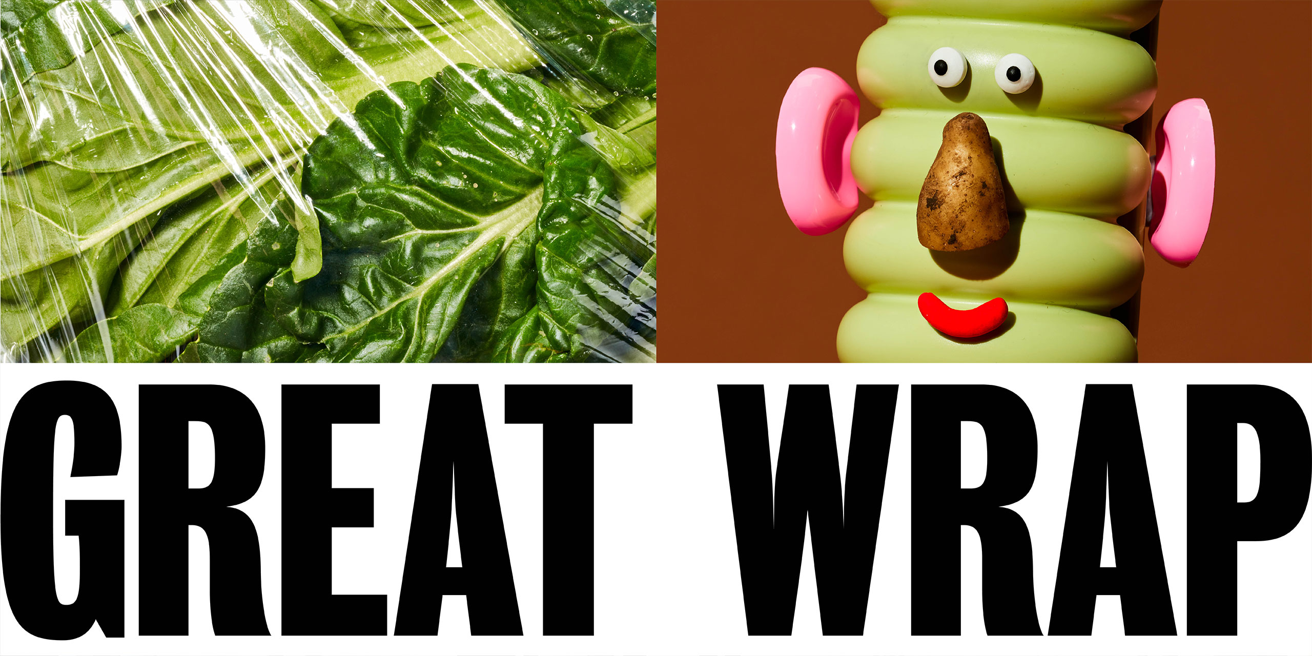
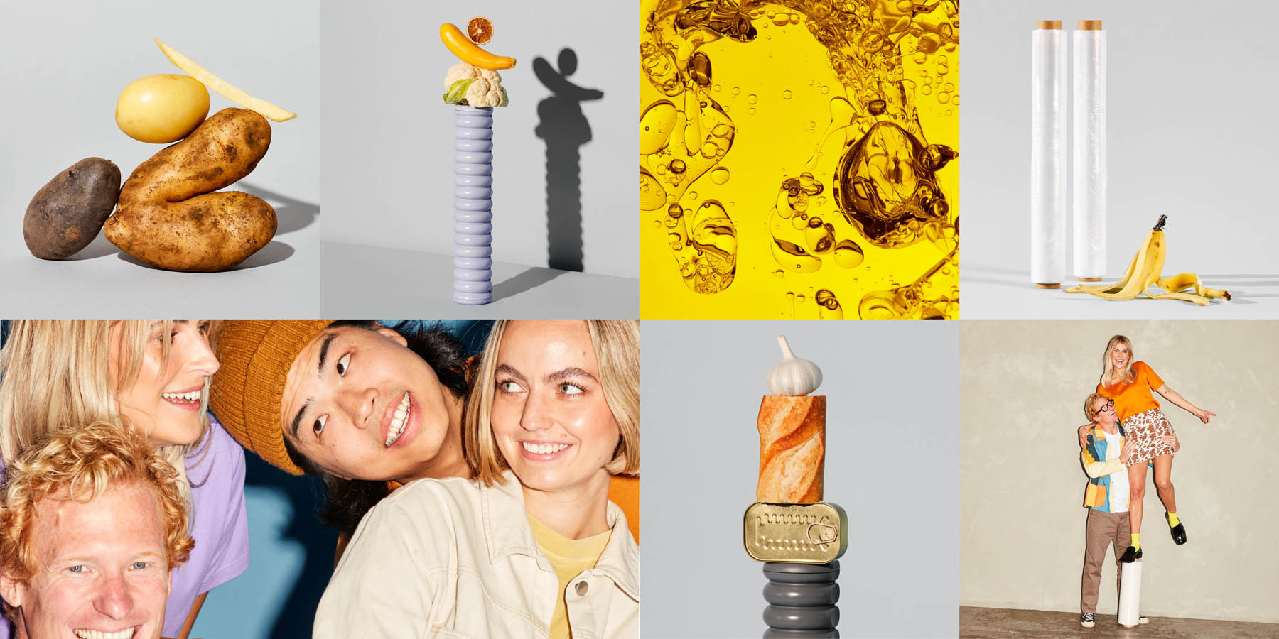
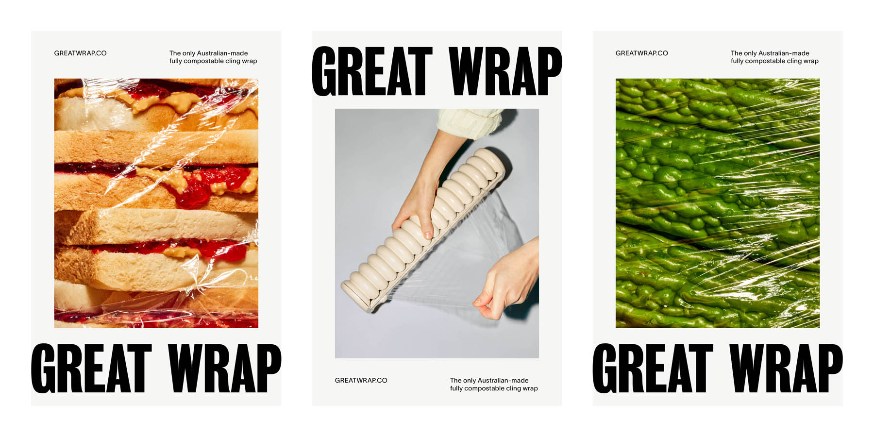
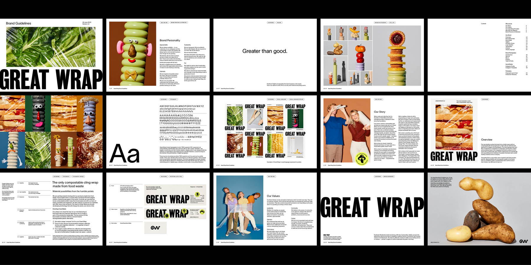
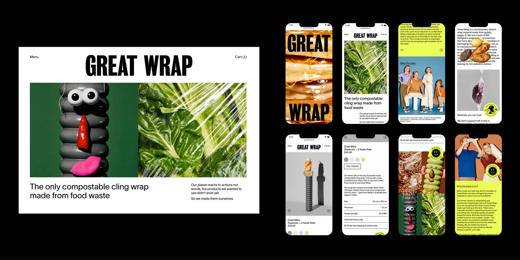
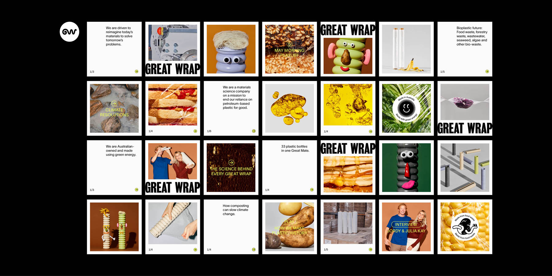
Great Wrap needed to be refreshed and repositioned in the aspirational sector, moving away from the eco/reusable market space. As a company, Great Wrap is always seeking to improve and is never satisfied with just good enough. At AFOM, we have succinctly distilled the brand essence into "Greater than good" and this became our underlying design ethos for Great Wrap. We aim to challenge the market by reimagining what a ‘green’ or environmentally-conscious brand can be, while embodying the vision and essence of Great Wrap as an optimistic, confident, curious and authentic brand.
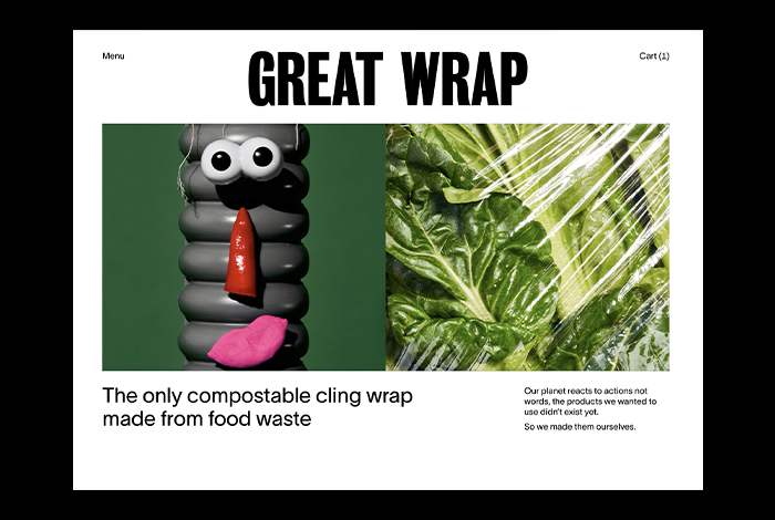
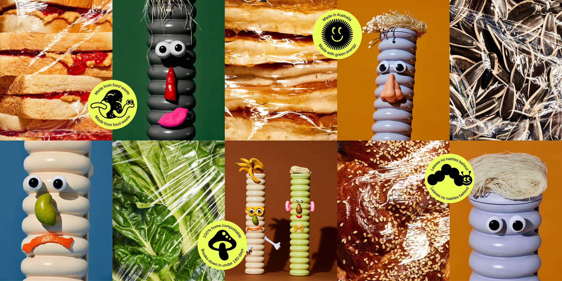
Essentially, our design strategy repositions Great Wrap as attainable luxury wrapped in approachable science. In a heavily saturated market, our solution for Great Wrap sets the company apart from its competitors in the eco space with a bright colour palette, bold typography matched with an approachable and playful art direction and a suite of illustrations that humanises the tech-led brand.
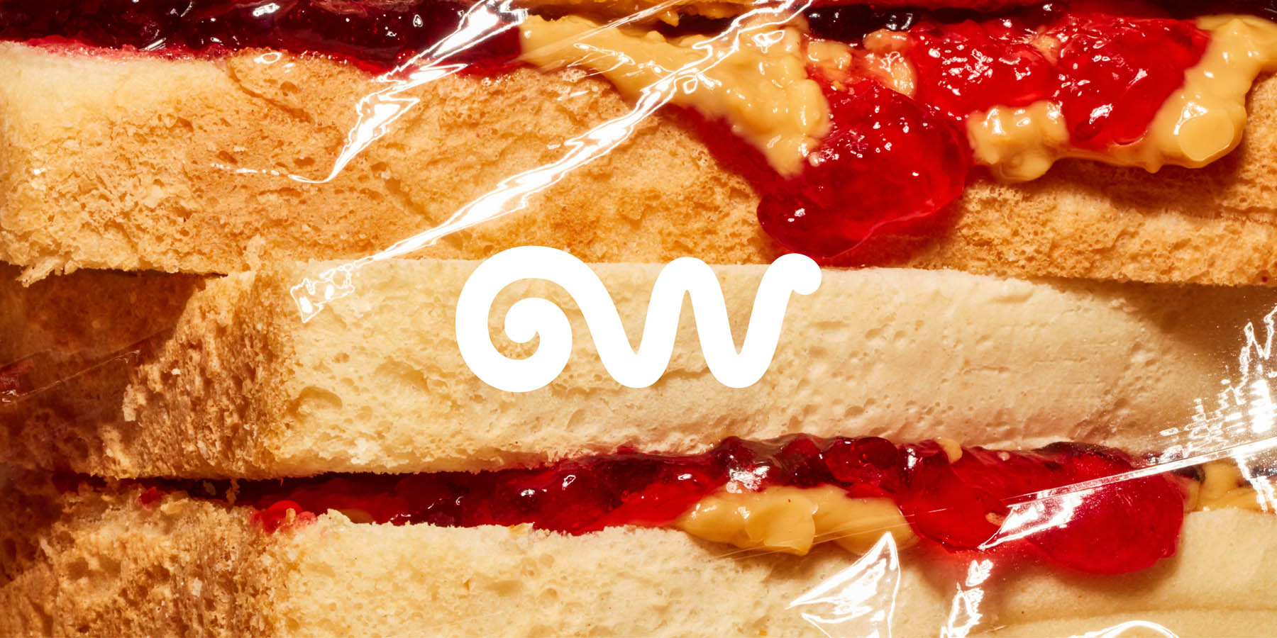
An unapologetically strong logotype is matched with an editorial-style approach to imagery and typography. The bold logotype acts like a masthead of a magazine or newspaper, framing the content and providing impact in an engaging humanistic presence; this is paired with clear mission statements and scientifically-led copywriting and art direction to position the brand as a world-leading material science company. Grounding this is a secondary brand mark inspired by the product's end of life — a worm-inspired mark that also spells GW and cleverly mimics the unrolling experience, providing warmth, approachability and a humanistic quality to the brand. Our brand strategy and design for Great Wrap reimagined the brand as more than a cling wrap manufacturer, but a material science company without alienating their current customers. In this new direction, Great Wrap is confident, grown-up and serious about their mission, but still loves to have fun.

