Storyfolk and Alto asked: What should be the fundamentals of healthcare, and is the current market addressing this need? Healthcare should fuse expertise with empathy to allow for a considered experience across touchpoints. What was discovered was a clear void within the market. With the location of the inner Sydney suburb of Rosebery, expectations were high. Three main principles guided the design process: humanising healthcare, focusing on accessibility and problem-solving.
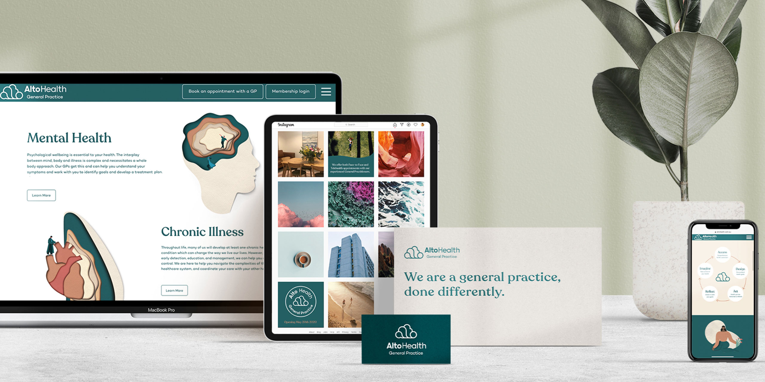
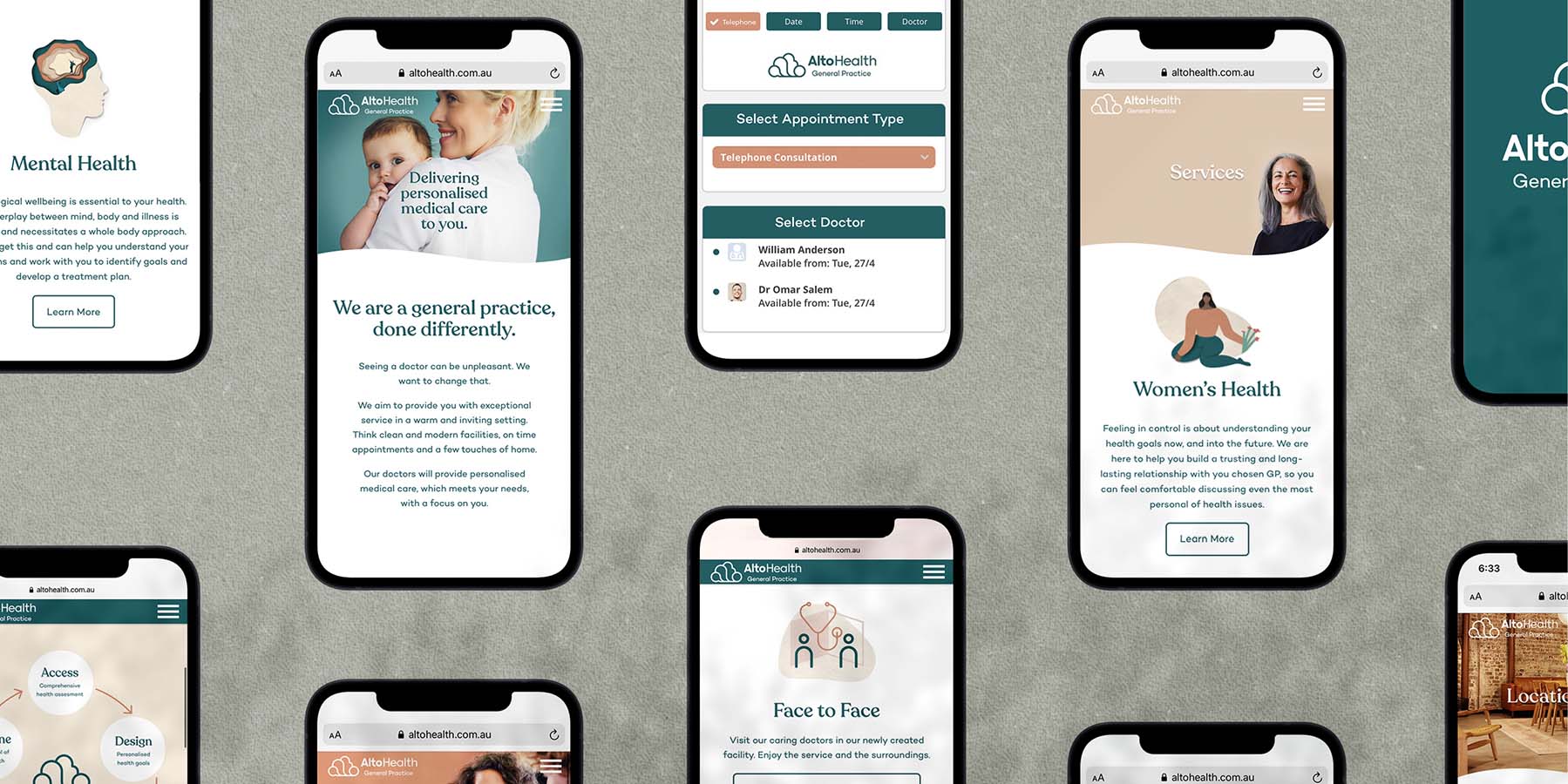
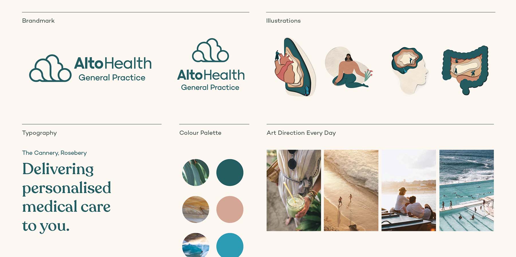
Intuitive and empathetic design-thinking paired with thoughtful design elements allowed Alto Health to mimic in-person approachability, bringing compassion to the digital and in-person experience. Alto’s brand and digital experience have been designed to attract the affluent Sydney-sider to its General Practice. The natural colours and soft contours appeal to the Sydney-sider’s love of the local landscape. The cloud formation altocumulus inspired the name ‘Alto’. These clouds are dynamic, complex, interconnected and, like our health, have many different layers.
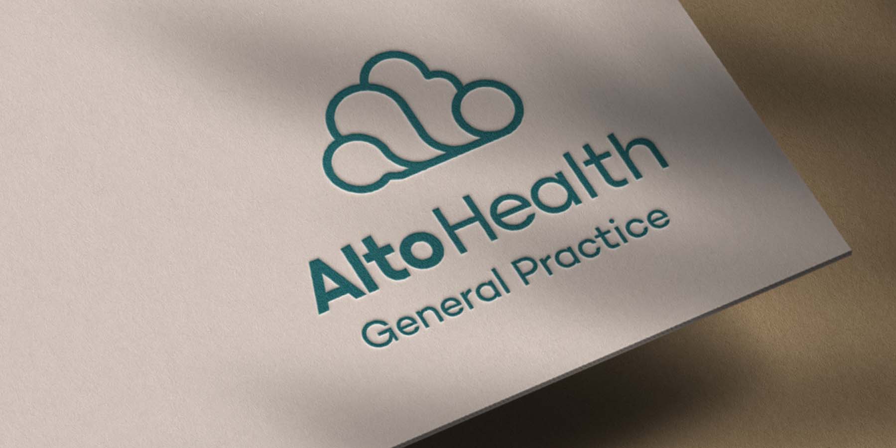
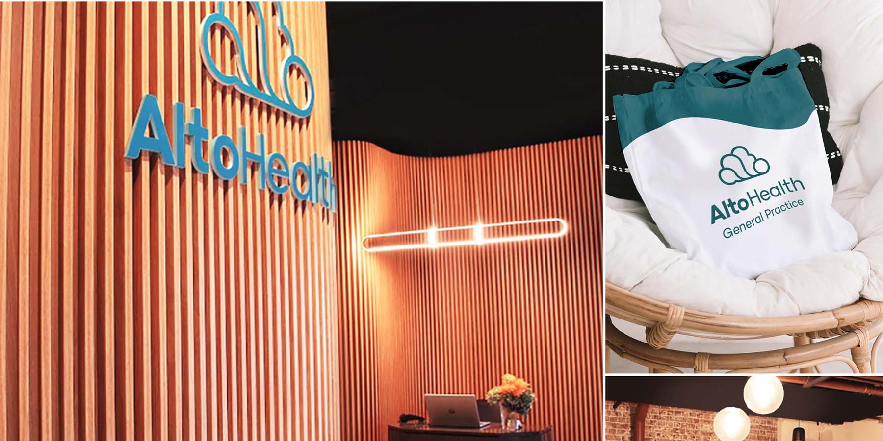
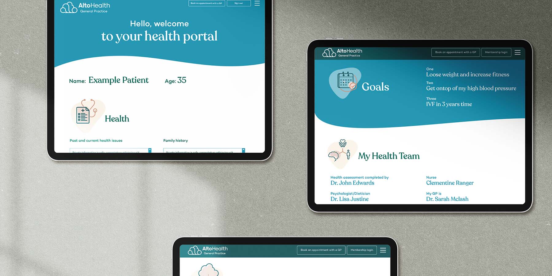
This multilayered methodology was carried through to the branding and all touchpoints. This layered story can be seen in the brandmark, which subtly fuses the letters ‘a l t o’ into an interconnected cloud formation through to the practice's interior architecture, which features curving contoured walls to the soft flowing forms in digital and print applications. While other General Practices hesitated to move to digital technology and Telehealth, Storyfolk saw an opportunity for Alto to be at the forefront of the innovation with Telehealth implementation incorporated into the website design within three weeks before their launch.

