Finalist 2021

Wall Mounted Refill aquaBUBBLER

aquaBUBBLER / Berry Design

The Wall Mounted Refill aquaBUBBLER is a bottle refill station with an ergonomic palm push tap and smooth body contours.

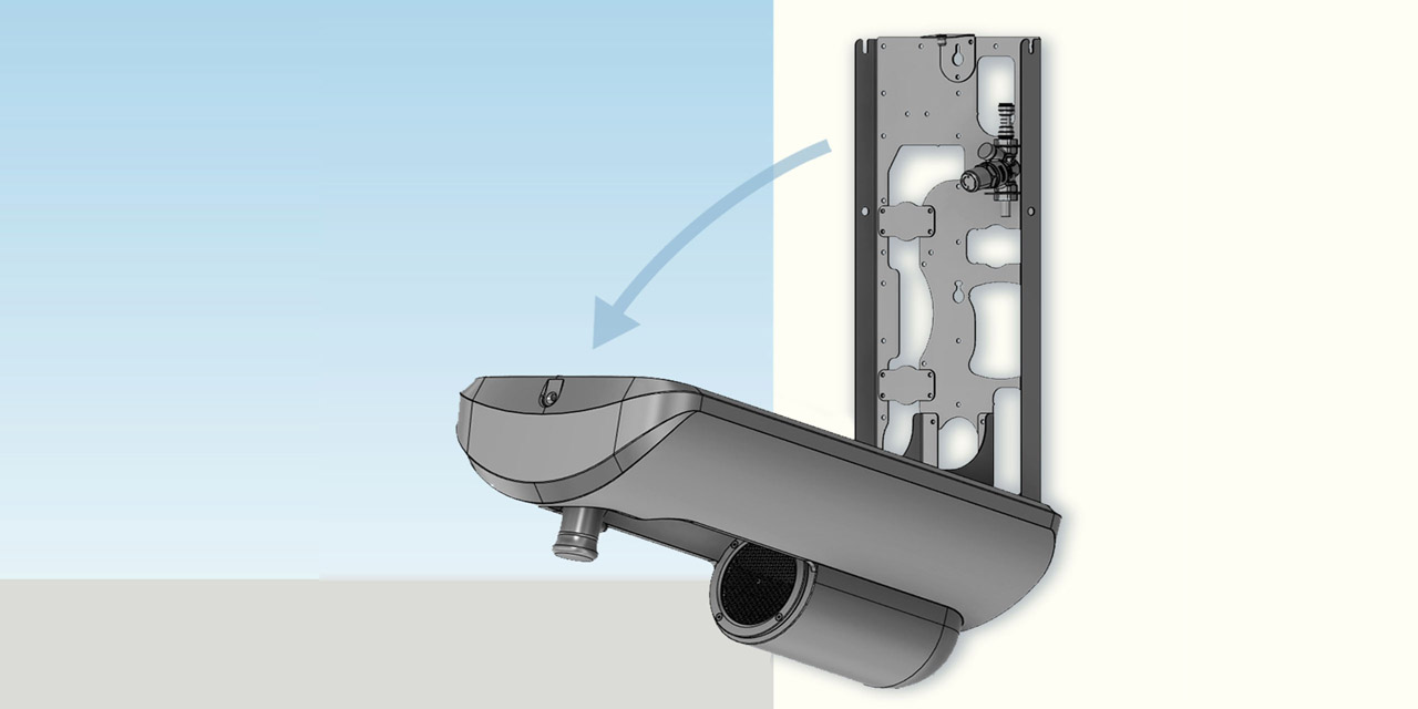
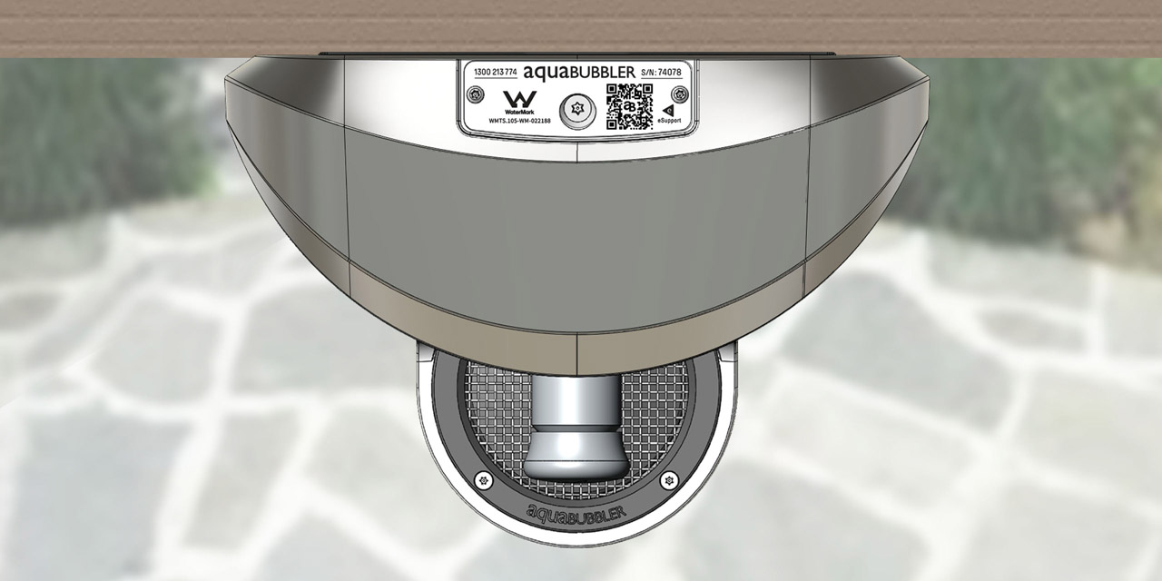
The hydration solution for limited spaces & large walls alike, the Wall Mounted Refill (WMRa) aquaBUBBLER is a water bottle refill station with an ergonomic palm push tap and smooth body contours. Its principal materials are a super-tough, durable polymer (unit body) and stainless steel (taps, parts etc). The unit attaches securely and seamlessly to the wall via 304 SS chassis.

The WMRa provides effective and convenient hydration especially for through-traffic and places of gathering, and can be installed either as stand-alone units or in series for a hydration hub. Manufacture and assembly are entirely onshore in Australia: >90% in Victoria.

Design Brief

We wanted to create a wall mounted unit - exclusively for the refilling of bottles - to complement our existing range of stand-alone models.

Hydration stations should invite people to drink water by virtue of their attractive appearance, and be comfortable and enjoyable to use due to their ergonomic design. We required our new design to have the same simple, rounded silhouette as our existing models, and sufficient surface area to carry in-mould graphics which would be clearly seen from a distance.

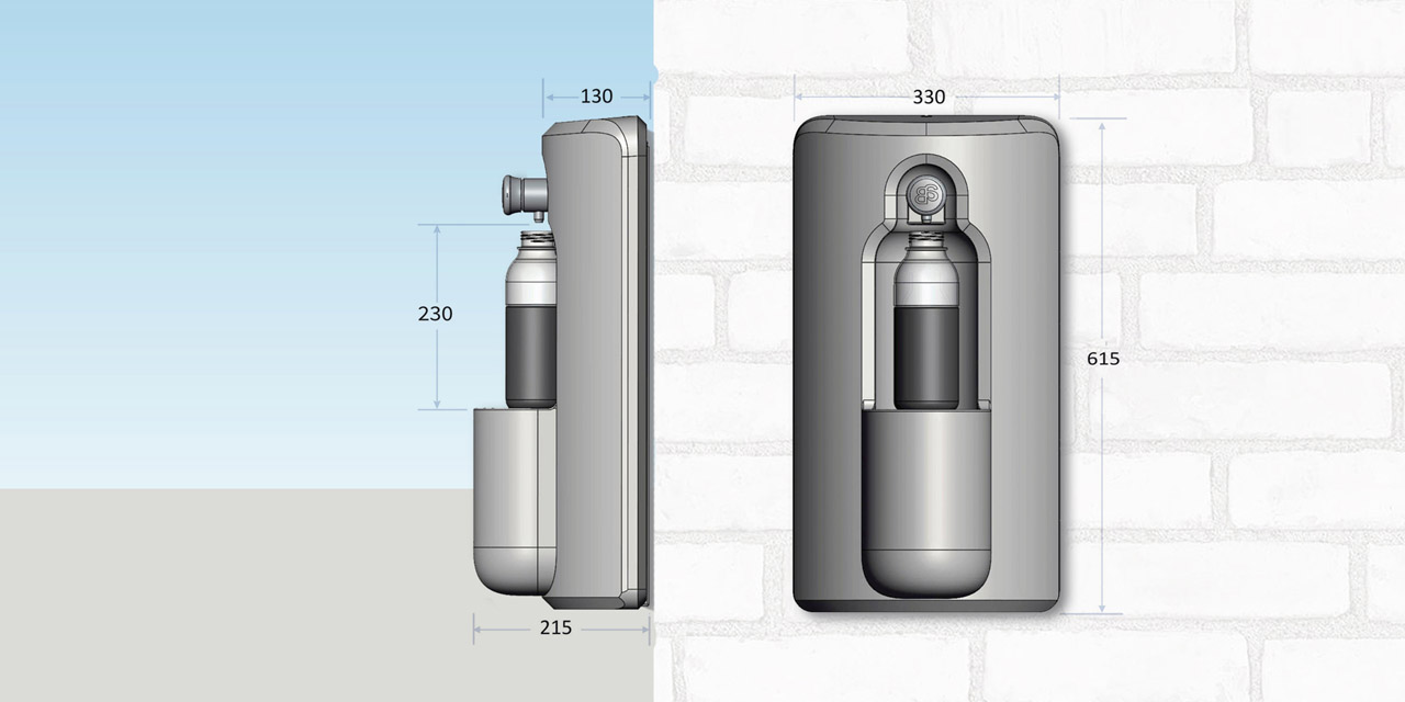
Tall bottles would need to be comfortably accommodated under the tap. The unit body would protrude just enough from the wall so as to attract the eye; but its contours would be smooth in order to be visually unobtrusive and to avoid creating a physical hazard.

Easy installation was a priority, and attachment to the wall had to be super-secure. Routine maintenance needed to be simple and straightforward.


This project was developed by:

Design Process

We began by identifying the key groups that we knew would be interacting with our product: ie. the client (eg. a school), the installer (the plumber), the user group (students), and the maintenance person (eg. the school handyman).

We knew that the expectations of these groups for a wall mounted hydration station were in brief: ease of installation, good functionality, adjustability, attractive appearance, and serviceability. We also wanted to include a number of features, capabilities and customisable choices that we believed would enhance user experience, but that we did not see in any single wall mounted model currently on the market.

Capability to mount the unit on any type of wall was a defining feature, that would guide our design process with the WMRa. This would make the product appropriate for a wide variety of environments, spanning all building typologies and all strata of society.

The basic outcome of our design process is an elegant but functional piece of equipment that can be installed on any wall. As discussed above, the WMRa has additional features and capabilities that enhance user experience, which indicates that the design brief has been exceeded.

Design excellence

The WMRa satisfies the ten principles of Good Design, as described below:

Useful, Honest & Long-lasting:
The WMRa is user-friendly because it comfortably accommodates all drink bottles - even tall ones. Tap operation is low newton force and doesn't require fine motor skills, and units can be installed at the appropriate heights for the intended user groups.

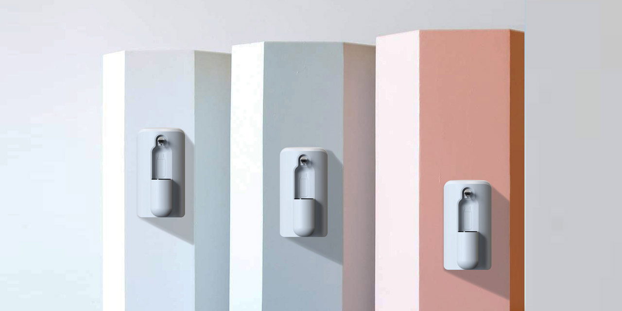
The client can individualise the WMRa by choosing their desired body colour and in-mould graphics to promote visual identity and/or enhance school/team spirit.

The WMRa, like all aB models, is made of extremely durable recyclable (and in some cases recycled) materials.

Aesthetically Pleasing & Understandable:
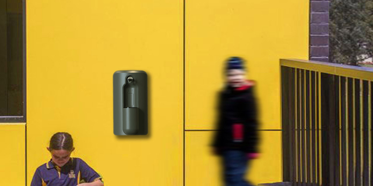
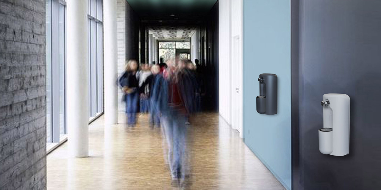
Wall mounting makes the WMRa more visible than hydration stations that are recessed into the wall. In relief from the surrounding wall, the WMRa's rounded contours make its distinctive, clean silhouette clearly visible from a distance.

The placement of its single tap and the pod below makes the front of the WMRa look a bit like a face: this attracts the eye and renders the object more relatable. Its subtle anthropomorphic appearance is intended to increase rates of interaction with the device, and ultimately enhance its usefulness as a product.

Thinking about hydration stations differently - as objects that announce their presence and purpose instead of receding into their surroundings - has underpinned our design approach to the WMRa.

We wanted to create a confident, contemporary ambassador for the drinking of tap water. The deceptive simplicity of its design creates a rewarding user experience, translating into better outcomes for community wellbeing and the environment.

The WMRa sets a new benchmark for design excellence in Victoria because it demonstrates a new approach to hydration: one that is not focused solely on dispensing potable water from a functional device; but one designed to please all of the senses in order to encourage uptake.

Design Innovation

A major problem for hydration stations is that they are difficult to see, and this contributes to their underuse The design of these low visibility hydration stations evidently places low priority on aesthetic appeal, which aquaBUBBLER, in contrast, believes to be fundamental in promoting user uptake.

aquaBUBBLER doesn't think of hydration stations purely as utilitarian objects: we view them as design objects that should look cheerful and friendly, and can be easily recognised across large distances, for example across sports fields, university campuses etc. Therefore, rather than being recessed into the wall, the WMRa stands in relief from its wall, making it more visible and announcing its function.

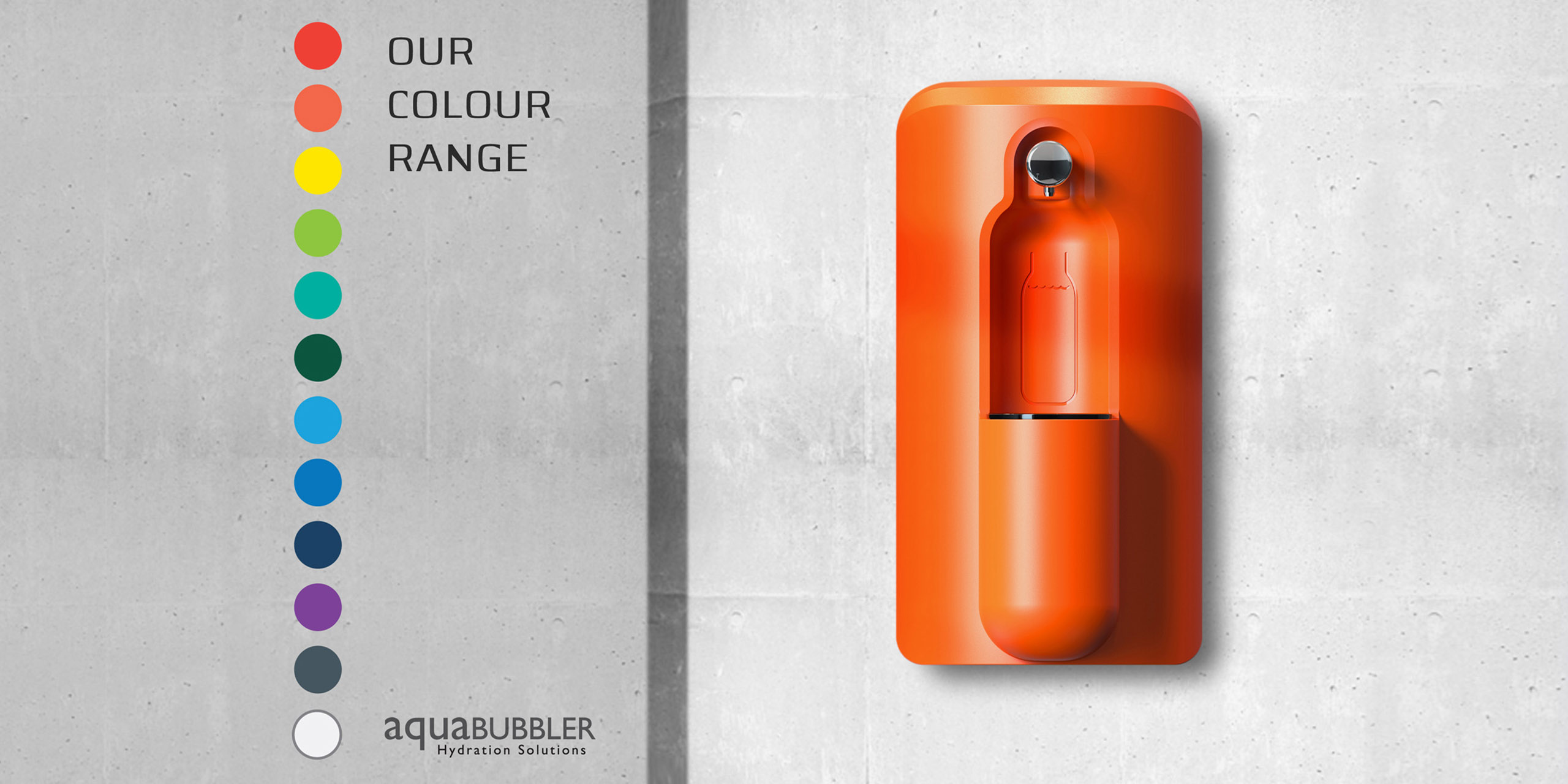
Colours can be chosen to enhance its visibility, as well as adding accent to break up monotonous expanses of wall. We recognised that wall-mounting allows background colour and texture could be used to great effect. To show our clients the surprising scope of design possibilities that a WMRa can add to any setting, we have developed a colour inspiration brochure (images included). This demonstrates the versatility of our twelve-colour palette when combined with different surfaces in different settings.

Design Impact

The WMRa is eye-catching but unobtrusive - aB has struck the fine balance required to promote hydration outcomes.

The WMRa mediates situations in which space is either lacking or in excess: depending on the setting, it either animates empty wall space and renders it functional; or takes advantage of limited space in general (eg. a school with small grounds) by transforming a wall into a hydration point.

Long-lasting and positive impacts for:
Client: their setting is enlivened, and wall space optimised in terms of utility. Their users are more hydrated, and less likely to use disposable plastic bottles, so their waste problem and carbon footprint is reduced.

Society: The utility of the individual spaces (both public and private) that make up the urban fabric is increased, making it more friendly and welcoming. People's sense of place is enhanced. Promotes culture of reusing personal bottles; Makes disposable culture unappealing. Does this by being a nice object to interact with, and potentially creates social opportunities at the unit itself, as users wait to refill their bottles, compare and discuss their bottles etc.

Environment: Waste from plastic bottles is designed out completely through use of the WMRa: its attractive design and excellent functionality will encourage people to fill their own personal bottles in preference to buying single use ones. Manufacture of the WMRa is entirely in Australia, meaning that carbon emissions associated with transport are minimised.

Adherent to the principles of a Circular Economy, materials use is minimised with the WMRa. Its constituents have been selected and processed to favour durability - meaning long life and graceful ageing. The WMRa contains parts made from recycled plastic, and the tap is designed for reconditioning via an exchange program. At the end of its life, the body and other parts may be recycled.

Circular Design and Sustainability Features

The difference in environmental impact between drinking water from a disposable bottle, compared with from the tap, is well known to be enormous. The production of plastic bottles involves enormous volumes of both water and oil, and generates significant pollution - this is before the bottles are even discarded.

The WMRa is a hydration station that, because of its excellent design and resulting superior user experience, will negate the need for consumption of water packaged in single use plastic bottles wherever this unit is installed.

The WMRa is a product entirely manufactured in Australia, which keeps the environmental costs of transport to a minimum. Its materials are either recycled, recyclable, or part of a reconditioning and exchange program.

Product Design 2021 Finalists

Brutalis Collection by Acustico Lighting

Acustico Lighting / Envirorubber Solutions / Tyre Stewardship Australia

KUTITJI Mobile Isolation Unit

Health Forge / Purple House

Evo Tablet Platform

Bosstab / Whistle Design Group

TernX Carry On

Tern-x / Tack Lee / Hoe Ping Lo / Tricycle Developments

LIZ SMART BOTTLE

Liam Johnston / Cecile Villien / NOERDEN / UCC Australia

Savic Motorcycles

Savic Motorcycles / Dennis Savic / Dave Hendroff

CFX Opus Real-Time PCR System

Cobalt Design / Bio-Rad Laboratories

:Dsmile

Dentismile Australia Pty Ltd / Charlwood Design / Floating Books / R-Co

ACMI Lens

ACMI / Swinburne University Centre for Design Innovation / Publicis Sapient (Australia)

OKTI

Outerspace Design Group Pty Ltd / Compumedics Limited

ROVing Intelligence T7

Matt Millar / Matt Curtain

Christie Barbecues ICON Cabinet

Christie Barbecues / Rory Sangster, Product Development Manager / Paul Conradie, Head of Sales

Smash Blue

Nicholas Bow / Smash Enterprises

Oasis Reusable Spice Shaker

qDesign Enterprises / Be Tribe / Oasis