The following list makes the process seem linear, but really the timeline was such that research, design and technical foundations all started concurrently and continuously informed each other for the duration of the project.
1. Discovery
There were multiple discovery workshops with many Monash IVF team members from various parts of the organisation including Fertility Doctors, Nurses and Marketing experts. Our main goal was to collaborate on a vision for their new digital product and identify known issues and opportunities.
2. Structure and Information Architecture
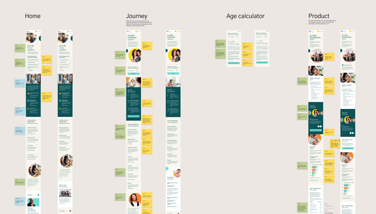
We moved quickly into prototyping and tree testing to understand how to create a structure that supported more users and met them where they were at on their journey as much as possible. We completed tree testing of potential IA variants and the findings informed the wireframes and designs to take into testing. We synthesised previous patient experience research into potential customer journeys to understand service pathways and what patients and potential patients needed from the digital experience, and when.
3. Testing and content
User testing revealed that the journey focused structure could be isolating to some patients and potential patients and also that it sometimes didn't support users in a task-oriented mindset e.g. "I want to find out how much IVF costs".
Throughout this we were working closely with Monash IVF to rework their content so that it was more warm, realistic, easy to understand and acknowledged that people could be jaded and distressed after failed fertility treatment attempts.
4. Build and technology
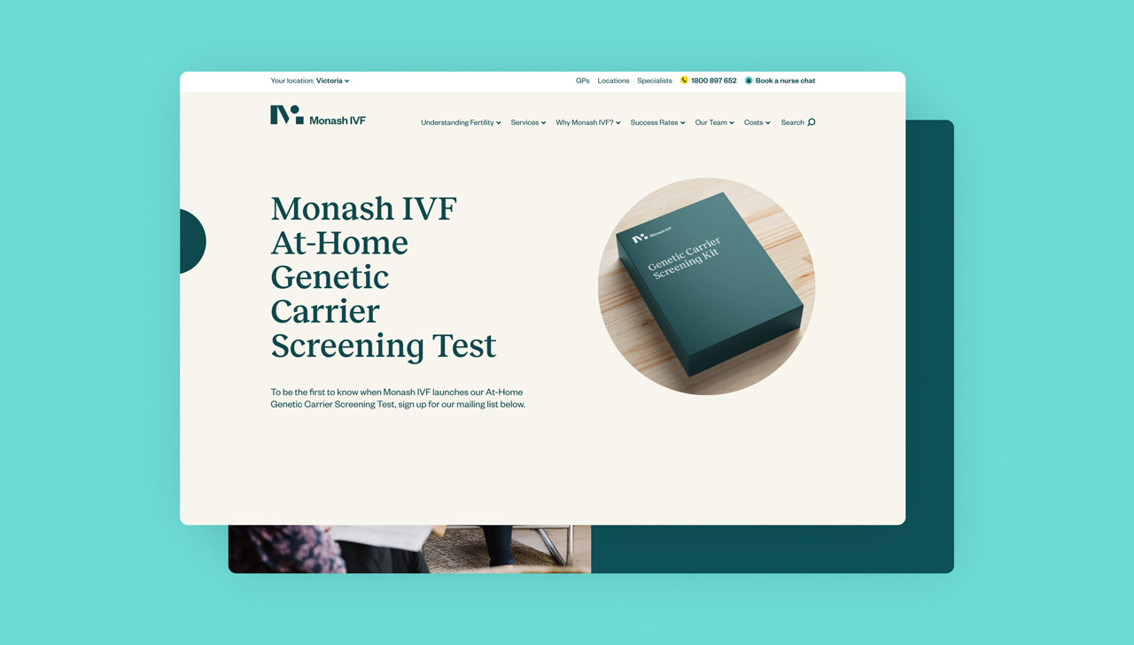
We designed an approach for Monash IVF's complex geolocation requirements. The site had to display many different types of content based on where the user was, and not just clinic locations as you might expect. Our solution also enables clinical content for health professionals—distinct and restricted from the other users.

