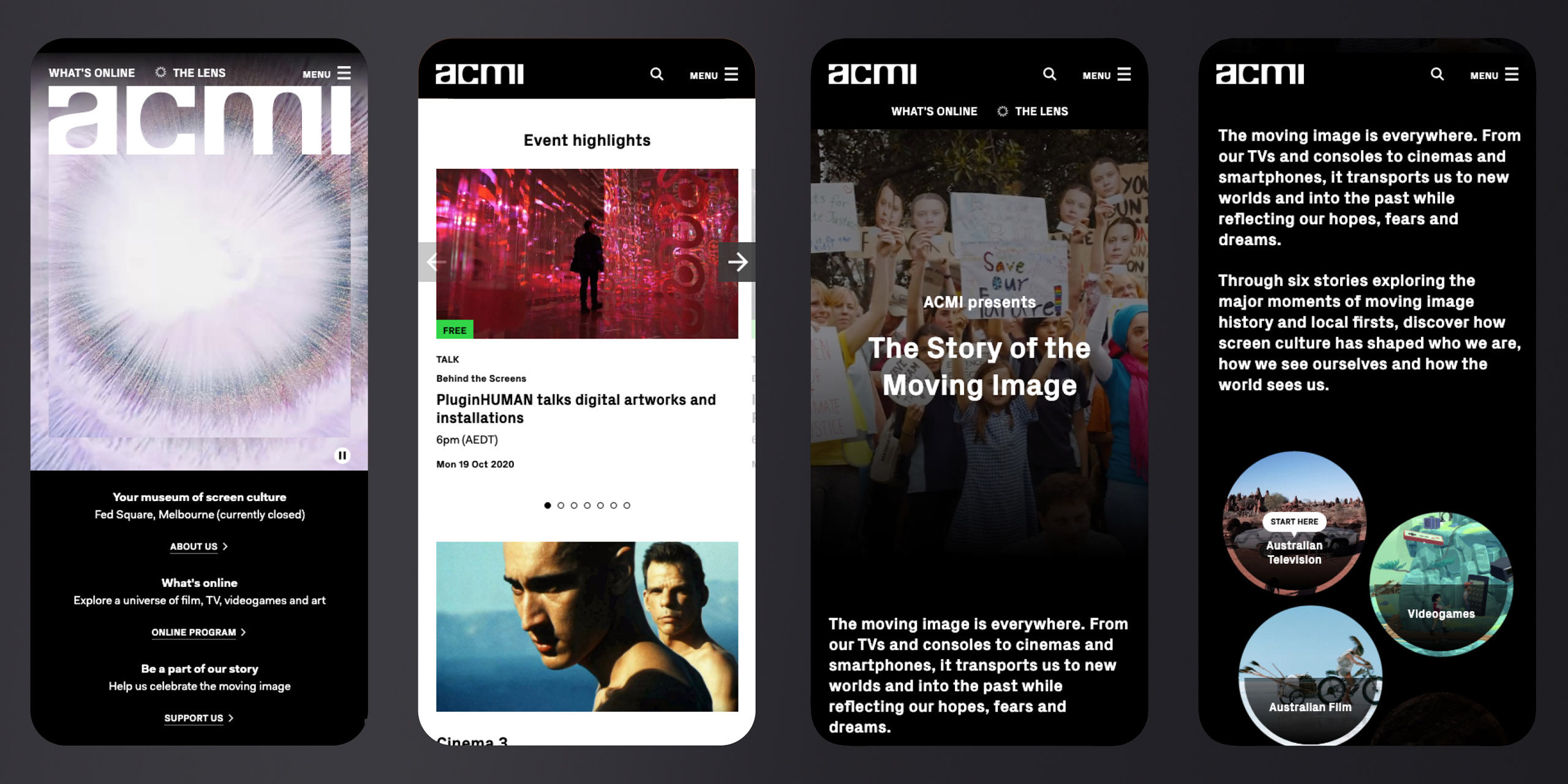
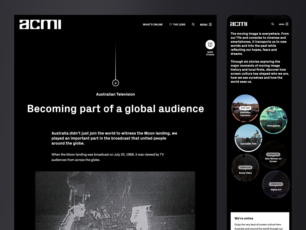
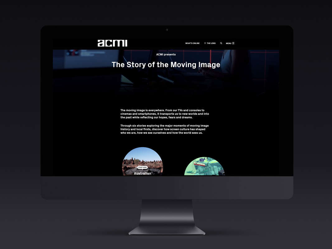
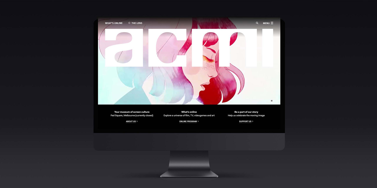
We conducted market and customer research analysis, and interviewed real ACMI visitors to understand their goals and frustrations. We sat down with the ACMI team and established aspirations and expectations, giving ourselves the tools to measure success throughout the project. We then created user personas and user journeys, synthesising a broad range of users into 5 key groups.
Next, we created an early sitemap and presented it along with a tonne of questions, which allowed us to define the content structures that the site would be built around.
After extensive competitor and design research, we embarked on a huge series of stakeholder workshops and prototype sprints to find solutions to some current website challenges. We designed low fidelity wireframes for each key page of the website and tested them with users; both to validate some of the IA decisions made early on and to gauge the success of the designs thus far.
ACMI’s offering is unique in that it’s so varied. In addition to their core offerings of film screenings and exhibitions, they also regularly host festivals, film seasons and programs, workshops, exhibitions, talks, tours and performances. We wanted to present all these experiences in a consistent way, helping users to seamlessly navigate from one to the other, so we designed a robust, flexible event template – one that would work just as well for presenting a long-term exhibition as it would for a single workshop.


