Finalist 2021

Yume

Ellis Jones / Yume

Expressing purpose through identity and impact.

Yume works with leading food suppliers to ship surplus stock, that may otherwise have been wasted, to smart hospitality and retail businesses, preventing good food from ending up in landfill. Yume approached Ellis Jones to lead them through the process of evolving their brand identity to reflect their growth beyond a start-up, and hero purpose at the heart of what they do.

Design Brief

Yume works with leading food suppliers to ship surplus stock, that may otherwise have been wasted, to smart hospitality and retail businesses, preventing good food from ending up in landfill. Yume approached Ellis Jones to lead them through the process of evolving their brand identity to reflect their growth beyond a start-up, and hero purpose at the heart of what they do.


This project was developed by:

Design Process

Ellis Jones worked with Yume’s executive leadership team to capture and communicate their brand identity. Through research and workshops we mapped their key audiences, their values, preferences and needs, and defined a compelling value proposition to reach them. Our design studio articulated the brand strategy through a visual identity system that speaks to the maturity of the Yume model and platform, and ‘heros’ the brand purpose, while remaining ownable and differentiated from other players in the market.

Ellis Jones designed and facilitated an organisation wide co-design and creative branding process, culminating in the delivery of:

* A strategic brand identity
* Value proposition and key messaging
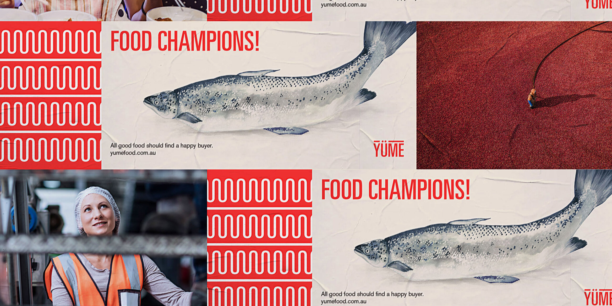
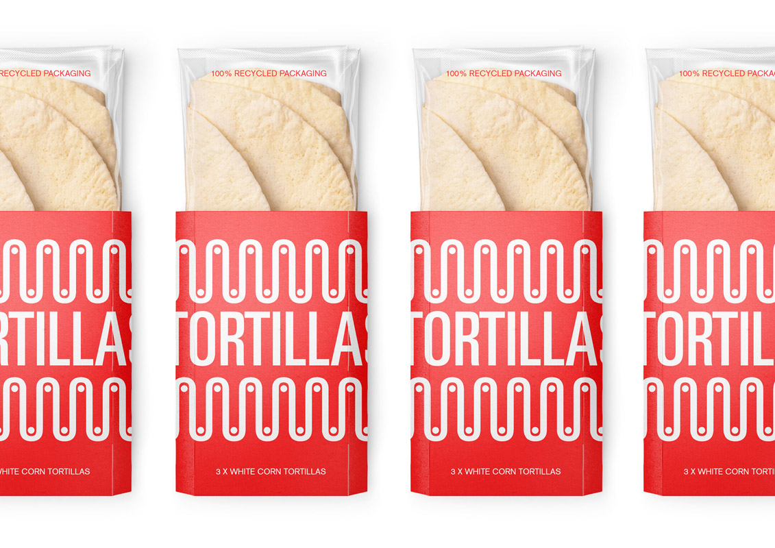
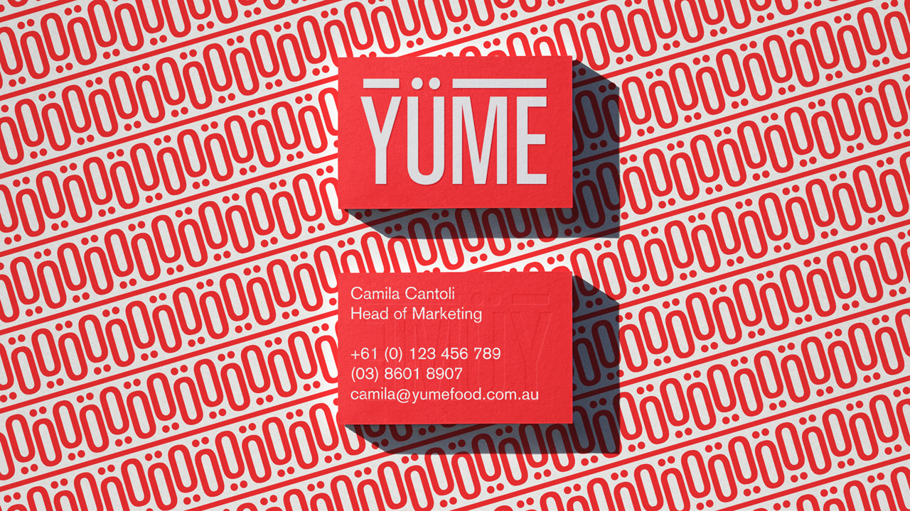
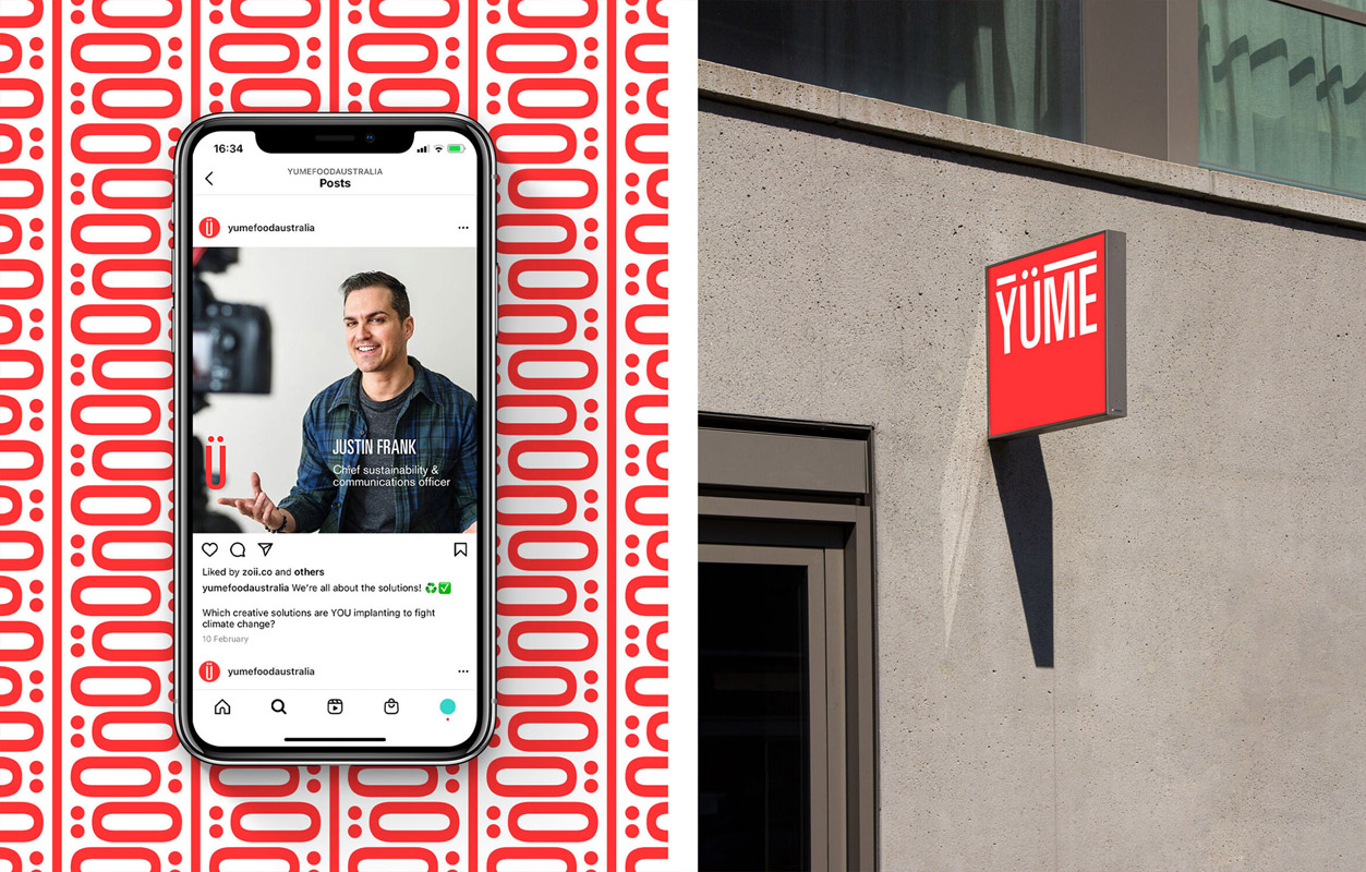
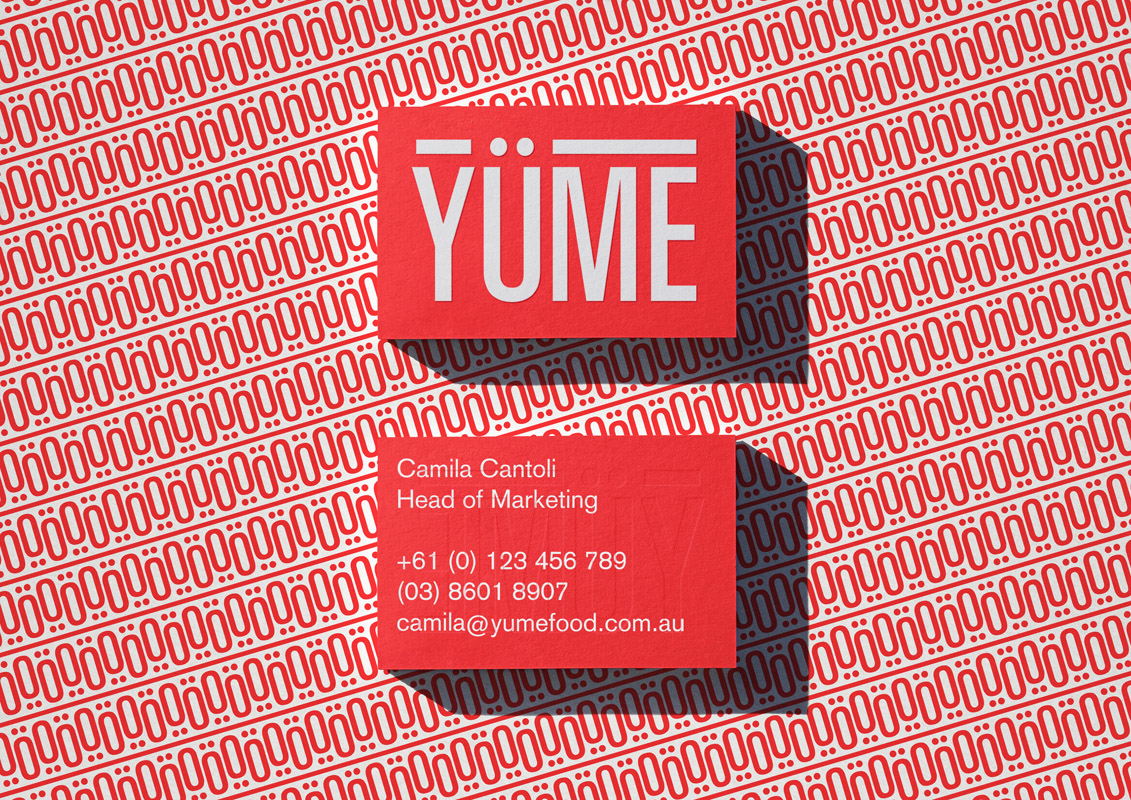
* Visual identity (inc. style guide)
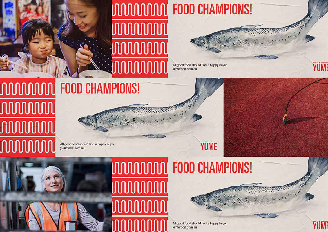
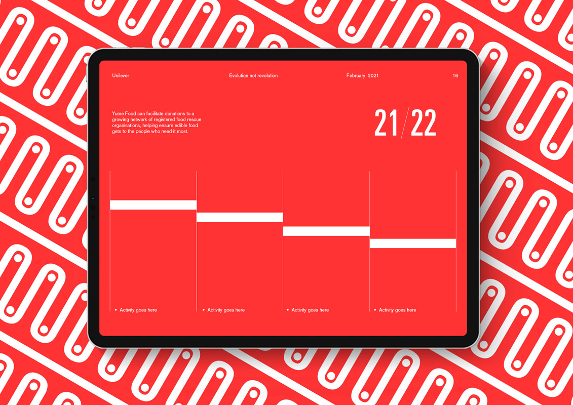
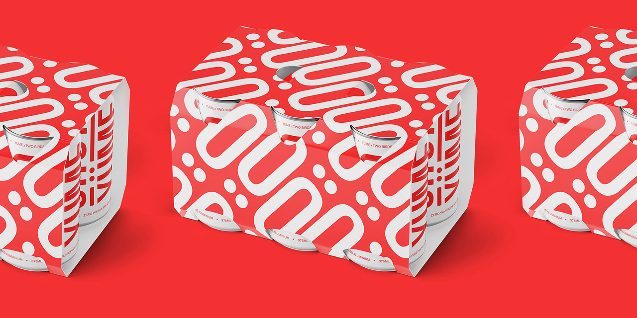
* Launch collateral (inc. pitch decks, collateral, social channel badging and content treatments, packaging, identity livery, and website platform UI)
* Unique illustrations created by the agency’s talented artists and designers
* An activation plan outlining brand expression mapped to key customer group journeys.
* Armed with a renewed strategic direction, and a visual identity commensurate with experience and scale, Yüme relaunched to market in early 2021.

Design Excellence

Strategic rigour provides the foundation for Yume's revised brand and visual identity. A clear understanding of the audience, competitive landscape and organisational goals informed every design decision. To entertain the idea of objectivity as it relates to "good design", investment in this investigation process is critical.

A co-design process with Yume's executive team provided audience insights and three principal persona groups were defined: buyers, suppliers, marketplace users. Understanding the pains/gains and aspirations of these archetypal groups allowed us to focus our design response and strategically influence user and stakeholder perceptions of the brand. Assessment of the competitive and collegial brand landscape identified tropes or trends in language, logotypes, symbols, colours and imagery. This was the vehicle to understand opportunities for difference, and agree upon legitimate visual cues used to navigate the space. The investigative phase culminated in a business and positioning review, outlining: external market forces; Yume's current context (what had changed, what was different); and an approach to brand architecture.

Design Innovation

The insights gathered above informed the brand identity in which an "essence" of ingenuity was defined. Yüme possesses a ‘start up mentality’; the drive to keep learning and evolving, using what is at hand in order to adapt to context and need, and create success. This resourcefulness is communicated as a competitive advantage from other market players, and an alluring attribute to larger, slower moving institutional clients. The realities of bootstrapping and building a business from ‘the ground up’ are still present in the collective psyche of the business. As such, creativity, and resourcefulness are hallmarks of the businesses behaviour and output.

The revised logotype communicates Yume's brand essence with unconventionally condensed character widths and a custom umlaut. A rule above the logotype provides solidity, and brings focus to the personification of the "U". A strong 'skeleton' logotype, allows us to build and be playful where the context is right (think logo from berries, or hand painted), but also play to a more polished and professional tone when required.

The digital-first nature of the brand offers an opportunity to "push" the saturation of the YÜME red and establish a recognisable and own-able hue amongst the competitive landscape. A sophisticated palette of natural tones provide relief.

Passion and creativity — hallmarks of Yume's behavior and output — are expressed through a considered typographic palette. 'Display' copy and 'pull outs' make use of the unconventional logotype font and are supported by a robust working sans-serif.

Photography demonstrates an understanding of the integrity of food. The effort and energy that goes into food production means that it must fulfill its purpose - to be enjoyed! Yüme are food champions!

Design Impact

Yume’s brand identity defines the experience people can expect to have when they interact with its employees, digital presence, services, resources and collateral.
It is also a reference point for strategic decision making at executive and operational levels. The outcomes are to:

* Align identity and experience with achievement of organisational goals and strategies
* Define the organisation uniquely in the sectors, markets and communities that it is active
* Ensure the brand position is relevant, meaningful and believable, and resonates with all target audiences
* Accurately reflect the nature and capacity of Yume
* Instill pride among employees, and attract partners of aligned values and attitudes
* Influence user and stakeholder brand perceptions to build brand equity

Armed with a renewed strategic direction, and a visual identity commensurate with experience and scale, Yume relaunched to market in early 2021. The brand has been celebrated for its creativity and continues to shape and share the positive impacts of Yume's work, a snapshot of which is offered below:

* 2,884,255kg of food prevented from going to waste
* 10,500,425kg CO2 saved
* 608m ltr water saved
* $6.5 million returned to Australian farmers and manufacturers

Communication Design 2021 Finalists

Treasures of the Natural World

Museums Victoria Design Studio / Studio Peter King

Yawa Aquatic Centre

Studio Binocular / Mornington Peninsula Shire Council

The Crossing

Australian Open Tennis Tournament / Nicholas Azidis / Rose Staff

Ewe Care Sheep Milk Skincare

Design by Bird / Ewe Care

You Me and Money Preventing economic abuse in young adult relationships

Today / RMIT University School of Economics / YLab / Ecstra Foundation

Telstra Creator Space

Studio Binocular / The University of Melbourne / Telstra

FSC Universe

Atollon / FSC Group

FACES PLACES intergenerational community art activation Coburg

Moreland City Council / Steph Hughes / Playable Streets

Digestive Tumble

HAFP Research Lab

V for Victori

Charlie Ryan (Five Creative) / QMS Media / Total Outdoor Media / Plakkit Media / SMLXL Fine Art Print Studio / Australian Graphic Design Association (AGDA) / Fireworks PR

Oho

Ellis Jones / Oho

Carlton Learning Precinct

Nexus Designs / City of Melbourne / Law Architects

Metro Tunnel Headquarters

We Are Best / Rail Projects Victoria

Darkness

Shane Gavin – Creative

Penguin Parade Visitor Centre

Phillip Island Nature Parks / Thylacine Design / Gemma Field / Mental Media / Benjamin Cisterne / Marc Martin

Quarantine Station

Nicole Cullinan A Poetic point of view. / Mornington Peninsula Shire Council / Jane German - Mornington Peninsula Shire / Michael Stowers - Mornington Peninsula Shire / Mikayla Fulton - Popic Printing / Acknowledgement – Bunurong People

JEDI

Studio Binocular / National Skills Commission

Shrine of Remembrance

Multiple Studio / Shrine of Remembrance