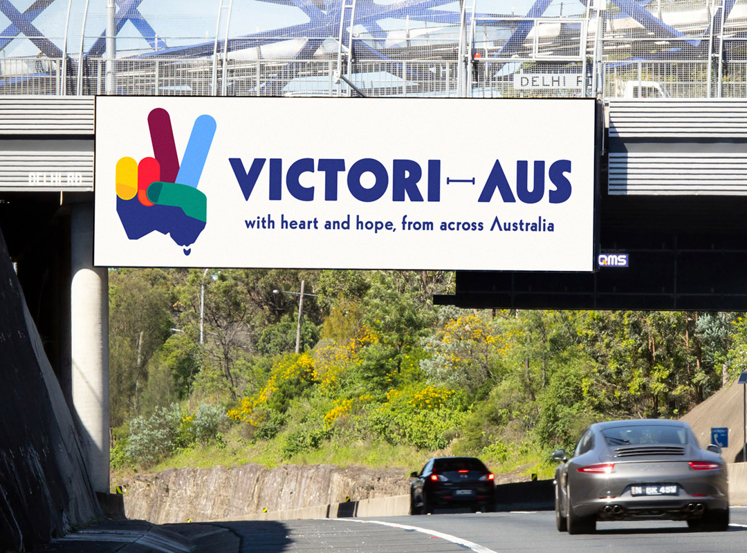
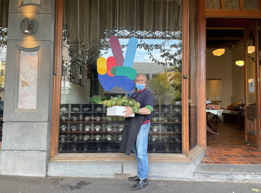
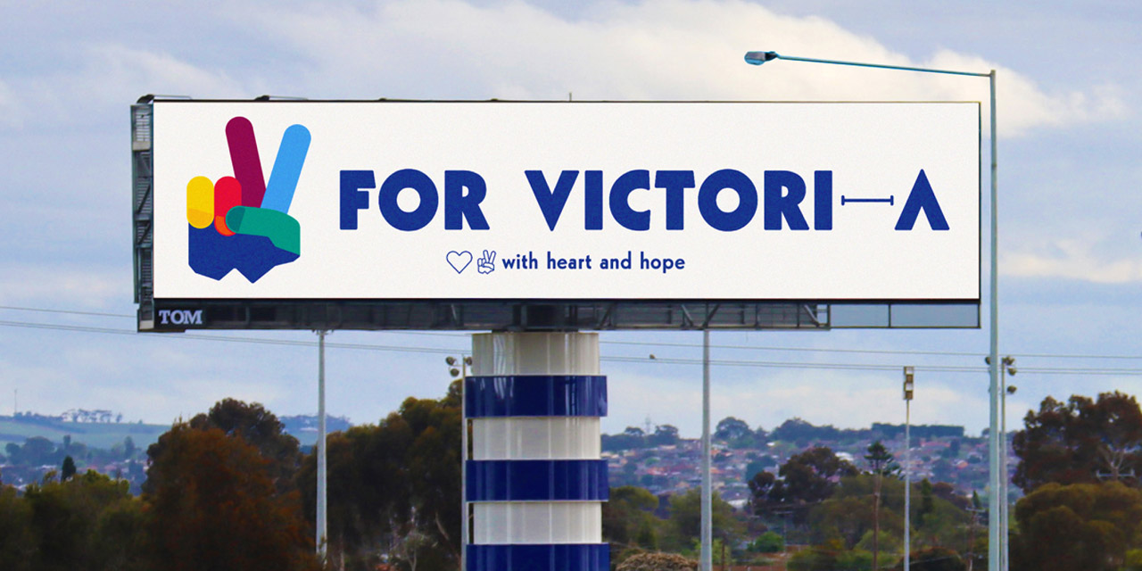
The campaign logo and name upcycles Winston Churchill’s ‘V for Victory’ and the peace sign of the 1960s, giving Australian’s a common symbol that can be proudly worn, displayed and shared to represent our united fight towards victory against COVID-19 and its greater flow-on effects within the community.
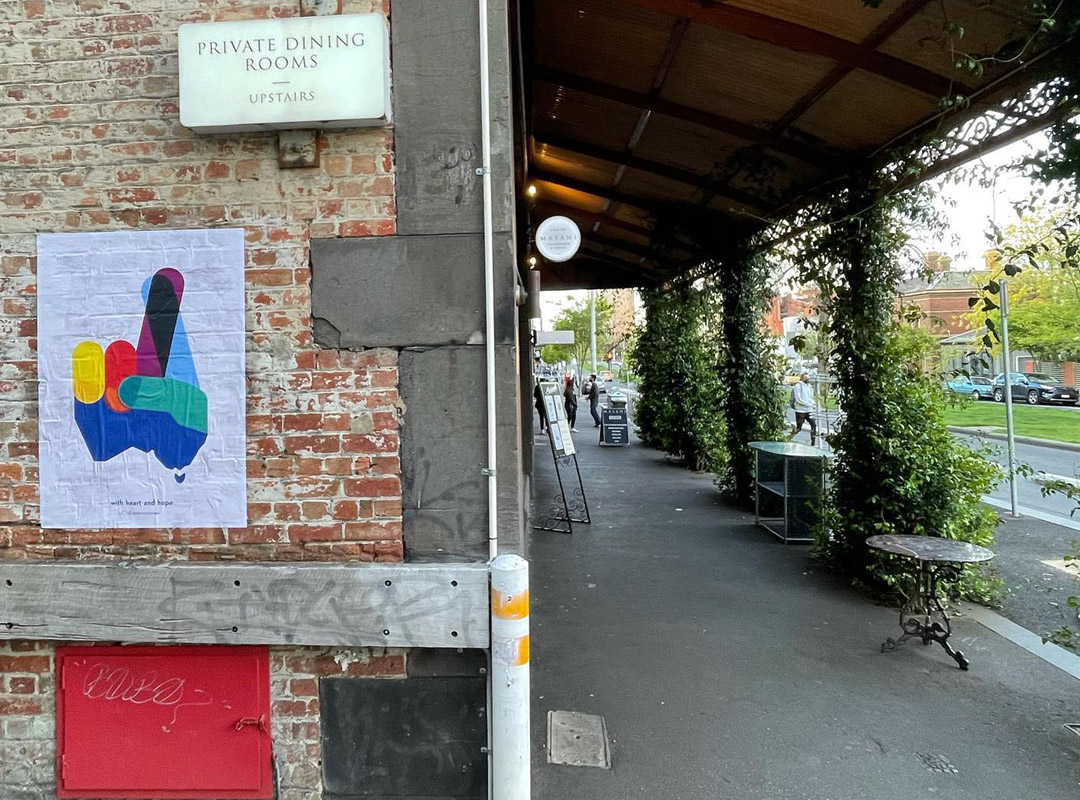
And whilst the original design cleverly incorporated the shape of Victoria as the palm of the hand, it has since been upgraded with the bottom half of the Australian continent. And its vibrant palette representing the official colours of all Australian Commonwealth flags, states and territories (the Navy Blue representing the state of Victoria).
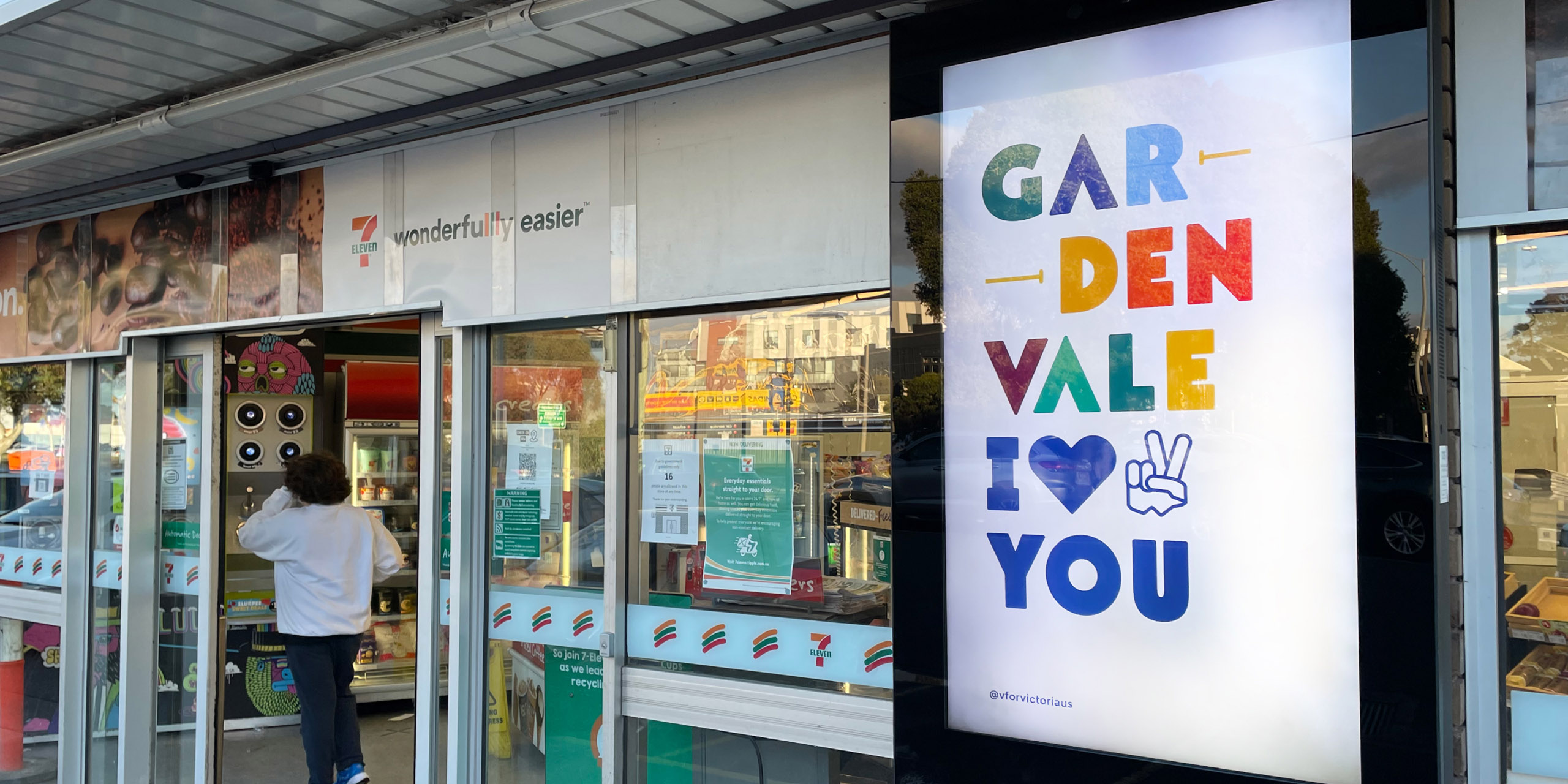
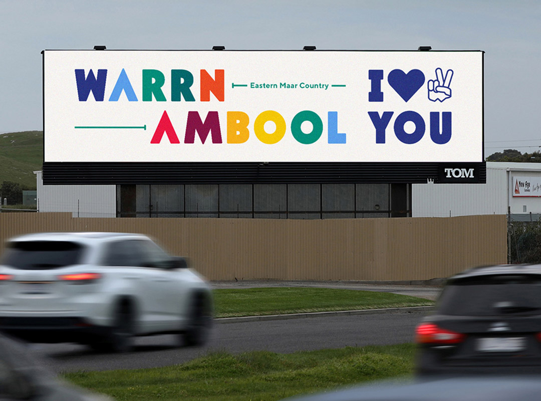
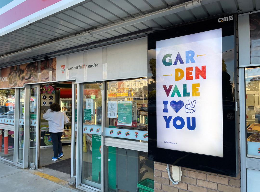
The project has since evolved to include a growing range of ‘I Heart and Hope’ poster designs (inspired by American graphic designer Milton Glaser’s iconic ‘I Love New York’) which incorporates the names of individual towns, suburbs and places celebrating the resilience, love and support found in every community, particularly during this period of ‘staying apart, together’. These posters also included the traditional place names incorporated into the design.
What started with sharing the designs on social media, the project quickly led into the real-world distribution of large format street posters printed in Melbourne and pasted in major metropolitan cities including Melbourne, Sydney, Brisbane, Gold Coast and Adelaide. As well as being mailed to a selection of participating individuals living in regional and rural areas of Victoria.
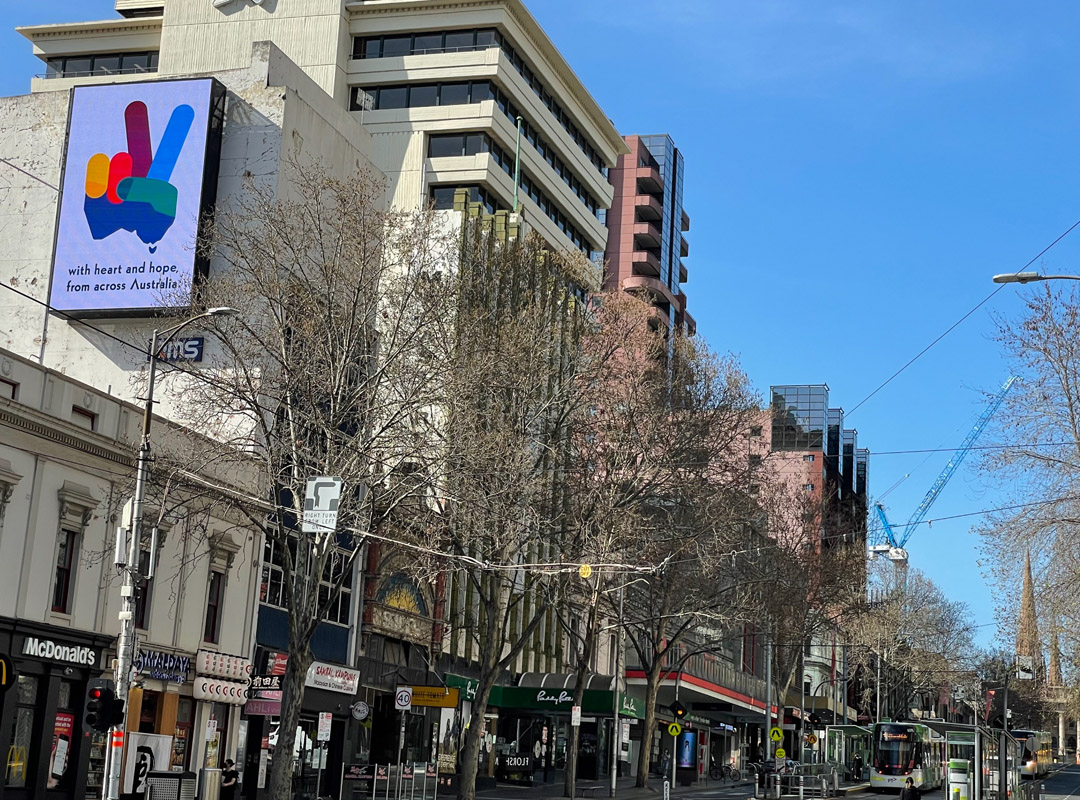
And with the generous support from out-of-home project partners, QMS Media and Total Outdoor Media, 100s of digital billboards and screens have been donated to share the campaign artwork across Melbourne and Sydney and in regional Victorian cities, including Ballarat, Geelong, Warrnambool, Wangaratta, Shepparton and Traralgon.

