Finalist 2021

Shrine of Remembrance

Multiple Studio / Shrine of Remembrance

Evolving the brandmark of a Melbourne icon

Shrine of Remembrance Brand Refresh.

Design Brief

How do you transform a brand for a Melbourne icon? With care, grace, respect, a commitment to collaboration, a keen eye for detail and a clear understanding of what has gone before and how to evolve for the future.

As the Shrine of Remembrance embarked on a period of reflective transformation it sought to review its brand to address a series of key objectives — evolve the brand to create utility across all applications, particularly the digital environment; allow flexibility whilst maintaining consistency; enhance memorability and build on the strength in the brand equity. Multiple Studio partnered with the Shrine to help them position the Shrine as a relevant and welcoming place for all visitors and must-see Melbourne attraction.


This project was developed by:

Design Process

Initially the Shrine sought a proposal on an integrated approach to communications and opportunities for audience engagement, online and offline. The objective was to enhance brand positioning and clearly articulate what the Shrine brand is, and what it stands for—then position messaging to engage its audience and build deep personal connections.

We sought to explore the imperatives of the brand refresh. To inspire. To question what exists, evaluate what works, what doesn’t, what’s useful, usable, engaging and what could be more so. The brand needed to be evolved to reflect a deeper understanding of community perceptions and needs. To be more relevant, more memorable, more engaging, more accessible to a diverse audience and more contemporary.

Importantly the key stakeholders were engaged in the process to ensure a clear vision and unified understanding of the importance and benefits of the change, which was ultimately embraced. The new brand consolidates the Shrine’s brand essence drawing from the iconic form and features, continues a proud history and embraces the beloved landmark’s shorthand name.

Design Excellence

When you arrive at the entrance to the Shrine you discover a message inlaid into the concrete wall; ‘ANZAC is not merely about loss it is about courage and endurance and duty and love of country and mateship and good humour and survival of sense of self-worth and decency in the face of dreadful odds’. Profound, inspiring, reassuring and relatable.

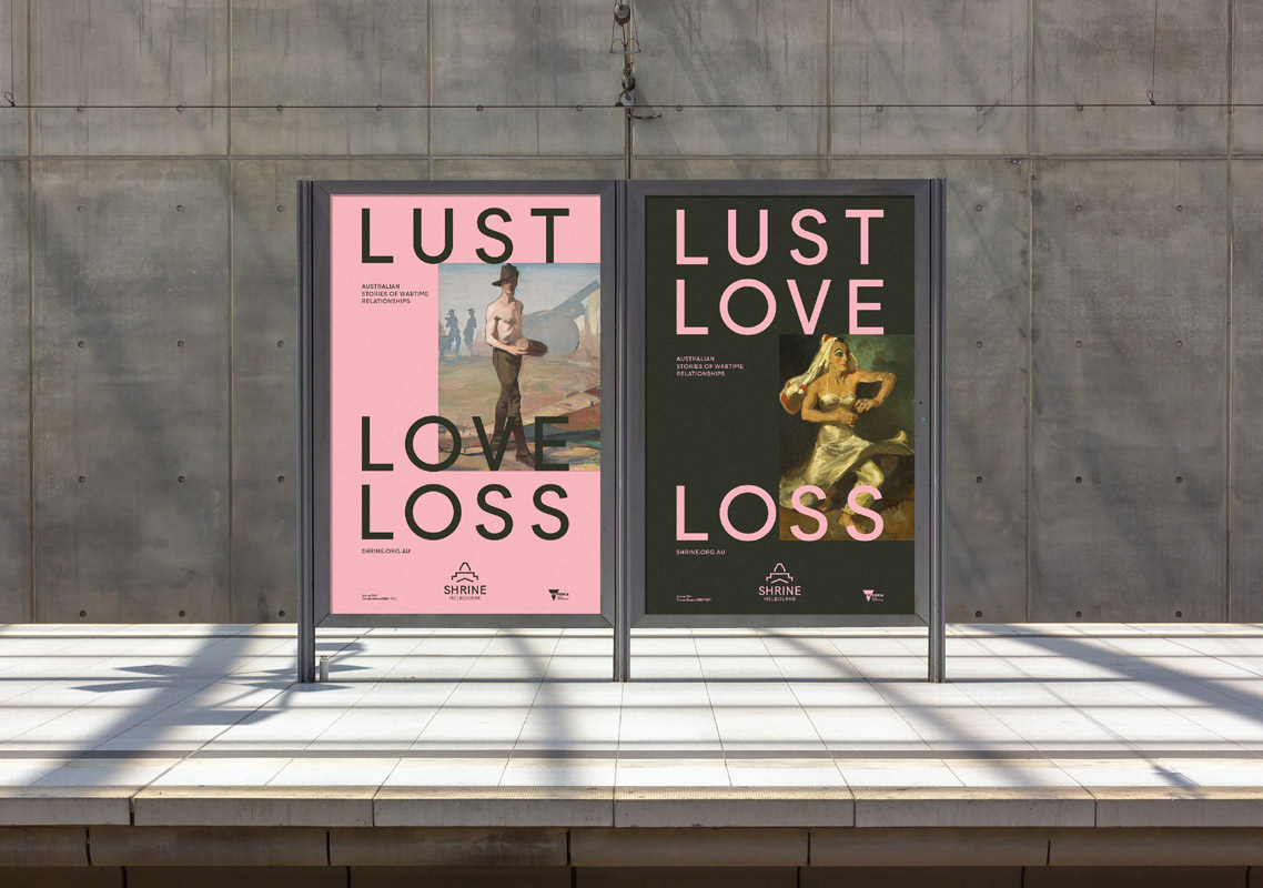
Through extensive exploration we evolved the Shrine’s brandmark to strengthen its presence across all marketing communications. We shortened the public facing brandmark to its colloquial name —‘Shrine’; easier to say and read, quicker to digest, and ultimately more memorable. This contemporary evolution maintains existing brand recognition, increases legibility, has greater utility and is unmistakably the 'Shrine’. We built a brand language that is highly adaptable, inclusive and impactful; a robust system to enhance ongoing campaigns and marketing material to capitalise on the landmark location in central Melbourne as a unique destination to inspire and position the Shrine as a place to discover and explore.

Design Innovation

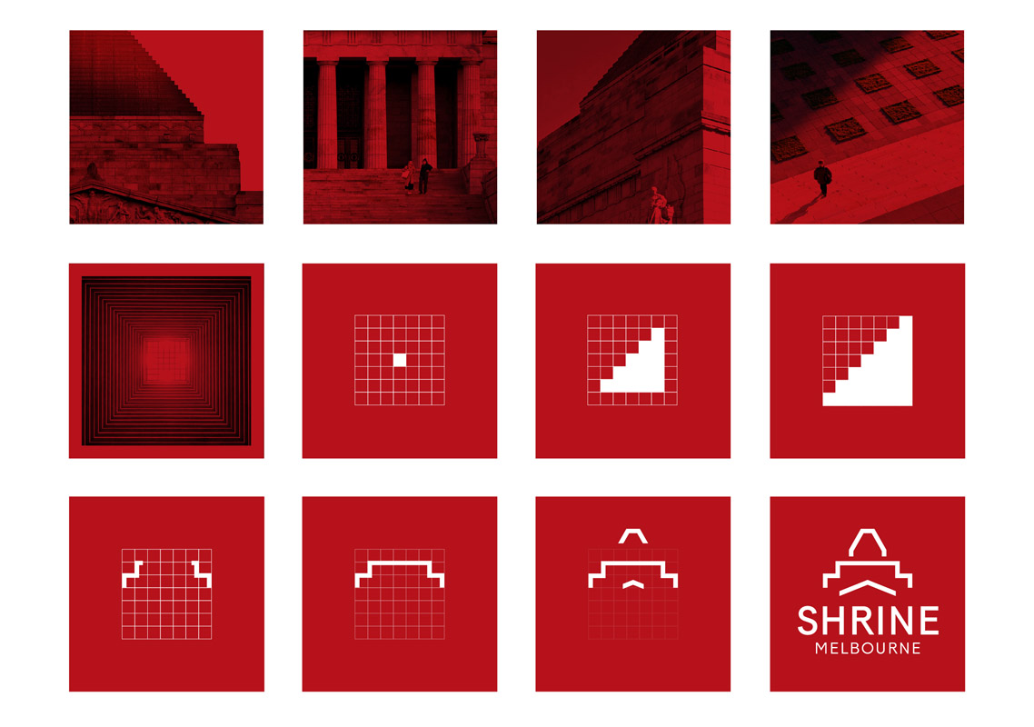
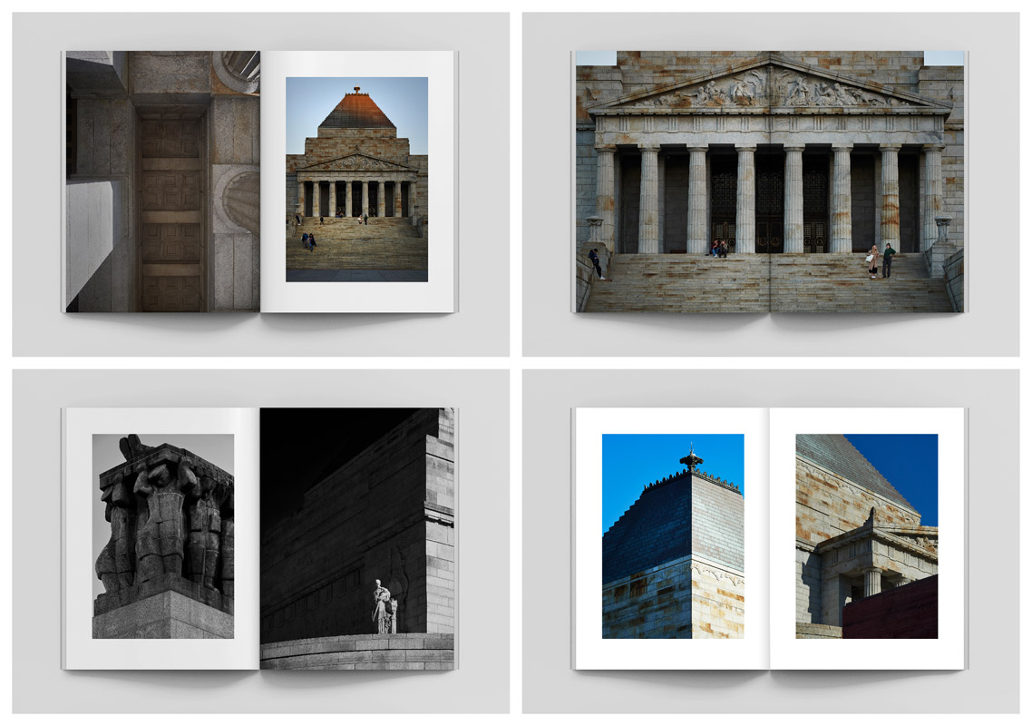
Based on the iconic building’s forms and features the evolution of the brandmark presents a refined, contemporary icon, which honours the pure proportions, strength and form of the architecture and creates greater legibility and consistency. It capitilises on truth and embraces the simplicity in the colloquial name familiar to all Victorians whilst maintaining a connection to its traditional roots.

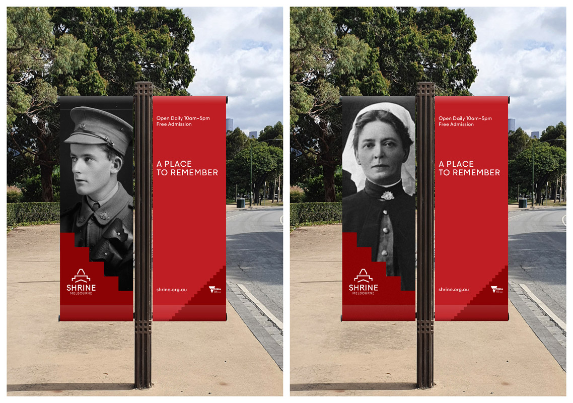
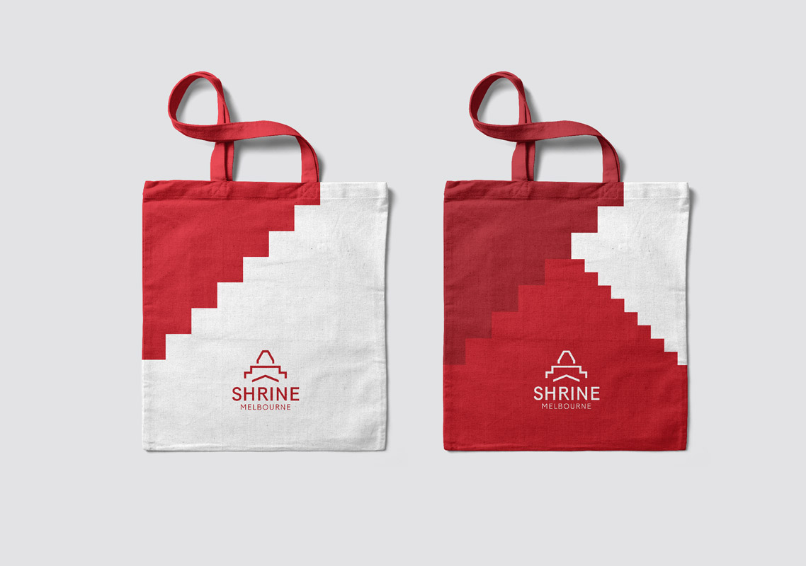
The lines and forms of the icon, particularly the horizontal and vertical lines, are drawn from a robust grid. The iconic architecture of the Shrine manifests in a graphic language of stepped shapes. These stepped graphics represent transformation, growth and community. From this simple idea we build a flexible graphic system extending beyond a traditional logo. The elements combine to create an energetic, impactful, thoughtful and memorable visual language; both contemporary and traditional. Its flexibility provides perpetual utility and expression across variable applications allowing the brand to evolve and maintain a robust visual presence. Frames and borders can also be built from the grid, taking cues from other parts of the architecture. The concept of a frame showcases the stories and images of Australians in war and peacekeeping, bringing to light their experiences in a respectful, honourable, engaging and contemporary way.

Design Impact

The Shrine’s enduring purpose is to be a memorial honouring the service and sacrifice of Victorians and Australians in war, peacemaking and peacekeeping. It engages more than one million people annually as visitors and participants in their commemorative and education programs.

Uniquely Australian stories of resilience are profoundly relatable, especially today as we contemplate a post-COVID world. The new brandmark provides a reinvigorated platform to help the Shrine continue to re-connect people locally, nationally and globally in a shared and meaningful way, and play an important role in continuing to inspire cultural and social connections. It provides an enduring capacity to share the Shrine’s stories in a engaging, exciting way and enhance its reputation. It also creates a platform to leverage the full potential of the Galleries, support the delivery and promotion of a range of commemorative services and deliver programs that meet community needs and expectations. To grow, enhance and enrich the visitor experience.

Communication Design 2021 Finalists

The Crossing

Australian Open Tennis Tournament / Nicholas Azidis / Rose Staff

You Me and Money Preventing economic abuse in young adult relationships

Today / RMIT University School of Economics / YLab / Ecstra Foundation

Digestive Tumble

HAFP Research Lab

Treasures of the Natural World

Museums Victoria Design Studio / Studio Peter King

JEDI

Studio Binocular / National Skills Commission

Yawa Aquatic Centre

Studio Binocular / Mornington Peninsula Shire Council

Penguin Parade Visitor Centre

Phillip Island Nature Parks / Thylacine Design / Gemma Field / Mental Media / Benjamin Cisterne / Marc Martin

Metro Tunnel Headquarters

We Are Best / Rail Projects Victoria

FSC Universe

Atollon / FSC Group

Oho

Ellis Jones / Oho

Ewe Care Sheep Milk Skincare

Design by Bird / Ewe Care

Quarantine Station

Nicole Cullinan A Poetic point of view. / Mornington Peninsula Shire Council / Jane German - Mornington Peninsula Shire / Michael Stowers - Mornington Peninsula Shire / Mikayla Fulton - Popic Printing / Acknowledgement – Bunurong People

Telstra Creator Space

Studio Binocular / The University of Melbourne / Telstra

FACES PLACES intergenerational community art activation Coburg

Moreland City Council / Steph Hughes / Playable Streets

Darkness

Shane Gavin – Creative

Carlton Learning Precinct

Nexus Designs / City of Melbourne / Law Architects

V for Victori

Charlie Ryan (Five Creative) / QMS Media / Total Outdoor Media / Plakkit Media / SMLXL Fine Art Print Studio / Australian Graphic Design Association (AGDA) / Fireworks PR

Yume

Ellis Jones / Yume