

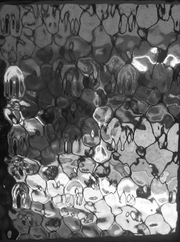
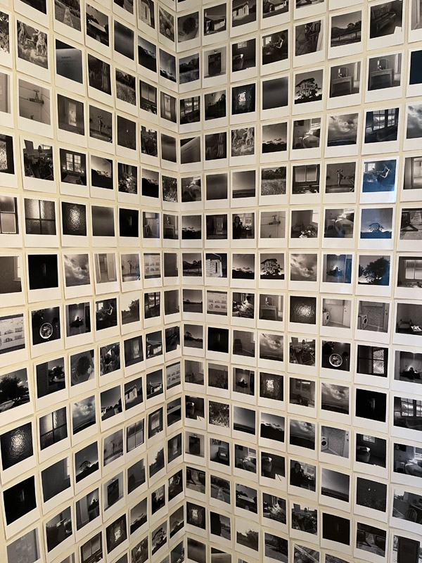
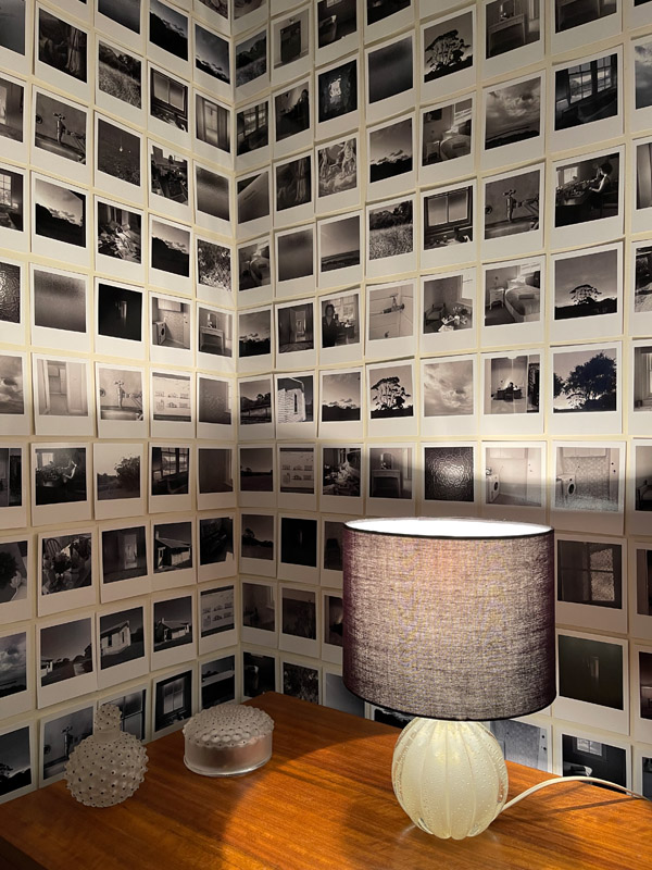
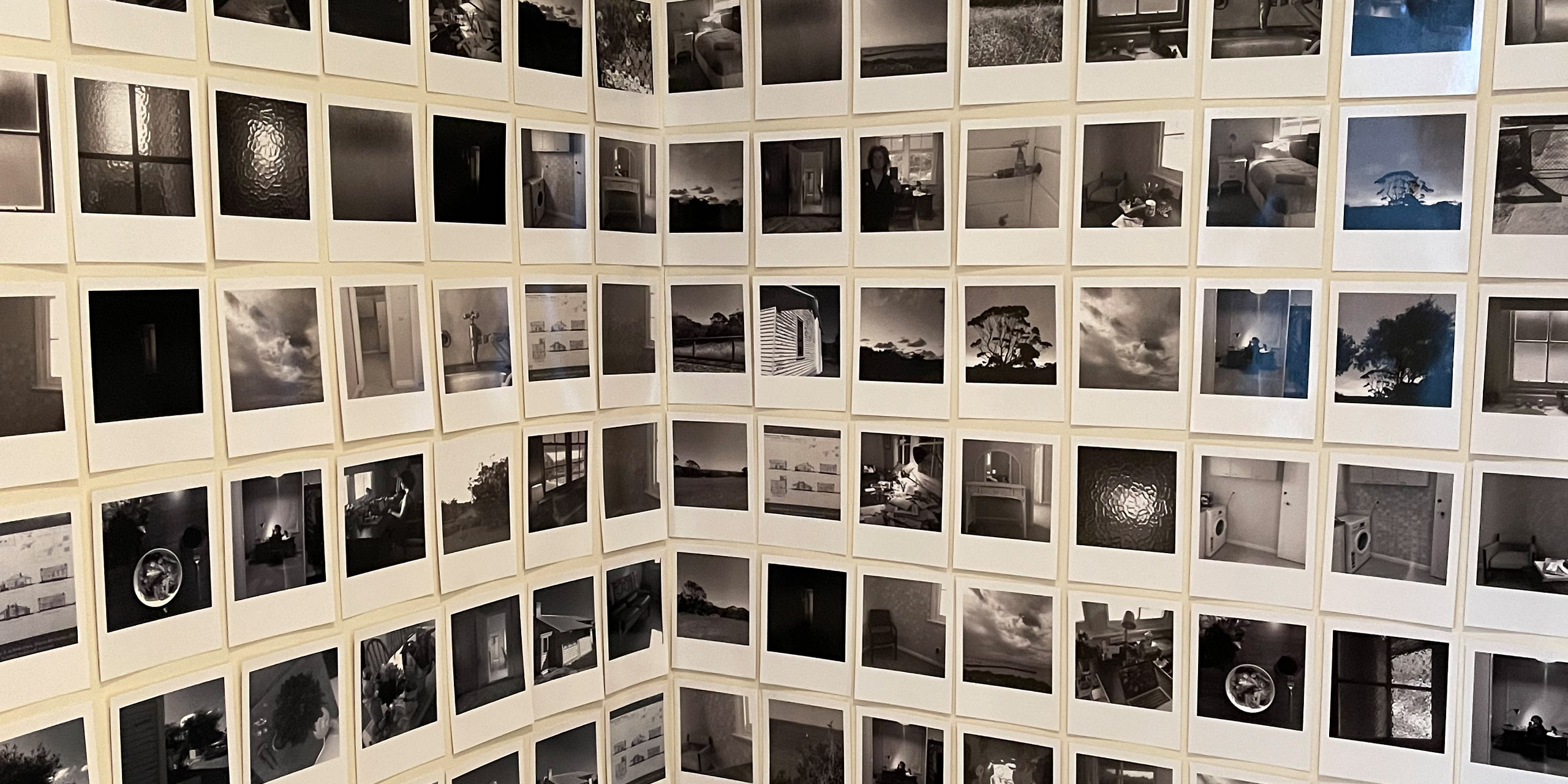
Usually, the studio follows a structured design process, but we always allow for the iterative nature of the design. One of the most enjoyable parts of the process is human-centred, the desire to empathise and understand what the client wants. Mornington Shire Peninsula Council wished to invest in the Arts to benefit both the producer (artist) and the user (visitor). To facilitate this, the studio embarked on a research process, enabling us to define what an exhibition visitor in Mornington wants. An opportunity to ideate a specific direction for the exhibition. We identified the typical visitor as being a weekender who would like to have a cultural experience. We believed this should have a positive context and be easy to consume. A prototype was formulated based on the image limitations and the identified user. At this point, we conceived to produce the photo essay as a series of polaroids. It resolves image quality issues and allows the user to get up close to the images. There would be no need for a running board along the floor to protect images as they would be tiny and inexpensive. The user could stand very close to the photos as though they were looking through a family photo album. The images were printed on semi-gloss paper the same size as a polaroid but without the hyper gloss that would leave fingerprints when touched, facilitating an interactive installation where there would be little need to supervise the visitor. We also conceived of an idea to run a poem through the images for the curious. We ran printing tests. We did eye height wall placement tests. In the end, the pain point was that the exhibition was not going to go ahead (covid lockdowns), which was realised months later. It was then launched online.
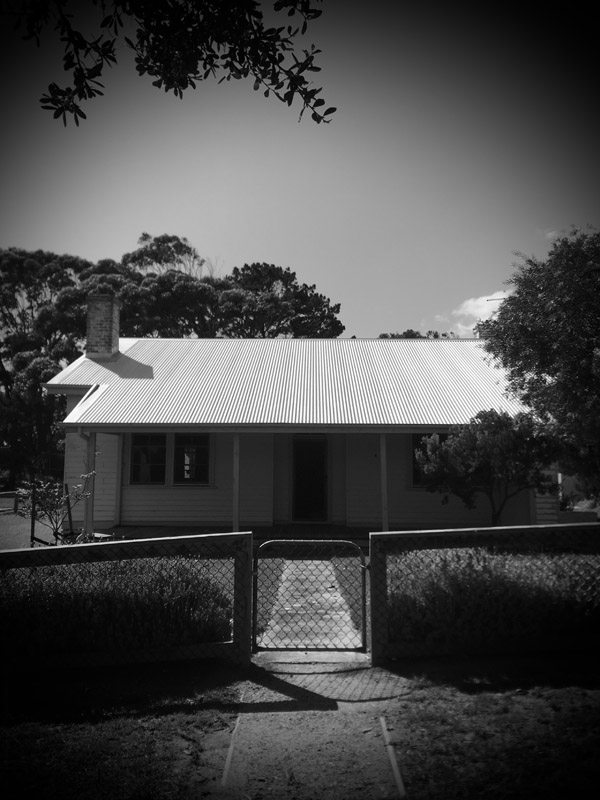
Quarantine Station
Memorials of human frailty are few and far between. Quote by Phillip Goad. The Architecture of Crisis.
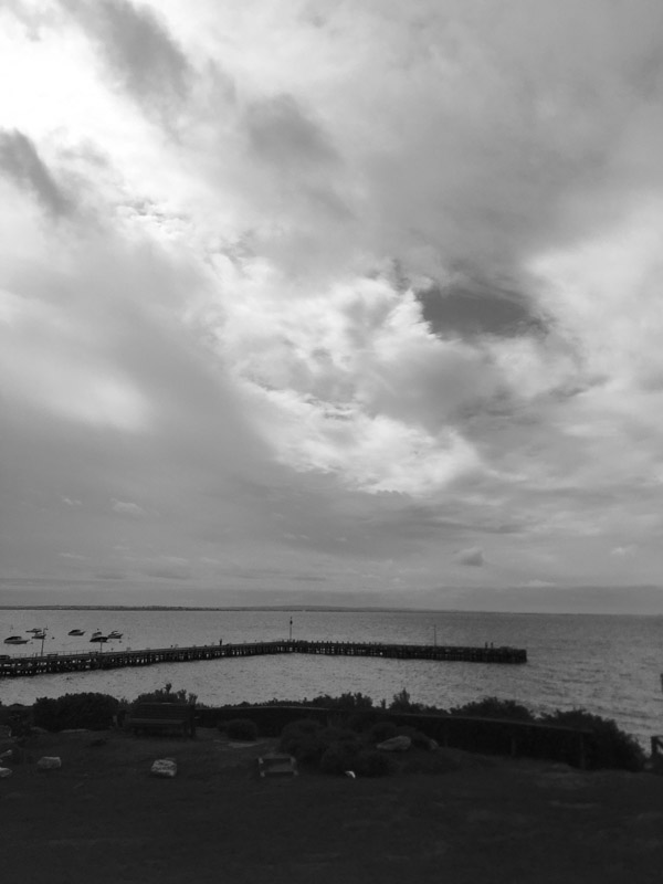
The studio presents a photo essay of Quarantine Station in Point Nepean Victoria. This photo essay displays hundreds of polaroids taken in February 2019, just before the Australian experience of Covid 19. It was to be exhibited by Mornington Peninsula Shire Council Culture and Arts Program at Point Nepean in June 2021 and then rescheduled for September 2021 and was then subsequently launched online due to extended lockdowns. The design communication narrative of this photo essay is one of hope and endurance.
Design Brief
This polaroid photo essay was formalised by invitation for exhibition; therefore, it did not follow the usual client design brief process. Whilst I was an artist in residence at Quarantine Station, I recorded the essay unwittingly. I had no idea we were about to enter a pandemic, but I had a fascination with history and pandemics. When I was subsequently invited to exhibit the photo essay, this became problematic because I had recorded the essay on an everyday camera; not suitable for large scale prints or magazine work that the studio would typically produce. This problem formed the foundation for the design process.
This project was developed by:
- Nicole Cullinan A Poetic point of view.
- Mornington Peninsula Shire Council
- Jane German - Mornington Peninsula Shire
- Michael Stowers - Mornington Peninsula Shire
- Mikayla Fulton - Popic Printing
- Acknowledgement – Bunurong People
Design Process
Design Excellence
We strive for design excellence by identifying and maintaining the concept of purpose with every project we complete in the studio. The functional element for this polaroid photo essay was to provide hope. I think we achieved that. We wanted the user to leave the exhibition with a sense of optimism; the photos should remind them that this has happened before (Spanish Flu 1920) and that they will be okay. The exhibition looked fantastic and was easy to consume. There were many reprints during the black and white printing process to get it just right. Not too blue, just a little blue, because blue is calming, but these are black and white polaroids. Much thought went into the shades of black and white. The feedback was excellent. Safety for the user and producer is essential, and we were lucky to have a space that was very accessible, something I was grateful for. From a holistic point of view, this project was meaningful but also accidental and in a way that mirrors how life is now, a little unpredictable but still manageable. Creatives are not motivated by capitalism, but we need to make a living; this project was not conceived with monetary motivations but curiosity. I think it does communicate the benefit of investing in professional design. Two of the photos from this project have subsequently been featured in an international literary magazine.
Design Innovation
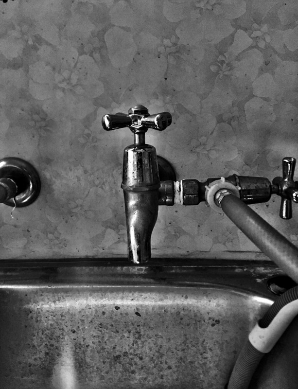
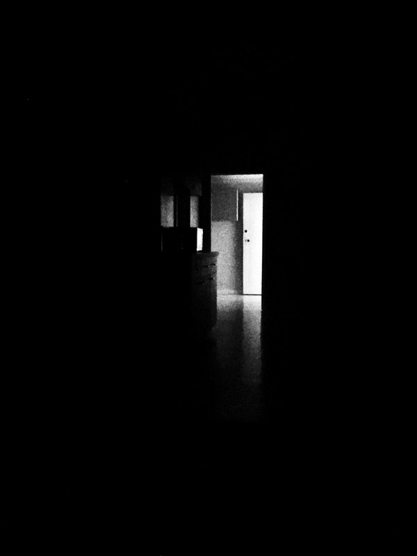
This project is unique because it is whimsical; it was not conceived for a design brief, although it ended up being moulded into a brief after someone recognised its potential beauty. Whilst I was staying at quarantine cottages as an artist in residence, I covered the walls in post-it notes of pastel colours (request photos if you want to see this). They looked so pretty against the backdrop of the painted walls, dusty pink, greens and blues. I was trying to resolve an unfinished studio project that had become stuck. A council representative turned up during my stay and reminded me that I had signed a lease agreement to take care of the house. I reassured them I had tested the post-it note before attaching it to the wall and it did not leave marks once removed. After they left, I took photos of the post-it note installation and removed them. This began the process for the polaroid photo essay. The next day the council rang and said the post-it notes installation looked interesting and perhaps I could leave it there. But it was too late. I reflect on design communication, its ability to be memorialised, whether it is seen by many or not. Perhaps each little project becomes part of something else at some other time. After two failed opening dates, in the end, this polaroid photo essay was published online.
Design Impact
Everything passes eventually. I say this all of the time. Yet, it is bookended by the concept of some designs being enduring. Perhaps this is a conversation about trends as opposed to timelessness. I think from a social perspective, this project claims the hope that we will be happy again and that eventually, everything passes, this pandemic too will end.
The studio has experienced commercial opportunities from the quarantine photo essay. International magazines have grabbed several of the photos. But that is not why we do this. We do this because we crave a sense of meaning in our lives. It is a privilege when the studio is paid to express company and individual visions for the future they wish to create.
Circular Design and Sustainability Features
The concept of multiple life cycles is not new. Content creation and budget constraints in the arts and architecture are commonplace and inform a significant number of projects by design. The photo essay was both affordable and sustainable. It involved a lot of communication with the printer regarding materiality and repurpose. It is a constant need to ask and not assume that the values we bring to work align with those to who we outsource work. It is a shame that the photo essay was not seen in person by the user, but it was posted online to the studio blog platform, with close to one hundred thousand views per year. Part of the exhibition has now been reinstalled on one of the studio walls. This project did not go to plan, but I can’t help believing it is part of the bigger picture.
Meet the Jury
Entries are judged by a panel of national and international design experts representing the diverse range of design disciplines showcased by the awards.
View the Awards JuryEntering the Awards
The Awards are free to enter for eligible Victorian designers and architects with submissions across eight design categories.
Learn more about the guidelines and processType on the line above then press the Enter/Return key to submit a new search query