1. Grasping the potential
Studio Binocular collaborated with the JEDI team of data scientists, strategists and policy analysts to understand the capabilities of JEDI – which provides a real-time view of the Australian labour market, drawing complex data from multiple sources into its data engine, and transforming it into meaningful insights for many different users.
2. A user-centred approach
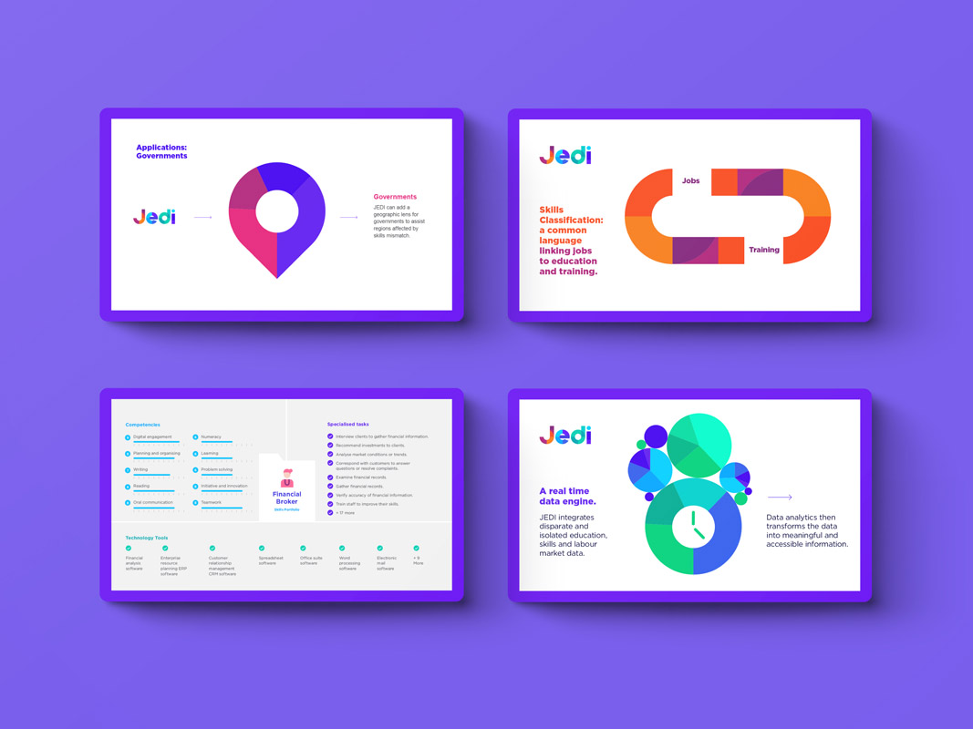
The next step was to understand what this actually means for users in a practical sense – what would JEDI give them, and what would that knowledge allow them to do? We learned that for employers it might mean identifying skills gaps in their workforce and offering training; for educators it might mean developing training to support future skills demands; and for governments it might mean a better understanding of regional challenges.
3. Key messaging
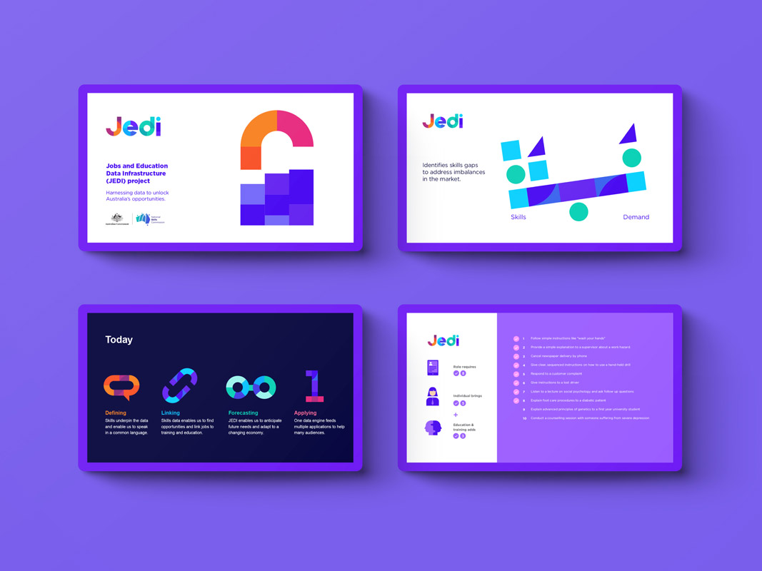
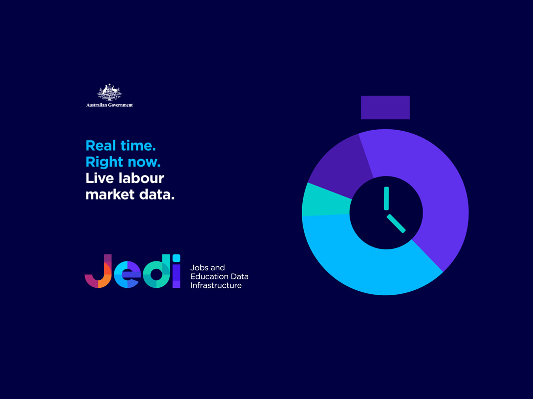
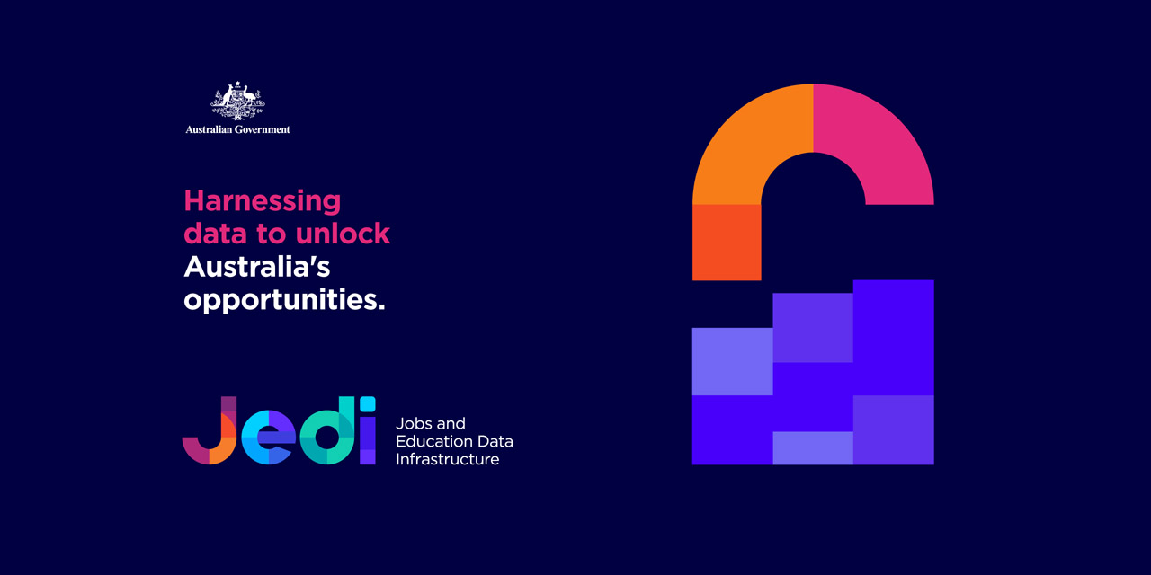
We developed a series of key messages and visuals which helped the federal government articulate the value of JEDI in a clear, succinct, and understandable way.
4. A bold brandmark
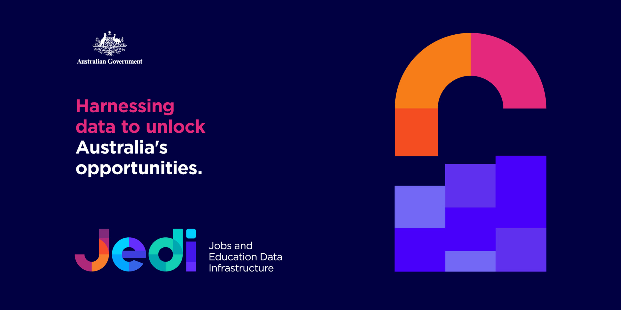
The brandmark reflects the multi-faceted and inter-related nature of real-time data through overlapping geometric shapes and colour housed in a clear typographic mark.
5. A confident visual language
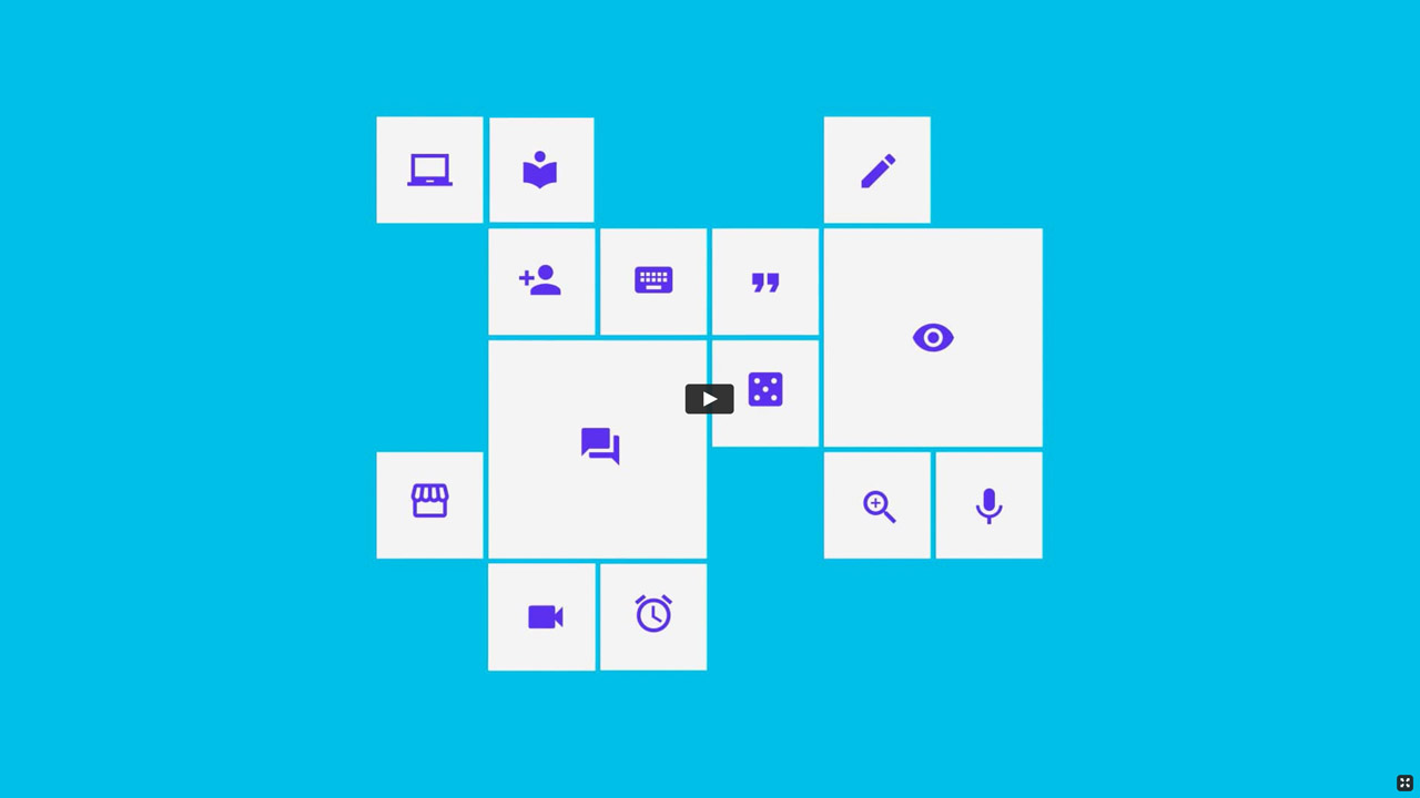
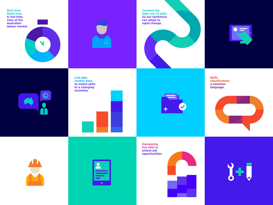
The visual language extends this further through animated illustrations, icons and strong colour which provide ample flexibility to present a bold, confident and innovative brand.
6. A multi-channel brand
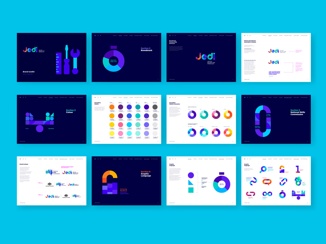
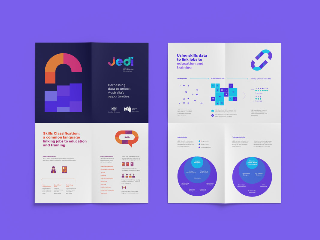
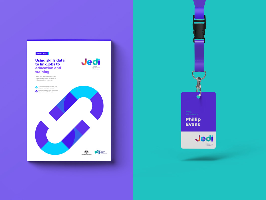
The JEDI brand was documented with brand guidelines, and expanded to include an explainer video, presentation tools, digital templates and a range of leave-behind collateral.

