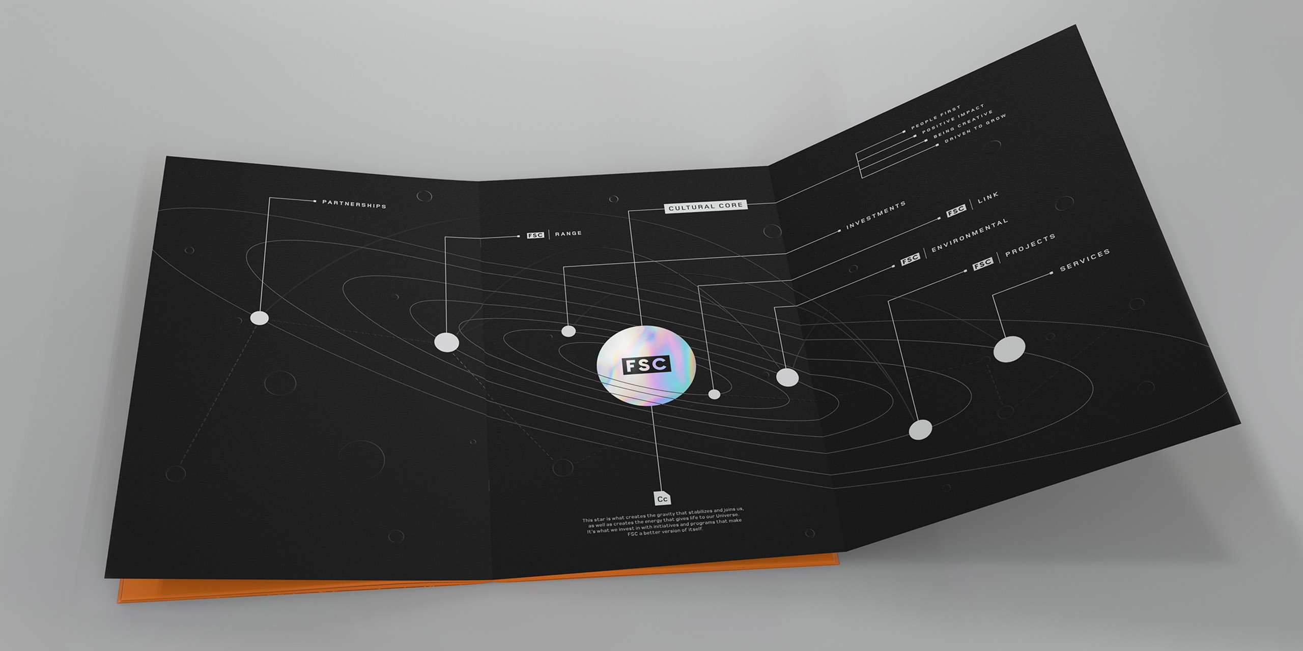
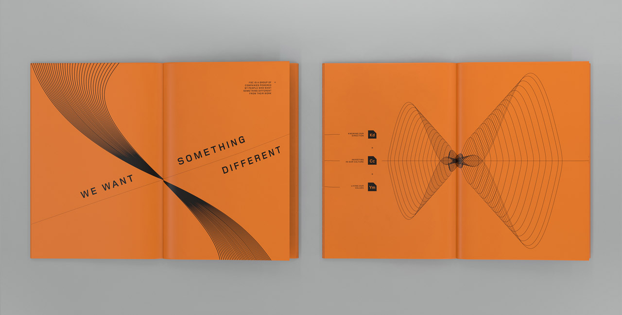
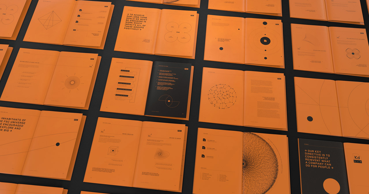
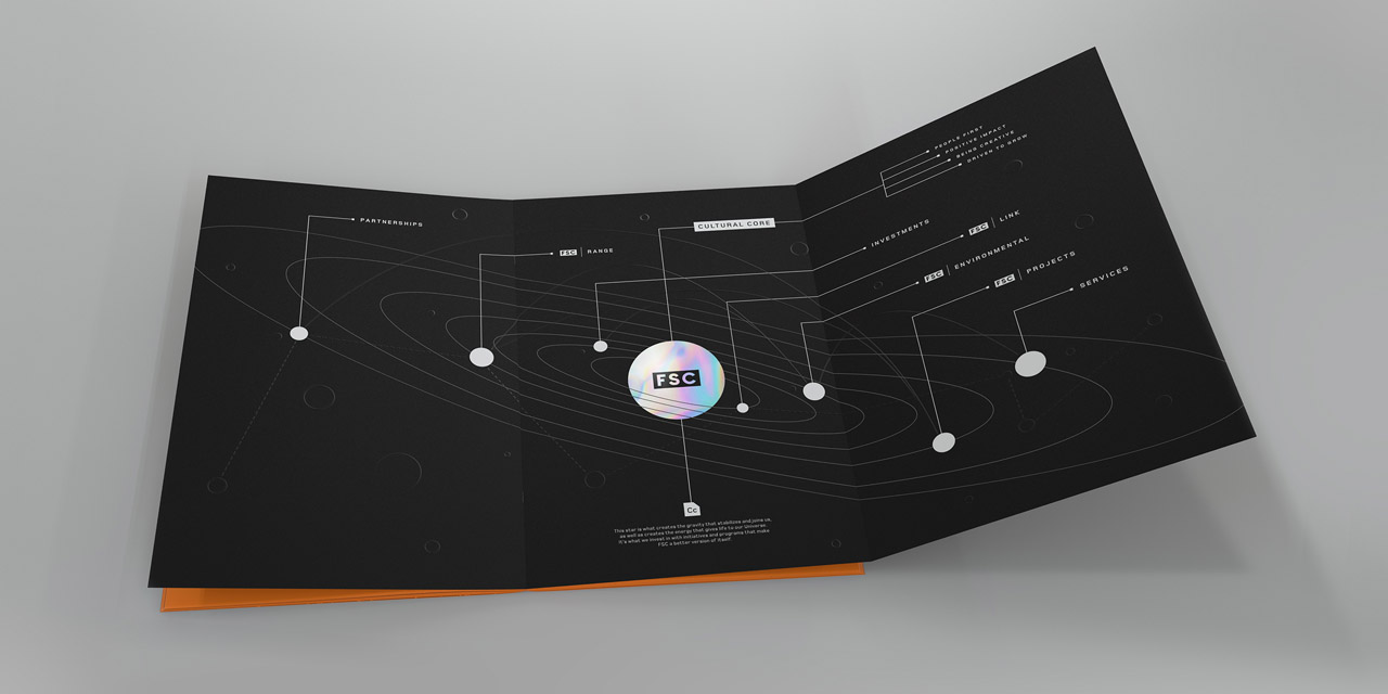
The initial introduction to this project centred around a discussion and a wireframe of the proposed content. We broke those components down and thought about how we could communicate them - what would be an engaging way to make this story digestible? How might we structure the hierarchy of information to give it clarity? Where might we need to elaborate in detail?
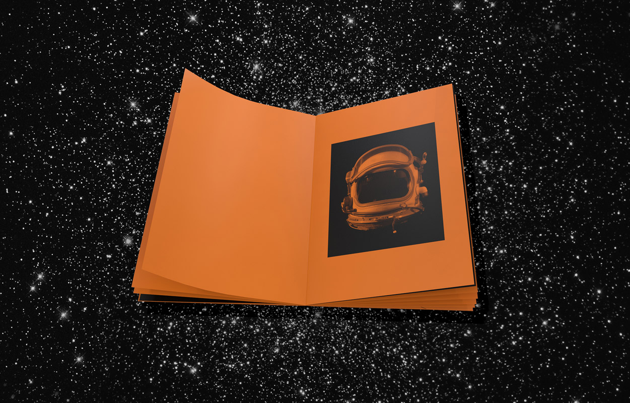
Collectively, we were quick to rule out trying to achieve this with existing brand identity elements — this needed to be something special on a different level. With an idea and direction mapped out, we set about exploring mood boards to approach the visuals. We researched scientific infographics, sci-fi novels, astronomy diagrams, particle physics, deep space, Einstein’s Theory of Relativity, cosmic background radiation, Carl Sagan... early on, it was all on the table.
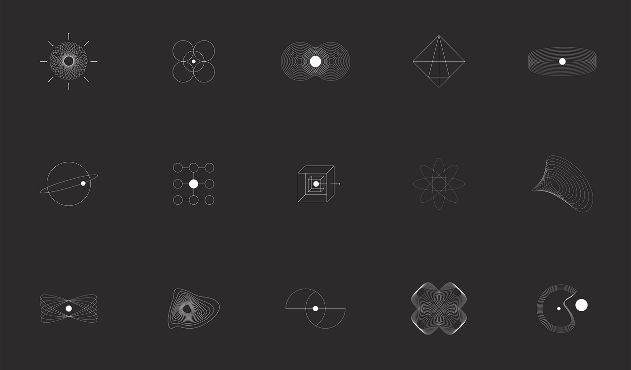
Through this process, knowing what would make it too complex helped us to define what would make it simple. Acknowledging that simplicity was key to communicating the abstract ideas set the visual goal posts. Levelling the playing field and developing pictograms that represented aspects and categories of the content gave us a way to achieve consistency and clarity. It also left room for interpretation and an invitation for exploration from the reader.
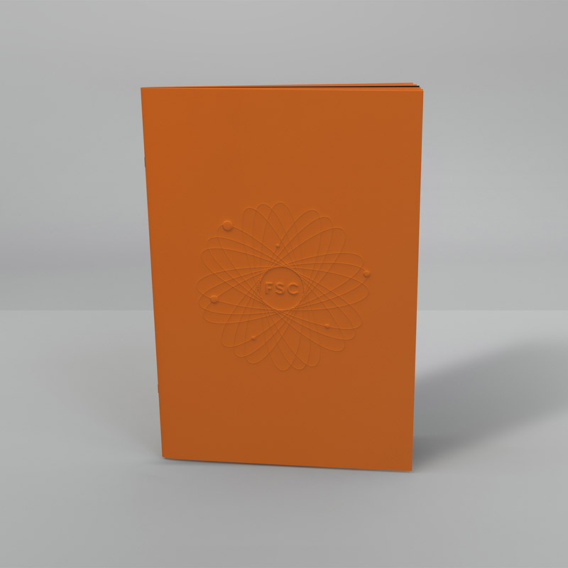
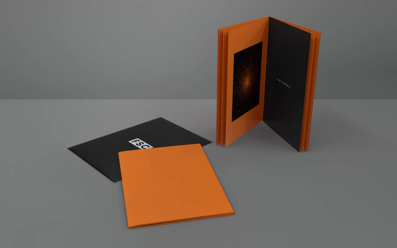
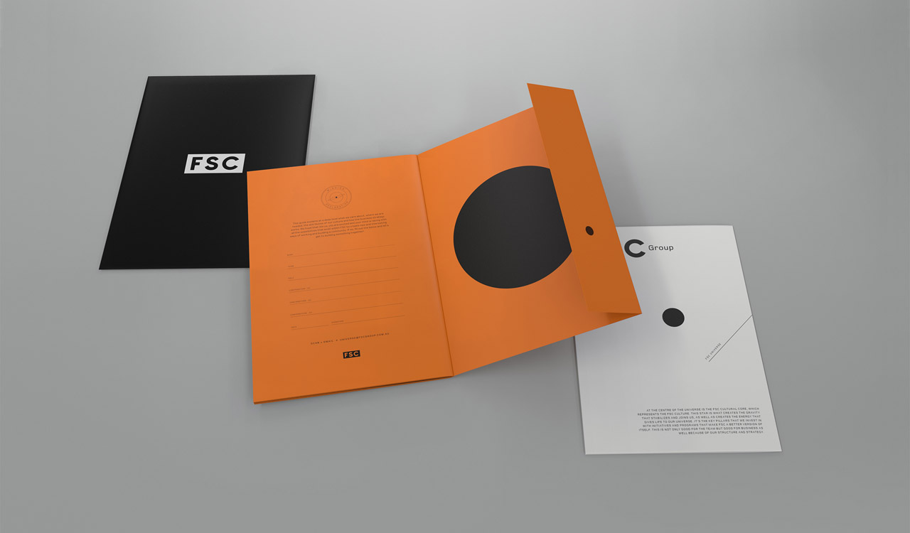
Tim Meyer (Atollon, Creative Director) worked closely with Lachlan Smith (FSC, Managing Director) to refine and nurture all aspects of this project. This included everything from getting the tactile feel right; reviewing and evolving the content; and ensuring the design was relevant and inspiring. Together, we could see and feel the impact we were creating — FSC Universe quickly became a passion project. The end result? A publication that creates its own gravity.

