Finalist 2021

Ewe Care Sheep Milk Skincare

Design by Bird / Ewe Care

From the Earth, for the Earth. Not another cookie-cutter beauty brand.

Ewe Care is Australia’s first sheep milk natural skincare range that combines the benefits of sheep milk with uniquely Tasmanian ingredients. From product to packaging, every aspect of Ewe Care is made to proudly reflect and honour the land it’s made on. Fuelled by Ewe Care’s business values, Design by Bird were engaged to communicate a sense of bespoke luxury, consider local provenance and potential physical waste footprint beauty brands leave through packaging, to ultimately cut waste and provide a 100% home compostable solution.

Design Brief

Cut through the noise and create an aesthetic that broadly appeals and sits outside the normal beauty scene narrative. The identity must also embrace the business values of sustainability and address a significant gap in the Australian skincare market and give life to exceptional ingredients that are otherwise going to waste.

Expected to achieve an economical and viable solution to provide a 100% home compostable packaging solution. Minimising Ewe Care’s waste footprint as much as possible. Ewe Care skincare is essentially born from the need to reduce waste in sheep milk cheese production.
Embracing these essentials delivers a holistic brand experience and presence that effectively adapts to a plethora of design needs, point of sale, print marketing & digital assets.

Repurposing waste (By-products).
Socially & environmentally conscious.
Sustainable (no longer good enough).
Experimentation. Innovation.
Positive disruptors.


This project was developed by:

Design Process

An internal and externally collaborative design process was undertaken. Firstly, an initial research phase allowed us to produce work that is not only aesthetically refined, but strategically differentiated and globally benchmarked. A review of comparable markets provided a visual audit and critique of existing beauty cream identities and identification of key visual characteristics where opportunities for differentiation could be explored. Visual and verbal opportunities were found across various and relevant sectors and informed decision making throughout the creative process.

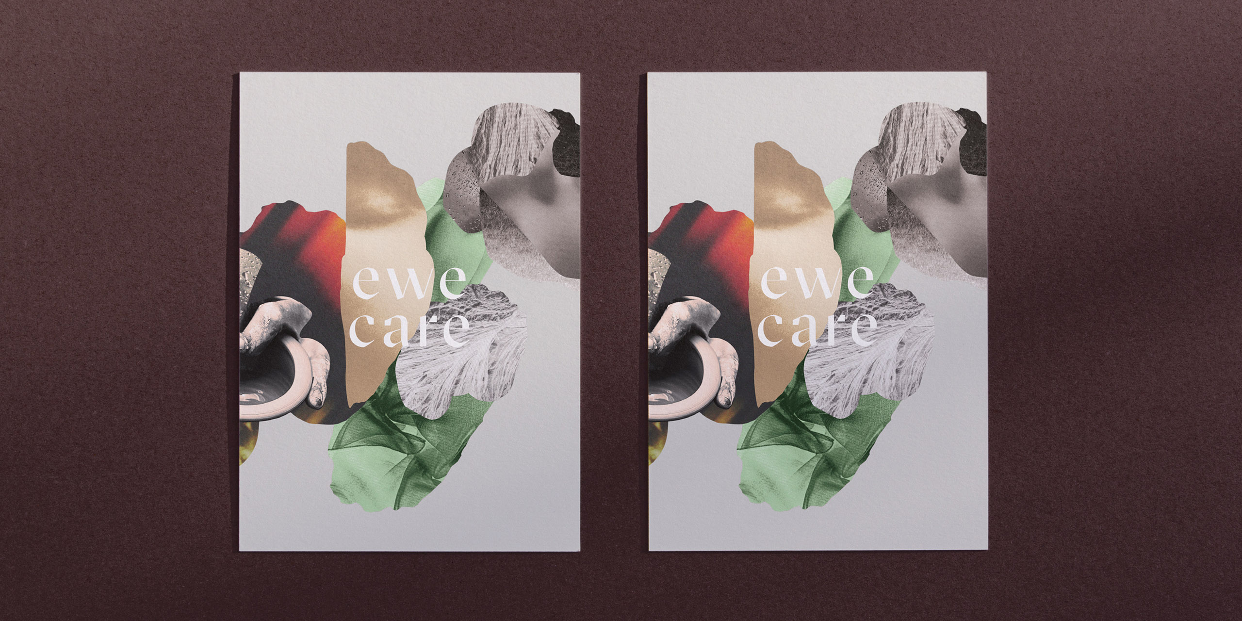
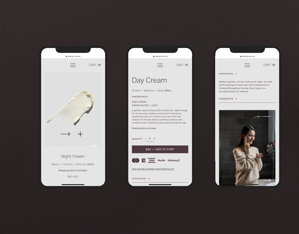
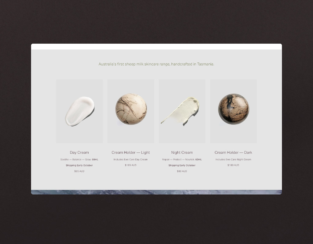
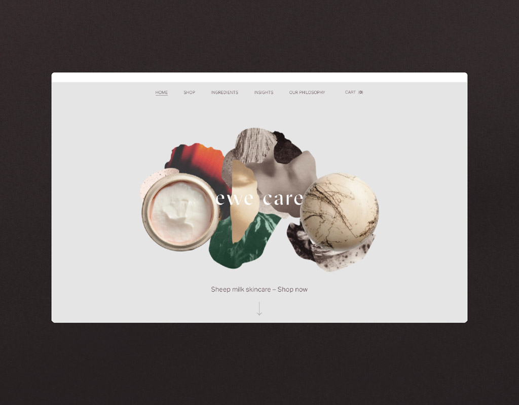
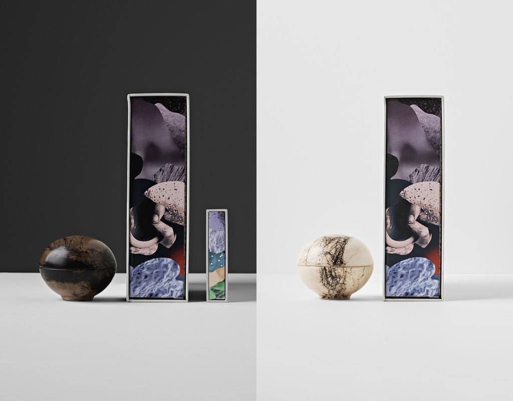
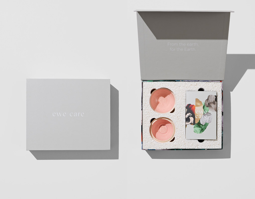
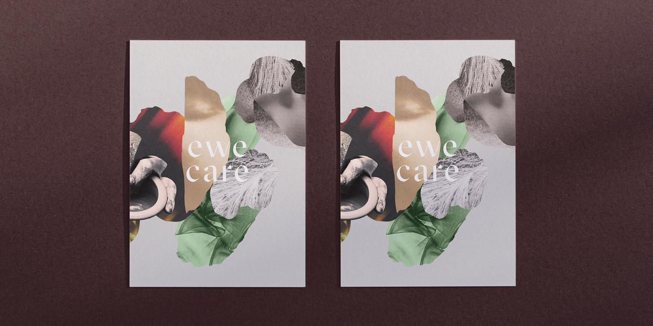
Exploration and development of design concepts for Ewe Care. Innovation was a key, and we kept our creativity grounded in our overall purpose, ensuring our concepts were tactical and meaningful. We carefully explored how the identity will be applied on screen and throughout printed collateral. Appropriate exploration of the design architecture, style and tone approach provided confidence and a clear direction moving forward. Design by Bird also, in collaboration with Ewe Care, began understanding how the fragile product can be packaged and still address the need to minimise waste. The cream holders saw the implementation of sheeps wool being applied in a Raku technique to visually differentiate the vessels and provide a fitting premium aesthetic.

During design and product development, Design by Bird offered experience, knowledge and leadership — pointing the project in the right direction. We provided an honest and authentic approach through product development, design refinement and production of all collateral; digital, motion and print.

Delivering a beautiful, well-rounded design outcome that delivers on this design challenge. The outcome is purposeful and bespoke – providing an authentic and memorable tone & brand story that exceeds expectations. The design aesthetic and story captures the soul of the brand whilst the packaging delivers this promise and becomes a conduit to build awareness of this message. Creating tangible equity.

Design Excellence

Visual and verbal storytelling and clarity were paramount in driving the creative direction of this brand. We didn’t want to repeat and create another cookie-cutter skincare brand that is ever so present at the moment. True honesty and authenticity in the messages told.

Collage and handcrafted elements were at the heart of the visual identity. A true Tasmanian sense of environment, tone & colour palette celebrates local provenance; embracing history, landscape and context via their brand narratives, uniquely defined and further enhanced through a descriptive visual language – delivering a holistic brand experience and presence.

Communication throughout printed collateral and the digital space highlight a no waste methodology and although premium in appearance communicates the packaging properties – home compostable and reusable cream holders.

Design Innovation

An impactful bi-line “From the Earth, For the Earth” informs the user of the product's origins and goals. The intention is to create a sense of good within the purchaser and make them question the broader skincare industry and amounts of waste globally. A simple intention.

The product “Sheep milk skincare” is new to the market and one of a kind. Born from the intention to reduce further waste in sheep cheese production. Concisely highlights what the product is and differentiates it again from the industry.

Collage elements from the production process and beauty space is a creative device that reinforces the sense of handcrafted. Bespoke process, limited product editions and one of a kind pieces.

Design Impact

Design of packaging has been considered. Sustainability at the forefront. All packaging is 100% home compostable.

The creams, bespoke cream holders and packaging are respectfully made from the earth and can be safely returned to it.

The cream holder packages achieve ‘TUV Austria’ Certification and are made from Organic Waste only.

Ewe Care was created as a solution to a waste problem; there was no intention to create new ones with the packaging.

Ewe Care wants to do better. Positively & actively encourages others to do better by the environment and carry that through every aspect of the brand.

Circular Design and Sustainability Features

Design by Bird, collaboratively with Ewe Care, designed and sourced sustainable product packaging materials. The cream holder packages achieve ‘TUV Austria’ Certification and are made from Organic Waste only.

All printed collateral uses soy based inks and Recycled & FSC accredited papers. Glues used throughout packaging and seals are also compostable.

The foam insert modules, that safely cradle the cream holders in transit, are also 100% home compostable. It is encouraged in print material to utilise this foam for cream application and to retain moisture when storing the creams in the cream holders.

The cream holders have sheep wool from the farm uniquely burnt to each cream holder. A Raku technique is used to visually differentiate the vessels and provide a fitting premium aesthetic and create desirability; whilst importantly solving another by-product solution.

Communication Design 2021 Finalists

Digestive Tumble

HAFP Research Lab

Quarantine Station

Nicole Cullinan A Poetic point of view. / Mornington Peninsula Shire Council / Jane German - Mornington Peninsula Shire / Michael Stowers - Mornington Peninsula Shire / Mikayla Fulton - Popic Printing / Acknowledgement – Bunurong People

Oho

Ellis Jones / Oho

Yume

Ellis Jones / Yume

Penguin Parade Visitor Centre

Phillip Island Nature Parks / Thylacine Design / Gemma Field / Mental Media / Benjamin Cisterne / Marc Martin

The Crossing

Australian Open Tennis Tournament / Nicholas Azidis / Rose Staff

Treasures of the Natural World

Museums Victoria Design Studio / Studio Peter King

Yawa Aquatic Centre

Studio Binocular / Mornington Peninsula Shire Council

Telstra Creator Space

Studio Binocular / The University of Melbourne / Telstra

JEDI

Studio Binocular / National Skills Commission

Darkness

Shane Gavin – Creative

Carlton Learning Precinct

Nexus Designs / City of Melbourne / Law Architects

V for Victori

Charlie Ryan (Five Creative) / QMS Media / Total Outdoor Media / Plakkit Media / SMLXL Fine Art Print Studio / Australian Graphic Design Association (AGDA) / Fireworks PR

Metro Tunnel Headquarters

We Are Best / Rail Projects Victoria

You Me and Money Preventing economic abuse in young adult relationships

Today / RMIT University School of Economics / YLab / Ecstra Foundation

FACES PLACES intergenerational community art activation Coburg

Moreland City Council / Steph Hughes / Playable Streets

FSC Universe

Atollon / FSC Group

Shrine of Remembrance

Multiple Studio / Shrine of Remembrance