Digestive Tumble has been developed by an in-house team of industrial designers and computer scientists with expertise in digital health and interaction design. The system was iteratively designed over a period of 10 months, where different iterations were tested with the lab members.
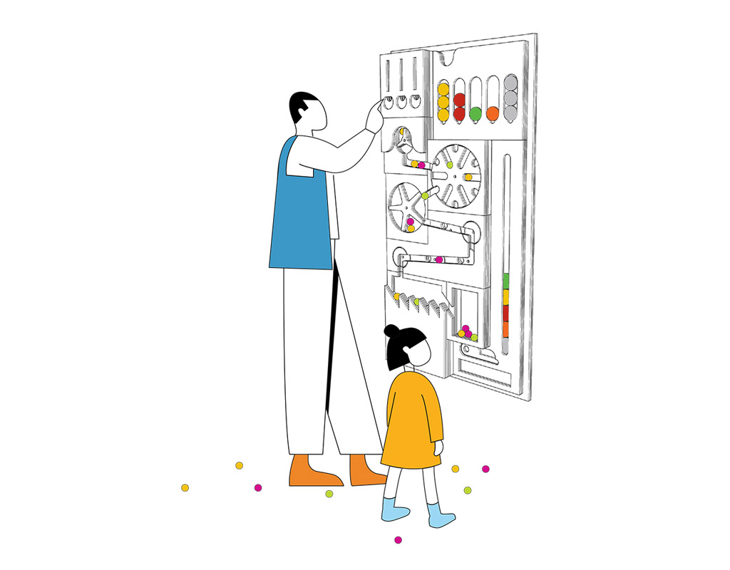
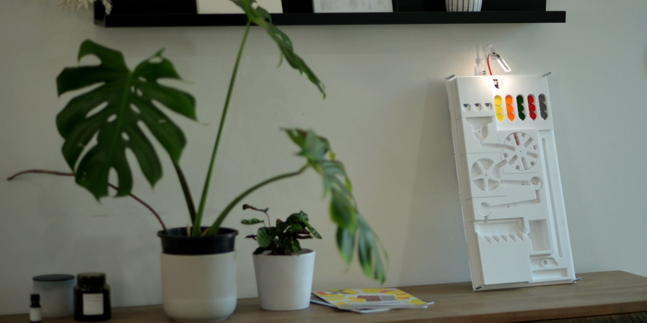
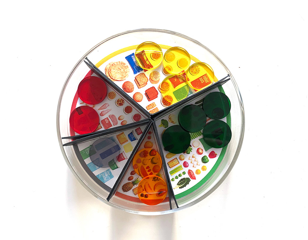
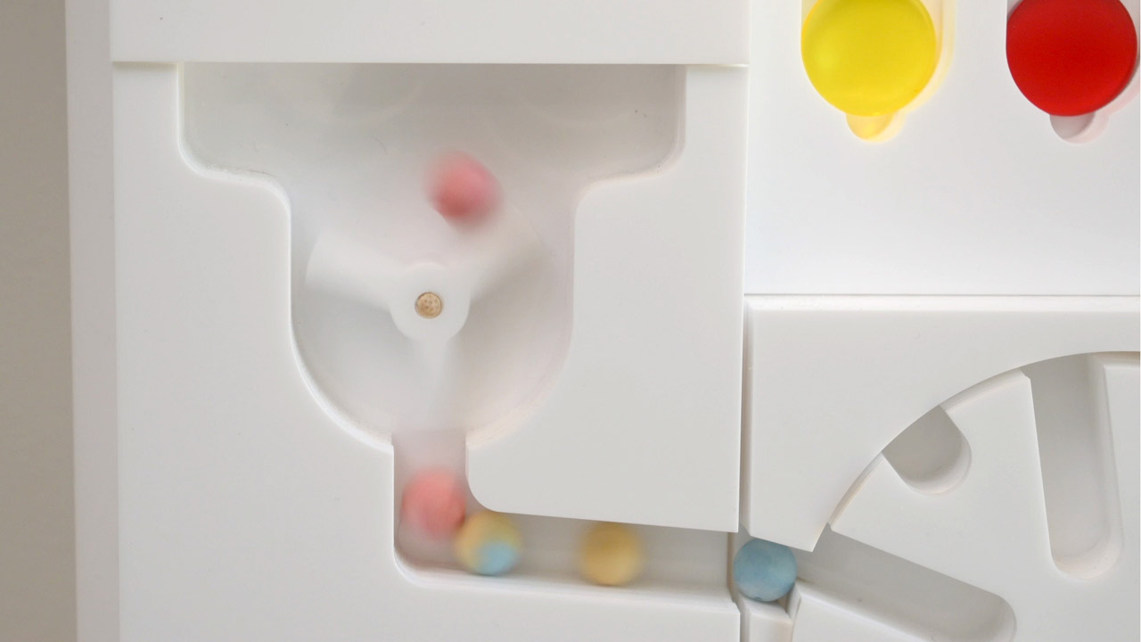
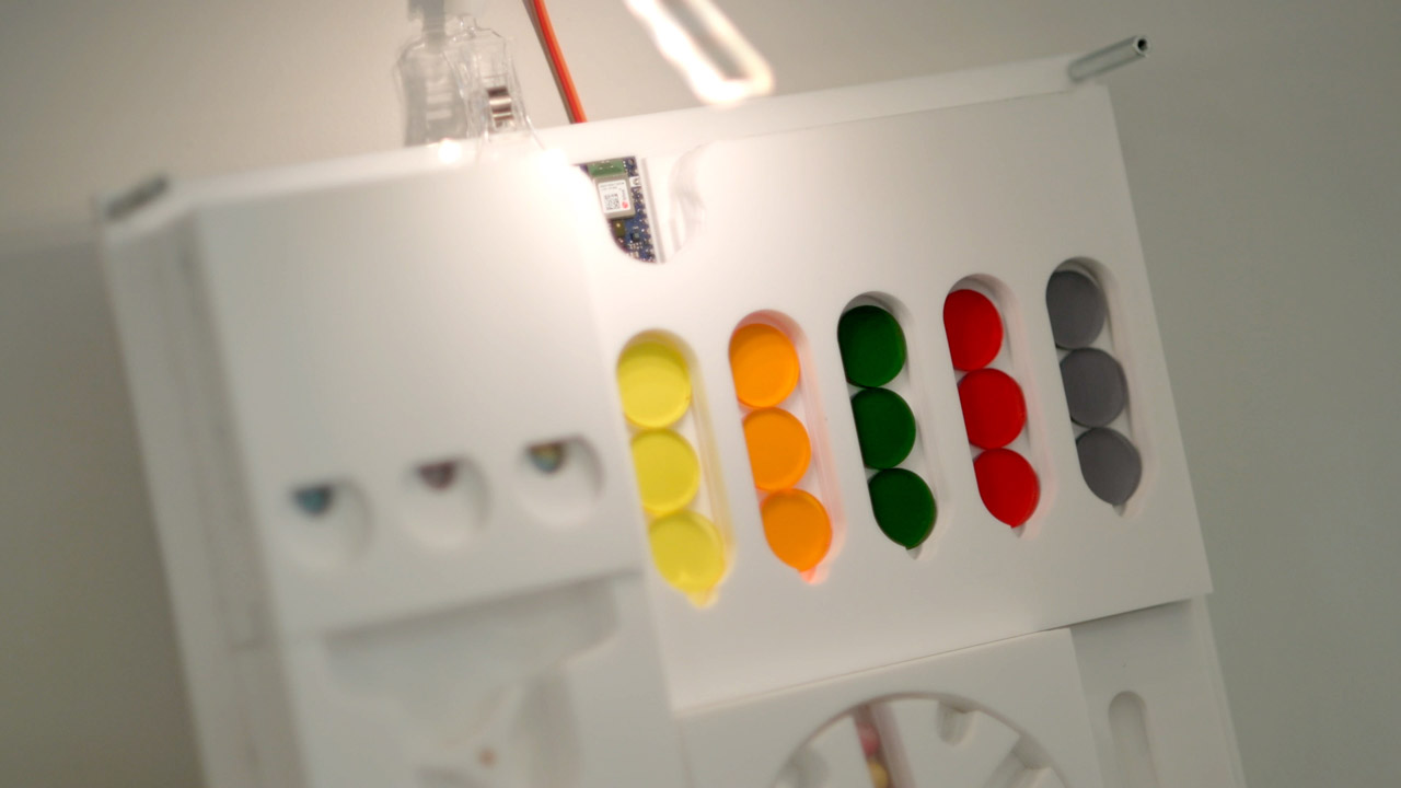
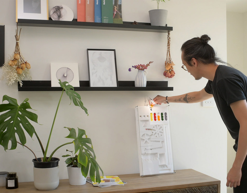
Digestive Tumble demonstrates how the food goes through different processes by using physical metaphors like tokens and beads. Following the Australian Dietary Guideline, we categorized different food items into five main groups: grains, meat, fruits, vegetables, and dairy. These food groups are represented through colorful tokens. The system takes a couple of hours to show the digestion of a meal, where the time varies depending upon the food composition of the meal. For instance, fruits and vegetables are high in fiber, hence get easily digested; whereas grains, meat and dairy follow slow digestion. The system also utilizes audio and visual representations to show the internal transformations of food. Finally, taking inspiration from the ‘body as a factory’ analogy, we used familiar metaphors of machines and industrial processes to visualize the digestive processes. For instance, while mechanisms like conveyor belts, and hold and release claws are used to represent the processes; geometrical figures like square, rectangle, and L-shapes are used to design the modules.
Digestive Tumble includes a certain level of abstraction to simplify the complex digestive processes so that users can easily understand the processes and can use the system safely at home. For instance, the excretion process does not contain the stigmatic details like colour, shape, or odour of the stool, hence providing opportunities to discuss the processes both in general and in relation to one’s body. By externalizing the internal processes and putting them out on display, we aim to remove the stigma of discussing one’s digestive health.


