


The design addresses each text as if it were a single folio leaf and typeset according to traditional canons of book design which are rooted in early medieval manuscript production. Using some of Camille Henrot’s philosophical underpinnings – centred around her interests in Leibniz – we specified typefaces whose formal design foundations are rooted in the Enlightenment period and are of French origin. Typefaces designed during the Enlightenment tend to be anchored to rationalist principals. These typefaces are considered transitional, somewhere between an ‘old style’ and the modern types of the later nineteenth century. The letterforms used draw a fine line between classic and contemporary and have some interesting idiosyncrasies present. The general handling of the typefaces gestures towards traditional typesetting present in encyclopaedias which resonate with Henrot’s literary and archival references. These typefaces are contemporary re-readings of historical forms, and remnants of archival artefacts. The typefaces are chosen to embody some of the key defining aspects of Henrot’s work: excessive curiosity and an excess of principals. The design response highlights tensions between contemporary graphic design and traditional historical forms and methods of reproduction. This multi-modal response looks not only to the conceptual underpinning, but also to the form; bringing in pluralistic ways to reinterpret the conceptual/material relations already present, and in turn, to use design to create new relationships.
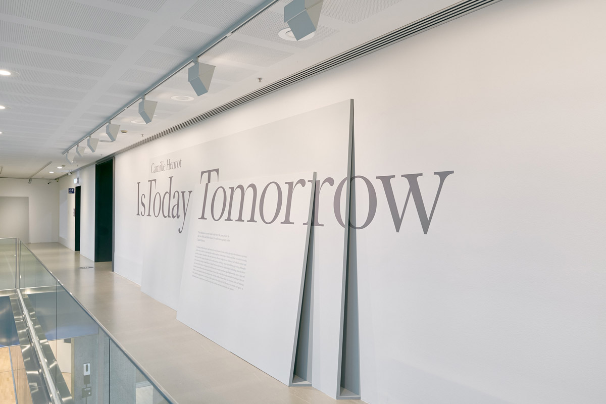
Camille Henrot Is Today Tomorrow - Exhibition Graphics
Exhibition graphics for the NGV exhibition Camille Henrot: Is Today Tomorrow, responding to the artist's work and use of assemblage.
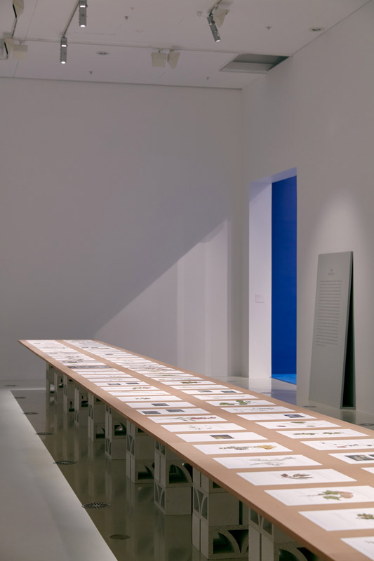
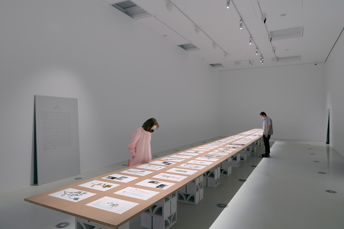
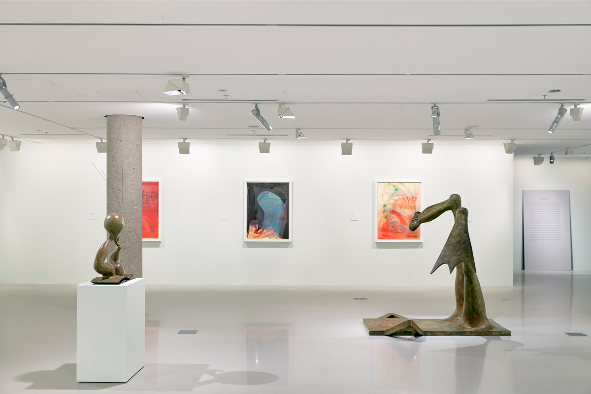
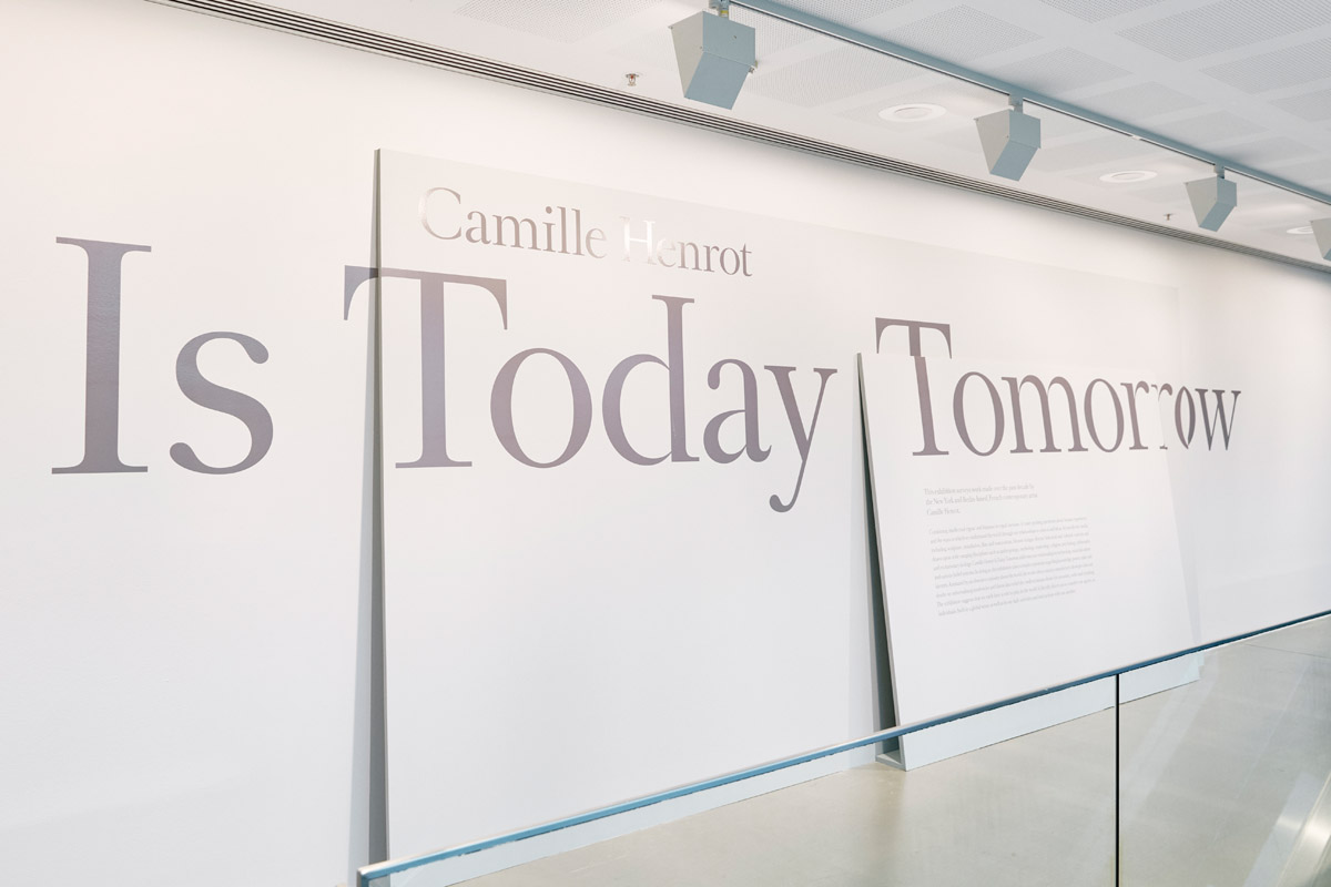
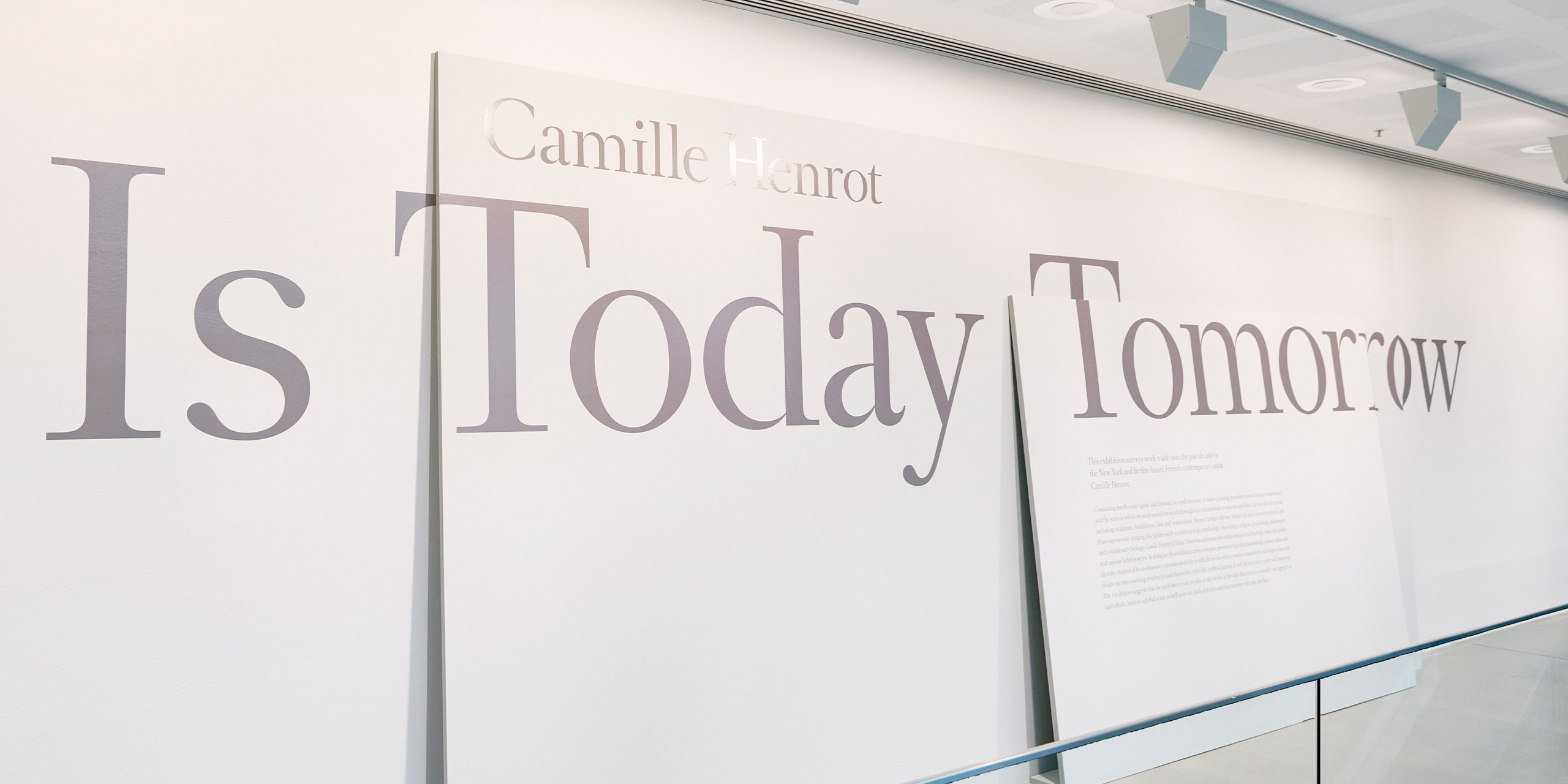
Exhibition graphics for the NGV exhibition Camille Henrot: Is Today Tomorrow, including way-finding, title wall, labels and didactics. The graphic approach was to layer materials, responding to Henrot’s use of assemblage. The graphics have dual presence being both on leaning planes as well as imprinting itself on the wall beneath. The graphic design highlights the tension between the analogue and the digital, the material and the immaterial, which was achieved through the layering of paint onto the shadows cast by the structural panels.
Design Brief
The brief tasked was designing a visual identity system to sit alongside the work of contemporary artist Camille Henrot. Henrot’s work is diverse spanning media including sculpture, drawing, video and installation; addressing many existential concerns, Henrot often uses techniques of assemblage. The work is often in dialogue with other disciplines including anthropology, museology, literature, philosophy and mythology. Given the intertextual nature of the work on display this brief required a response that is conceptually rich but not formally overpowering. A title wall is required, as well as a methodology for the display of contextual information for each room in the exhibition. The materials used must comply with strict parameters defined by conservation, as well as adhering to accessibility requirements for a public institution.
This project was developed by:
Design Process
Design Excellence
Producing design to sit alongside conceptual work is always challenging as the design needs to function but also to be sensitive to the artists intentions. This design response transcends mere simulation of the artists practice through use of various formal techniques (colour, typeface, format, material etc) of graphic design to contribute in its own disciplinary voice to the further communication of the intentions. The structure of the panels was considered in the design to ensure a seamless experience in viewing these pieces of information architecture. The combination of these structural and painted elements coalesces into a seamless piece of design, simultaneously analogue and digital, forming an intricate network of meaning. This design outcome evidences the ways we can use languages of visual communication to interpret and respond to a curatorial premise and in doing so, consider the spatial implications of these decisions.
Design Innovation
The graphics for this exhibition are exemplary of the possibilities for the use of low fidelity materials in achieving a conceptually rigorous design response that meets the necessary requirements of a public institution, with regards to both conservation and accessibility considerations. The melding together of traditional practices of historical typography and contemporary approaches to exhibition design contributes to the developing discourse around how we may give a material presence to contextual information in an art museum environment. The historical approach reinterpreted within this contemporary post-structural framework – articulating the material and the immaterial through painting the shadows cast by the panels – is unique for design that sits alongside contemporary art in this context. The scale and materiality of these panels walk a fine line between being both in and alongside the exhibition and in that offer a new site for reflecting on artworks which often play on assemblage, translation and historical forms of knowing.
Design Impact
The materials specified in this design can be seamlessly de-installed and repainted to be used as signage elsewhere in the gallery. The panels are designed to the same specifications and the surfaces can be joined into a modular unit if larger format signage is required at a later stage.
Meet the Jury
Entries are judged by a panel of national and international design experts representing the diverse range of design disciplines showcased by the awards.
View the Awards JuryEntering the Awards
The Awards are free to enter for eligible Victorian designers and architects with submissions across eight design categories.
Learn more about the guidelines and processType on the line above then press the Enter/Return key to submit a new search query